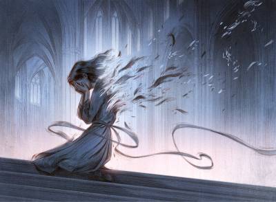
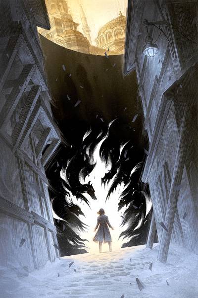
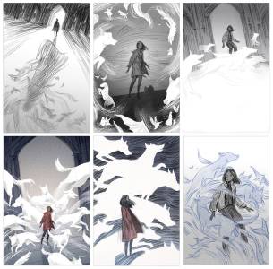
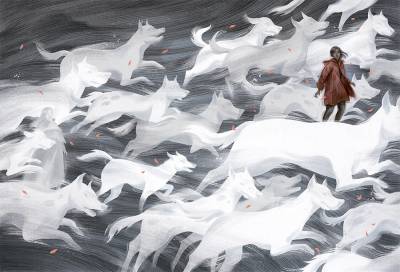
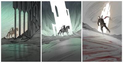
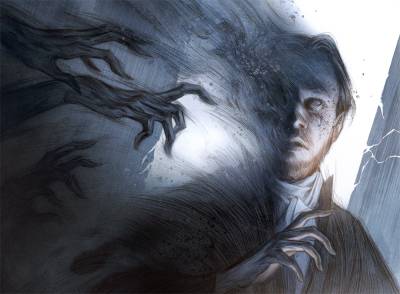
Providing multiple sketches for a client to pick from is a routine part of the illustration process. While I am not usually one to become very attached to a specific sketch or idea, I do sometimes lament what could have been. So today I am sharing a bunch of rejected sketches, along with the illustration that was actually taken to final.
I tend to send at least three sketches: one closely following what the client asked for, one showing how I would interpret the source material while remaining within the parameters of what the client asked for, and one that is a little unorthodox; creatively interesting but perhaps not the most “commercial” or expected. It’s always a treat when the client goes for the more creative idea, but I also understand that at the end of the day – especially for book covers and interiors – the image has to serve a specific purpose or goal, and often that requires meeting the client in the middle.
My sketches are always on the rougher side, because I see them as an initial jumping off point. It’s hard to discuss visual things without anything to look at, so scribbling down a few quick ideas gets the conversation going. It is not unusual for my sketches go through rounds of revisions, and this can be a valuable process, as it helps me gauge what is important to the client. The momentum of building on an existing sketch can also lead to more interesting iterations (though it is of course delightful when the AD just picks an initial sketch and we can go straight to final).
This is common advice, but it doesn’t hurt to repeat: never send a sketch you don’t want to do! Even when I send a sketch that closely follows what the client asked for, I am still picking out parts of the brief that I am interested in illustrating. Finding that balance of what is appropriate for the project and what I want to draw is a fun challenge, and I’ve almost never run into a situation where there is nothing in the brief or source material that interests me.
There are some image ideas and motifs that have been swimming around in my head for ages, that I’ve submitted as a sketch a few times (adjusted to fit the requirements of the project, of course), but that have yet to be chosen. Looking at the rejected sketches I’ve shared here, I hope one day I’ll finally get to do an image of something framed by columns and an arched doorway!






Your designs are fantastic! My favorites are the two thumbnails with the horses.