 Using references for artists goes WAY back. Whether you’re painting from nature like Van Gogh out in the wild, scratching on a cave to reproduce what you’ve seen int he forest, models posing in your studio, or like Munch, using the new tech of photographs to create work from… referring to the outside world to capture it’s reality, or to study it’s architecture is as old as art making itself is. These day’s the library of possibilities is near endless. Reference is a source of details, information essential to our process, that’s obvious. But it can also be a trap and a siren to sing your art to shipwreck if you’re not careful. The temptation to hook too many chains to the point of being imprisoned by the subject is always a threat, especially if you are working in a more naturalistic way like I do.

I work professionally with a lot of likeness requirements, especially when it comes to the film and soundtrack LP work. There’s a thousand hurdles in that format alone, this dependency is at the apex of the trap/gift side of reference: the job insists it be as close in likeness as ever possible- (and this is true whether it’s a cartoon like my work on BRAVE, or photographic as is my work on say, PARASITE). The key point in any reference you use, is this:
References are always and only ever should be, a STARTING POINT.
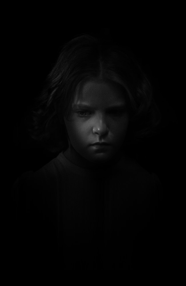
The piece you are making, no matter how realistic you are working, is a different thing from the reference. The manner and details by which you create the piece might not get those exacting photographic details right, and that’s it’s VALUE not a deficit. Your art lives and dies in the interpretation, not in reproduction. It’s harder to fall into the trap with live models than it is photographed or 2-d references sources for all the obvious reasons- when you’re working from a 3-d source, you’re already in the act of interpretation. Copying is impossible, so you are halfway to your goal with the first marks on the paper. A 2-d source is a more like vs like translation and leans easily into copying rather than interpretation. The upside of 2-d reference is of course, practical. It’s a lot easier to bang off a bunch of pics for reference than it is to have some sit in a room with you for hours on end. The internet image search makes the potentialities of the source and reference material all the more attractive as a wellspring to dip your cup into. The in-person subject demands much more translation from having to leap from literally one dimension of existence to another by way of your brain and hand. The photograph exists not he same plane of existence so it makes them both in many ways easier to translate and draw from, but also much more dangerous in lacking the natural filter drawing from life can provide. I’m not judging either as a value over the other except only to point out there a LOT less information from a photograph than a living model. That may matter more or less so depending on thew way you express you picture.

KNOW WHEN TO RUN
Even in a loyal screen-referenced set of pieces like in DI, there’s a place to add character and those little details to make the piece more than just a reproduction. The way to that is both in those details but really so much more so in knowing when to LEAVE THE REFERENCE. Like saying goodbye to a vacation, put it away and make the piece about itself more than trying to reproduce it’s shiny sister. The reference in these situations are like the aforementioned siren songs that sing you to your doom. They WANT you do be them, even to your failure- so it’s good to know when to push it away and use the source just for those check ins. With this kind of work, likeness details, once you’ve got the basics and needs down, I think it’s best to take a break and give the relationship some space. It invites room for your voice to be heard in the piece, and a chance to invent a new way through light or color or form, to express your subject. I sometimes weirdly like to have low rez online stuff because they DON’T solve all the issues and require you to lean more on your own knowledge and craft than the reference you’re working from. Those pics you see for Greg Manchess or Dan Dos posing with brooms for swords and blankets underlie while crouching on their fridge for a reference shot and then leaping from that to a painting of a pirate battling invaders or dragons or whatever comes from that skillset. The references become leaping off points to provide basic details not solve the whole show. Sometimes in this regard less is more, or rather less temptation to mimic is better than more room to interpret. Poor use of reference usually shows itself ion this way. Anytime your viewer is seeing the reference source or even getting a whiff of it, you’re failing the piece.

LEARN FIGURE/PORTRAIT DRAWING. FORE REAL.
Just because you have access to a photo ref that does all your hard work in pose lighting all that, doesn’t mean that it won’t look stilted, or flimsy and weightless when you draw from it. Understanding anatomy, muscles bone structure… those details that give you tools to translate the reference as a source, are what makes it all work. You can always tell when someone has copied a photo of say, Tony Stark or Obama, and doesn’t;t have a solid grasp on muscles light, bone and character. The flatness is going to sting you at every stage, and it’s what makes doing something super naturalistic still look. real and alive. It’s a race across a tightrope over a volcano for sure, but you can widen that rope with study, live model sessions…. just learn to SEE so you can see what you’re DRAWING. For me in this thing, it’s not horseshoes and hand-grenades: close doesn’t cut it. Just getting overt the hill c an make all the difference to the overall piece- even if it’s not working, you’re in a whole new realm where the repair is about detailing the fix to the likeness not making it look alive. Dressing Frankenstein’s monster as opposed to bringing him to life int he first place. With Double Indemnity my first take on Barbara Stanwyck’s character looked a hell of a lot more like Madeline Kahn than Stanwyck- so I had to redo that bit and get it right. I do this often and especially when the piece is at a scale where the benefit of a larger size doesn’t offer flexibility to the exercise.
 But the getting it wrong is not a bad thing. Art is alive from its errors not its successes- and getting it right all the time doesn’t help you get better…. quite the opposite. When you screw up and make someone look just a little bit like someone else, there’s a case to solve and learn from. Was it the nose, or the turn of a lip, to cheeky, or maybe too gaunt? when you figure out what went awry and then successfully fix it, congratulations! You’ve just had a backdoor lesson in anatomy. I do a lot of cover work for Nnedi Okorafor, and almost exclusively featuring portraits of African women. Africa is HUGE, and the diversity of form across this massive continent is diverse as hell. A Nigerian has an entirely different physical structure than a Rwandan Hutu, or a Somali. The act of having to puzzle out those distinctive features was an amazing learning p0lace for me to bring to every piece I do. It teaches authenticity and truth. The Mona Lisa works so well because she’s alive in that painting. Leonardo assembled an orchestra of character details to harmonize in a whole person. That’s what you want and what you can get to by hugging the inevitability of screwing it up here and there. EMBRACE THE SUCK as they say.

AVOID EASY & EASILY IDENTIFIABLE REFERENCES
The Google, Bing, etc.. searches always forefront the most common pieces to use, and this is why I say avoid them if you can. With film and tv work you will get some pushback against this because they want a smooth easy approval via the actor and don’t care or even notice it might come at a cost to the piece as a piece unto itself. The test of this is everywhere to see what I mean- you see most fan art or even hired guns draft something that you’ve already seen… you’re first response is, oh I KNOW that reference! I’ve fallen victim to this in some jobs myself, and they are always a super bummer. You want to build your own source by assembling parts, or at the very least build from less obvious poses, lighting and sources. The viewer wants to see the character they love but not necessarily the same what they have already seen it. Ideally you will capture their hearts, and those of the actors and directors you’re doing this for (if it’s that kind of project) if you manage to show them in a way they haven’t seen or thought of before. If it’s a book cover the equivalent praise there is when the author celebrates you somehow managing to create the person they alone only saw in their head, come to life on a page. The point is to be both loyal to the subject and surprise by showing a personal vision of that subject. I have a hard time quantifying that line in words… you definitely know it when you see it. And it all comes down to a unique click of the head, nod of the hand, or the way someone sits with a personal hitch to the left. The less of these little details you bring in, the less alive your piece will be.
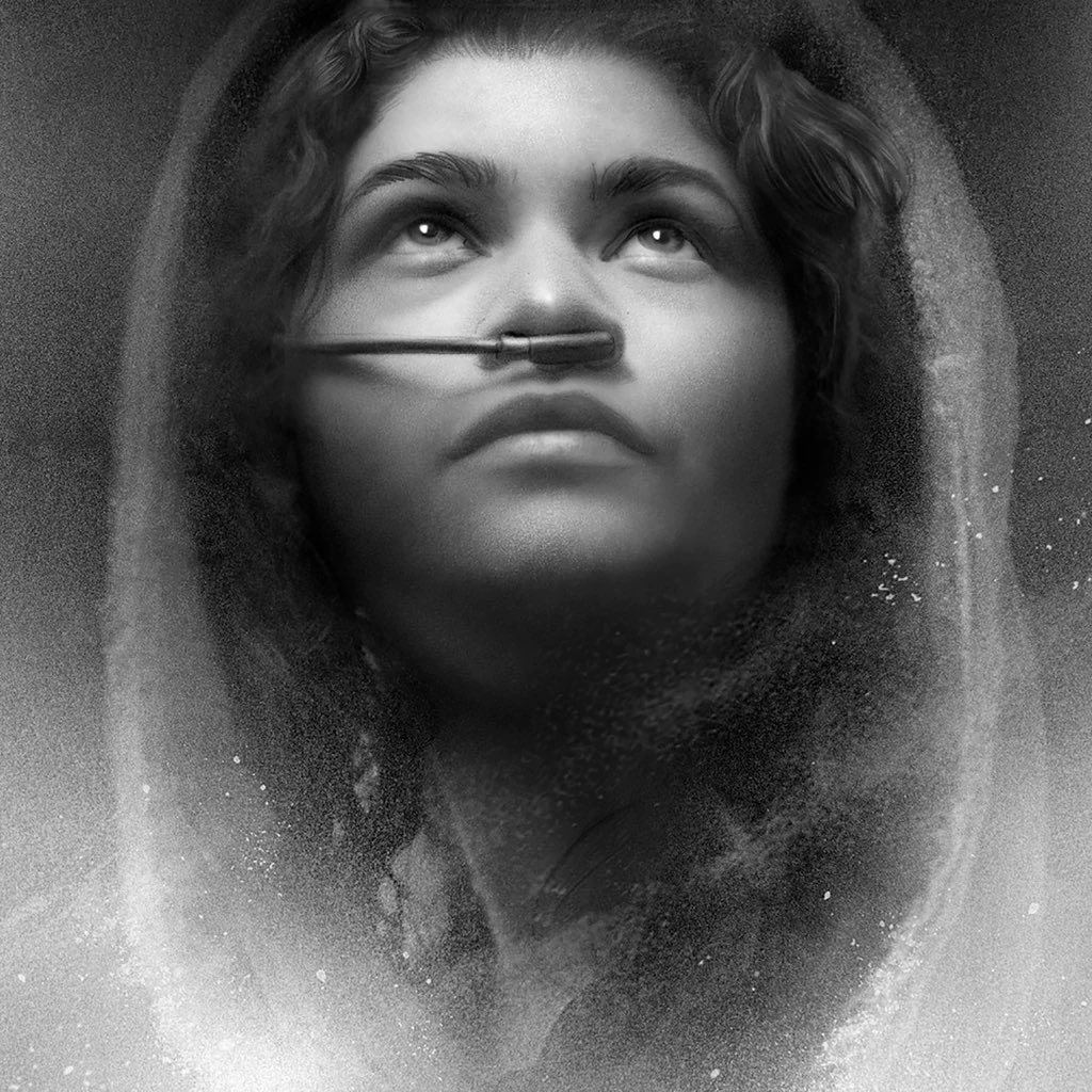
Human faces engage our brain more than any other visual subject. It ignites so many more of our neurons, triggers so much more brain activity, it’s not even close. We all possess the selfsame predator’s vision and perception that triggers our sense of something being off or unreal. And so the uncanny valley is our term for when something artificial is too real and as a result not real enough in exponentially opposing fashion. It’s a doomsday spiral you ant to avoid. And in my work where sometimes the most requisite photo realistic portraiture is required, say for Criterion’s THE OTHERS as an example, it’s STILL absolutely essential, more than ever, to make sure that the interpretation principle rules. You’re making something real and feel real, but you’re not trying to fool anyone that it is. It’s sounds ephemeral and a little hokey, but it really is about triggering that uncanny valley response or skipping it. A hyper real portrait of Mr Incredible will always avoid the Valley because it’s inherent architecture is cartoony. It’s expression is indicative not duplicative, and why when you see someone making hyper realistic naturalized images of say, what the Simpsons would look like as real people, the effect is nothing short of terrifying. So just don’t try to be smarter than the viewer. Tickle less to get more from their perception, and allow your marks to remind them you are creating a piece of art. There’s great solace in the obvious tools that might seem as a deficit that are in fact a value when it comes to rising above and beyond reference. If you can step over it and keep climbing you can make something truly magical that will surprise you. But spend too much time trying to achieve a technical success always comes at the expense of the feeling and sense of aliveness in your piece. Simply put, you don’t need to remake the photograph- that already exists. Make something new. Tell me something else about the subject. Extend beyond the limits of the source material and elevate. You’ll be happier making the work, and the result will be something alive and breathing and captivating, as opposed to something more akin to Frankenstein’s monster, that no matter how much lightening you force into its corpse, never rises to toss that little girl into the lake later. It just lies there like the dead thing it was before you ever came along.


How does Greg Ruth caution against the pitfalls of relying on easily identifiable references, and what alternatives does he propose for creating more original artwork? Regards, Telkom University/a>
I think the best ways is to work up an aggregate from as many reference sources as you can to create something that is of that effort as opposed to merely aping the reference. I also recommend finding out what reference sources are the most over exposed and just kick them to the curb so you don;t start from a place of over familiarity.
Now sometimes- often the studios will want or even insist you use their own reference sources, which means you’re kind of stuck with that origin point. if you find yourself in this kind of pickle, as I find myself even today as I type this, then you’re best offramp is alter it so much, frame the reference within a design that is utterly new or unique so that while the reference may be identifiable, what you DO with it overrides that and takes it someplace that expands, rather than becomes enslaved by it.