‘Business in the front and party in the back.’ Dura-lar, aka, the Mullet of painting surfaces.
I first stepped into working on Dura-lar on a journey for the above. I wanted a surface that I could do detail work on the front side, but also be able to cut loose, get aggressive with my mark making on the reverse, and NOT mess up all the hard work I’d already done.
I tried vellum, or the modern version of vellum that comes in a pad (like a thick tracing paper). But it wrinkled when wet. Which can have some cool effects, but not what I was after. I do Yupo once in a while, but almost all the work has to happen on the front, because it isn’t nearly as translucent.
Then I discovered the Grafix Dura-lar. It does not wrinkle no matter how wet you get it. And it has taken everything I have thrown at it from graphite to oil paint, like a champ.
The first thing to know is I use the MATTE version. Not the ‘wet media’ version. The matte will take dry media (Prisma, graphite, charcoal, pastel.) and wet media (Acrylic ink, acrylagouache, enamel, oil paint).
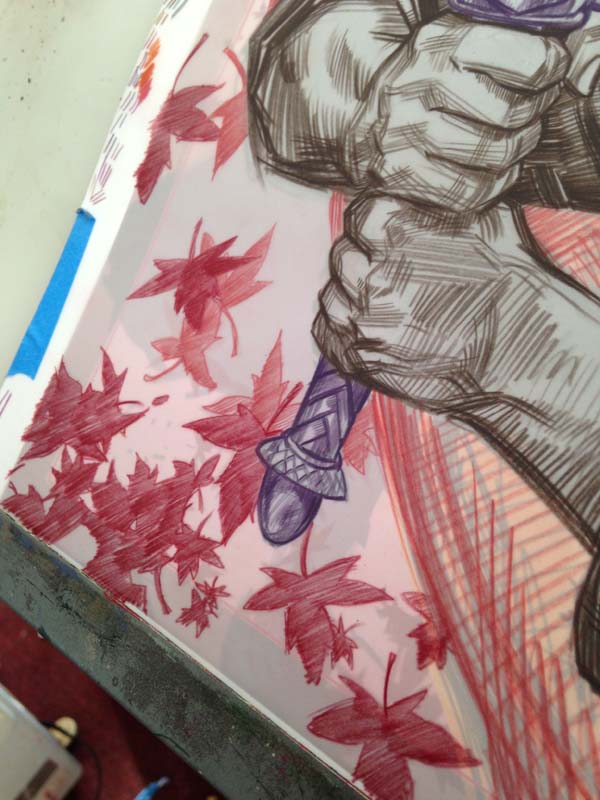
Because the matte is translucent, and not clear, it will ghost out what ever work is done on the reverse. I love this aspect because it is automatic atmospheric perspective, and lets you judge your final, darkest accents on the front.
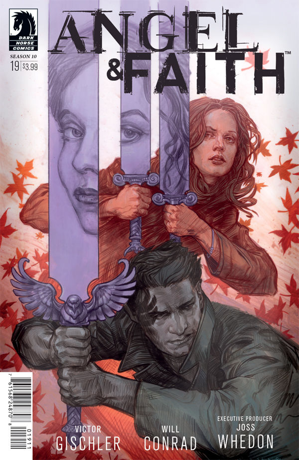
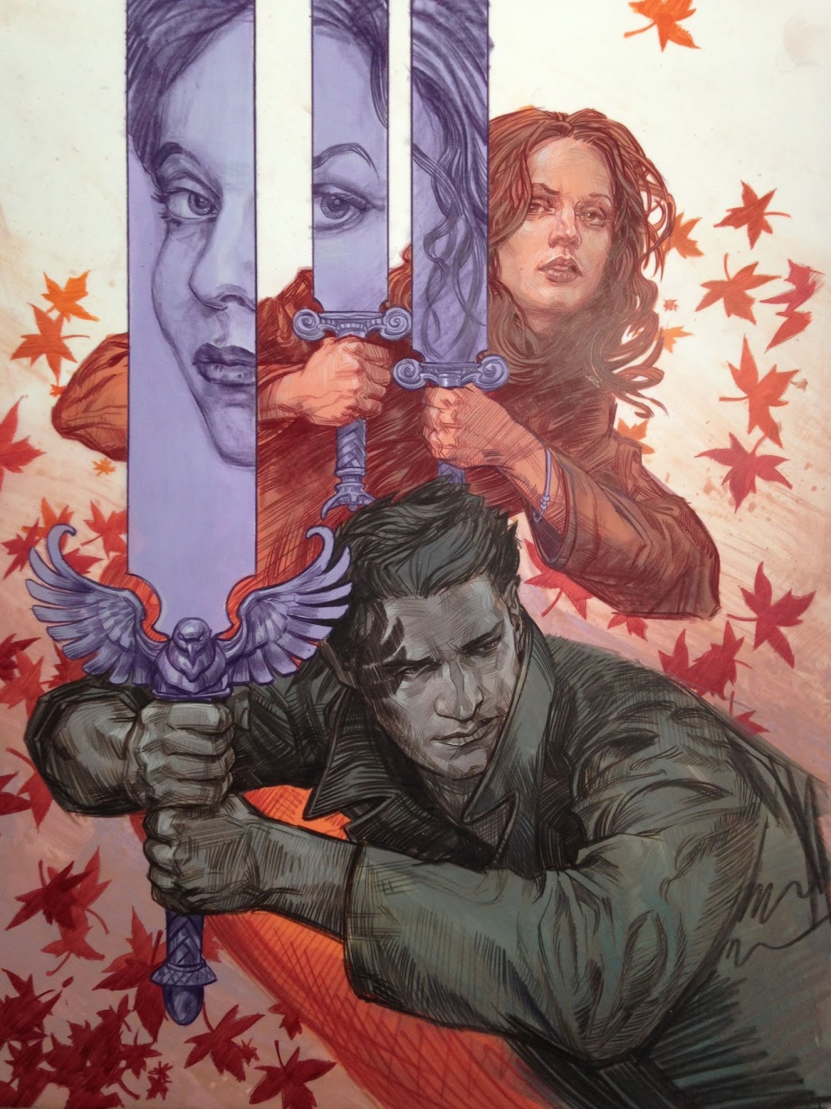
What follows is a step by step of my Angel and Faith cover #19 for Dark Horse Comics. I am using Prisma Color pencil FW ink and Acrylagouache:
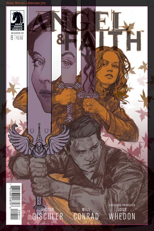
This is the level I took my digital comp before even beginning to make
it real. I like to have most of the design questions answered, which
frees me in the application of materials, because I can have fun with
such a solid foundation beneath me.
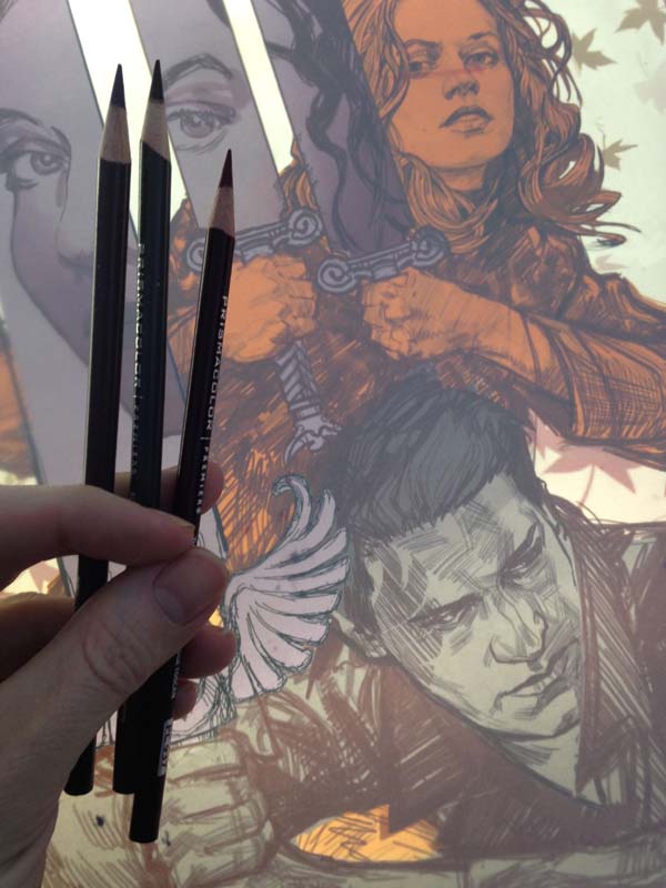
The rough drawing is printed out and is now on my light box with the
Dura-lar over the print. I have selected pencils within in a limited
range of values.
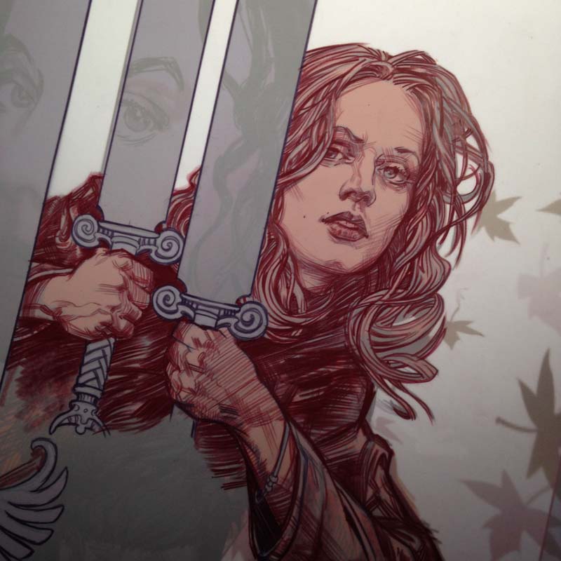
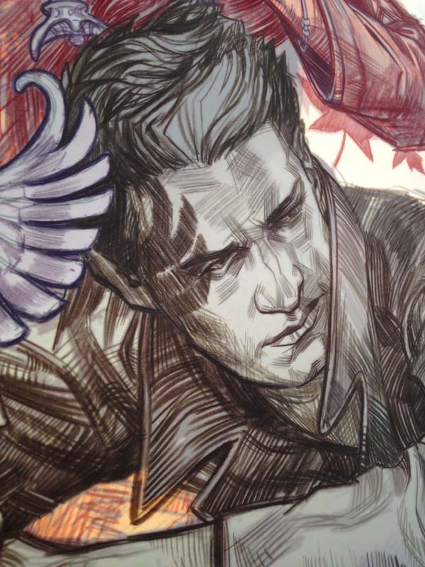
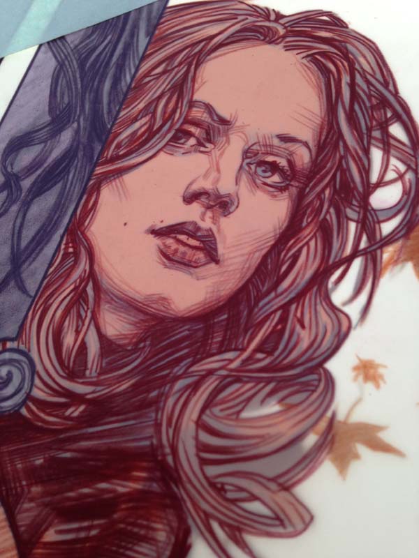
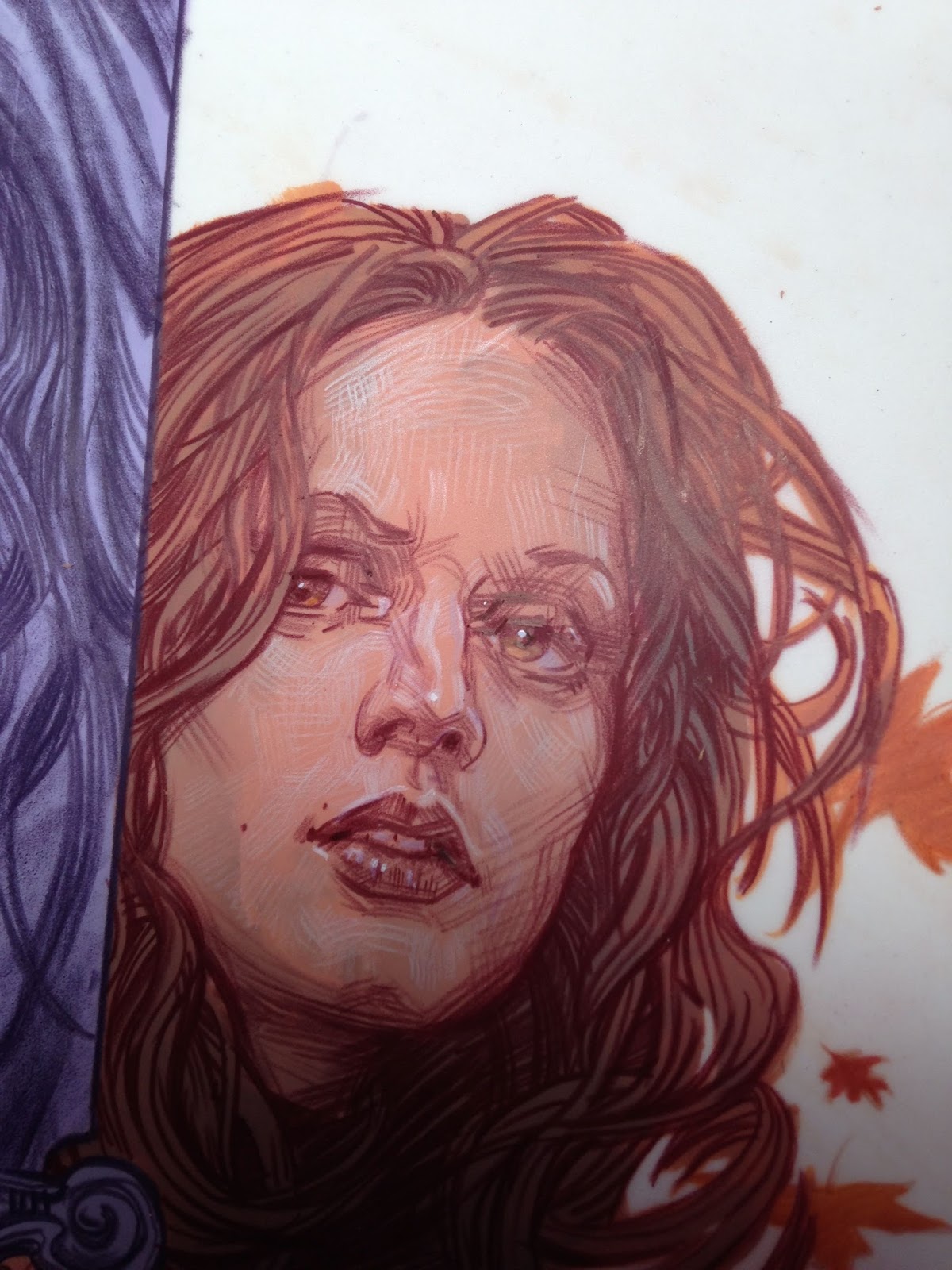
Time to DRAW! I did most of the first character with one prisma pencil.
Note how FLAT prisma color goes down on duralar. It is almost like
gouache!
I work my way through the second character in darker Prisma values than
the first. I am basically working in color zones through out the piece.
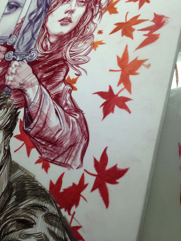
Having finished the characters, I move on to the swords and the falling leaves.
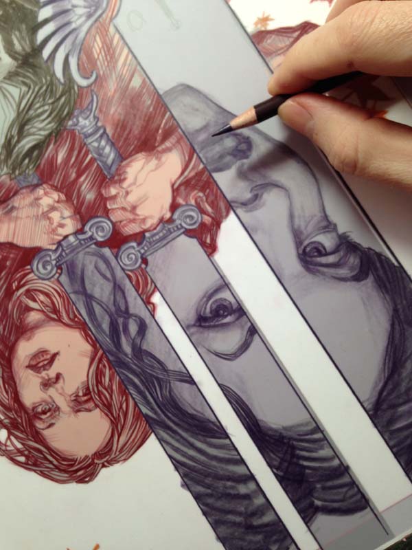
For the third character I wanted a softer feel, so I used the side of the pencil for shading.
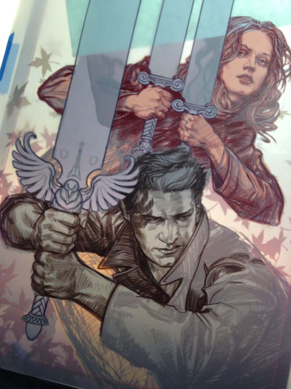
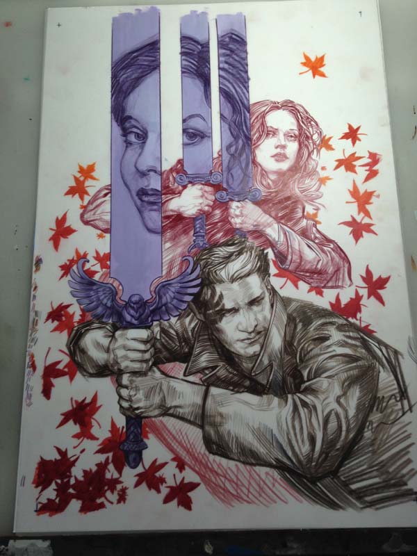
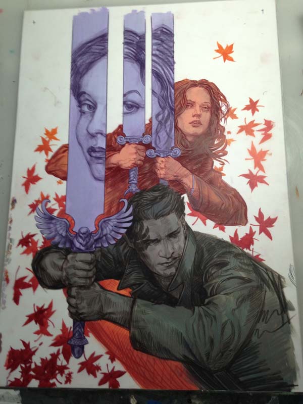
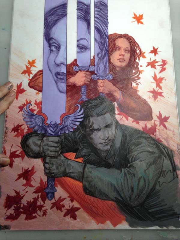
And here we have the drawing on dura-lar with a piece of white paper
behind it. Any values you saw prior to this were the original print-out
of my rough drawing.
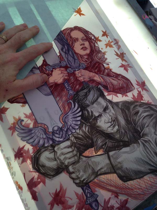
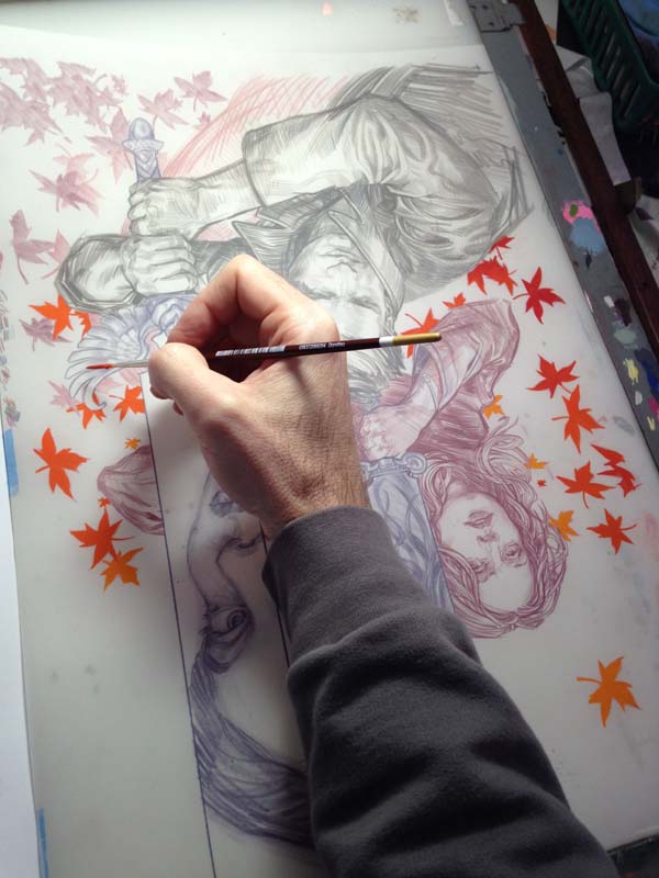
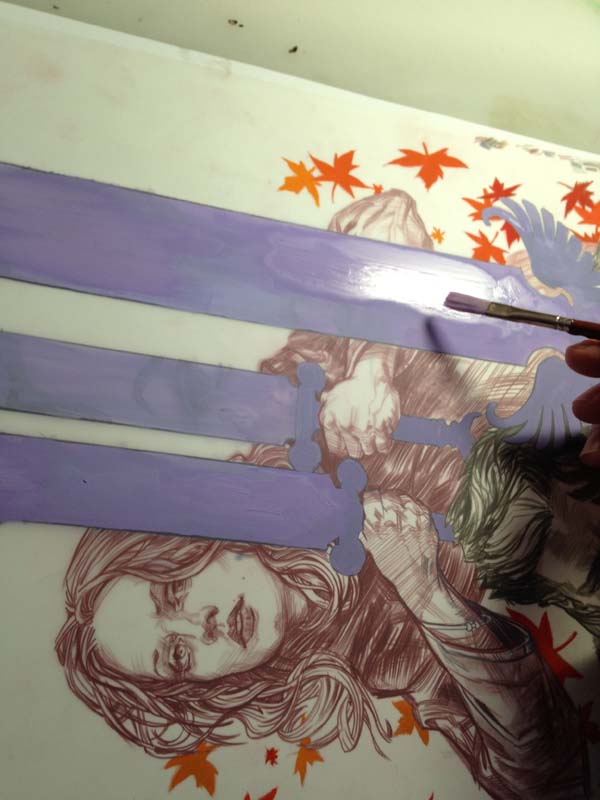
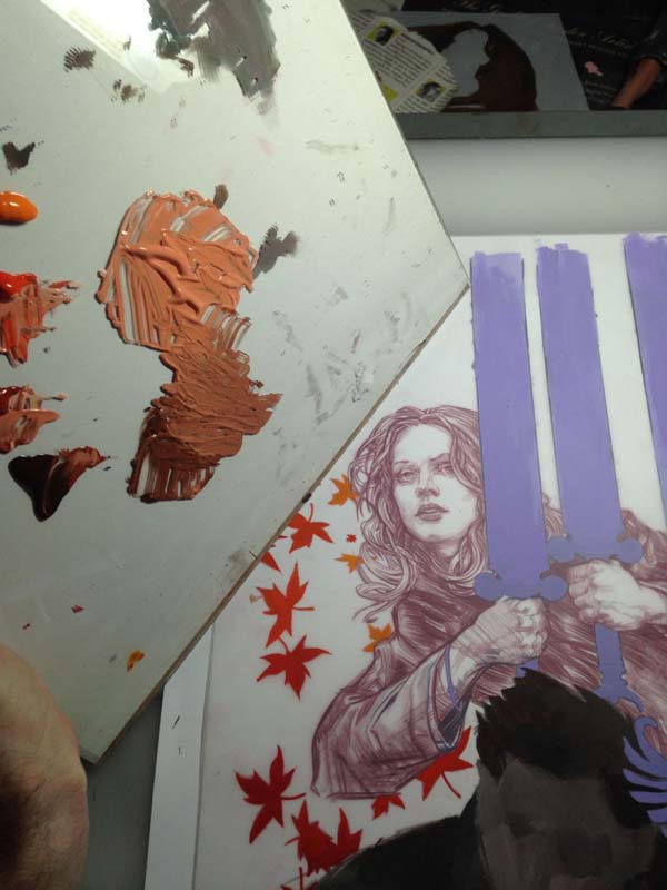
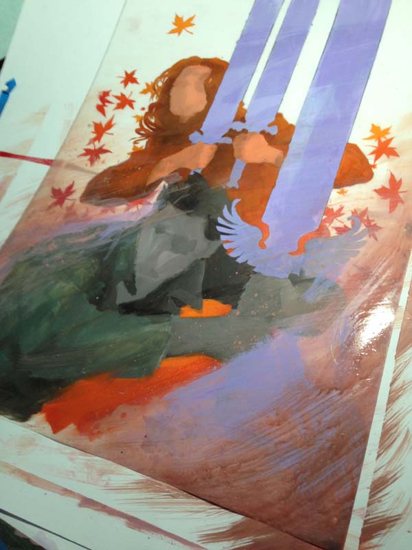
I flip the drawing over and start working the back side. I mix a quick
gradient of Acrylagouache on my pallet, and start filling in the
transition of the leaves.
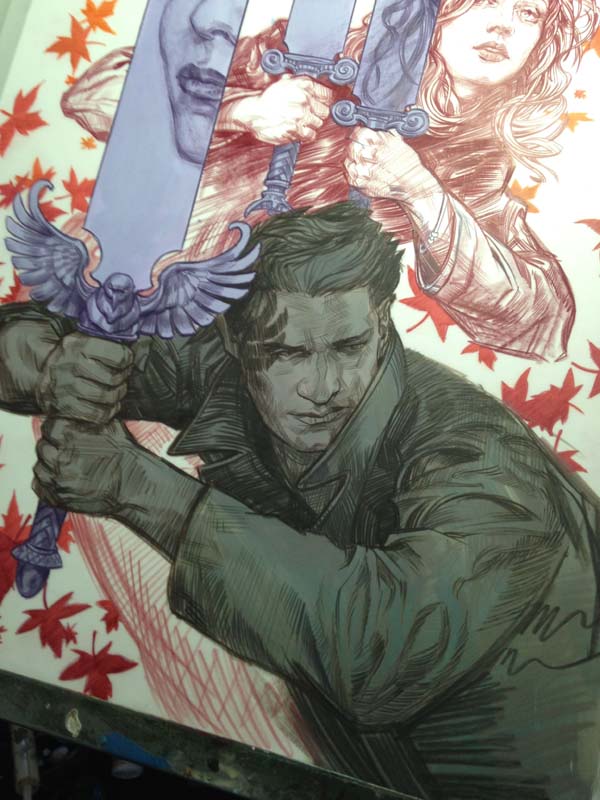
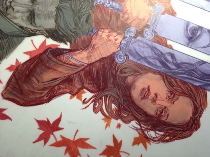
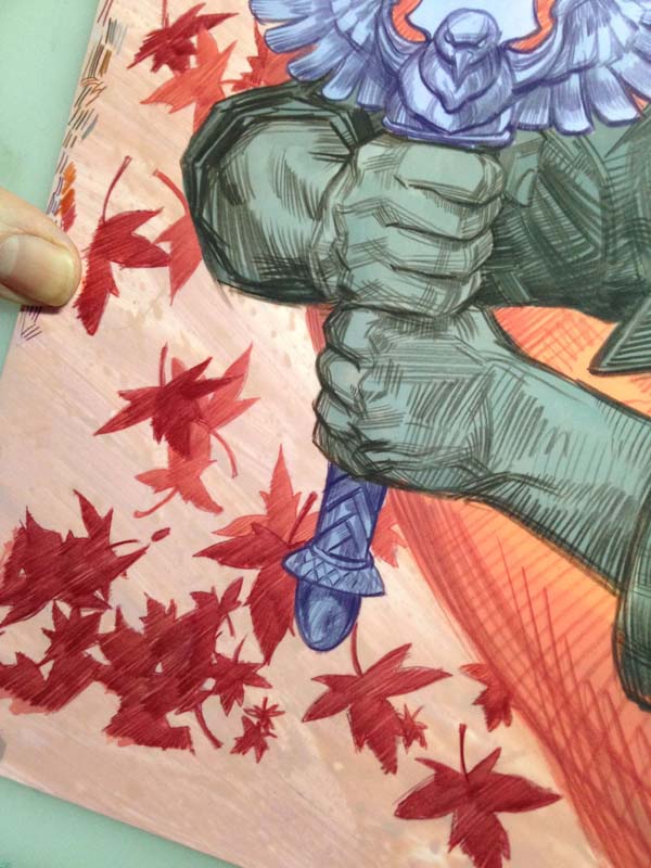
And when we flip it back over to the front, you can see the line-work
over the leaves. Some ask, “Why not just do it all on the front?” And
the reason is, it would be much harder to draw with colored pencil on
top of lumpy paint. And I want the lines to show, for as I get older I
realize the true heart of an artist is in the drawing. (No matter how
you frost it.)
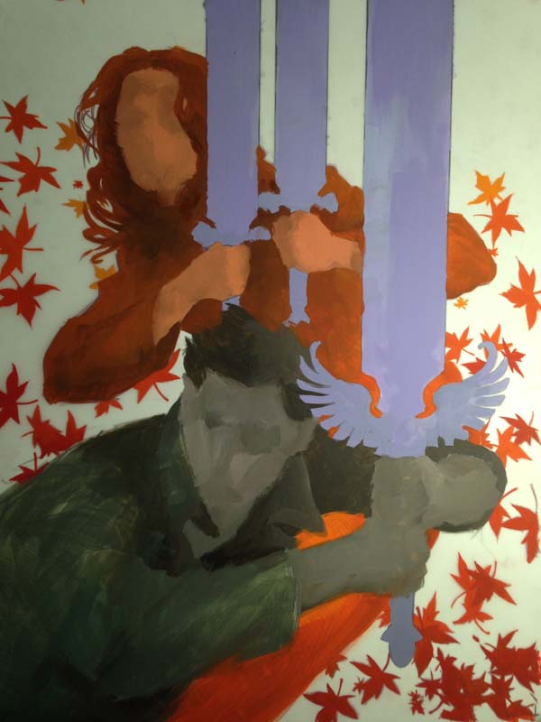
Filling in the swords on the back, and the flip reveal.
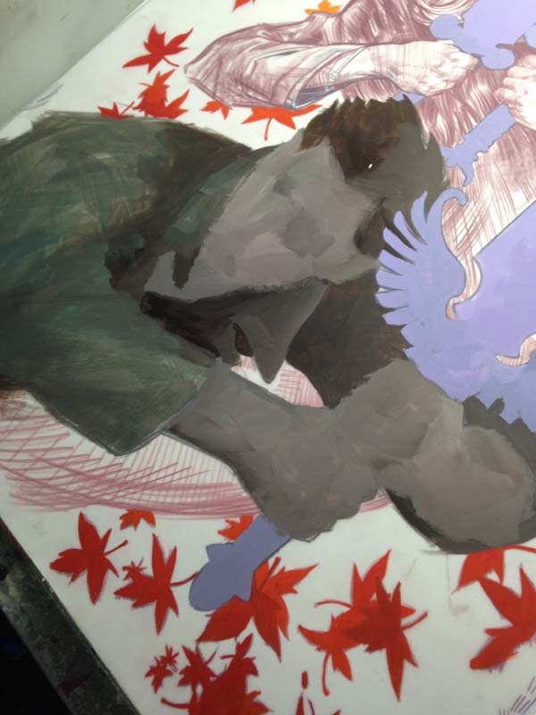
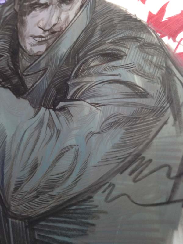
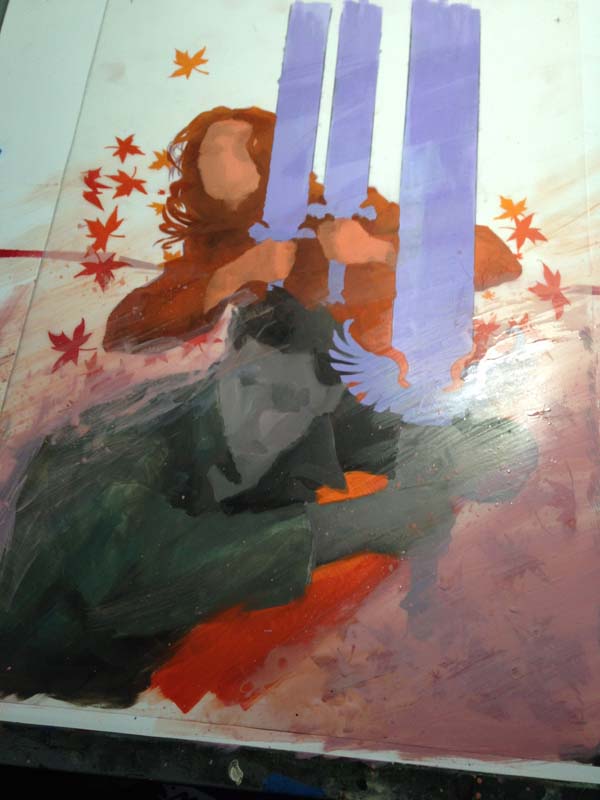
The below sequence shows the puddle of value I mix for Angel, and the
ham fisted ‘render’ I do on the back side of figures. So there will be
some transition in the flat, some base structure, but the detail is all
on the front.
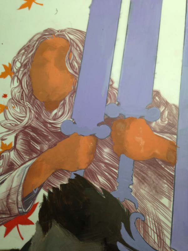
Same thing for Faith, filling in her form on the reverse with a painted gradient and crude modeling.
Ahh… but the magic is in the FLIP! The drawing is doing all the work!
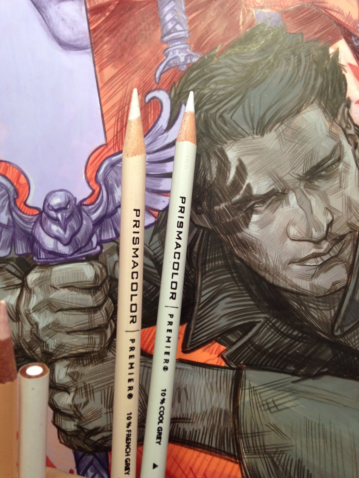
With my dark and middle values established, it is time to work up the
highlights! Again using a range of three lighter value prisma pencils.
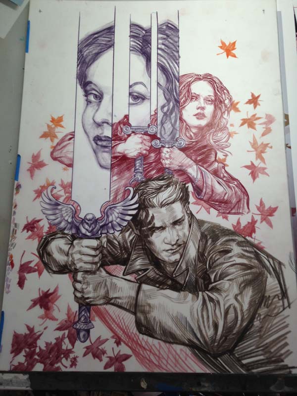
And here is the entire scene with the major elements drawn on front and painted on back. Now it is time to have fun!
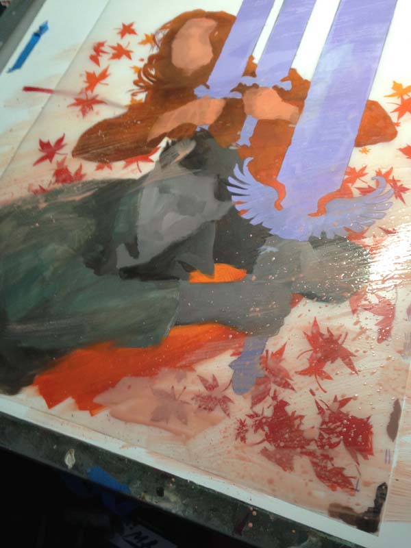
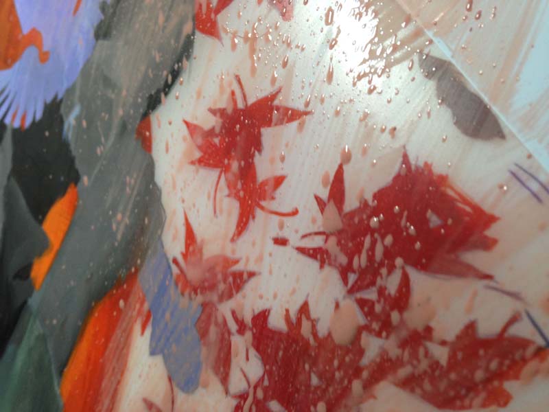
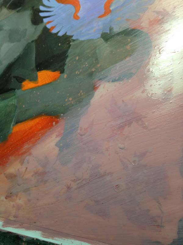
This is where the really aggressive things happen. Spatter, streaks,
scratches it is all fair game because I know the major details of the
piece will be pristine on the front.
Flipping back over for more fun. You often have to paint in reverse, like an animation cel painter or a glass painter. Protecting things like figures with flat paint before you start up the party wagon of texture.
And the final flip! Sometimes I will cover the entire back with white after it is done.
Hope you enjoyed it!





Really great to see your process! After the piece is complete, do you use anything to seal it?
It's excellent to see more about your process with the Duralar, Scott! It's good to have this article to link to when people ask about it as well. Thanks for taking the time to post this!
Always great stuff Scott. You've seen Sergio Martinez's work on vellum right? Glowing. You have a different approach that's so effective. I love layering.
Wow! What a great post! Thanks for that 🙂
Artists have been using and experimenting with all kinds of materials in the past, but man … we live in exciting times when it comes to choice! From digital and VR to the huge amounts of (new)traditional stuff – we are really privileged! Yay!
Sometimes I seal it. With crystal clear spray, or varnish. But I think since everything on the front of this was color pencil, I let it be.
Totally, Manchess told be about Sergio. Almost stained glass like. I've tried lighting mine from behind but they look like crap because of all the painting-outside-the-lines that I do back there.
My reply to you went to the bottom somehow, but yup, I sometimes seal it up. But don't remember if I did on this one. I live the matte waxy finish of color pencil on Duralar.
Interesting process. I've done something similar where I painted on one type of paper and then laid a piece of tracing paper over the top and did my final drawing on that (scanning or displaying them held together).
Your method, which is very much akin to how animation used to do things (draw ink lines on one side of the acetate, while painting with acrylics on the backside), seems a bit terrifying! Painting directly on the same sheet as your drawing means you have to get it right the first time (No takesies backsies)! I might try this at one point, but as a long-term method I always prefer things that I can adjust or control at any point. I know you went back in with colored pencil on the front (which are nice for subtle changes), but how would you handle a complete blunder?
It has happened, and when working with FW ink and Acryla Gouach, a correction usually takes nail polish remover to get the paint off, then I redo that section. Nothing like taking nailpolish remover to a head you rendered, only to do it all over again.
This is beautiful. This technique you have achieves a timeless look of ancient and modern that really draws me in.
I've been told by a great editor that if you can produce something that feels familiar, but is modern at the same time, it is a good spot to exist in.
Geez if that stuff can take nail polish and still not wrinkle or warp, that is amazing!
Btw I'm surprised no-one has said anything yet, but I love the picture within a picture on the sword blades. pure genius design!
Really enjoy seeing your process, as ever, Scott! Would you ever consider doing a live demo for the Patreons of MC? I'd love to watch you do some of this live! Do you ever have issues with the paint accidentally scraping off and do you find it affects the final image if it does?
I believe a live demo is in the works for later this year! Thanks for asking.
Great topic. Lovely to see the drawing.
Great topic. Lovely to see the drawing.
Speaking as a long time fan of Prismacolor pencils – that is amazing! Thanks for sharing the process, going to have to add that to the list of media to try.
I'm experimenting with this stuff myself because of your work I've seen in the past. You should also try Terraskin. It doesn't have the same translucency as Dura-Lar but you can soak, scratch, scrape the “paper” and it won't suffer.
Wonderful post, and — of course — beautiful art.
How would you mount the finished piece on — let's say — an Ampersand panel? Acrylic gel pasting the Duralar to the panel?
This is my question too!
Thank you for sharing with us your process!
I was wondering if you've tried other colored pencils on dura lar to share your impression, prismacolors are a bit hard to find and check out in the european side of the world, polychromos faber castell are the easier find.
thanks
Thank you for sharing your process with us!
I was wondering if you've checked out other colored pencils to use on Dura-lar and share impressions on the feel, since prismacolors [wax based] are not easy to find and check out in the european side of world – polychromos faber castell [oil based] are easier.
thanks :]
Thanks for sharing the art process with us. Your work and talent are amazing.
Great work sir. I am a big fan of your work
Awesome!
Thank you, Scott.
I think I’ve got the wrong kind of Duralar but what a great method you have for working. I’m an art student in Canada right now trying to use Duralar in creative ways for my drawing class and this is super enlightening. Thanks a lot!