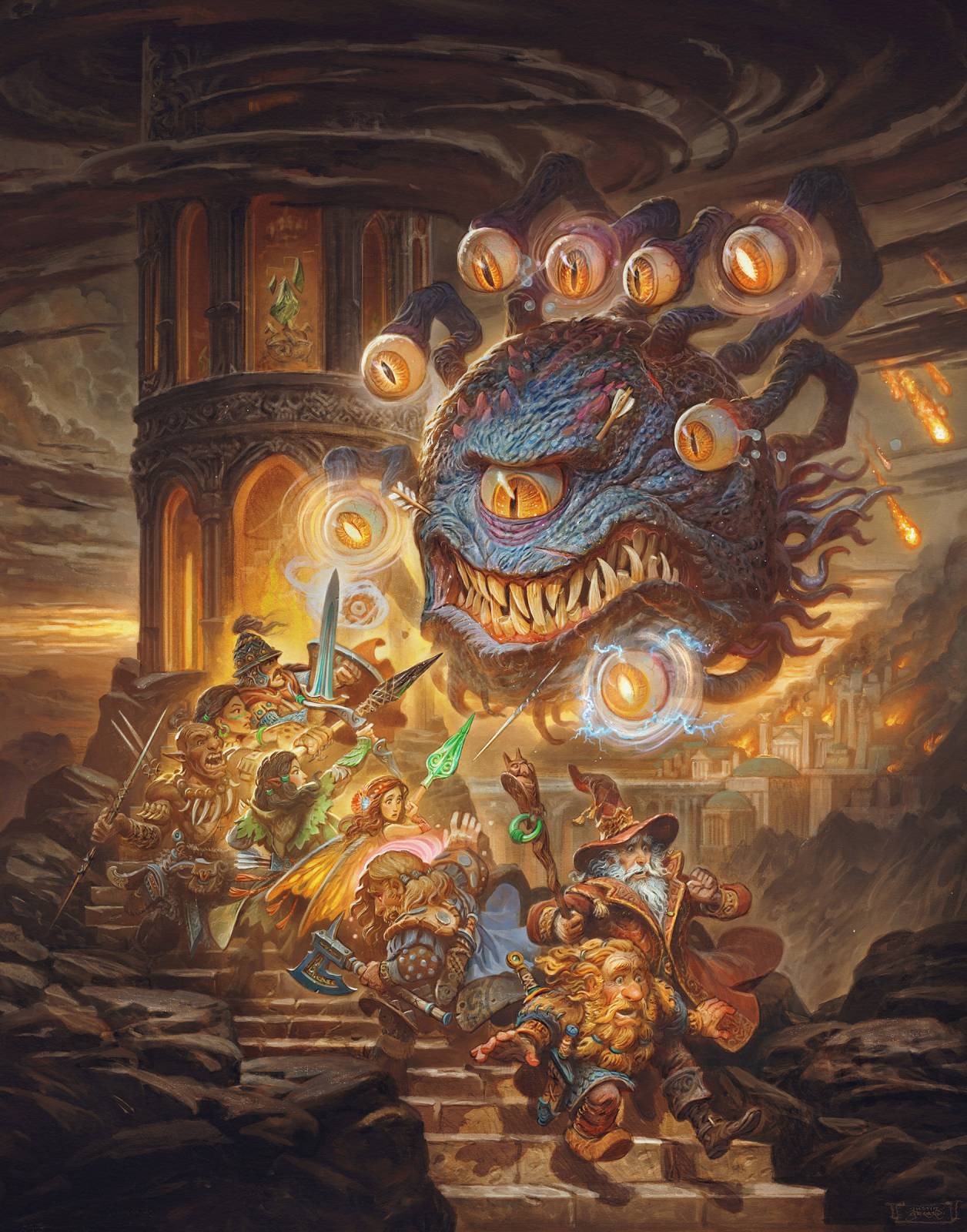
Last month I shared some development work for a new illustration I have been working on called, “Eye of the Beholder.” I finished working on the image recently and today I’d like to share a few images from the process and talk through some of my approach to painting this one. Hopefully it will be of some use to you as you seek to avoid landmines, pitfalls, headaches, and accidently opening a gateway that lets demons into the world, while painting your own images.
For decades, when I have used photoshop to add color over a traditional drawing, I use the same laboriously methodical approach each time: Monochrome value painting, followed by transparent color application, followed by some harsh highlight work, all of which is finally blended together with opaque paint. It has a proven track record and many solid successes behind it. So naturally, when I started this painting, I threw all of that out and decided WE’RE DOING HARD LIGHT LAYERS!
For those of you unfamiliar with Photoshop’s layer modes, Hard Light layers in Photoshop are possibly the most brutal, unsophisticated, and barbaric way of adding color. It’s like painting with a hatchet.
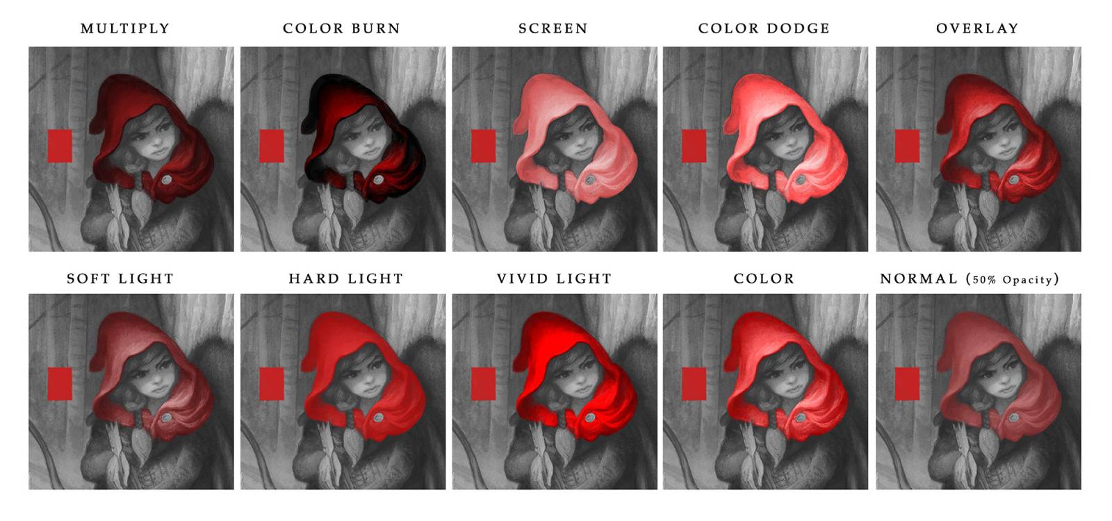
In spite of several warnings I’ve written to myself against the use of Hard Light, scrawled in notebooks, plastered over my office walls and ceiling, and tattooed on various parts of my body; I ignored all that, and instead listened to its siren song. Hard Light is brutal, yes, but it can also offer some really interesting effects, and the punchiness of the color is so alluring!
…And I paid the price. In the second and third frames in the example above you can see me meandering all over the place. My plan was to use it to add light, shadow, and color at the same time, using black, white, and a saturated color. In my head, it seemed like it would be an amazing shortcut, collapsing all the laborious stages I normally do, saving me hours, possibly days of work in the long run. Instead, I just puttered around, muddying everything, and wasting hours and hours. Worst of all, I killed the details present in the drawing, with no real payoff to speak of.
Eventually I deleted the Hard Light layers, and went back to sensible, predictable layer modes: Multiply (which functions very much like traditional transparent watercolor) and Screen (which functions more like lighter colors of traditional opaque gouache). And these went to work saving the day. It was like waking from a nightmare, the clouds parted, and everything fell into place. I had wasted a day in there somewhere, trying to make this whole Hard Light experiment work. I am fairly certain that the layer mode was drawing strength from my soul as it was my life force was drained away. Had I gone further, I believe the Hard Light would have manifested itself onto our plain of existence, as a portal through which the forces of hell might pour into our reality.
Thankfully for all our sakes, I murdered my darlings, deleted the hard light layers, and thus purified, I painted the rest of the image in the old reliable method. No listening to voices from the Warp. No dalliances with questionable layer modes. Just classic layer modes doing classic work.
In the above example (painted later on) I used Multiply to apply thin layers of color, before switching to screen, and ultimately too normal layers to blend it all together. You can see how the progress here just sort of works from start to finish. And it was all painted in a fraction of the time.
Maybe I’m being dramatic, sure. I’ve been known to be. But I think we’ve all been there! We want to explore new places, try new things, and if we aren’t failing every now and then, maybe we aren’t trying hard enough to be better than we are now. I don’t regret the wasted hours here, after all I got all these new tattoos and I think I learned something good from it; even if it was just to trust my old reliable method a bit more, even if it is a bit slow and plodding.
P.S. At the risk of opening a gateway to the other side, I did go back and use a little hard light at the end, just to punch up some of the complementary colors. Not saying I’m going to go all-in on it again, just that, I still think it has a place!
I hope you’ve enjoyed this one! For those of you interested, the original commission was for Art of the Genre, who are running a kickstarter now for a 5e adventure featuring this one and several others from my Dungeon Master Series! You can check them out here: www.kickstarter.com/projects/563681582/the-complete-virgin-mine-adandd-5e-mega-dungeon
-jg


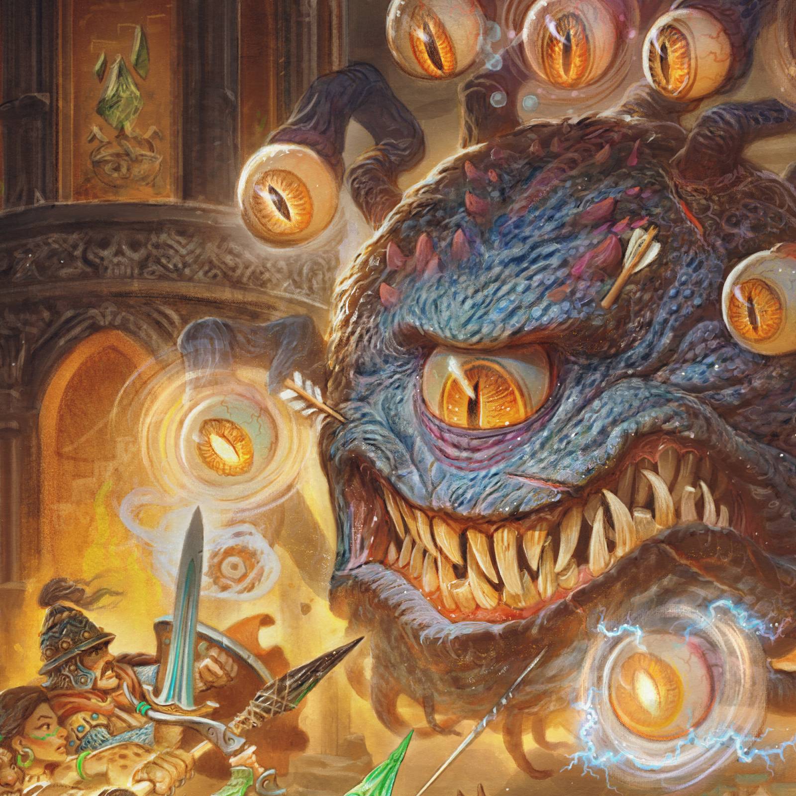
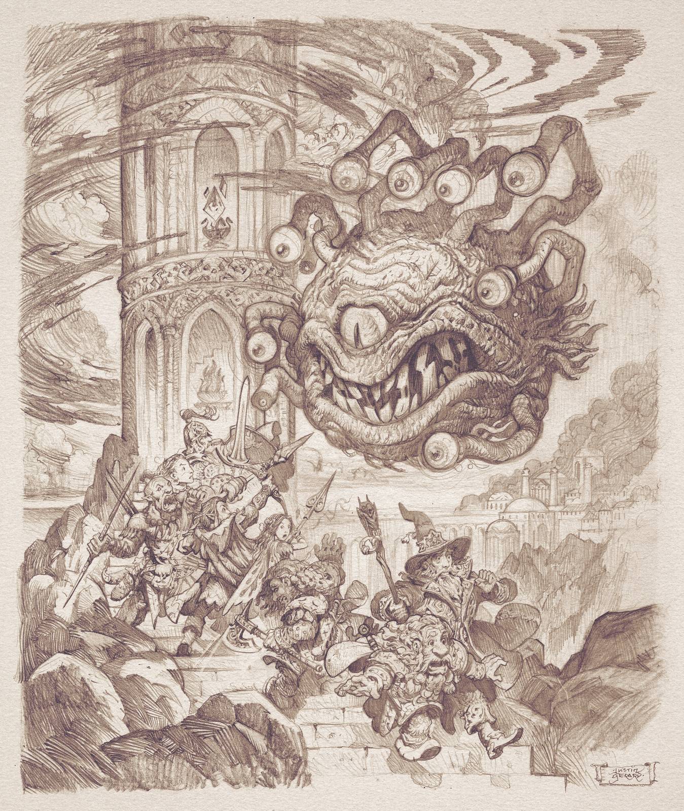


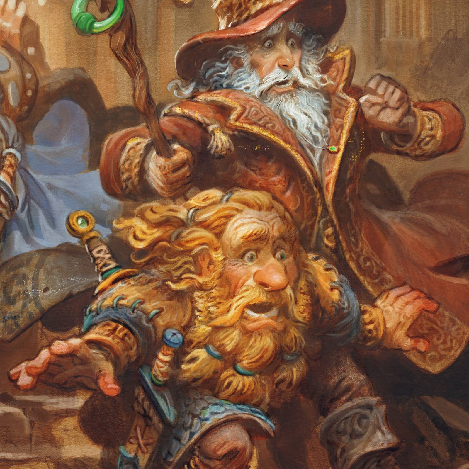

It’s pretty cool to see how you solve the problem of putting color on monochrome paintings digitally. It’s so tricky.