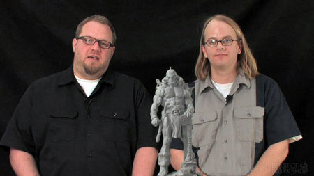
Ron Lemen is an illustrator/painter, educator, and designer.
Ron's career first took off in the Action Sports Industry working as a board graphic illustrator, layout artist, logo and product designer. From there he turned to sequential story telling as well as doing book covers, interior illustrations and the newly emerging market of concept design. During this time he went back to train, found and graduated from the Atelier System. He was also mentored by Sebastian Capella, Spanish portrait virtuoso.
Ron has been a concept designer and art director in the video game and film industry for 15 years with dozens of clients including Harmony Gold, Amazon, Sony, Activision, Ubi Soft, Mattel and more. Now freelancing full-time, his clients include Upper Deck, Dragon lance, White Wolf, Time Warner, Wizards of the Coast, Image Comics, Birdhouse Projects, Ride Snowboards, Disney, and more.
In addition to illustrating and Portrait Painting, Ron has been an art instructor for nearly 25 years, teaching for X-Train, LAAFA, CGMA, Gnomon, Studio 2nd Street, Park Blvd Studios, Sony, The Art Department, and Rev Art Academy.


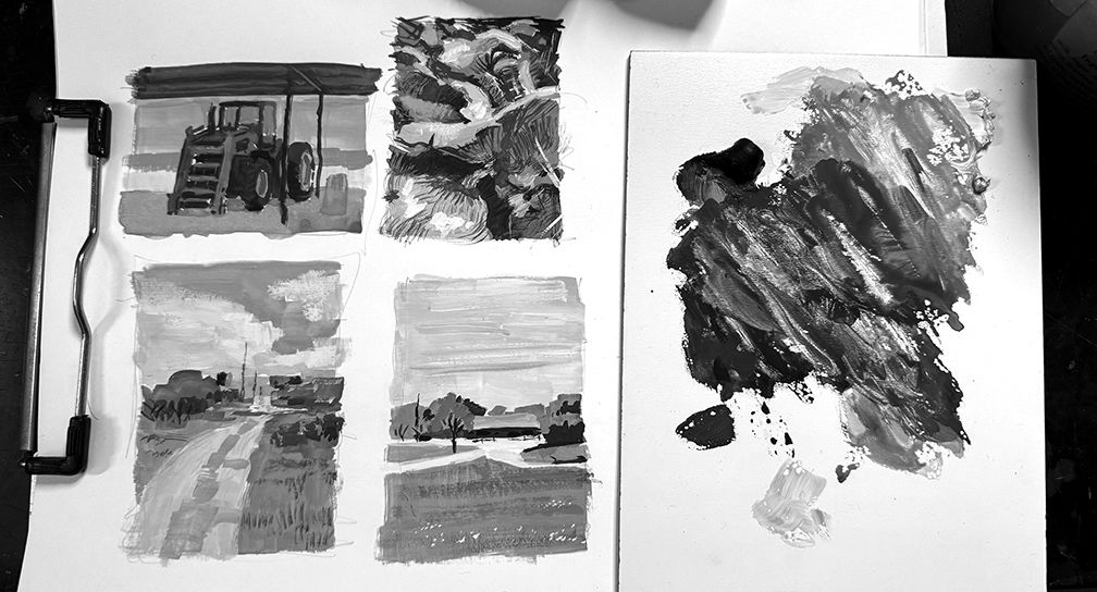
Thank you Ron! I have started to use gouache as it looks like a really nice technique that could suit my style well, so your video is unvaluable.
One thing I have noticed while using gouache (in swatches, not in tubes) at live painting is that it isn’t completely opaque. Furthermore, colour values change a lot from wet to dry. Specially light colors are really hard, as they get much darker, and even pure white is a value 2 when dry.
Any tips about this?
Again thanks for this video!
Hello tayete, thank you for writing and thank you for the kind words.
Knowing that gouache dries lighter because of the sugars in the binder, when they dry, the crystalize, which light travels through, making the pigment appear lighter as a result. Depending upon how much time you spend on the piece, it is a good idea to have the neighboring colors mixed at the same time so you can see their true relationship of value in the wet state which will be similar in the dry state. The lighter colors darken a little from the gum arabic, white is especially prone to yellowing more than usual if there is an abundance of binder with it. Try to use the white of the surface you are working on first, and preserve the areas of greatest whiteness. Then, I use graphic white, the kind you use to white out ink that come in bottles with a squeeze stopper. They are clean, white, and have no gum arabic in them so they will retain their whiteness when painted down.