I’m writing with another conversation on a topic that includes traditional skills, design, and the celebration of the one-of-a-kind. If you enjoyed my talk with my critique partner Lyss, you’ll like this chat with another one of my critique partners and friends, Deb Pilutti.
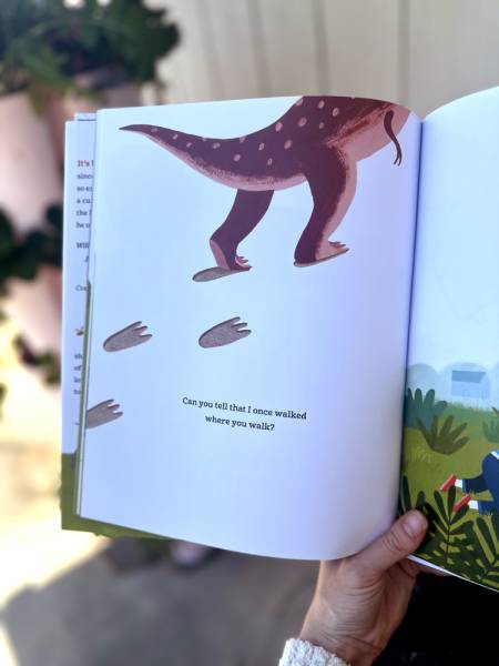
Before becoming an author and illustrator she was a graphic designer for SeaWorld and Warner Brothers theme parks. Along her journey she even designed a few toys, it’s not a surprise she landed in children’s publishing. Deb published her ninth picture book, The Dinosaur In The Garden last month.
Deb and I met through the Society of Children’s Book Writers and Illustrators. Later, Deb and I volunteered together and eventually shared the role of SCBWI Illustrator Coordinator in the Michigan region. We became travel partners, crit partners, and friends.
While working on projects for SCBWI we quickly learned each other’s tastes in color and design. I’ve learned a lot from Deb. Deb agreed to let me pick her brain on Muddy Colors on a topic I’m very excited about – hand lettering.
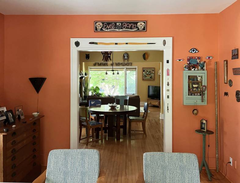
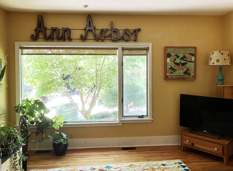
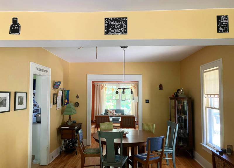
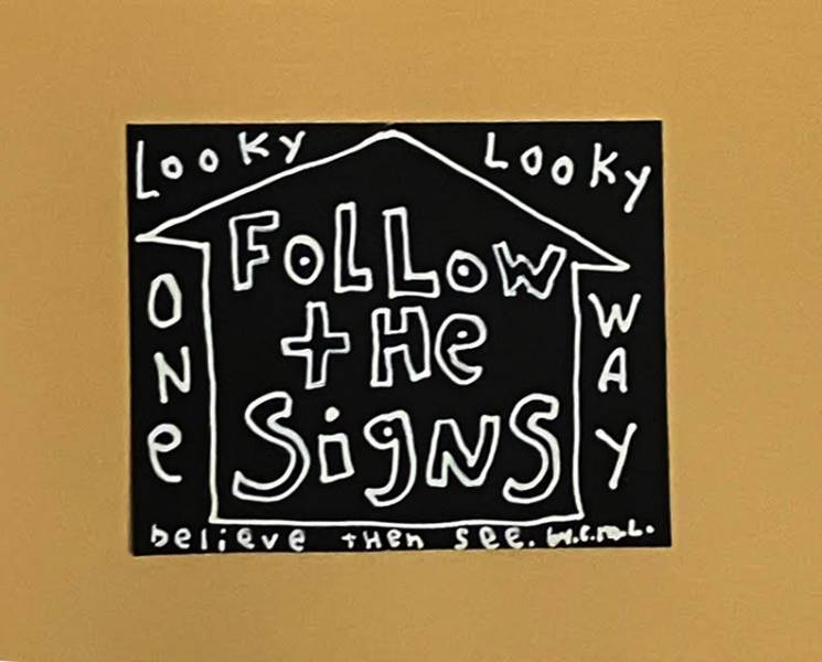
Deb has also agreed to share a bit of her home in Ann Arbor, Michigan which features many inspirations for type and design. Thank you Deb and first let me congratulate you again, on your new book, The Dinosaur in the Garden.
Thanks, Kirbi! I always love talking shop with you.
KIRBI: The hand-lettering on your books adds an extra polish that makes them stand out on the shelf. You’ve worked for just about all the big players in publishing, yet your books still feel consistent… Where does your eye for this come from?
DEB: I studied and practiced as a graphic designer long before I started illustrating my own type. That background was extremely helpful and would encourage any illustrator to study typography.
KIRBI: I regret not taking more graphic design classes in art school… Lots of artists are thinking about what they are bringing to their clients that AI images can’t right now. Hand lettering seems like a place to explore.
DEB: I love the imperfections and differences in letterforms that come from hand lettering. It can make the work more unique and personal.
As the illustrator of a particular piece, I can pull colors and design the type to be harmonious with the work. We need to take the needs of the piece, as well as the audience and intent into consideration when combining type with an illustration. Letterforms can reflect your characters, their moods, or a subject matter or concept.
KIRBI: Kind of like another actor in your story.
DEB: That is a wonderful description. Type is another actor!
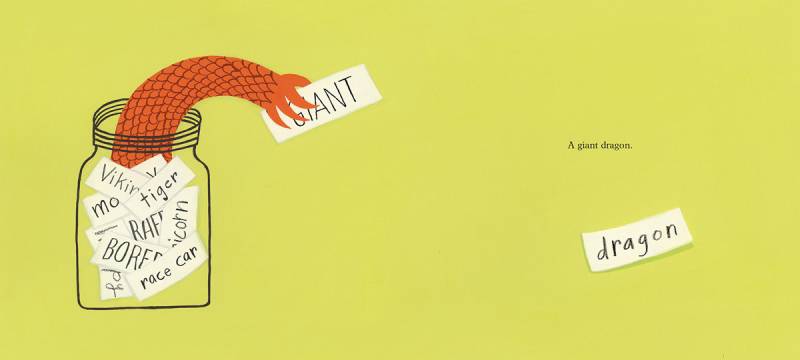
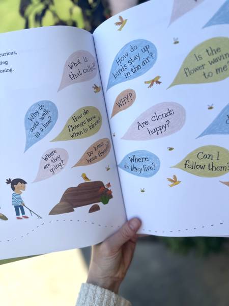
This spread from the book IDEA JAR written by Adam Lehrhaupt – 3×3 International Picture Book Show winner
The first job of the type or letterforms is to serve the story or concept. Everything comes from that: style, formatting, etc. I think about each work individually and how best to communicate the ideas within. I don’t think about it looking like “my work,” but I guess that’s natural.
KIRBI: Being yourself isn’t as easy as you make it look. Is hand lettering usually in an illustrator’s contract? Should they charge extra?
DEB: It’s not been in any of my contracts and I’ve never thought about charging extra for hand lettering. That’s not to say that it’s not worth it.
KIRBI: Everything is negotiable I suppose. I’ve noticed on my cover art gigs an additional freelancer is commissioned separately for hand lettering but that’s on a budget-to-budget basis.
DEB: I prefer to hand letter titles and some interior type (like talk bubbles or exclamations), it gives me an extra layer of control and creativity over the finished product.
DEB: A lot of people are involved in the cover decision. One time when I was working on a book, the designer showed a concept for the cover with a traditional typeset title. I didn’t think it was quite right, so I sent in a hand lettered option for consideration. The hand lettered option was chosen because it fit the concept and felt integral to the design. There are other times when the traditional typeset option was the best choice.
KIRBI: Bold moves pay off. I’m sure the books are much better for it. When we were playing with tools at your house, you mentioned I should try a large brush. What other tools might be inspiring to experiment with?
DEB: Some of my favorites are Kuretake brush pens, inexpensive bamboo ink brushes or dip pens, croquill pen, a scruffy paint brush, micron pen, china marker, posca paint marker. Surprising things can happen when you are a little uncomfortable with the tool, or use a tool that is not meant for what you are doing.
KIRBI Sounds playful, as art should be. Another tip that you offered me that helped me get going was to try to imitate fonts and letterforms.
DEB: There is a lot to learn from the classics. I like to look at fonts for inspiration. Do I want something bold or delicate? Should it have serifs? Where are the thicks and thins? It all depends on what message you are trying to convey and what feelings you want to evoke.
Also— some letters are just hard to draw, so I might seek a comparable font and look at how the S or R is done.
KIRBI: Tell me more letters to watch out for. I’ve definitely struggled with R!
DEB: Qs can definitely be weird.

DEB: I was hoping you weren’t going to ask. If I’m lucky, someone will read this and send a comment to tell me about a much easier way to go about this task.
KIRBI: You know I’m going to ask the hard questions! We both know, that whatever “trick” you use to get rid of the negative space, there’s always a tremendous amount of cleanup needed. Break it down, please.
DEB: Let me say first that yes, you can draw in Procreate or Fresco and it is much easier to integrate that type with an illustration. But sometimes I just need to go traditional. And when I do, I scan my hand drawn type and bring it into Photoshop.
Even though I want imperfections, I do not have a very steady hand and still need to clean up the type considerably. If the text is going on top of a white background, it’s easier. You can just place the cleaned-up type in a file. If you need to place it within an illustration and change colors, it’s more involved because the type needs to work seamlessly with the background.
KIRBI: I can hear the readers Deb and they are saying, “What about layer styles!”
DEB: Multiply or other layer options are not flexible enough for me. I select the type and copy and paste in a new layer. At this point, I either fill the selected area with a new color or paint the edges with the selected color to get rid of the slight bit of background color that is still at the edges of the type.
KIRBI: It’s a surgical process. The illustration department chair of my school used to say “Art is surgery!”
DEB: You don’t want a slight white line around your type when it is on top of another color. There are other ways to go about this and I have tried several, but this is the method I use most often. It takes time.
KIRBI: Do you think your hand has always been shaky? Maybe this wiggle you feel is the sauce to your type?
DEB: That’s a good way to look at it. Yes, it has always been a little shaky or unsteady. I’m lucky that I am inclined to work in a more naïve style, it suits my unsteadiness. Artist Phil Hansen gave a TED talk on how embracing a limitation could drive creativity. “Embrace the shake”
KIRBI: Deb, you said sometimes, you “just need to go traditional.” Tell me about that.
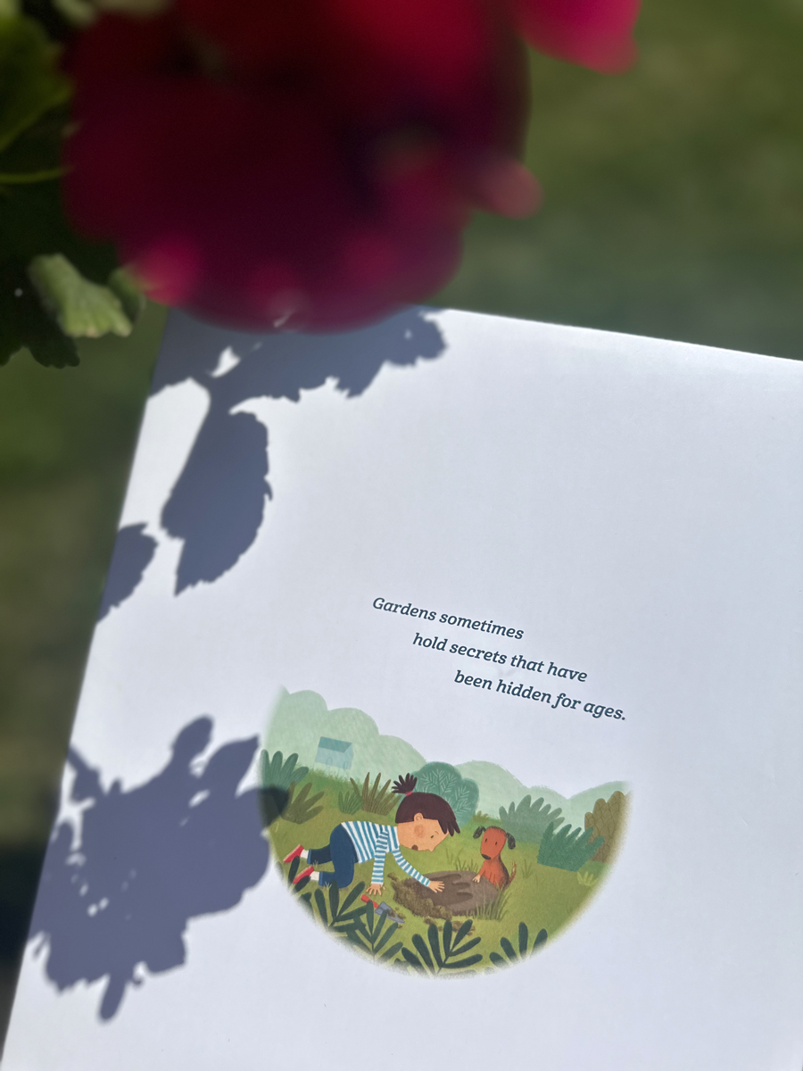
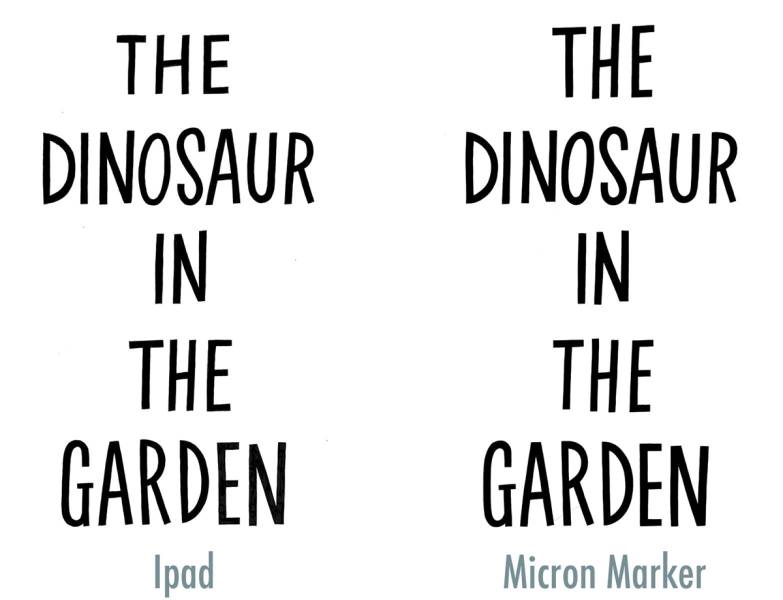
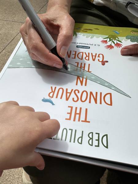
DEB: The same letters can look different if I’m using brush and ink, marker, or digital. For Dinosaur in the Garden, I first drew the title in Procreate on my iPad but ended up liking it better when I inked it with a thin marker on illustration paper.
KIRBI: Can you describe the bad type? I tell my students not to put type on the work if they aren’t sure. What should we look for when evaluating our work?
DEB: Good question, but tough to answer. Look at artwork with hand-drawn lettering and traditional fonts and ask yourself what you like about it or don’t like about it. Does it enhance the illustration? Why do you think the designer chose a particular font? Does it shout or is it quiet? Does it go with the concept or mood? For instance, a playful, hand-lettered headline might not be your choice for a serious topic.
KIRBI: I’m inspired to get to my sketchbook. Thank you for talking with me.
Deb’s work has inspired me to try hand lettering and I hope she inspired you to try something different too. Do check out The Dinosaur In the Garden at your library or purchase it for your shelf whether it’s a reference for great design or to share with curious 4-8 year olds. Maybe both. Check it out by clicking here.
Until next time.











Really enjoyed reading this, thank you.
I think too many authors underrate typography, not oniy in children’s books.
Fabulous interview, Kirbi and Deb! I had no idea all of these key considerations were at play. Thank you for sharing the details in your artistic process. Loved the photographs!
Very interesting! LOVE the snippets of art and of Deb’s home. I’m in love with those walls.
Side note: My editor and I discussed handlettering the text for my first book, but she said the book had potential to sell in other languages and handlettering is a hassle for translations. They found a typeface that seemed similar to my own handlettering. This interview makes me more inclined to send handlettering samples with my book dummies.
Thank you for this valuable resource! Very best wishes to Deb and Kirbi. I love your work!
Hey Ruth! That’s an interesting observation about translations. When some of my books have been translated, I provide the hand lettered type on a separate layer and the foreign publisher supplies their own type. Your lettering is so fun, you should definitely include!