I don’t (and couldn’t) read every comic that comes out. I’m sure a lot of things out there are excellent, and I am personally aware of how difficult it is to make something at all, much less something sublime. I want to talk about a project that moved and impressed me in a powerful way. The last time I was swept away by a work was probably Barry Windsor Smith’s WEAPON X, and probably for some of the same reasons. A corporately-owned superhero becomes the instrument of a capable narrative voice, and the overcrowded favela of mediocre and garish melodrama is escaped for a brief time.
Usually, comic books are made by a team of people, and more often than not under conditions that can hex a wonderful idea. Chief amongst these vexing phenomena is Continuity, the most pernicious enemy of the sincere comic book storyteller. Most great comics artists aren’t necessarily great writers, so when you have auteurs like Frank Miller, Mike Mignola, or BWS, It can result in a powerful, singular vision. The work may fly with the eagles or crash in bitter disgrace, but it’s almost always more interesting than a committee’s labor. It’s exciting to see a pure vision of a creative storyteller.
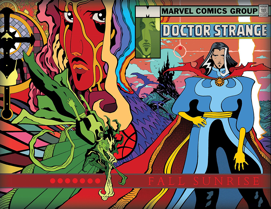
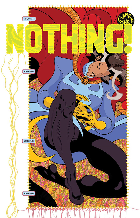
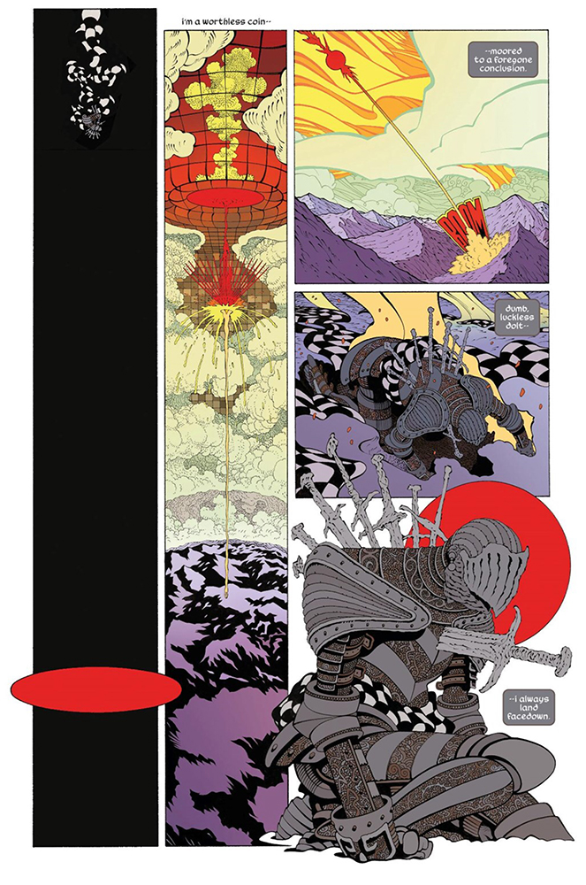
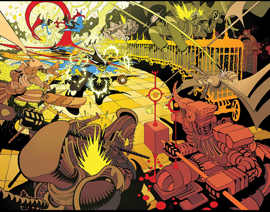
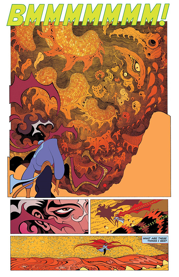
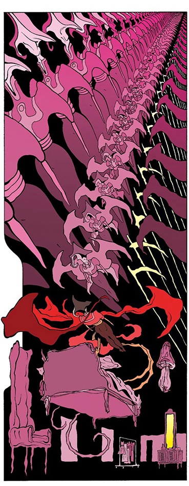
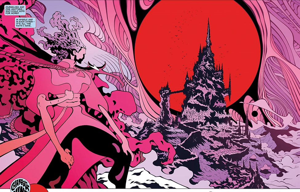
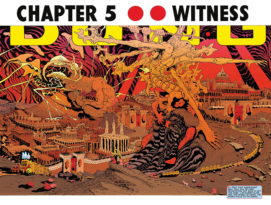
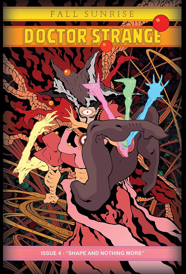
A couple of years ago, DR. STRANGE: FALL SUNRISE, a four issue miniseries was published, and you haven’t seen anything like it. It was written and drawn by Tradd Moore, with colors by the amazing Heather Moore. The issues were collected in an oversized volume, and I can’t recommend this IMAX version enough. It’s a very dense work that requires the careful attention of the reader, and probably a couple of rereads. New things will appear in it upon each revisit, a telling mark of a masterwork. This is doubly true if you have any familiarity with Gnosticism, the Existentialists, the striving and emotional sculptures of August Rodin, or early 2000’s video games by Konami or Squaresoft.
A big advantage of using a licensed character to tell a story is that no worldbuilding or backstory is required. We know that Dr. Strange is weird and can do all things magical, and this foundation allows us to embark on explorations of Platonic ideas, the deterministic forces of the unseen gods, and what it means to be a healer, and other hefty concepts usually not found in super-books.
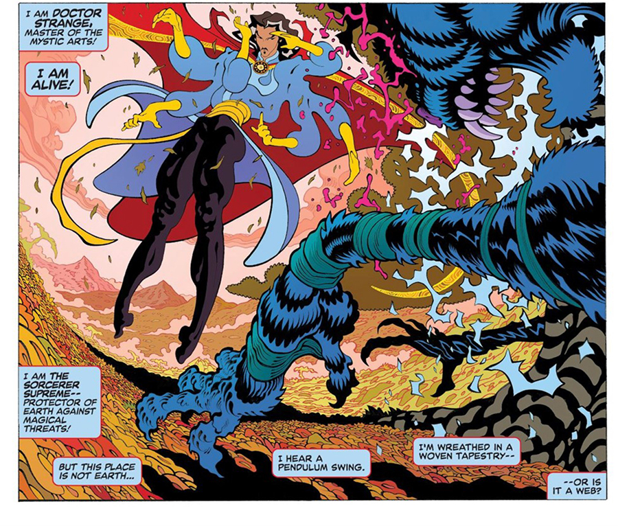
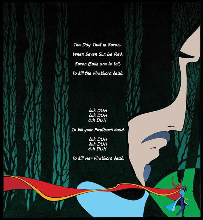
Tradd Moore has been doing virtuosic work and exploring interesting ideas for over 10 years, and has gotten to visit a lot of the flagship characters for both Marvel and DC. With this Dr. Strange series, we get to see him helm the story completely as both writer and artist. He reminds me of Goku from Dragon Ball Z, always finding a new way to go super-saiyan and confound the previous possibilities of imagination and reality. The approach to linework changes with each project, but his command of elastic and dramatic figurework soars even higher with this project. Everything exists with a lightness and fluidity unachieved by anyone else working today. If you disregard the expert craftsmanship (all of which is accomplished with a sable brush), the camerawork and choreography, and the compositions and page layouts are dazzling in their inventiveness and creativity. He especially treats special effects like explosions, magical spells, and collisions with a careful attention to physics and dynamism. Everything gets attention, nothing is haphazard. If something doesn’t make sense, look at it longer. When you finally see it, BAM.
This is a busy comic book. There’s almost no gray tone or crosshatching, but there are often hundreds of tiny shapes delineated, and this style of linework can be a nightmare for a color artist. Heather Moore handles this masterfully and with powerful effect. Panels are tasteful and cohesive, and important focal points are delicately pointed to in a way that guides the reader on the magical mystery tour across each page. The palettes are wonderful and soft and subtle gradients are impressively applied with taste.
The story sticks the landing and plays a complex chord of emotional notes, achieving that addictive bittersweet quality that will justify this volume’s permanent residence on your bookshelf. I hope that someone else reading this discovers this comic and loves it as much as I do.






Awesome…
Thank you very much. I think this one is right up your alley…
Thank you very much David!
Wonderful post about a wonderful comic, Stephen. Tradd is something unique.
Thanks for this article! I didn’t know about this and now I want to read it! 🙂