Halil Ural Thumbnails
This is a brief follow up to the last post I wrote.
Illustration is visual story telling. The image is a picture sentence. A memorable or thought-provoking illustration is well planned. Planning well for it means plenty of rehearsal before execution. Part of that rehearsal is your career; everything you have done up until now has led you down the path towards the finish of each new piece. This certainly shapes your confidence to execute another piece. To keep hitting grand slams every time you create takes a carefully planned and thoroughly dissected approach each and every time.
The bulk of the problem solving is done early on in the preliminary stages. In addition to sketches of models and scenes, objects and effects, there is all the preparation work done in the thumbnails, the first draft of your raw idea laid out before your very eyes in crude, hasty marks. Once satisfied that these scribbles are the idea to complete, they are cleaned up and organized in such a way that answers all major design questions and gives motivation to the carefully selected parts.
The thumbnail process can help you break down the image into its many design parts to better understand the underpinnings of what makes the image a strong and convincing image. Any instance can be rendered “Epic” if the artist has absolute control over the entire puzzle to solve. Here are several different types of thumbnails to get you started with, layers to dissect from your images.
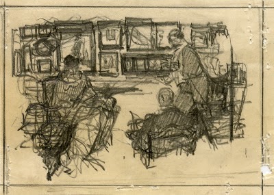
– The Framing or Block-in Plan – This is like the initial thought to an idea and can be as crude as needed to imply the concept that will be carved up into perfection using the following thumbnail steps. This rough block in is the way a storyboard artist defines the placement or arrangement and movement of the actors and pertinent props the actors are interacting with, but is primarily focused on the actors. These are done very quickly and are used as a general reference guide to visualizing the shot or sequence. And like the storyboard artists block-in roughs, they are cleaned up for greater legibility and clarity of concept or idea.
Leo Tsang Thumbnails
Thumbnail 1 – The value plan (NOTAN of local values) – This arrangement helps the artist visualize the objects in the pictorial space and how they relate to each other on the local value level. Local Value is the “built-in” color/value of an object. The value plan helps define the tonal key arrangement of the piece which is a big part of defining the mood of the image. The arrangement of local values gets misconstrued for local colors without equating the color to value, and is one reason why a picture can start to look “patchy” or broken into bits and pieces. The opening image by Halil Ural is a fantastic example of the Notan or Value Thumbnail.
John Harris Thumbnails
Saul Tepper Thumbnail
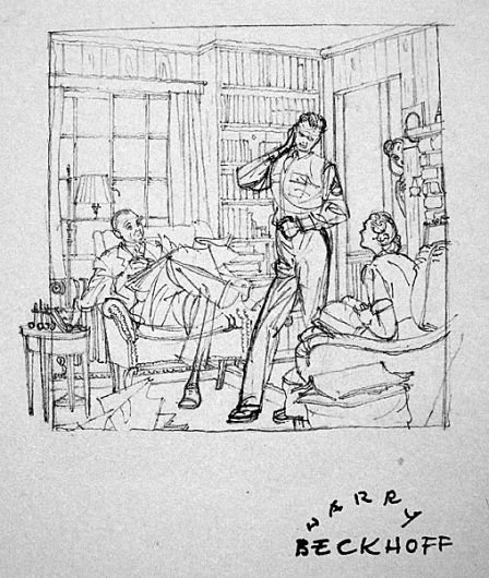
Thumbnail 2 – The Line Design – The line design is the linear breakup of shapes in a picture space. Our eyes follow linear pathways, these are often the edges of shapes that are long and unbroken. The line design helps us separate objects from one another and is also a tool of abstraction linking shapes to one another that are often not linked together at all. Understanding this abstract concept can help the artist shape the picture so that these edges, or linear pathways become implied lines of action, or implied line paths that can lead the viewer back to the focus regardless of which way their eyes might wander.
Thumbnail by Dean Cornwell
Thumbnails by Al Dorne
Harry Beckhoff Thumbnail
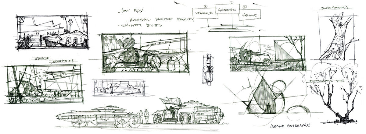
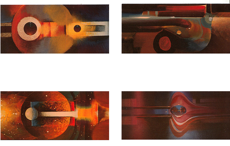
Thumbnail 3 – The Graphic Design Plan – Some artists are more inclined to graphically design more than they have a connection with or the toolbox for drawing realism- places, objects, people, etc. The organization of the objects within a space is organized through design and pattern, these patterns are worked out linearly and using value. The goal of this thumbnail is to see the big picture, the overall impression all the details make summed up together and organized into a well-thought-out design matrix.
Thumbnails By Syd Mead
Thumbnails by Joko Budiono
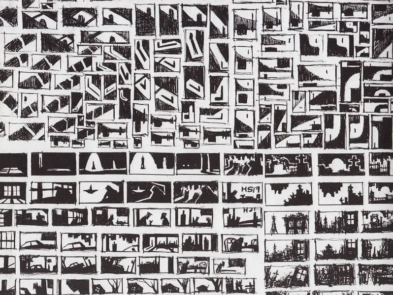
Thumbnail 4 – The Lighting Plan or Arrangement (NOTAN of light source)– linear drawing is shape based and tends not to include light as a part of the process. The arrangement of shadows can help simplify the design by grouping unrelated objects together under the same value scheme called grouping, and can help simplify complex subject matter by organizing the visual space into patterns instead of details.
Thumbnails by Robert Fawcett
Thumbnail 5 – The Color Plan – The color thumbnail helps organize the value plan into a cohesive color scheme, whether it is drawn up in realistic lighting or a “color recipe”- how illustrators design their color relationships. The color plan helps establish the emotional tone of the image initially found in the value and lighting arrangements.
John Berkey Color Thumbs
John Harris Thumbnails
In the process of creation, a thumbnail can take anywhere from a few seconds to a few hours to perfect. However, if each of your thumbnails take you hours to draw and clean up, then you are taking too much time on them and they might not effectively work as thumbnails anymore if overworked. Overworking a thumbnail is basically like doing a finish. Under working them leads to more confusion or unknown problems that still have to be solved before completing the piece. You will find a balance that suits your needs, and they will change per client, so be prepared to make some really tight looking thumbnails and be ready to intellectually scribble and scrawl.
Your thumbnails are the road map to completing your piece with success. They expose the problems you will be solving in the following steps. They solidify your footing towards a successful finish if you allow them to become a part of your routine rather than holding them at an arm’s length, or resisting them altogether. In many ways they are more important than your finish and they assist in helping you breathe life into your finish that could potentially mean more life beyond its completion.














this is really interesting and useful! Thank you, Ron
Always so impressed by the quality content on this website! Thanks Ron, this is a very well researched article.
Man where do you pull of these artist names and digital art images from? Whenever I try to take a look I always end up getting results of currently working artists, which there is nothing wrong with but I feel we all end up doing the same things as a result. I am looking for niche things perhaps from past century.
Sorry for the tangent. The article is great and a great expansion to your previous one. I will be going over it and digesting it many times. it has that much depth!