
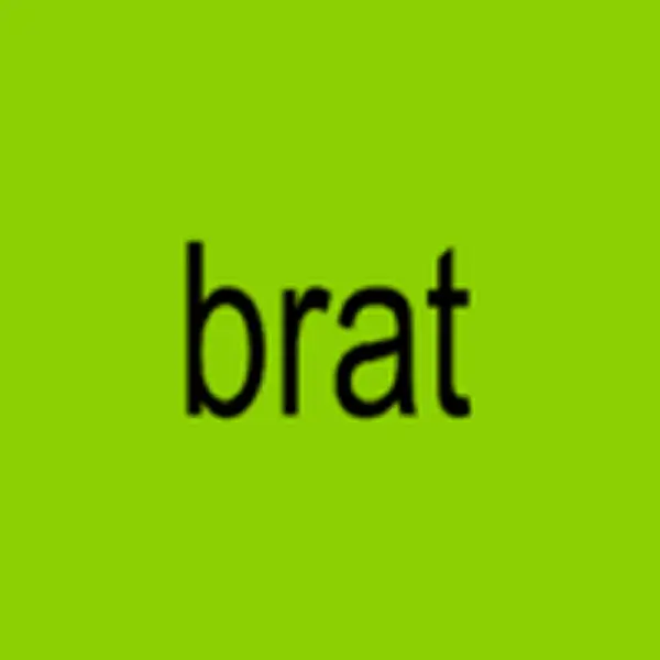
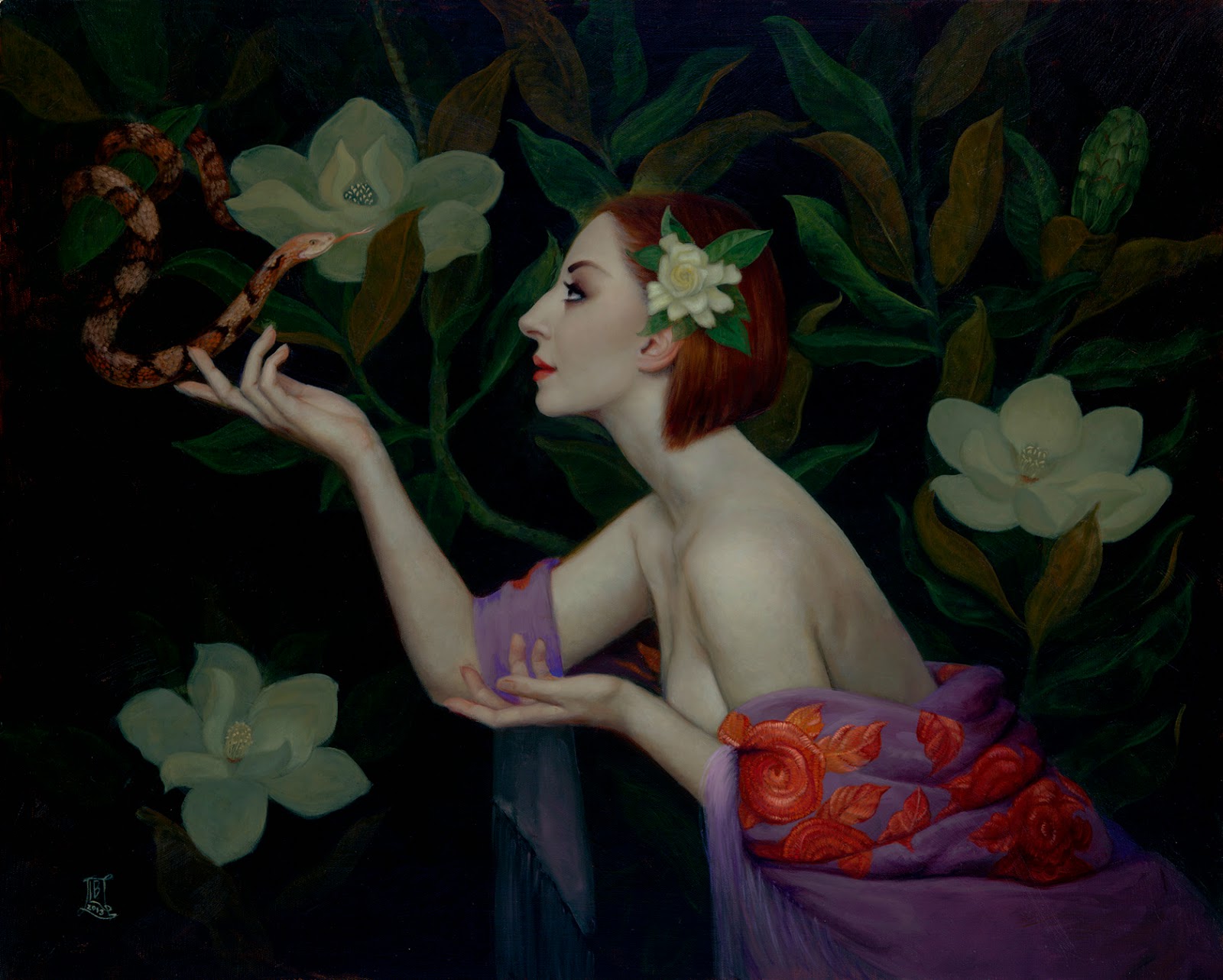
If you thought I was going to let the summer go by without mentioning brat green — you’re wrong. From the day the new Charlie XCX album, brat, was released — long before it became a political meme — friends have been joking that it’s MY SUMMER. And while I prefer a slightly more yellow green—a true chartreuse—as my favorite shade of green, even I have to admit, this is pretty close.
And while the album cover looks like it was designed in 30 seconds, designers know better. There have been more than a few interviews with the design firm Special Offer Inc that handled the design, and hundreds of colors were narrowed down to get to this one. The New York Times and Architectural Digest articles about “brat green” are worth a read for fun, but I’m interested in a wider view.
We’re artists, of course we know how important color is. And “hip” shades have come and gone. Pantone has been naming a “Color of the Year” for ages. But the colors that actually do break out and become culturally relevant can’t really be forced upon us. A few years ago all everyone was thinking about was “Millenial Pink”, which seemed to peak in 2018 but was starting to fade by 2019 and was truly done in over the peak pandemic years.

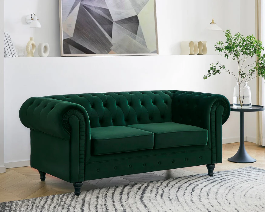
Green slowly crept into the cultural zeitgeist — maybe it was because we were mostly stuck inside and embracing our houseplant era. Maybe it was because we’re all saying “green” everything now, as shorthand for environmentally friendly. I think it was no small part to do with the fact that green is a much calmer color to decorate with, and we were all craving comfort in scary times. Suddenly think pieces about Green Velvet Couches were everywhere. (Yes, I do have a green velvet couch, duh). Brat green is just the apex of a color trend that’s been slowly building since 2020. And I am sure most folks will be thoroughly sick of lime green (not me, of course) by the end of 2024.
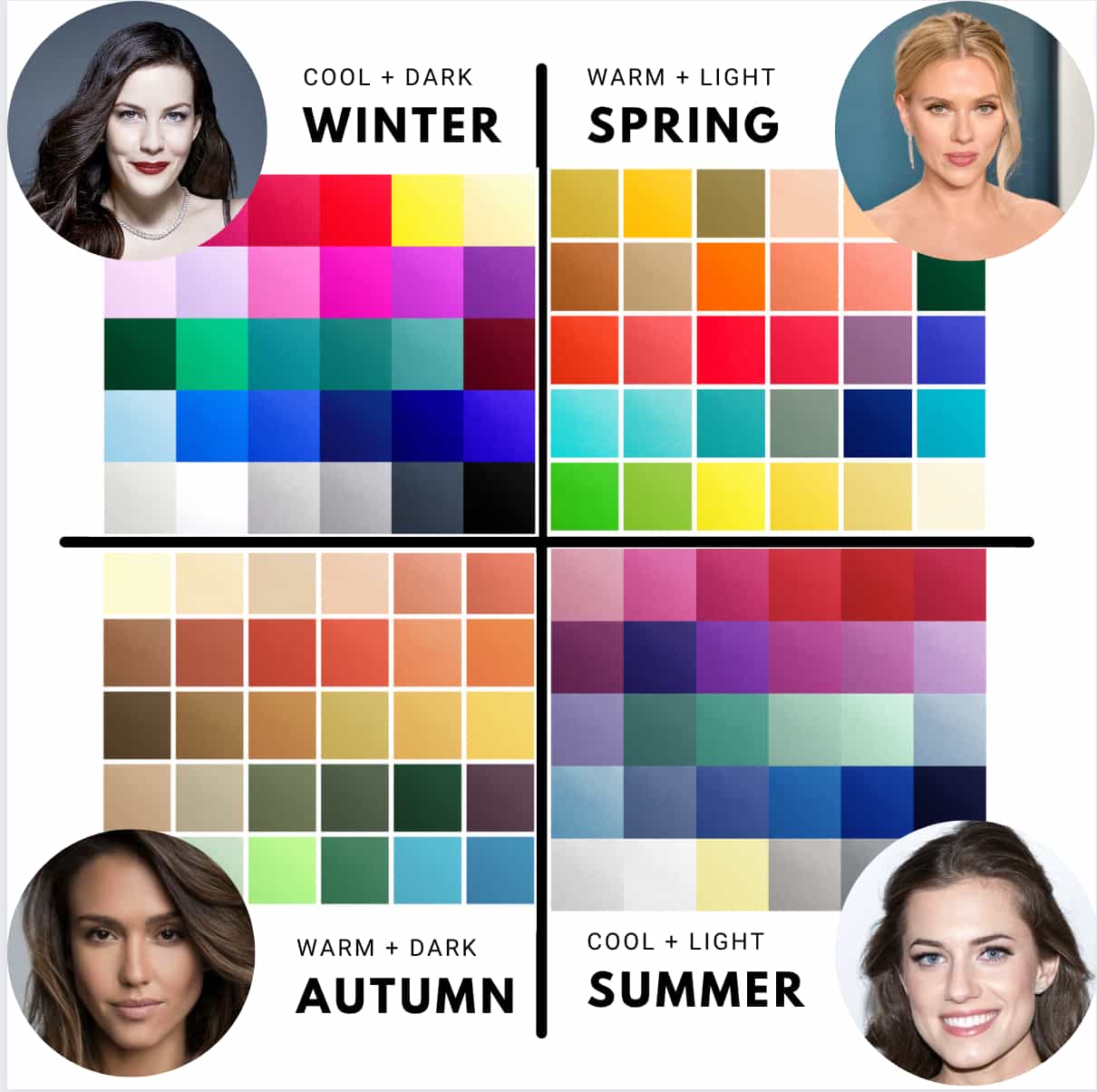
Interestingly enough, these cultural color moments have been so inescapable that it’s made a lot of normal non-artist folks start caring about color theory and color history. The fashion corner of social media has been absolutely obsessed about getting your Color Analysis done and dressing for your “color season”.
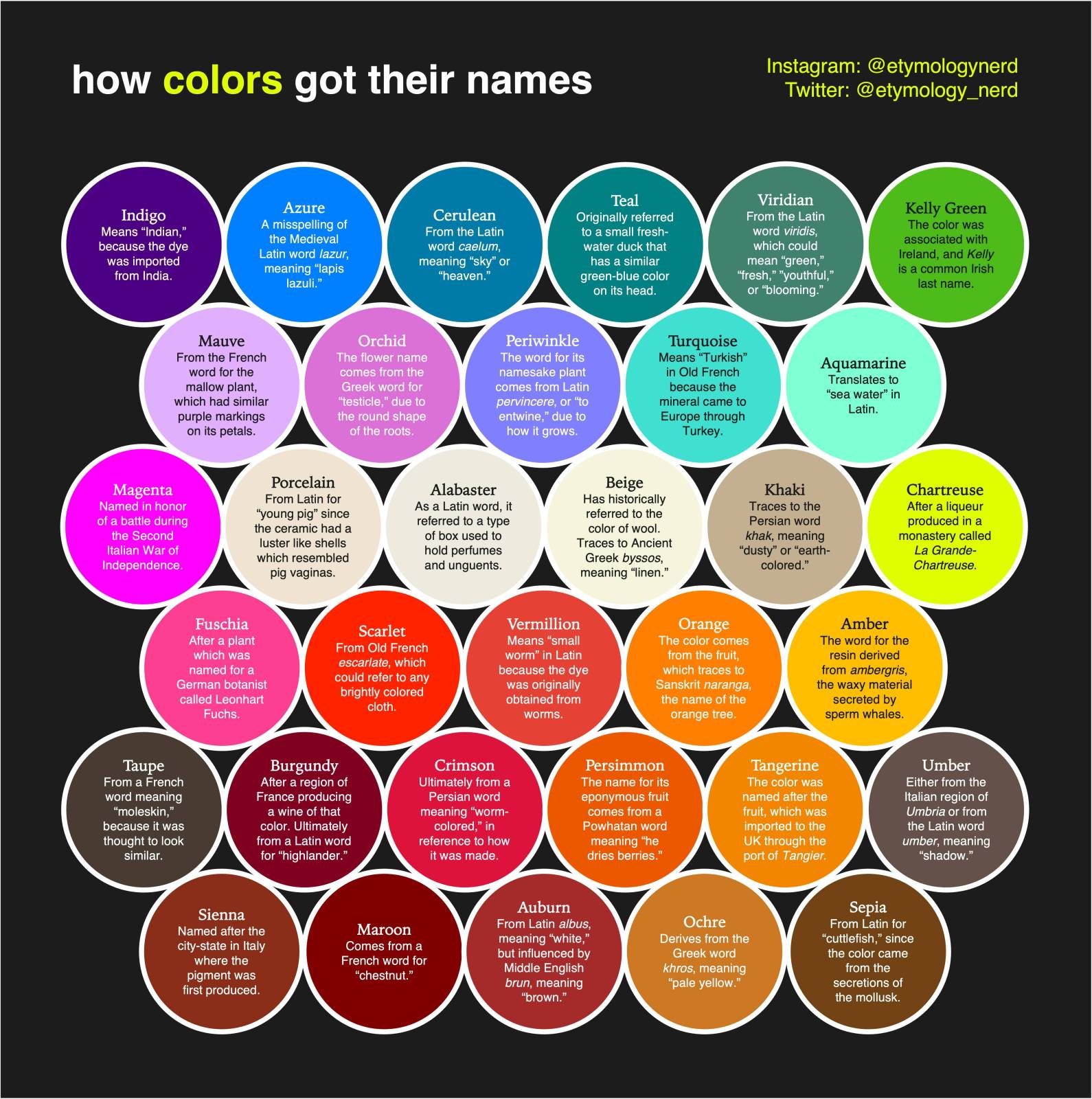
And I’ve been a big fan of The Etymology Nerd, who did this really fun names of color chart:
And I’ve been loving this series on the history of artist’s pigments from Jackson’s Art Supplies and Evie Hatch:
And if you don’t want to sift through instagram for them, they’re collected on Jackson’s Youtube Page.
So why am I talking about this? We’re artists, we know more about color than anyone. But how conscious are you of the colors you are picking? I’m not telling you to paint things in Brat Green just because it’s trendy right now. But I do think becoming conscious of what colors you’re using — and what colors are having cultural moments — is a great way to start honing your trendwatching muscle:
First: A lot of us make instinctual choices. About color, sure, but also about visual hierarchy, composition, contrast, etc. But instinct can only get you so far. You should let your gut move you, but strengthen that instinct by realizing why your instinct is moving you that way. As Dolly Parton says, “Find out who you are. And Do it on purpose.” Being conscious of what you’re doing instinctively, and following and choosing consciously after you recognize those instincts is how you find your style. (And “how do I find my style” is one of the top 5 questions I get over and over again).
Second: Color works subconsciously on your audience — just like fonts do. You can make your audience FEEL things by your choices that they don’t consciously realize is coming from your choices. It’s not obvious. It’s sneaky. And that’s very powerful. Dangerous in the hands of advertising. But an important tool in the hands of an artist. You can have layers of meaning in your work, both the conscious and the unconscious.
Third: Trendwatching is important to your career. I’ve told this story here before, and it comes up all the time in classes I teach, but anticipating trends will make your career. Not CHASING trends. You have to be ahead of them. For example, I saw the cultural zeitgeist shifting in 2010-ish from hyper-real book cover art to more abstract illustrations. Other book covers didn’t tell me that. I saw it in the reactions to the saturation of hyper-real CGI in movies and slick metallic shiny 2000s fashion. The pendulum was swinging back — you started seeing raw denim and heritage fashion brands coming into vogue, and every restaurant and bar opening had exposed brick and Edison bulbs.
I knew that was going to affect books eventually, and I worked hard to get ahead of it. Remember book covers have to be started at least a year ahead of when they release. Often earlier. We were surrounded by a sea of photographs covers in SFF, and I was telling my publisher we had to hire more illustrators and more abstract ones. He thought I was a little nutty but he trusted my logic. And I was right. I was hiring folks like Daniel Dociu and Richard Anderson and then suddenly everyone else was too because the fans were responding to texture and abstraction. And more and more book covers have gone to illustrated styles. People still crave texture. But now we’re seeing reactions to over-abstracted covers, especially in contemporary fiction, where the “book blob” trend has become a punchline. I think the new book blob is animal illustrations. But these are mini-trends. It’s important to watch the bigger currents and meta-trends. Illustration and texture is still king, because people are still craving comfort, and anything too slick is a little scary. The affect of the pandemic on trends is so big it’s hard to really see it clearly. Illustration doesn’t feel like it’s going anywhere anytime soon. Right now I would say folks should expect the trends to keep pushing away from anything that has that AI look and push towards more and more unique styles and evidence of human hands. What exactly that means I’m not sure. But I know it when I see it, and fans will too.
This affects subject matter too. In SFF books the big trends are Romantasy (aka sexy monster books) on one side and Cozy Fantasy on the other. It makes 1000% sense that the new Magic The Gathering set was cute animals. Maybe their next set will be sexier. We’ll see. These look like polar opposite trends on the surface, spicy smut vs. no sex at all, but really both are all about escapism. And that’s absolutely a response to things like the pandemic, inflation, and climate crisis. People are scared, and they’re craving escape. What form that escape takes is what’s making the trends.
Trends affect who is going to get hired, because trends affect consumers…and it’s mostly unconscious. It’s our job to realize what’s happening consciously and then do it on purpose. If you start looking at the currents that are affecting the industries you’re working in, and the bigger cultural currents affecting them, you’ll have a lot more conscious affect on your work and your career.

Very good points.