
I spent much of my life self taught, so when I came to atelier training, there were a lot of things that blew my mind. I realized I had spent so much time reinventing the wheel. There’s nothing I can do about all of that but what I can do is share some of the giant “AHA!” nuggets of information that ended up being life-changing for me. (OK maybe that’s a bit dramatic, but that’s how I felt).
One of the big game changers for me was the concept of different types of edges or transitions and what they communicate. If everything is super sharp or everything is fuzzy, there isn’t hierarchy. We can create more depth and dimension if we understand how to use edges as a way to communicate form and space. In this post, I will use a charcoal cast drawing as an example since I think it’s easier to see when the color is not a factor.
I will talk about softness and sharpness of edges on a scale of 0 to 10. 0 If there is no edge and it’s the softest softest edge… to a 10 which is razor sharp sharpety sharp sharp edge.
Contour Edges
An object in space has contour edges. I think edges are the unsung hero of creating form.

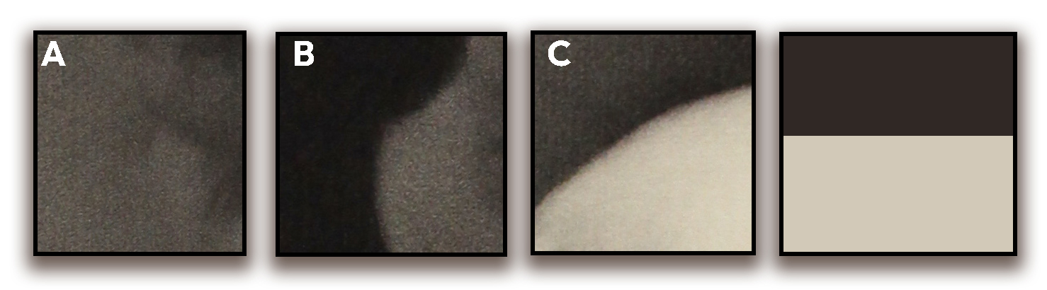
- A- Lost edge: This area of the cast looks almost completely lost! I would call this a 0 or a .5. The edge is so soft and the contrast is so low there’s no solid definition to the edge. Effect: Low value contrast and soft edges mean we are LOSING information and therefore it’s NOT IMPORTANT for the viewer to notice it. It also forces the edge of the cast to RECEDE into space going away from us, furthering the depth of the object almost like it’s out of focus. This helps give the effect of atmosphere as well.
- B- Soft Edge: This would be about a 3 softness. This area has a higher value contract but the edge is still soft. Effect: This causes a similar effect as the lost edge but not as dramatic.
- C- Slightly Soft edge: I would call this about an 8. While this edge is higher contrast it still has a slightly slightly soft edge. Effect: This helps us to tell the viewer that this is a round object. The slight darkening at the edge allows for the viewer to know that it’s a rounded egde. If the very top of this bright white cast was a sharp egde up against the background it would appear as it it was a flat sticker on the wall. That micro-softening communicates a rounded form.
Notice that around the entire cast, there are no razor sharp edges? A 3D object in space will not have a razor sharp edge. However, it would work if you were painting a sticker or piece of paper.
Shadow edges
There are 2 types of shadow edges – cast shadow edges (the shadow that results from something interrupting the light source) and form shadow edges (The edge of a form where light can no longer access. Some call this the bed-bug line, some call this the terminator -“I’ll be back”-, others call it the shadow edge. Either way, it’s sharpness or softness communicates a lot.)
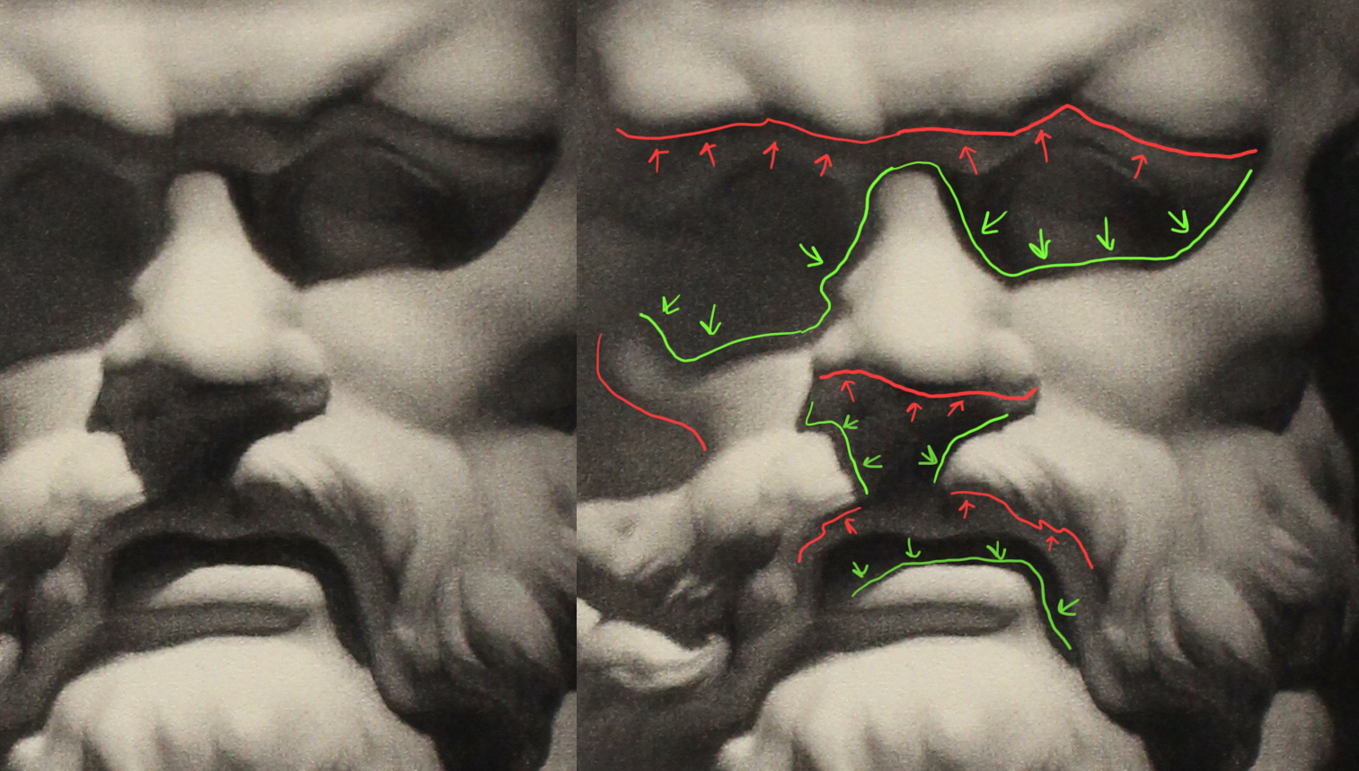
Red edges are FORM SHADOW edges. Green lines are CAST shadow edges.
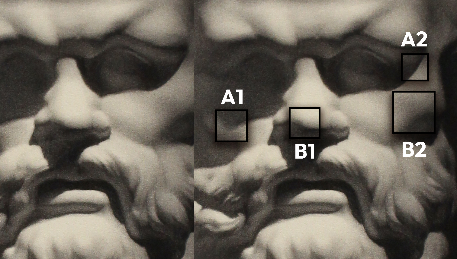
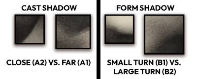
- Cast shadow edges (A1 and A2) – Sharp cast shadow edges communicate a SHORT distance from the object casting it. The further away the distance, the softer it gets. These babies get the full sharp range of 0-10. Super sharp = super close. Super soft = super far
- Form Shadows (B1 and B2) – Anytime you have a value shift, or something going from lighter to darker, this is a transition. How quickly it does this communicates how fast the form is turning. This is VERY obvious more along the terminator or form shadow edges. Anything thing 3 D usually has a range of 1 to 9. Notice there is no zero (which would mean no value change and no form change… which means flat) and no 10 (no sharpety sharp sharp). A super sharp form shadow edge would make the viewer think it’s an immediate drop off. I try to keep my form shadows at at least a 1 or higher.
Perspective and Depth
If you think about sharpness as a way to create focus, you gain even more control on what your audience notices. More details, more sharpness is a way of saying “LOOK OVER HERE!!!” For example, should you viewers care about whats in the foreground the most? Or what’s in the middle ground? Or perhaps the background has more of a priority? You can use this to your advantage in composition and in creating believable scenarios in invented work. After all, humans can only focus their eyes on one depth at a time so by using softness or sharpness of edges, you can mimic our natural way of experiencing the world.
In Summary
Consider your edges and transitions. They have POWER. Hope this helps… Happy painting!


Good points. I’m only just learning how to use edges like that. It is mind-blowing when it works. Thanks for sharing.
Fantastic post Julie! A great explanation of all the edge types.
You are such a gifted teacher Julie, especially explaining the ‘sharpity sharp sharp edges….I am going to pass this blog onto my students it’s much better than any of my explanation 🤭