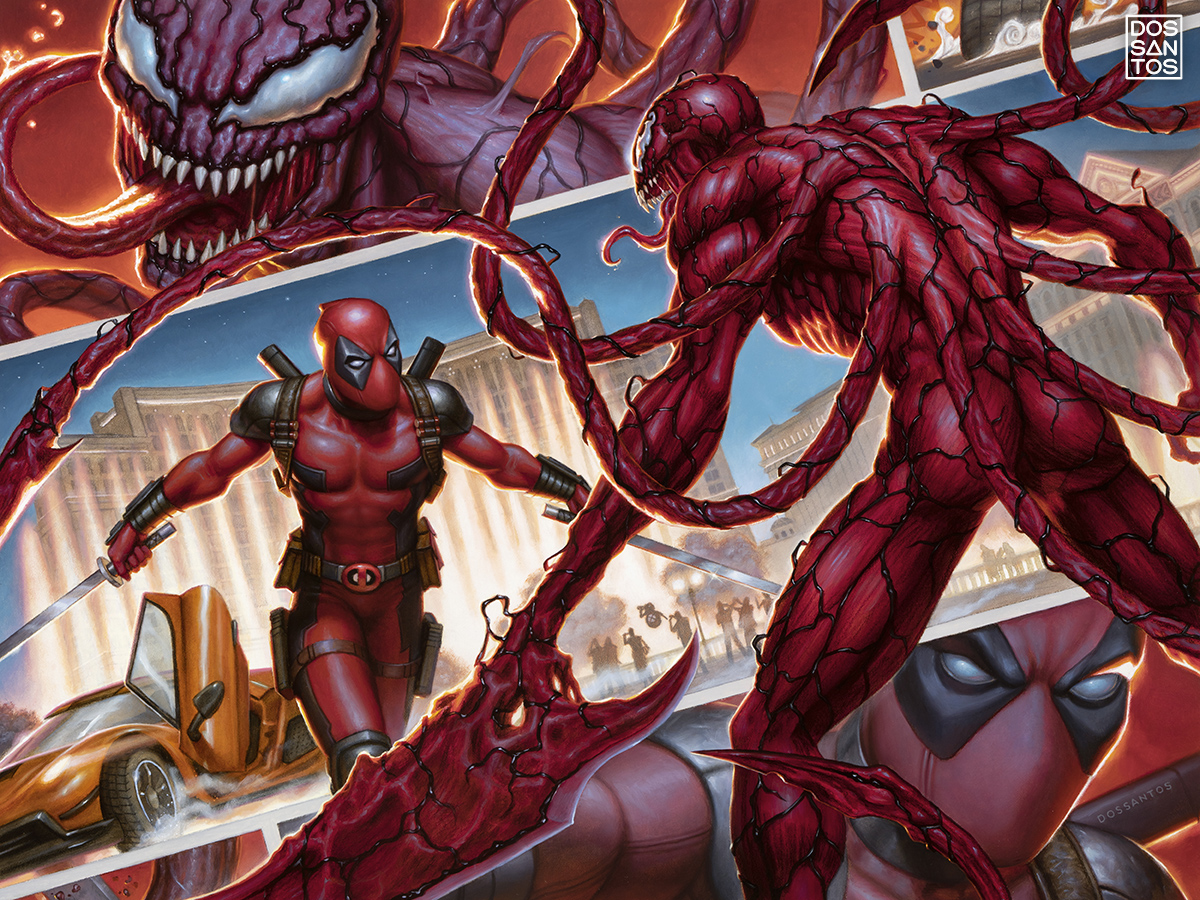
Here’ a fun private commission I recently finished for a client. I was asked to show Carnage and Deadpool fighting on the Las Vegas Strip, with sports cars and glitz. The whole idea seemed aptly over-the-top for Deadpool, so I tried to treat the composition the same way, and pack as much narrative as I could in there. Maybe even break the ‘fourth wall’. The background looking like a comic book page is meant as a visual pun, as they are literally, on ‘the strip’.
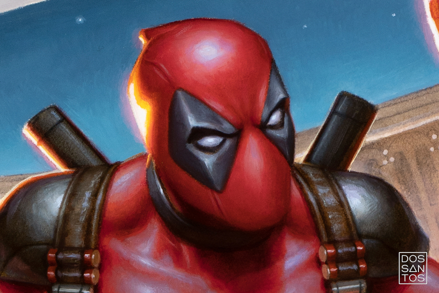
The similar color scheme for the two characters was a fun challenge to play with. Making micro-compositions of just different shades of red is a solid day, imo.
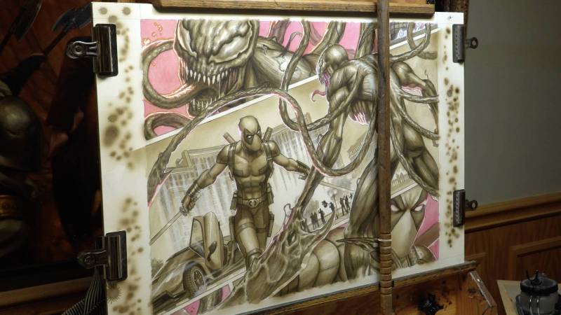
The final painting is all traditional, a mixture of acrylic and oils, 18×24″


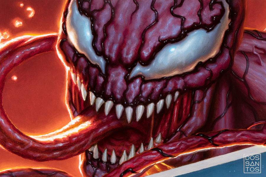

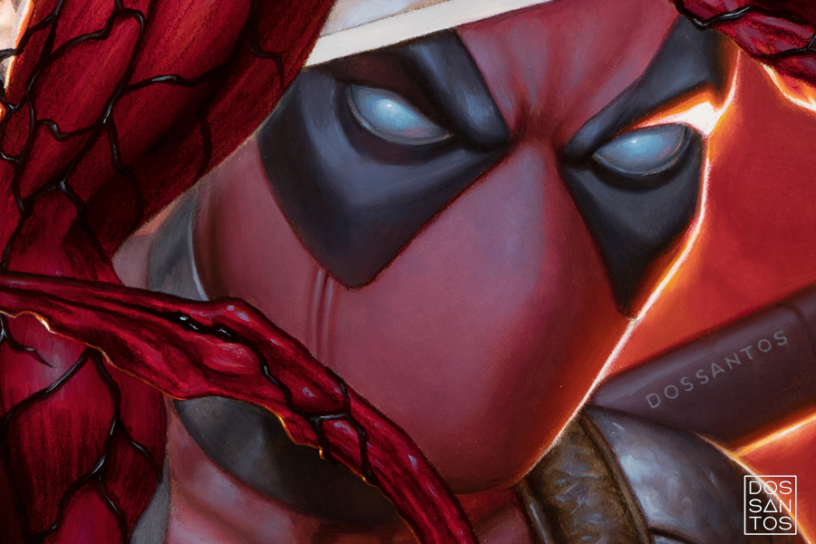
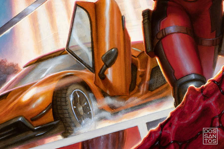



So cool! And using red backgrounds for the close-ups of their snarling faces at the top and bottom–definitely feels like a professional’s choice. Love the visual pun; exciting work as always, Dan!
It’s kind of amazing to see all the different variations of red you did, and still kept the image readable. That’s mind-boggling
Amazing!!! Dan, thanks for sharing this. It was such a treat to stumble on this post after not visiting the Muddy Colors website in a while. I loved how you shared your thought process with the composition and trying to add a story to the picture, too.
ALAÇATI TRANSFER