
Next week is the opening for Character in Context, a show in Trinidad, CO at the A.R. Mitchell Museum of Western Art. Character in Context emphasizes process by also exhibiting the preliminary work and making those artifacts of creation available. Last time on Muddy Colors I explored the early part of my process for this show, and today we open the floor to several other exhibiting artists to discuss their creative processes.
Tawny Fritz
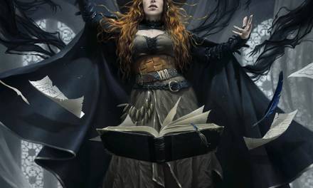
Tawny Fritz is an ink artist drawing women and macabre subjects inspired by mythology. Her childhood in New Orleans influenced a particular interest in voodoo and magic, and how those practices explore connections between the physical and spiritual worlds. Her ink drawing for this show is larger than her usual, and integrates gold leaf with tasteful restraint, showing up as subtle treasures amongst the rocks.
From Tawny:
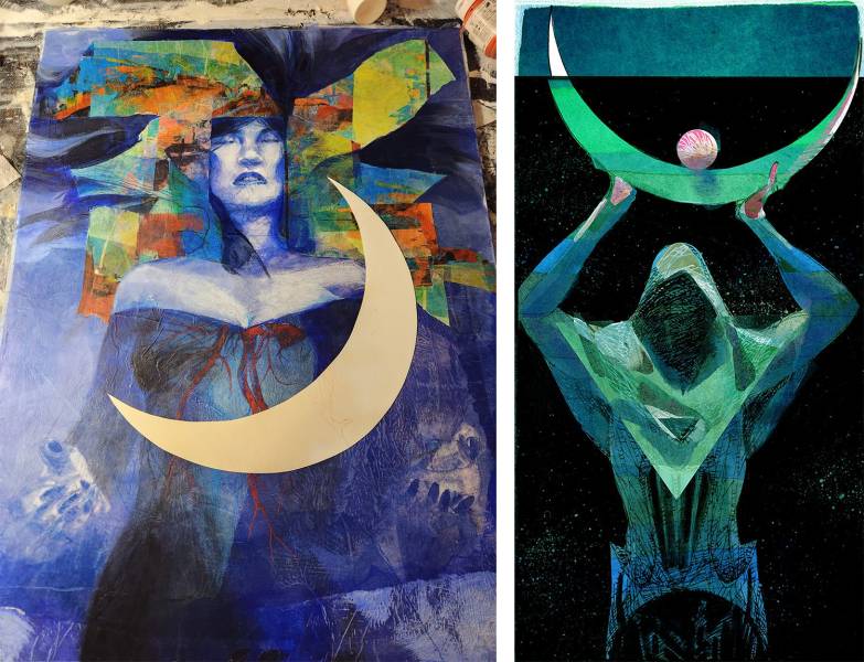
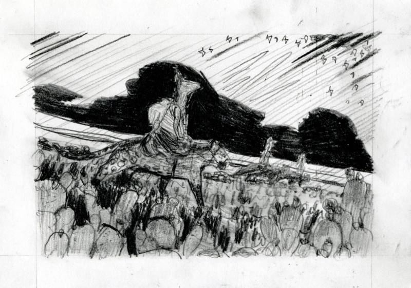
I craft intricate ink drawings of mythological and macabre subjects with my work, so for Character in Context I chose to depict Lilith as a “Soul digger” in search of greedy gold diggers.

I liked both of these poses and might revisit the one I didn’t choose at a later date, but I liked the smirky confrontational nature of the one I decided to use. The first sketch was more laid back but a little too cocky for what I was hoping for. I tend to choose one sketch over another for a small, seemingly insignificant reason nearly every time and this one was no different. The gloves. I wanted to draw them slightly too big, as though she’s wearing someone else’s gear. Once I was excited to draw those tough leather workman style gloves, it was easy to figure out the rest of the image.
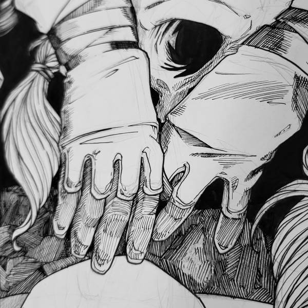
I’m often asked how I get long smooth lines and I would imagine my method is kind of strange. I spent 8 years in the Army and was an expert marksman. The breathing technique I learned for a steady shot is the same I use for a steady line of ink. Breathe in, hold for a beat, and start the
line on the slow exhale. The drawback of this meditative way of working is that once I’m lost in a piece, it becomes hard to stop and I easily forget to do things like record the process, take process shots, or even take breaks to eat food.
As an aside, sometimes a detail of a piece will change even after inks have begun. This one initially featured a regular style “demon” tail, which differs greatly from the subtle rattlesnake tail that Lilith is sporting in the final.
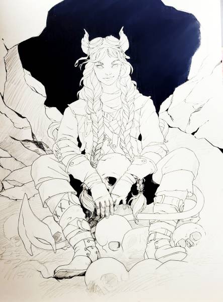
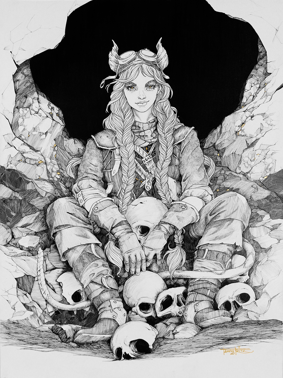
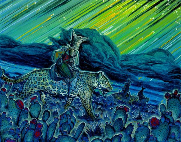
Soul Digger by Tawny Fritz · 18″ x 24″ · Ink
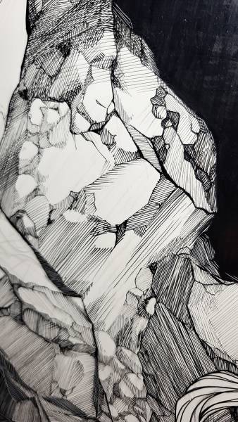
Ink is fascinating to me. I love finding the middle ground between the harsh, dark black areas and the bright, wide open white spaces. To be able to tell a whole story without color is a challenge and one that I strive to accomplish with every new piece. I hope this one tells the story in a way that’s dark but also weirdly quirky. She’s a Souldigger, but that doesn’t mean she isn’t just a girl having fun.
Eli Minaya
Eli Minaya is an illustrator and fine artist who’s innovative and explorative collage work explores mythology through abstracted human form and creatures. I find his use of line and shape captivating, and last October at IX had the opportunity to see his collage work in-person for the first time. He is based in Virginia, and has taught illustration at SMFA at Tufts University, Montserrat College of Art and New England College. Eli’s clients include Tor Books, Amazon Publishing, Wizards of the Coast, and Image Comics.
From Eli:
I don’t think I can succinctly talk about technique, I tend to ramble about all the possibilities of collage and mixed media. So I’m going to talk about my process when making personal work. Generally speaking, I don’t thumbnail. Thumbnails are for clients. It’s an important contract
between you and them, but as its personal work ; and the point is to experiment, learn, and discover, I’d rather not be locked into an idea before I find what I’m looking for in this painting. The drawing for this piece came from a commission for art on the back of an MtG artist proof. I
really liked it and wanted to do more with it.

But because of client work, this piece languished in my studio for 2 years before I was able to get back to it. And when I did, I found I wasn’t interested in what I was making anymore.

If I felt like I needed to commit to the initial idea, I might not have revisited it. But as soon as I had time to work on it, I was eager to see what had changed in the last two years. The first thing I wanted to do was destroy a lot of the conceptual decisions I was making then. This piece had
initially been geared toward a card in my oracle deck; Divination. A sort of remaster of the original illustration.
At this point, I dove in, without an idea. Without a plan. Just a need to apply some things I had learned and try out some new patterns I had created. My collage process had become more about painting in the last year and I really wanted to get back to just tearing paper and seeing
what could happen.
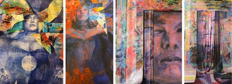
I had a teacher in school that taught me that if you have a solid drawing, you could literally paint whatever you want on top. I don’t know if he realized then how much that would encourage my willingness to destroy a painting and start over. So long as I had a drawing to fall back on. I have a dozen MtG paintings that didn’t get totally off the ground and now litter a closet. Working from the original drawing, collage layers, and new texture layers, I began refining some odds and ends (she was more scowly in the original than I had intended)
From this point on, it was just working the painting until I found it’s “Finish”. That is usually a point that is separate from me. A painting will just tell you it’s finished, good or bad. When “Dream and Dragon” told me, I felt there was still a lot of room to refine, but everything I went looking for in this piece had been found. So I let it go.
Dream and the Dragon by Eli Minaya · 18″ x 22″ · mixed media
It’s not perfect, and I would have loved to let it sit another 2 years,(could def use a better photo) but the Character in Context show is a great reason to let go of a piece. If it finds its way back to me, it just might get those years. But I do hope everyone enjoys seeing it at the show.
Shawn Adomanis
Shawn Adomanis is an oil painter who draws inspiration from the vast complexity, colorful chaos, and immense beauty of cellular organisms. His artwork is informed by many years spent working in the life sciences industry. Shawn’s paintings feature creatures and figures created from microorganisms such as mold, fungal, and bacterial cell cultures. His art is exceedingly unique and rich with detail, and I find myself drawn into the juxtaposition found in his paintings between the alien and grotesque, yet entrancingly beautiful and very-familiar (microorganisms in our bodies outnumber our own cells 10-1).
From Shawn:
At the start of any painting, I think of ideas for a few days. When I have a few, I will do many small thumbnails for several different concepts. With my favorite nailed down, I will focus on sketching the composition, direction, and lighting. Next, I scan that into Photoshop and work at size. This stage is quick and is really to refine the composition, nail down my proportions, and/or make the scene more dynamic. I will then use that digital sketch as a reference to either redraw the final pencils directly to the painting surface or, with this painting, to paper so I could have a preliminary sketch for the show.  With the pencils on the final surface, I will take a photo and bring that into Photoshop for my color comps. To me, this is the most crucial stage. At first, I focus on value before moving to color. Since I am colorblind, I have difficulties with trying to figure out what colors to use, so digital helps immensely. I tend to grab 2 complimentary colors, add in a 3rd, and just start experimenting, especially with the hue sliders. When happy, I will work solely from this as my reference.
  On the final, penciled surface, I move to oils from here on. A quick wash in earth tones will establish the lights and darks. I start building up light washes of color, add in darker shadows, and keep building colors and form. I reassess and edit throughout until I feel it is done. I have found that this process works best for me, however, I do refine my process after every few paintings, because it can always be better.

Vesperi basidiortus by Shawn Adomanis · 18″ x 24″ · Oil on panel
Danny Bitton
I had the pleasure of being introduced to Danny Bitton’s art in-person at IX a few years ago. The warm lines that come and go in his mixed media work, and the softness he achieves as those lines dip away, captured my attention. He’s based in Pennsylvania, graduated from the Maryland Institute College of Art, and his works appear in books, games, and galleries.
From Danny:
Here’s the traditional painting process I used for my piece in the Character in Context group show opening on May 2. The theme was fairly flexible, with the only requirement being that the piece had to revolve around a narrative. I decided to make a piece based on a personal narrative.
My process for personal work and client work is mostly the same. Since I’m making this piece for myself, I focused on a single theme and refined it to a final piece instead of providing multiple sketches.
I start with writing about a central theme to help get the ball rolling. My goal at this stage is not to judge any ideas but to get as many on paper as I can. I’ll summarize my stream of consciousness writing into 3 main categories, which are either one word or short phrases. From there I will begin making word stacks for each category, which are many separate words or phrases related to the theme. From here, I’ll sketch accompanying icons or small thumbnails for each word.
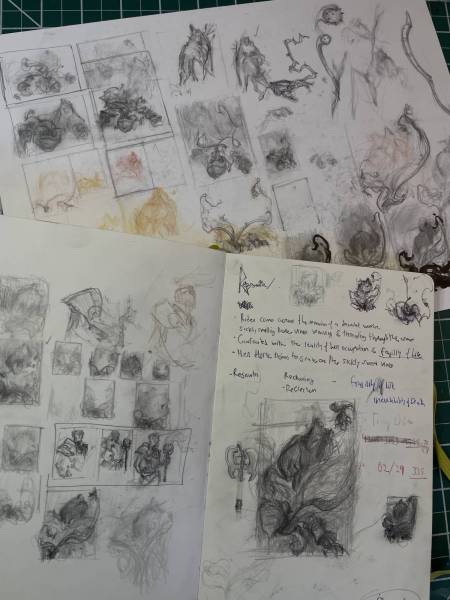
As drawn out as this process sounds, it gives me a consistent method of using project briefs or personal narratives to create subject matter that I find interesting.
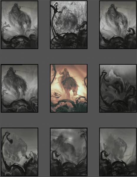
I’ll start with sketching first if I have a better idea of what I want to paint; other times it takes a bit more work at this initial stage to uncover a theme. From here I begin making several thumbnail sketches, which are rough and ugly. Their job is to help establish the basic value structure and design of the piece.
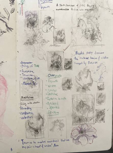
I’ll then make slightly larger thumbnails and upload them into Photoshop, where I can continue to refine them. There I’ll add rough color to the sketches with a solid value structure and then pick one sketch to move to the final piece. This is where I will shoot specific references and get the exact lighting and poses I need.
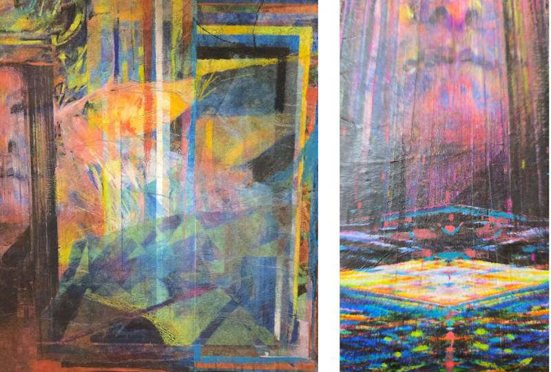
Screenshot
Since I don’t yet have a fancy Epson printer to print the linework on watercolor paper, I’ll either make a grid on Photoshop or use a lightbox to transfer the drawing. I first work on the underdrawing with col-erase colored pencils. Then begins the slow process of building up value with tinted acrylic ink. I will rework the drawing back into the focal areas and continue to add washes of acrylic paint. I repeat this process until the painting is close to final. Lastly, I will work opaque paint into areas that need a bit more contrast and then use Prismacolors for any final touches. Prismacolor has a waxy finish, so I like to wait until the end before using them.
Most of the work is front-loaded in the sketch phase since the sketch needs to have all the design and values figured out. I find this process very tactile and satisfying, and it gives my work a soft, textured atmosphere that I enjoy.
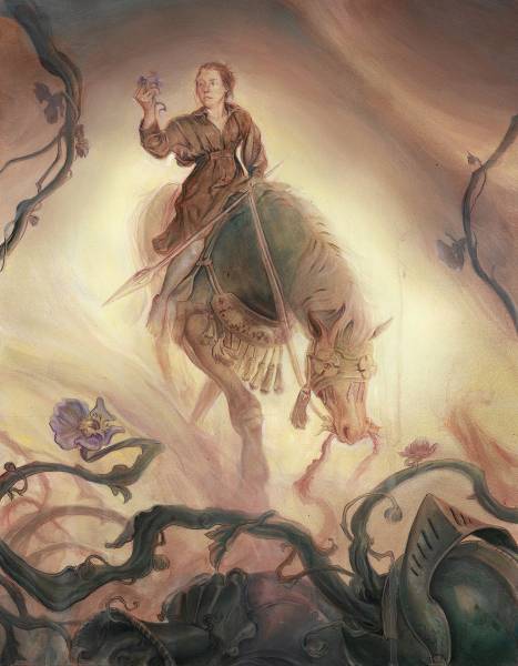
Regrowth by Danny Bitton · 14″ x 18″ · acrylic, colored pencil, & ink
Danny Schwartz
Danny Schwartz is an illustrator who’s work has always blown me away, in the way it straddles playful whimsy, elegant sophistication, and quirky caricature, and how he plays with perspective and selective flattening to simulate a unique sense of depth. His work has appeared in newspapers, magazines, books, games, and TV shows, but most recently you may have seen his fantastic work for Magic: The Gathering.
From Danny:
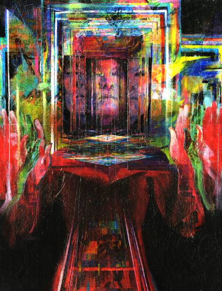
I feel more comfortable drawing than I do anything else in this world, so I stick to drawing when I’m making an image as much as I can. I end up drawing an image three times while I’m making it, which sounds insane to say but has become almost a central part of my process. The first time is during the sketch phase, when I’m arranging my chess pieces on the board and playing with my shapes.
The second is on the surface itself, when I render and design everything in pencil, forever my most comfortable medium. And the third time is after I’ve applied my color gradients and underpainting to establish mood and direct my composition, when I take a really really tiny brush and redraw my entire drawing on top of itself with paint, which helps me re-establish the shapes I feel are important, helps me establish some of my sharpest edges, and honestly just makes me feel secure and ready to transition to the wet media.

It takes a ton of time but it always feels worth it. In the end you only really see the last drawing, which I’m okay with. I always scan the pencil drawing before I start putting down paint for reference for the third paint-drawing, and also for my own records, but I don’t really consider it a final image on it’s own. I learned years ago not to really pay attention to value at this stage, because it messes me up when I start painting. It’s just rendering that serves as the essential backbone of everything that comes after.
The Arc of the Universe by Danny Schwartz · 11 x 14 · acrylic
Opening Weekend
The show opens on May 2nd at 5 PM, and is followed on Saturday, May 3rd with demos, an exploration of the archives in the museum basement, artist talks, figure drawing, and more. It happens to open the same day as Greg Manchess’ L’Amour by Manchess show in the same museum, in which he’ll have 50 paintings and even more drawings, from what I’ve heard. Combined with Character in Context’s 100 pieces, it’s an easy trip to justify. 19 of the artists will be in this little scenic town in Colorado for the weekend- if you’re interested in coming to check it out, there’s a carpool down from Denver Thursday morning. The show will be on display through July 19th.
Recent Comments