Just released the new album art for my good friend Aesop Rock’s upcoming album, BLACK HOLE SUPERETTE. The previous cover done for him was all hand drawn and colored to look like natural media, so this time I wanted to do something with a completely different look and feel. Thought it would be cool to do a piece that looked like a photograph of an actual place, but to lean into the surreal a little bit, pump up the colors, the atmosphere, and give it almost a stage set vibe.
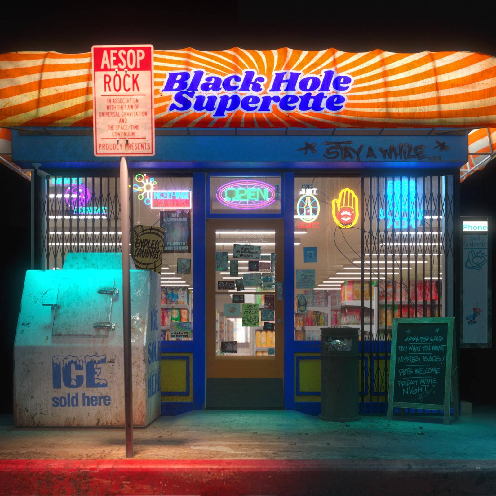
There’s tons of little details throughout…I found that you have to make a lot of peripheral materials to make a scene like this feel complete. Signage, stickers, graffiti, and little
Details like the cigarette butts on the floor or the scribes and smudges on the glass really help complete the idea.. I modeled and textured a good amount of this, and kitbashed/modified found elements that could work. I think this is my first 3d cover. Built in 3DS max and rendered in V-ray.
The full packaging concept is a subtle spiritual tribute to ICE-T’S POWER.
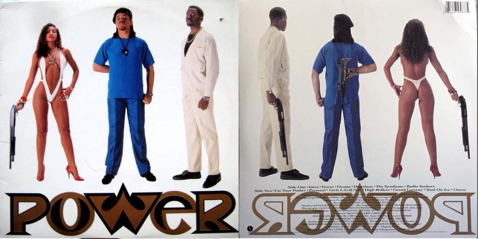
I remember as a kid my cousin got that album and when he showed it to me it was forever burned into my mind. Not only is the imagery- ahem- memorable for a 12 year old boy, but conceptually, it’s so dope to do the front/back reveal like that. The similar frontal, centered composition of the storefront was the perfect opportunity to create a mirrored back view of the cover. The iconic blue suit is paid low-key tribute in the blue BHS facade.

As much signage had to be created for the front, a similar amount of graffiti for the back. Again, tons of Easter eggs, dumb inside jokes, my kids names, my 10 year old even got up on the dumpster. Used some procreate “graffiti” brushes for all of it, and like, goddamn. No complaints. Can’t believe how realistic it looks.
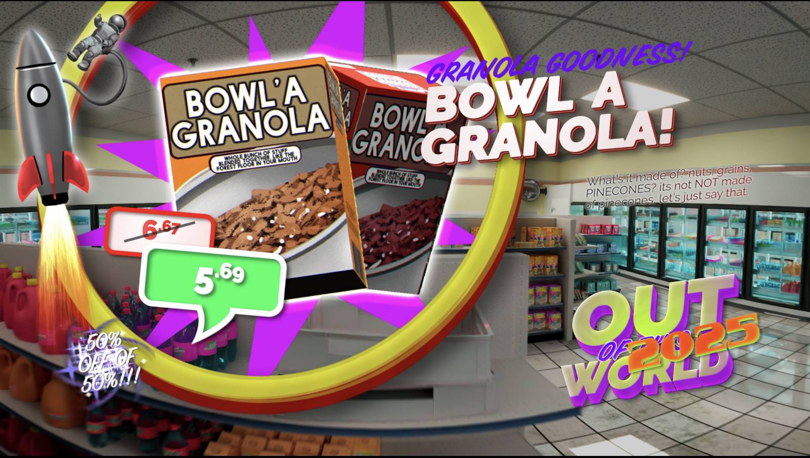
The front/back concept is expanded upon here with an illustration showcasing the store interior and with credits laid out to look sort of like a weird mailer you’d get for a local business. The store itself is filled with custom products that exist only in the BHS universe, many of which are themed after song titles. This ended up being a lot of work designing all of the products, but also very fun/strangely satisfying to do.

The slip covers feature spreads of floating bottles and cans sort of being sucked into the center of the album label.

We took things a little further on the deluxe edition artwork, where the front door, back door and ice machine physically open up to reveal additional images. The front door has a scratch off lottery ticket underneath it.
These albums are so much fun to work on. Often when you’re on a large campaign there can be so many stakeholders that ideas can get dumbed down or muddled in the spirit of compromise. Aes is one of those rare clients where it truly feels like a collaboration. Creatively we’re very aligned which makes it a lot of fun coming up with and executing on these projects. The record label is incredibly supportive of the weird ideas we present to them and always finds ways to expand upon and elevate things. I feel very fortunate to be able to contribute to these projects. I was a fan long before we became friends.
BUT WAIT! THERES MORE!
I also had the opportunity to create the video for the first single, CHECKERS!
This was my second music video and I can confidently say it went a lot smoother this time 🙂
Had about a month to pull this together, so came up with a general game plan where I’d lean in on the aesthetics of the cover, and concentrate on 3 lines of footage I could cut between.
Wanted to use the store and assets to create like liminal fly through, with it first appearing in space, and then having the camera go through the interior and then out the television.


Screenshot
Modified some pre-existing templates for the pop up ads. Created all of these fake products so I wanted to show them off a little:) this also makes the fly through a lot less boring 🙂
Screenshot
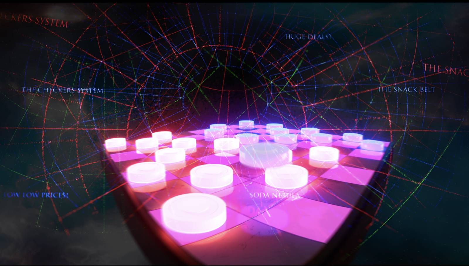
built out a checker board scene in 3d and rendered a few different sequences out of the camera flying around it. Tried to create sort of “visual ramp up” starting first with a straight checkers board and ending on everything lighting up all crazy like.

Screenshot
Screenshot
Lastly, I had Ian film a few run thoughs of himself rapping in front of a blank wall that I took into after effects and “nebulized” him with various layer effects.


Screenshot
Once I had all three lines of footage it was relatively simple to cut between them to create the actual video.
There’s a whole lot more to this that’s due to come out between now and the full album release that I can’t wait to share. this has been a very satisfying project to work on and I hope people appreciate the visuals that support the album.
Recent Comments