At the end of December, each of the artists represented by EVOKE Contemporary in Santa Fe, New Mexico received a gift box with chocolates (a yummy bribe?), a 10-panel Hahnemühle Zig Zag book and an invitation to create a book featuring the theme of love.
What better way to express the spectrum of emotion, the many facets of love than through visual images? Did I mention chocolates?
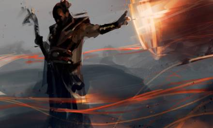
As described by the gallery, “Love, in all its infinite forms, unfolds in Lettera Amorosa, an evocative exhibition that invites artists to explore the depths of passion, longing, beauty and loss through the intimate format of the fan fold book. Drawing inspiration from the poetic words of Monteverdi (1567-1643), this collection transforms the zigzagged pages into a canvas for boundless creativity, where each fold holds a story, a confession, or a whispered secret. From painting and photography to mixed media and sculpture, the exhibition is a visual love letter – an exploration of how love shapes us, moves us, and lingers in our lives.”
You can view a video walk through of the Lettera Amorosa exhibition at the end of this article.
Having focused on sculpture for a very long time, creating a two-dimensional object seemed a fair challenge. Do I stick with what I know – 3D – cut the book apart and make a paper sculpture? Work with forms and actual light and shadow? Create a performance piece with me being part of the display? (That thought was quickly dismissed, but could’ve been kind of cool). Make a sculpture to hold the book? Sure, of course, doesn’t everybody? But what goes in the book that I could accomplish even moderately well without the years of practice any discipline takes? At this early stage, Colin was reasonably certain he was going to be painting my book for me.
Drawing always seemed the purest form of visual magic to me. The simplicity of pencil and paper – tools almost everyone has experienced at some time in their life – bringing entire worlds into being seemingly before your eyes… what sorcery is this? Okay – confessions – I hadn’t used pencils since I was a kid, and it was fun back then, but it had fallen by the wayside as I followed my penchant for clay. Perhaps I could excavate deep into that buried well? But then, what to draw?
I thought about creating a visual love letter to artists who came before that inspired me – tracking how their imagery found new expression through my work. I considered a tribute to my beloved fur-babies that had graced my life and now run in the fields beyond. But, as always, when it comes to the topic of love, Colin is always at the forefront of my thoughts. I referred back to some sketches I’d made for printmaking years before based on notes for stories I’d jotted down. I thought about the dreams we’d both had in which we were certain we’d known of each other years before we met.
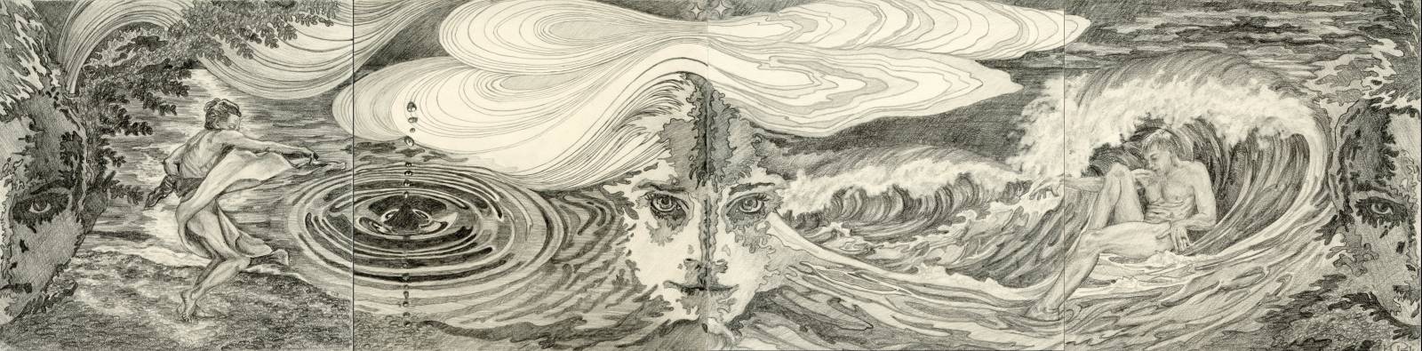
I began assembling my template for the drawing. As I worked through my reference imagery, I wanted his dream images to emerge from one side and mine from the other, meeting in the middle in the magical moments of finding each other, such that the book could be “read” traditionally from left to right, or right to left, outsides to inside, or from the center back to the beginning – how we got there, in a way. I knew the center panels would show the place we married – Paros Island in Greece. On that day, with the help of friends, we’d lined the path to our future with white marble pebbles. As we followed the trail towards the sea and our new life together, I’d asked him, “where do we go now?” “To explore the fields of our imaginations,” he said. And off we went.
As I worked through creating ten panels that worked individually, I saw that they could also work as one continuous visual story… and also in sets of two, four, six. The project became more and more complex – how to have the panels work in all these arrangements? What elements could carry through the piece? How to have symmetry between both sides, but not too much? Create dream components that tied into the elements of our actual experience? How in the world was I going to draw this???
I started very elementary, totally old school – cutting and taping my rough paper sketches together, changing them around, switching sides, following the themes as they developed. At some point, playing with the format of the accordion book, I realized different panels could be folded together to create even more options and new images. I adapted the sketches to make the panels work together in various ways – inviting a viewer to open, read, explore, play with the book in many different configurations. Ever more complicated. I guess my brother’s MAD Magazines from childhood served some purpose after all – the back cover “fold-in” by Al Jaffe was the only part that ever captivated me.
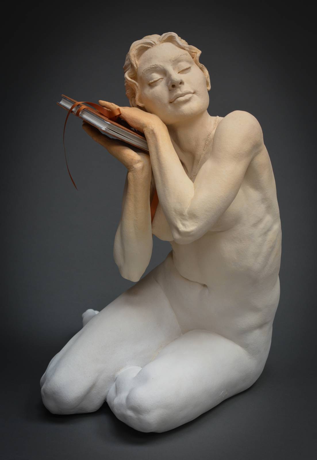
Now that I knew where the book was headed, I gave myself time to let my “back brain” work on the details while I launched into the “book holder.” Working from the idea of the book being a trove of our dreams, I chose a pose that showed her holding the book tenderly, like a pillow cradling her head – the gesture being one of her listening to what was being told in the story of her book. YūMē, a play on the Japanese word for dreams and the story of “you” and “me,” was to be soft and dreamlike. Knowing that the clay would shrink about 10% in the drying and firing, I left extra space between her fingers to be certain the book would still fit. I included details in her jewelry reflecting imagery that I knew I’d be putting in the book.
 While YūMē was drying and firing, I moved on to the book drawings. My original thought was that the exterior panels would be flat design, with blocks of color transitioning to more realistic, shaded panels at the center. At the same time, I intended to use colored pencils, beginning with cool greys, heightening the water themes at the beginnings of both sides, moving into warm greys and culminating with soft hints of color in the center panels, reflecting our dreams becoming reality. After a few preliminary tests though, I found the color presented too many additional challenges: I wasn’t able to get the blend, detail and coverage I wanted. Plus, managing color while dealing with re-familiarizing myself with drawing was a bit too much and I opted for straight graphite pencil.
Happy to be finally be starting the final, I launched in to the first panel, only to be stymied by the aggressive texture of the paper.
 As seen in the show walk through video below, the paper was conducive to water media – and pretty roller-coaster-y for pencil. I couldn’t get the darkness, tonal contrast and detail I had envisioned and found myself terribly frustrated. Colin saw me struggling and brought out several kinds of smoother drawing paper to try. Immediately I gravitated to Strathmore Series 400 Smooth in cream. Wait, what? Cream? Blech. Yeech. Yuck. But Colin encouraged me to try it and it was delightful. Fun, actually. What a difference!
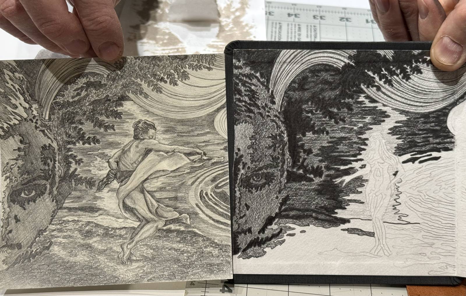
The original Hahnemuhle textured white paper with graphite on the right contrasted with the Strathmore 400 series smooth cream on the left
Panel by panel, I worked my way through the massive (for me) project. When something flummoxed me – “I don’t know how to draw rocks” “How do you draw waves?” – I could set that panel aside and work on another. They were very long days with neck cramps, elbow kinks and bleary eyes. But, it was done and considering everything, I was pleased! And some of the other options of ways the panels can go together, depending on how the book is folded:

 We finished the sculpture in warm golden tones using Golden’s SoFlat Matte acrylic. We stumbled onto this product quite unexpectedly when we received a stockpile of materials from a friend. We’d been using Golden acrylic with a matte medium, but this still didn’t get the truly flat finish I wanted. There’s always a slight “plasticky” sort of feeling and I wanted something that gives a nod to the look of fired clay. SoFlat Matte really created a finish I’d been seeking for years. Yay!
 Now we needed to mount the drawings in the zig zag format, and, no surprise, there were a few more challenges awaiting me. The original covers were a bit warped, which, after all the effort I’d already put into this project, was flat out not going to work.
 I was also not terribly keen on the red elastic band that held it together. I thought it might stretch and deform over time as elastic tends to.
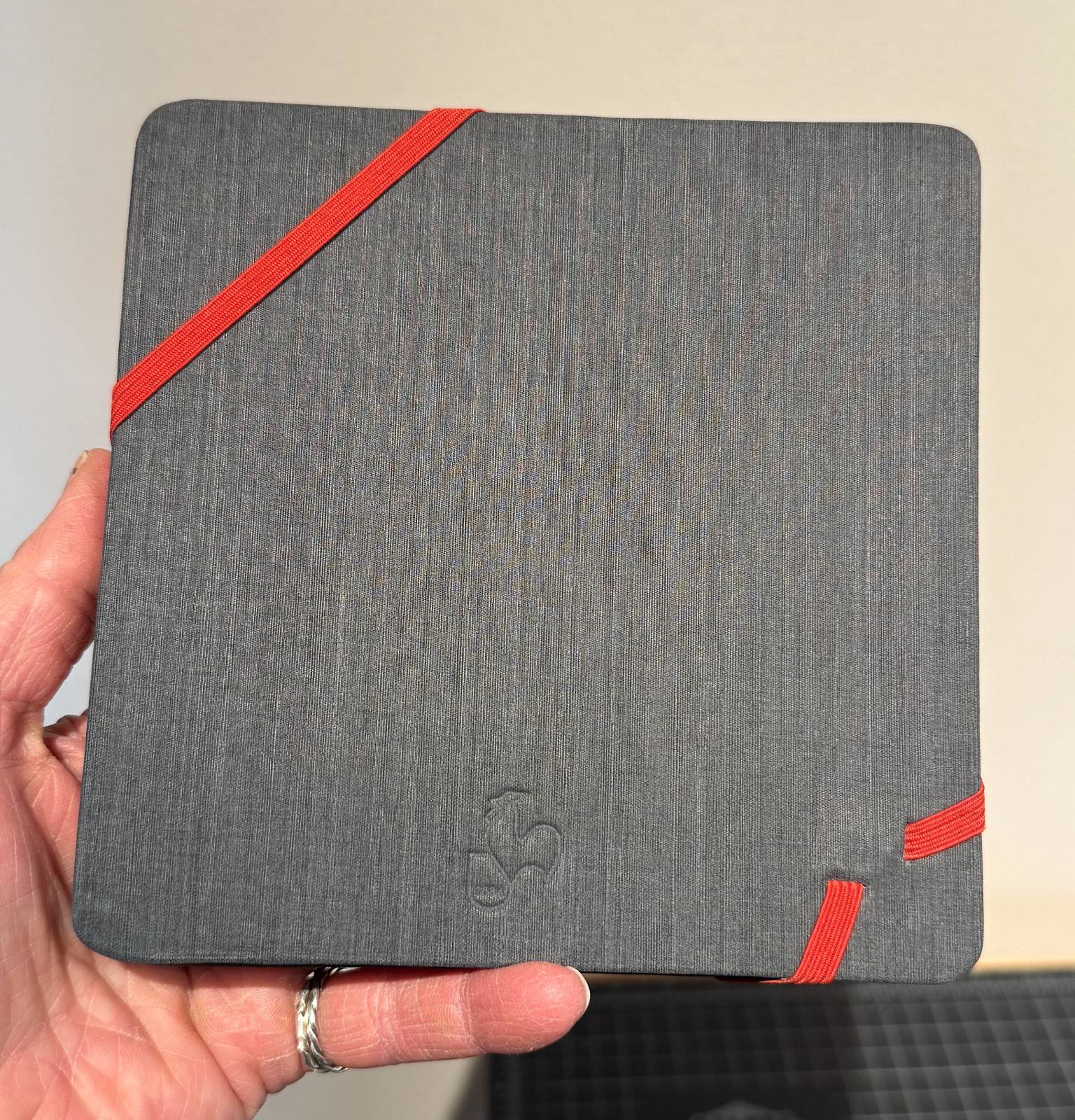 In stepped Colin. He fabricated a pair of beautiful steel covers with a rusted patina that looked like aged leather, but it turned out that they were a bit too thick and heavy – I was concerned they might stress or break the ceramic fingers, which are the most vulnerable part of a sculpture. Then he made a pair of aluminum ones which were light, perfectly flat and lovely, but the silver color didn’t mesh with the soft golden tones of the finished sculpture. We tried a variety of fabrics and other materials and ultimately found a suede leather with a satin ribbon that matched. This feels wonderful in your hands and complemented the sculpture beautifully. The aluminum edge is visible and adds a shiny accent when the book is in the sculpture’s hands and creates a frame around the drawings when the book is opened.
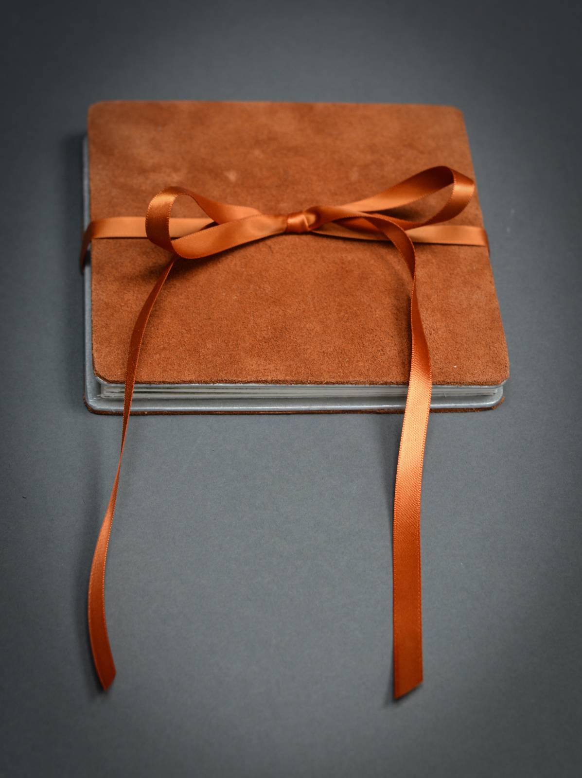 Now on the the next challenge: if we attached the aluminum/leather cover to the original book, the thickness of the original cover plus the new cover would not fit in the sculpture’s hands. We couldn’t get the end pages detached from the original book to use the inner pages as is. I bought a giant sheet of watercolor paper of the same weight thinking we could just make our own zig zag pages, but found that upon bending back and forth a couple times, the paper simply broke apart. Finally, I bought an extra Hahnemuhle book, cut out two pages which we used as new end panels. We used archival linen tape to attach them to the set of eight we were able to take out of the original book.
Now we had only to mount the drawings. The moisture in PVA bookmaker’s glue could distort the paper if not used correctly and we were far from confident that we knew how to do that without ruining the drawings. Eeks. Spray contact adhesive would be permanent, but terribly messy and with a great likelihood of messing up at least one of the mountings. Yikes.
Then we found that Grafix double tack (an acid free double sided adhesive paper) worked really well. We first adhered the drawing to the double tack. I held one side up while Colin attached the far edge,then worked the paper down onto the adhesive. We then trimmed the edges precisely to fit the panel of the book, leaving a tiny bit of extra space for the “gutters” where two pages folded into each other. Again, I held my side of the drawing up to keep it from sticking in the wrong place while Colin perfectly aligned the edges of the far side and then slowly burnished the drawing down. We pressed the completed book under a board and 40 pound sandbags overnight to flatten all the pages and edges.
Done!!! Not. Oh yeah, one more glitch. We had done sample tests of adhering both the leather and the paper to the aluminum with the PVA glue. On the test, it worked perfectly and couldn’t be removed without tearing the paper and leather to bits. But of course, when it counts, the paper popped from the aluminum, as did the leather. Oh…no… (did I mention we were on a deadline?) Running out of time and enthusiasm for “new learning opportunities,” we redid it with something we knew would stick – spray contact adhesive. This is awesome stuff, although a bit messy and nervewracking (you’ve got one shot at getting it perfect)- it creates a bond that is unbreakable – like our love.
Finally, off to the show we go.
Here is a video of how my book can be opened or “read” various ways.
Here is a video walk through of the Lettera Amorosa show, showing the 12 books on display. I am intrigued by all the different solutions and approaches presented by the artists. I also love the displays EVOKE came up with for the work. The floating acrylic shelves (not to mention the beautiful shadows they create) feel like you’re walking through fields of creative wonder.
If videos aren’t your bailiwick, a catalogue of the works in Lettera Amorosa can be viewed here:
https://evokecontemporary.com/online-catalogue/Lettera-Amorosa-online-catalogue.html
Indeed, as Monteverdi wrote in his opera, “Lettera Amorosa,”
“If my languishing glances
My gasping sighs,
My unfinished words
Have not been able so far
To bring you the complete proof of my passions…
“Read these words,
Believe this letter,
This letter in which my heart is distilled in the form of ink.”
Wow Kristine, what a magnificent project. The concept is great, and the drawings turned out really well, especially considering that you “hadn’t used pencils since I was a kid”. And of course the sculpture is awesome as usual, the posing and expression are standouts. Nice to see the walk-through video of the whole show. Congratulations.
Hi Joel, Thanks so much! Your words warm my heart and artistic spirit. I love that you watched the video with the show walk through – so many different approaches. I found many of them very inspiring. Next time, I’d like to incorporate the words of the story in the pages like Alice Briggs and Susan Guevara. I thought those two books were exceptional.