David Palumbo
In the documentary Pumping Iron, there is a scene in which then-reigning Mr. Olympia Arnold Schwarzenegger is advising a young bodybuilder on his posing technique. The young man, going through different poses, tries out one in which his torso twists into profile and his left arm is extended with his hand pointing forward. Arnold immediately jumps on him for looking too timid:
Schwarzenegger: “Remember one thing when you pose. A lot of little guys, they have one habit, and they hide away when they pose. When they do an arm pose, they do like, like this [he hunches his shoulders forward and tucks his chin and elbows in]. Okay? And a big guy will come right out with his arm [flexes his bicep high with a tall, confident posture]. So never do that. Never hide away … Show them the whole thing. Make the move.”
I think this is powerful advice and easily related to being a visual artist. In a sense, this is about confidence, which certainly makes a tremendous difference, but it goes beyond that. The deeper issue this gets at is giving total commitment to your choices.
I was told something similar by one of my mentors when I was a student creating my very first portfolio pieces. I was doing a painting of a dragon and this dragon had little dragon horns coming off of his head. My mentor took out a piece a tracing paper and laid it over top and started drawing big impressive fearsome horns, telling me “if you want to put horns on your dragon, really go for it. Don’t make these little horns, make them big. Always see if you can push it further” and he then went on to do the same with the wings. Big, bold, decisive shapes. My shy little dragon suddenly looks believable.
I think about this on nearly every painting that I do. It does not only relate to designing creatures by far (something which I do fairly little of) but every aspect of designing a picture. You want to make a particular portrait in the composition your focal point? Push it. Do it with full commitment! Don’t just use contrast, bring in some leading lines. Bring in some color cues. You want to set a piece in the Victorian period? Push it. Don’t just put the figures in generic Victorian clothing, research some interesting and striking costume ideas. Design the hell out of the background. Furniture, architecture, wall paper patterns, hairstyles. Total commitment. Emotional mood in a painting, interesting lighting, design of characters, creatures, costumes, objects, compositional choices… every step of the way you need to eventually get out of the middle of the road and make decisions.
Don’t be timid, lazy, or uncertain. When you have considered various options and are ready to make a choice, put all of your faith and enthusiasm into it and always test if you are pushing your decisive moments far enough.
Just as in bodybuilding, the “little guys” in illustration hold back. The champions step forward and hit us with bold, authoritative work.
Show them the whole thing. Make the move.




Great advice! Thanks for the reminder.
Excellent post (and excellent painting as well)! I had an illustration professor once say “It's better to push an image too far than not enough.” That quote has always stuck with me, and I often remember it when doing things besides art as well.
Arnold was famous during his bodybuilding days as being too cocky, a bullshitter and sort of an ass, giving people “All the wrong advices”. Then again, that's how you conquer the world. I'm saying this because, although his advice there may sound reasonable, I'm not sure how it should translate in art, or in bodybuilding for that matter. Ask Shawn Ray about the second one.
I'm saying this because, like many things, this piece of advice is conflicted by other pieces of advice.
It's hard to find this balance when you're learning, and going too much for something may be bad I think, especially if you don't like it. For instance, the advice for the horns of the dragon is something someone seemed to use for armor. Now we got this Warhammer and Warcraft style with characters carrying a castle on their shoulders. Sure it's successful, but I hate this style, and I wouldn't do Warhammer art, I just can't get myself to draw huge armor. Unfortunately this trickles down to other more “realistic” art pieces where the armor is still pretty ridiculous.
I bet the concept artists for the new Ninja Turtles movie thought the same thing. I have yet to meet or read of an artist who liked those designs! Traditional bamboo “armor” over a shell? 300 gadgets? “Teenagers” with more muscle than all the Mr. Olympias combined, yet more agile that Bruce Lee and Jackie Chan? Yea, it's a movie but this hyperbole is too much to help you suspend your disbelief, and those designs are just…bad.
So, where's the balance point? We admire and study older artists who sometimes barely clothed their characters. Look at Frazetta's Conan and other barbarians. Some loincloth, maybe an intricately ornamented weapon, minimalist armor, some fur, and there you go. Deathdealer is his most intricately designed character I can think of, and he pales in comparison to all the stuff artists put on their characters today. Nowadays, everybody and their uncle is drawing and painting barbarians with 2 tonnes of metal armor, 80-bladed 70-foot swords, helmets with horns the size of a Brontosaurus (yea I know, no such thing) and 1,500 skulls hanging from their groins. Are they any more kick-ass than Conan? They don't come close, not in a million years, not even when the best of artists do it. And at the same time, some people complain about bikini armor!!!
I'm just trying to figure out the balance in all this. Dave's post is awesome, and it refers I think to what is said about old illustrators, that is to “make it epic”. It can be frustrating at time tho when making it “big”, “loud” or whatever, get's confused with “epic”. Having the confidence to make the choices for your designs bold and unapologetic is good, but shouldn't there also be the wisdom of “how much” boldness etc should be in there?
Great advice. Always a good reminder.
No no no. no. Every piece of advice you'll ever hear from me should be taken with an implied “don't make work that you don't want to look at.” That is rule number one.
Maybe Arnold and the dragon example implied “make it epic” but that is totally not what I'm saying. Do I design that way? I don't think that I do. What I'm saying is “commit to something.” Tossing a mountain of gear on a character design and intricately detailing all the armor and weapons and whatever is committing for sure, but only choose that path if that is what you want to do. Just because a choice is louder does not make it “right,” it just makes it appropriate for specific audiences. Likewise with a quieter choice. What is important is making the decisions and not hedging with wishy washy lack of direction. When we begin, most of us make our moves too meekly. We're afraid to go too far. Go too far, it is actually a really good exercise. Most of the time you'll find you were actually aiming short of the target. Pushing yourself like this can teach you a lot about where you want to go with your art. Then we get to spend the rest of our lives trying to hit it just right.
Think about what you want to achieve, in specific pieces and as a body of work, and be *decisive* in pursuing and achieving it. If you can do it without tired tropes like massive swords and whatnot, all the better.
yes, totally! It is more a life philosophy than just a painting philosophy. My expected “too far” is usually almost far enough in actual practice
Over the past few years, I have noticed that the singers I love the most absolutely throw themselves into what they are singing. They open their mouths wide, they screw their eyes shut. They are not the least bit self-conscious or timid. They convey that they completely believe in what they are doing. And I have been wondering how this applies to painting. I think you've just explained it well. Commit to your piece, believe in it. Perfection is not a requirement, but passion is.
I understand Dave. I used the character design aspect just as an example. It could have been any part or parts of the picture making process or goal.
You've made the point even more clear now, which is great, cause here's the heart of my confusion… how does commitment pair together with critique?
Let me give you a personal example, of what kind of boat I was in a couple of years ago. I love making pieces with the triangle spotlight composition. I find them dramatic, I do love exploring other compositions, but these I like a lot for aesthetic reasons and cause they may serve my preferred narratives more. Now, critiques of my work, regardless of other skills, would also include expanding this, which is OK. However, there's times when I had to force myself into doing something in a different way, so as to avoid a variation of the setup, even if it made for a worse (in my opinion) image.
Practically, I have seen portfolios of some professionals which are mostly, let's say, portraits. I don't know what would make such a portfolio (save the technical excellence) not get the “expand your composition setup” critique, but this practical example makes me wonder how much I should follow said critiques, or advice such as your own. I personally have never minded the “monotonous” setups of such portfolios cause the people do it so damn well, they OWN their specific setups, there's no reason to even care since their work shines, but that's just me.
I guess what I'm trying to say is “when” and “how much” of whatever we commit to should we commit to…if that even makes sense…Again, it's not that I want to do only specific composition setups, I just don't want to have to think “aw man, I'm gonna have to do this differently, to spice up my portfolio”, when the narrative, my intentions and feelings for the piece would be best served with this setup.
See, the timidness comes from the contrast of critique/advice one may get, which contradicts your article (which is right up my alley), and the desire to follow one's goals. When you're a beginner, you feel others know best to the point that they maybe even know your feeling more than you do.
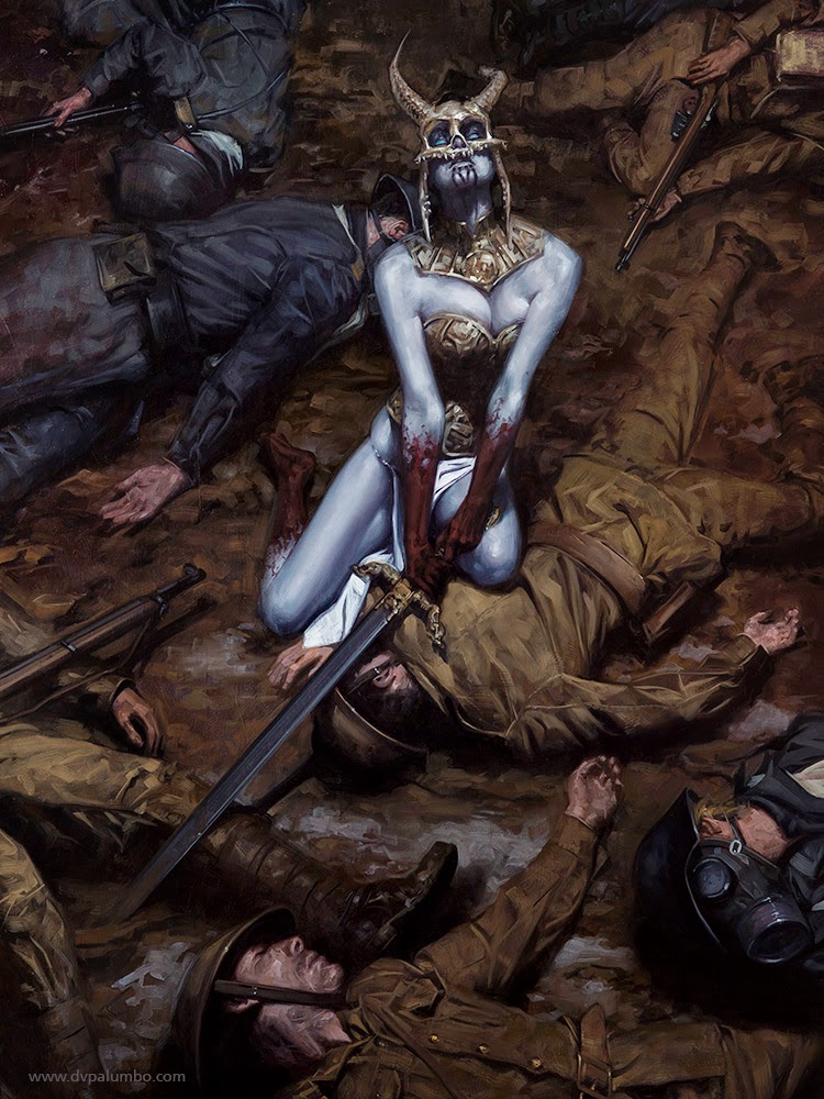
Brilliant painting! What's the narrative!
I think it would be a call you have to make based on the battle (that specific painting) as well as the war (the overall body of work) and being mindful of your desires and intentions for both. I have some default solutions to compositions which I constantly worry that I overuse. The correct this, I make a point to explore potentially more interesting solutions as often as possible. Some times I find an unexpected approach and am happy to both create some more diversity in my body of work as well as do something which is not the first thing that a person might expect to see. Sometimes I don't find it and that original plan wins out. Sometimes I don't bother looking because the point of the image really fits perfectly with my comfort zones anyhow.
What I would not do is try finding a solution with the mindset that it will be inferior but necessary to add variety to my portfolio, because that is almost certainly what you will end up with: an inferior idea. That is, in a way, non-committal. Don't pursue a direction that you don't believe in. Challenge yourself to explore other ideas but always go with the strongest one.
If you get the comment fairly often that your portfolio is compositionally boring for too much sameness, that could indicate a problem not just in compositional placement but also lighting, color, figure scale, type of narrative, mood, etc. If you are consistently hitting the same note in one of these areas, you probably will want to make an effort to build greater variety in to the others. Personally I like seeing in a portfolio many points of view of a similar world like a glimpse at all of the possibilities that exist there, but it can become tedious if it feels that each image is a recreation of the last one.
I guess that boils down to: don't be shy to play in your comfort zone, but make an effort to find opportunities to go beyond it as often as possible. Always pick the best idea.
I'm glad you shared your personal approach. It helped a lot to see that some of my thinking is shared by pros like yourself. I have been exploring more of what I want to make the past year, and avoid what I don't want to make. Critiques and comments on my portfolio are few, since I don't dare ask many artists and fewer have time to take a look, but a few who I have asked and gave me much help, such as Lars Grant-West, touched on more technical aspects because it shows that I know where I'm lacking, I really do…it's the sometimes conflicting information (which mostly comes in forms of mass opinion in threads or analysis of other's work, or general suggestions to new artists) that made me more timid in the past.
Sorry about my winded replies. That last paragraph you wrote just confirms to me that I'm taking the right direction in this matter and reinforced the gist of your article. Thanks Dave.
Sure thing!
I really see that in my own work!! It's hard to push yourself far in every way! Thank you for the extra shove and permission to have courage!
Great advice! Thanks for the pep talk!
This may be some of the best advice I've read in a good long time. My lack of confidence in my work is probably the biggest reason I hold back, and am timid with everything I do. I'm so terrified if it being ripped apart and/or coined as “unoriginal”. The unfortunate outcome is that everything comes out stiff and static, and, well, I'll just say it…. BORING! I've struggled with this for YEARS, but I'm working hard to push through it.