Ninety-nine percent of the time a sculptor’s work is reduced, compressed and flattened to a 2D image to be seen on the internet. Add the vagaries of lighting and the piece you see on Facebook or the like bears little resemblance to the actual sculpture. If the artist wants their work promoted, they’re forced to pick a money-shot. But unless the piece is a sculptural relief, there’s a whole lot of stuff left unseen that will never be discovered unless at a live show or in a gallery setting.
Some of the most interesting, compelling and inventive sections of a sculpture will remain hidden from the public view. And that, my friends, is a crying shame. A good part of the sculptor’s job is to move the viewer around and through the piece. And in that, expand or augment the narrative. Or sometimes, there are just some really cool bits a sculptor will include just for shits and giggles. There is no part of a statue that is irrelevant. Even sections that have been intentionally under-sculpted have intent.
I’ve asked three brilliant sculptors to select one of their pieces and walk us through it, starting with the money-shot and then taking us on a tour of the hidden beauty and mysteries few, if any of us, will ever get to see.
Calling Virginie a doll artist is like saying Michelangelo was a ceiling painter. Her craftsmanship is always at the service of her narrative. Both are exceptional.
 |
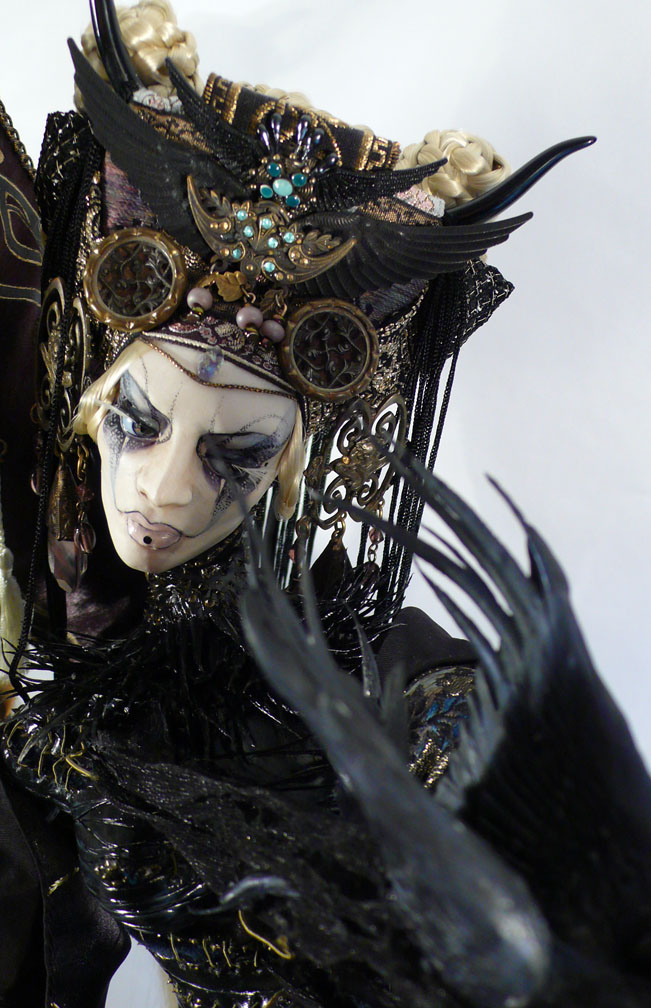
| Morrigan, 83cm, polymer clay and mixed media. |
This was a complicated piece to make, with lots of intricate details. I wanted the work to have some kind of a graphic movement that could be read from a distance. (ImageV1)
Sometimes you can pay too much attention to the details and lose sight of the general composition. It’s not easy to make a composition that works in 3D. You think about it from that one special angle, but you’ll have surprises (good ones sometimes) from other viewing angles which can give more information, expressing something new from a slightly point of view. That’s why 3D is always best experienced in person!
I love it when an artist works on all levels; general mood, composition and details that brings the viewer in for a closer look. That’s when you realize that all those tiny details participate to confirm the impression you had of it at first sight.
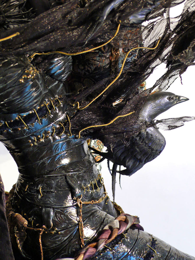
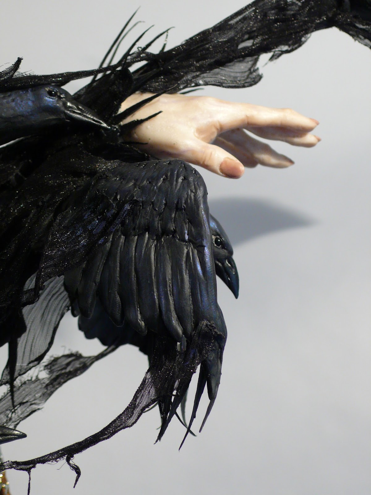
The Morrígan is a goddess of battle, strife, and sovereignty. She sometimes appears in the form of a crow, flying above the warriors. I made the crows coming out her torso to blend with the movement of her costume. The one that comes out of her hand makes a more obvious statement. You see where the crows come out of her body, the laces of her suit are undone to give them passage through her. I also added some fabric to give the impression of some magic stuff coming out with the crows. This is one of those details that adds depth to the story the closer you look.
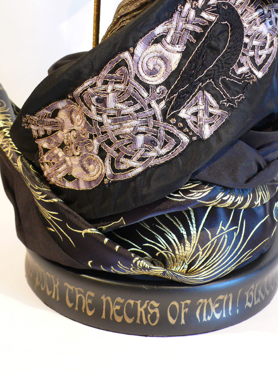
I also wanted to make some embroideries, write a sentence on the base, give some Japanese/Russian/Celtic mix to the piece, and work with very dark colors (not the best choice to make the details pop out) and give a wavy line to the whole thing.
I took elements from the Book of Kells and added the crow, with the colors matching the headdress. The text on the base is decorative as well as informative. It’s a part of mythical Irish literature called, Táin Bó Cúailnge (The Cattle Raid of Cooley) in which Morrigan appears. Here she is pushing men to battle.
The problem is to keep the piece from looking unfocused, with all the intricate details. Things must pop clearly the closer you look. The details must serve the whole piece. I chose white flesh because of the contrast with all the black, and the general line brings your eye to the hand that sends the crows. I tried to make this hand calm to contrast with the battle theme.
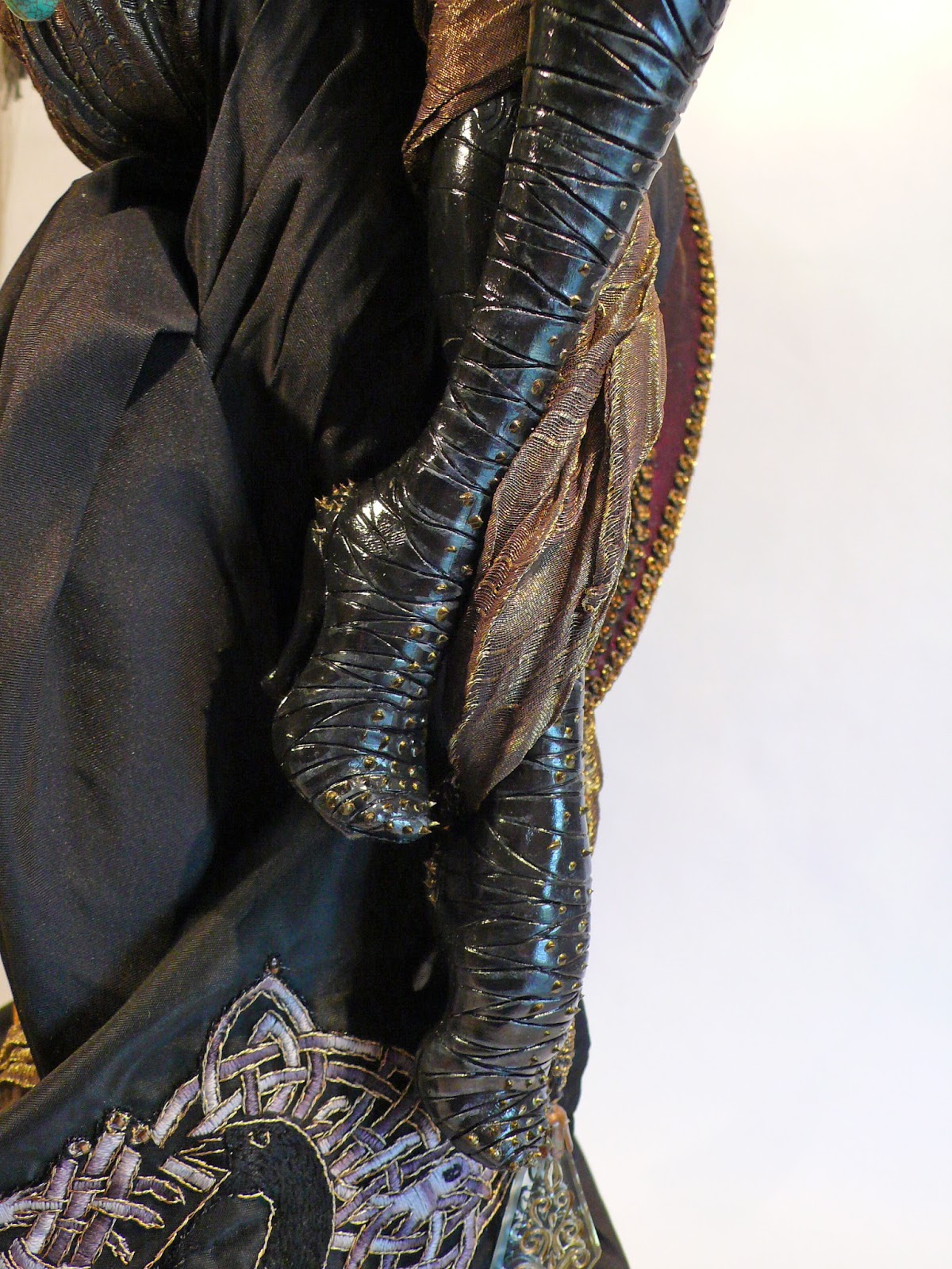
She is definitely sexy, at least to me, and I felt this goddess in a cat-suit with heels was very appealing and to have a bit of fun
I’ve included many things in the headdress: the black wings and the horns. But if you look at the whole piece, you don’t notice the wings. The horns give a kind of warrior feel to her headdress. The same design elements also work with the top of the banner post.


So beautiful, wonderful to see it up close this way. Amazing work!
This is beautiful, it's always wonderful to see sculptures and dimensional work. I appreciate the different angles and am excited for parts 2 and 3! I'd also be very interested if any of these three sculptors would be willing to share process shots, at some point.
Jameson Gardner
When I saw this up close I thought Virginie had wrapped leather or faux leather around a figure but all of that wrapping is carved. The little sewn details are magnificent. Really pays to see these in person. Thanks Tim and Virginie.
One of my all time favorite artists. Her work is sheer brilliance.
Stunning
Pinhopes is a new age recruitment destination that directly connects active job seekers with employers and is focused on improving the pace, quality and reliability of the online recruitment process. Visit for more, https://www.pinhopes.com
YouMart is an online supermarket with a range of products like Food & Groceries, Fresh fruits & vegetables, Fresh Meat & Seafood, Imported foods, Baby Products, Office Stationery and many more. For more, http://www.youmart.in
There are currently more than 250 micro-credit institutions operating in the United States, each with its own focus and minimum requirements for cash payday loans qualification. Small Business Loans from require the applicant to have a credit score of at least 575, have not filed for bankruptcy in the previous twelve months, in order to be current on all bills and expenses (especially rent or mortgage payments) , and to have less than guarantor loans 3,000 in debt. Small businesses should operate, have all licenses and permits necessary to conduct business, and have a regular cash flow sufficient to make the monthly payments of the guarantor payday loans . Other micro-lenders have other rules, some of which are much less severe than those.
http://tiny.cc/n7qygx
http://bit.do/onQc
Amazing Work!
So honored I get to look at this piece everyday and marvel at it's artistry….