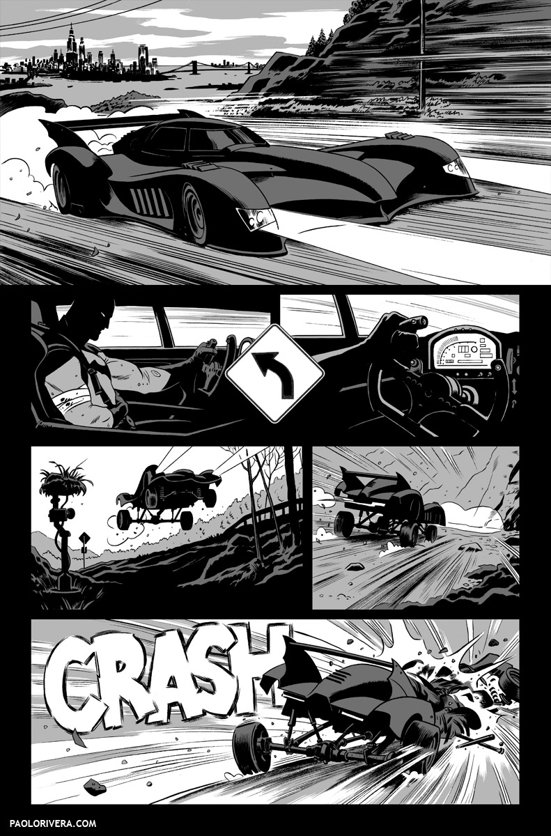
 |
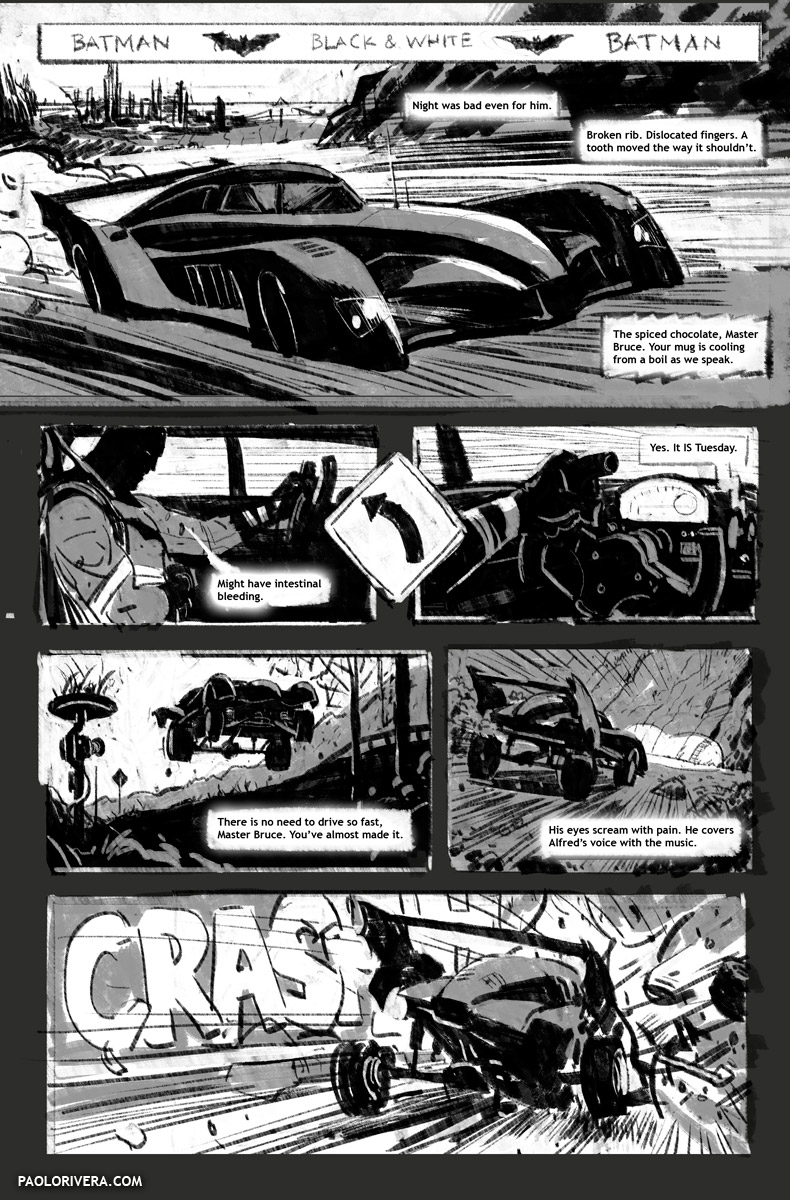
| BATMAN: BLACK & WHITE #5, PAGE 1. 2013. Ink(ed by Joe Rivera) on bristol board, 11 × 17″. |
When I was first invited to contribute to Muddy Colors, part of my role was to be the designated “comic book guy.” As it turned out, that was roughly the same time that I stopped making comics altogether. I was still very much in the business, but I was really only a cover artist for most of last year. The only exception was a an 8-page story for Batman: Black & White #5, written by Ivan Brandon, which just recently came out.
Doing just a handful of pages reminded me not only of how difficult it is to make comics, but also how fulfilling the challenge can be. My goal for 2014 is to get back to doing what I love.
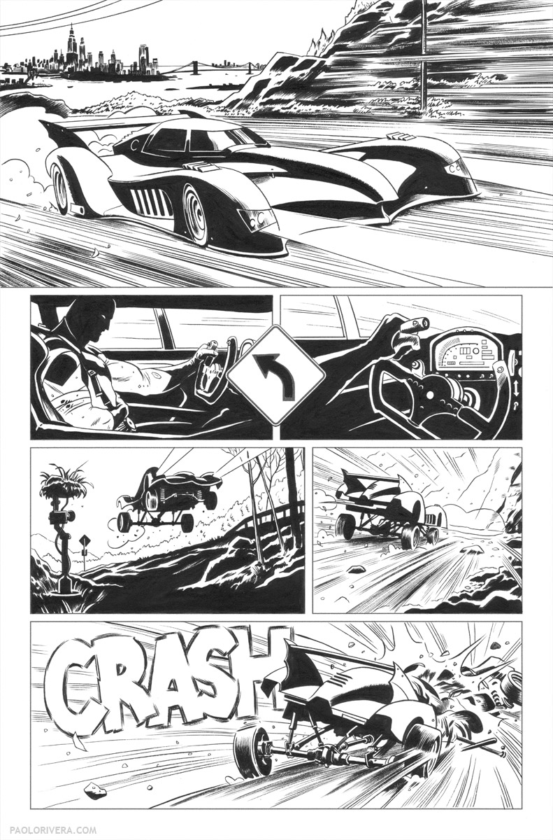 |
| inks by my Dad, Joe Rivera |
If you’ve seen my previous posts, you’ll probably recognize the familiar steps I take to create a piece of art. As with my covers, I work with my Dad, Joe Rivera, to help speed up the process. Pictured above are his inks, which are done over blue-line prints of my pencils, pictured below. I create the borders digitally, along with other technical elements — such as the road sign — and leave those to be printed in black.
If you cycle between the finished page and the original inks, you’ll see that I sometimes go back in and “ink” digitally. I’ve gotten better at “spotting blacks” without actually putting ink on the page, but it can be tough to make those compositional choices without seeing the results in front of me. In particular, you can see that I blacked out the right rear fender in the 1st panel and most of the steering wheel in the 3rd. I’m always looking to get away with the least information necessary, so if I ever see a way to take detail out of a composition without losing the subject matter, I go for it.
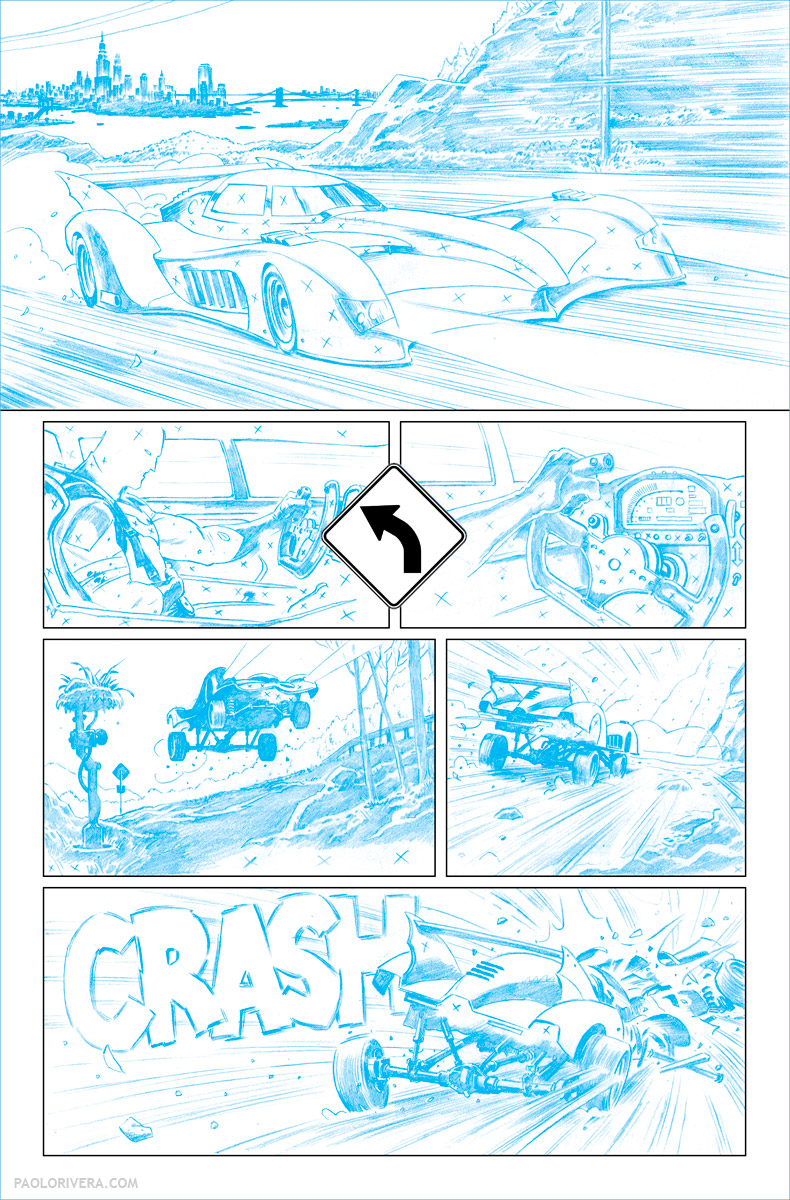 |
| blue-line print of pencils |
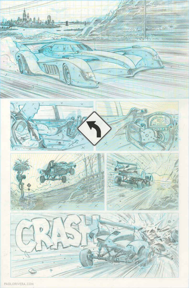 |
| pencils over digital sketch |
 |
| digital sketch with perspective grids superimposed |
While I’m not the one who ultimately letters the piece, it’s still my job as the penciler to leave an appropriate amount of space. I always share these sketches with the letterer just in case my intentions are not immediately apparent.
 |
| digital sketch |
 |
|
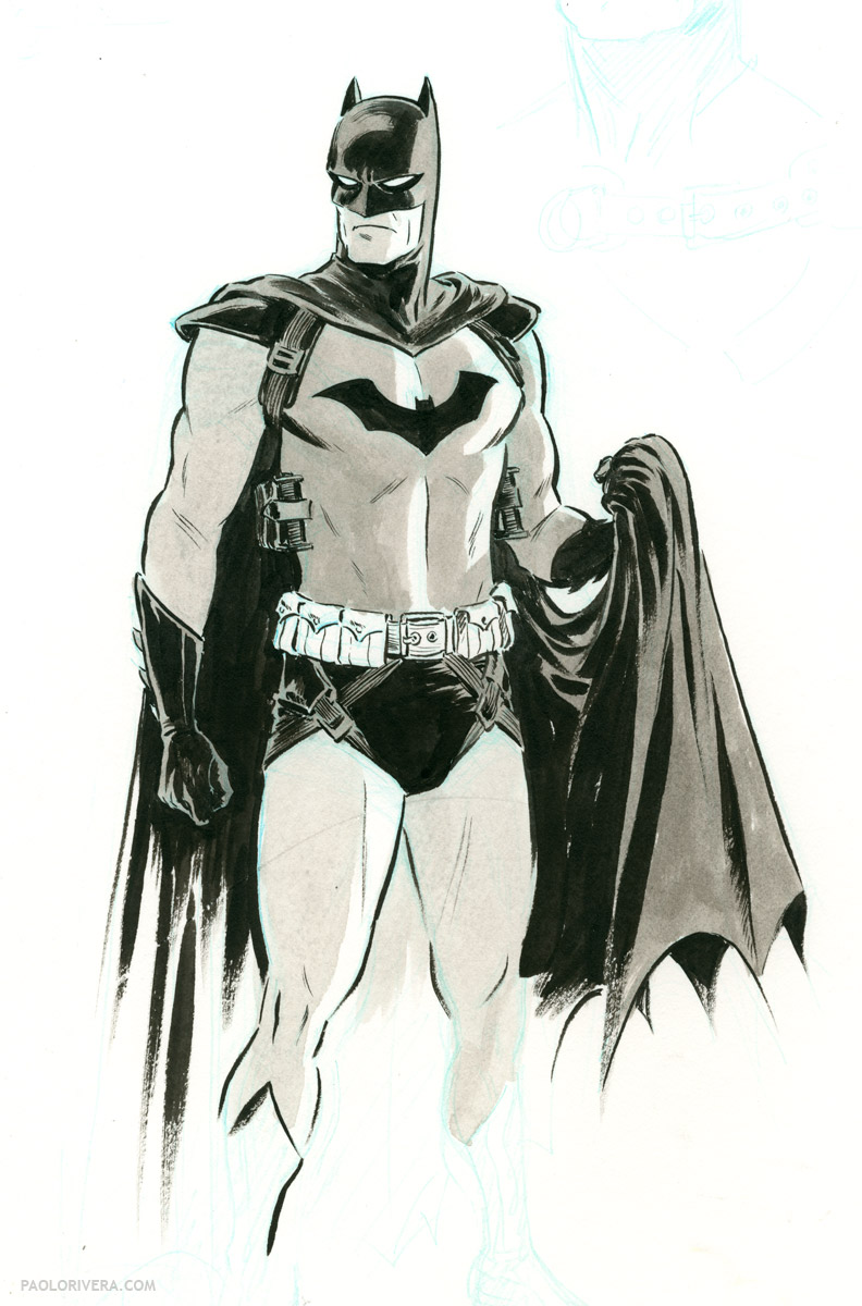
Batman Study. 2013. Ink on bristol board, 11 × 17″.
|
All that being said… it’s just plain fun drawing Batman. It was a dream of mine since I was a little kid, so I’ve had nearly 30 years to think of what my take on the Dark Knight would be. He doesn’t wear a cape — it’s a parachute. Those aren’t undies outside of his pants — it’s a harness. His Batmobile is built like a low-slung race car, but with a hydraulic lifts for off-roading.
Basically, I got to nerd out for 8 pages. I hope others can too. For a look at another page from the story (as well as some Wacky Reference Wednesday action) check out this previous post.



Great art to go with a great story. Thanks for the behind the scenes look!
Thanks!
Any chance you can make it to BigWow comicfest in San Jose?
Unfortunately, not this year — I've got a wedding to attend that weekend. I missed it last year because I was in the middle of moving (though I did drop in because I happened to be moving nearby). Anyway, I hope to make it next year. My art dealer is involved with the show so it's only a matter of time.
Hi very nice blog. Good usage of Hydraulic Lifts. These lifts are very useful and saves a lot of time. Thanks for posting this blog.