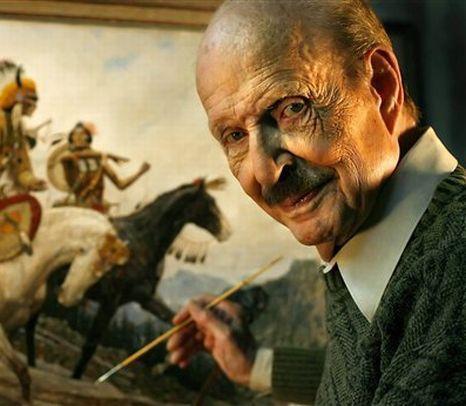
It isn’t often that you get to meet one of your childhood heroes. I grew up with my walls covered with paintings by Arnold Friberg. I had the chance to meet Friberg in 1997 while I was attending school at BYU. It was a great meeting, with lots of the illustration students in attendance. He gave a great presentation and spoke about many of his more famous paintings, including his official portraits of Queen Elizabeth and Prince Charles, as well as his experience working with Cecil B. DeMille. Afterwards, students could go up and shake hands and chat. Friberg was nice, but wasn’t engaging in a lot of conversation. He was cordial to be sure, but a little distanced.
I knew that he was from Scandinavia (his father was Swedish and his mother Norwegian) and I had recently lived in Norway. I also knew that he grew up in Arizona, my home state. So, when I approached him, I said “Hi Arnold, my name is Howard Lyon and I have lived in Norway and grew up in Arizona and I want to be an illustrator!” I must have struck a note with him because he spent the next 30 minutes chatting with me. I will share more of my conversation as we look at some of his paintings.
Friberg was known for his extremely masculine and stylized figures, painting subjects of men’s adventure as well as military and sport figures. He also did a lot of western work, expressing great admiration for the Native Americans and historical figures. The Royal Canadian Mounted Police were also among his favorite subjects. He painted them so well, and did so many (over 200) that he was made an honorary Mountie, the only American to receive that distinction.
In 1940, Friberg moved to New York where he studied with Norman Rockwell and Harvey Dunn, a well known instructor, illustrator and student of Howard Pyle. When WWII came around, Friberg joined the army and headed to war. Because of his background, he was offered a safe position creating art for the War Department, but instead chose to go fight on the front. After the war, he quickly set about working as an illustrator.
Enough biography, lets look at some paintings. I am excited to share these because I think for many of the Muddy Color’s readers, Friberg might be a new find.
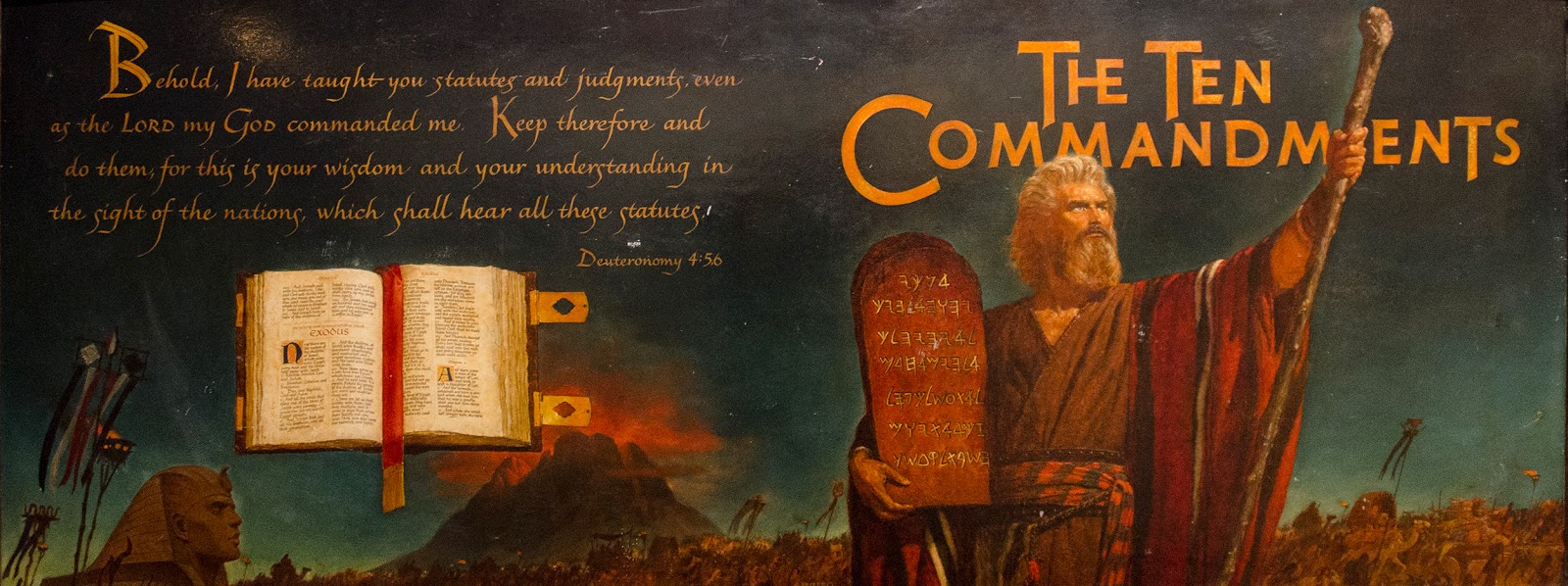
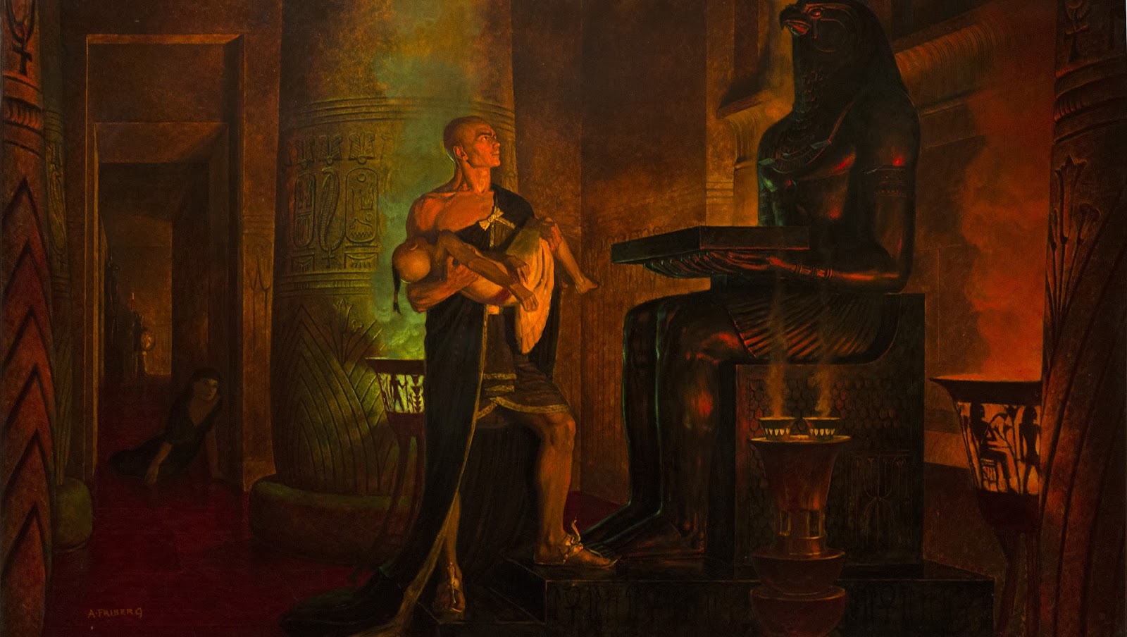
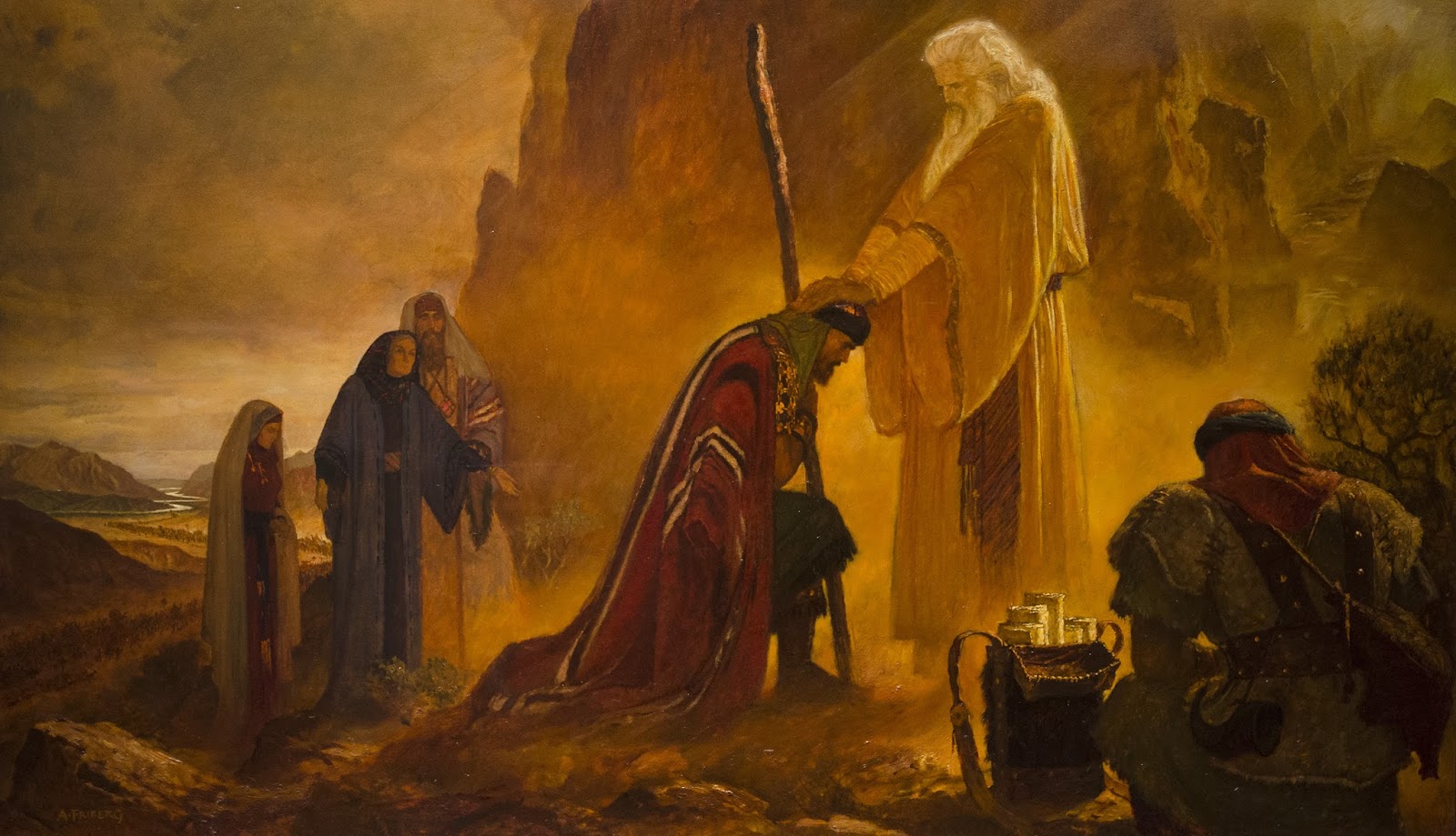
Friberg was approached to do come conceptual work for Cecil B. DeMille’s movie “The Ten Commandments.” He did mostly character design, but also some set and stage design. He ended up winning an Oscar for his efforts.
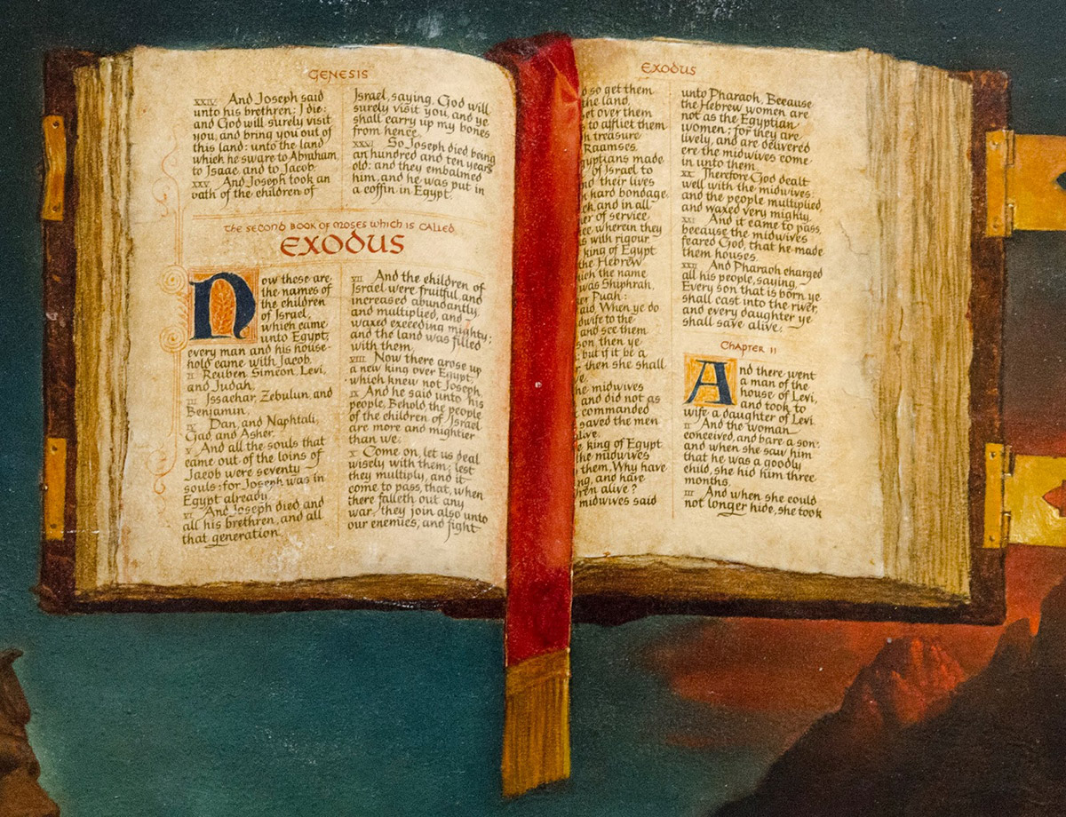
I thought the lettering in this painting was really cool. You will see this throughout his work actually, lots of beautiful hand-painted lettering.
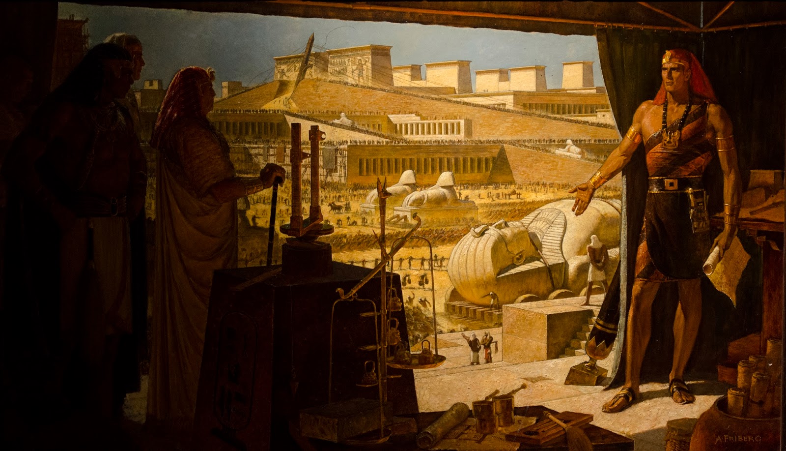
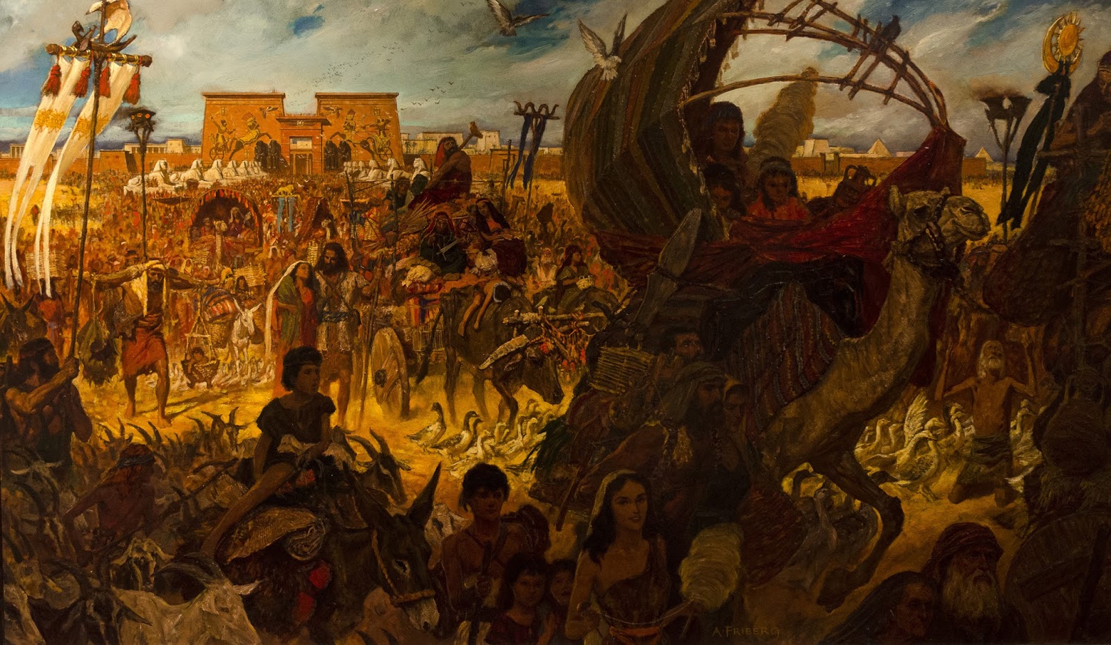
I really like the use of big dark shapes in the composition below. Also, notice some nice little dramatic touches, like the obelisk being raised in the far background. It looks like one of the guide ropes has snapped loose. The thousands of extras for a scene like this were par for the course in Hollywood in those days.
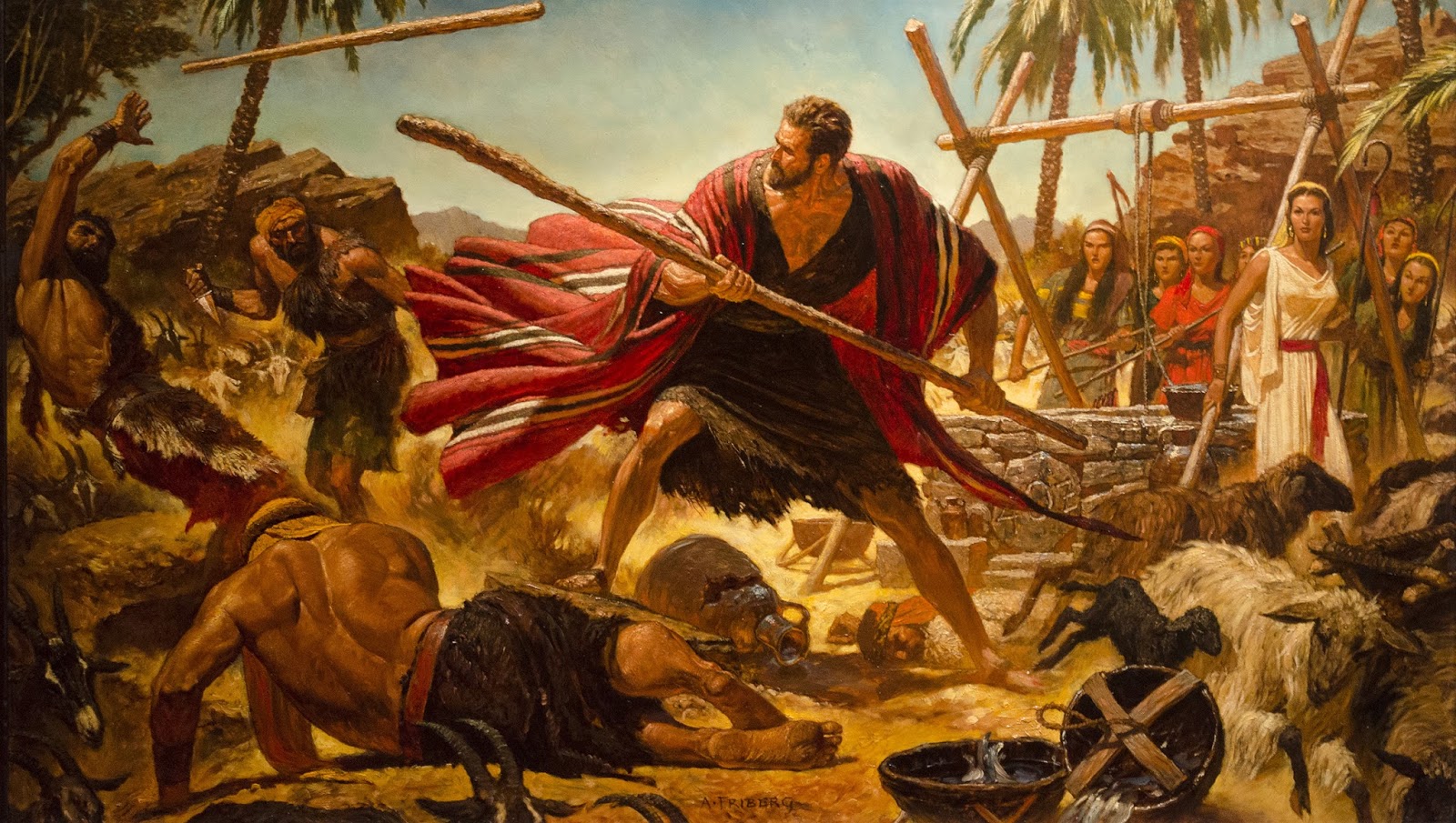
Here is Moses defending the daughters of Jethro. As a kid, I always loved the massive, stylized figures. Their physiques are almost more like a superhero. Looking at some of Friberg’s work now, I see a little more stylization than I care for, but it still inspires.
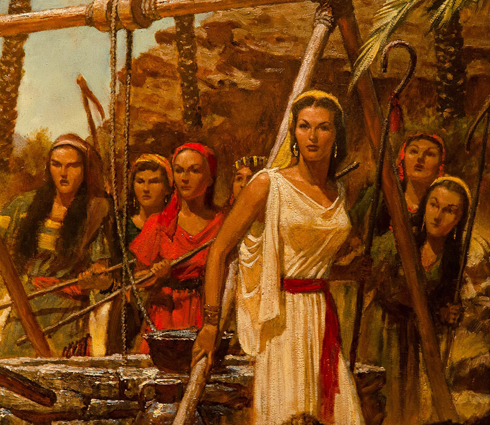
You will start to see a signature in the faces as you view more of his work. Strong chins, narrow but strong noses and a heavy brow, even in the women.
I love that this is essentially concept art. It would be a neat experience to do some large scale oil paintings and costume studies for a video game these days. Studio AD’s, let me know if you are interested!
A close up of the brushwork and texture
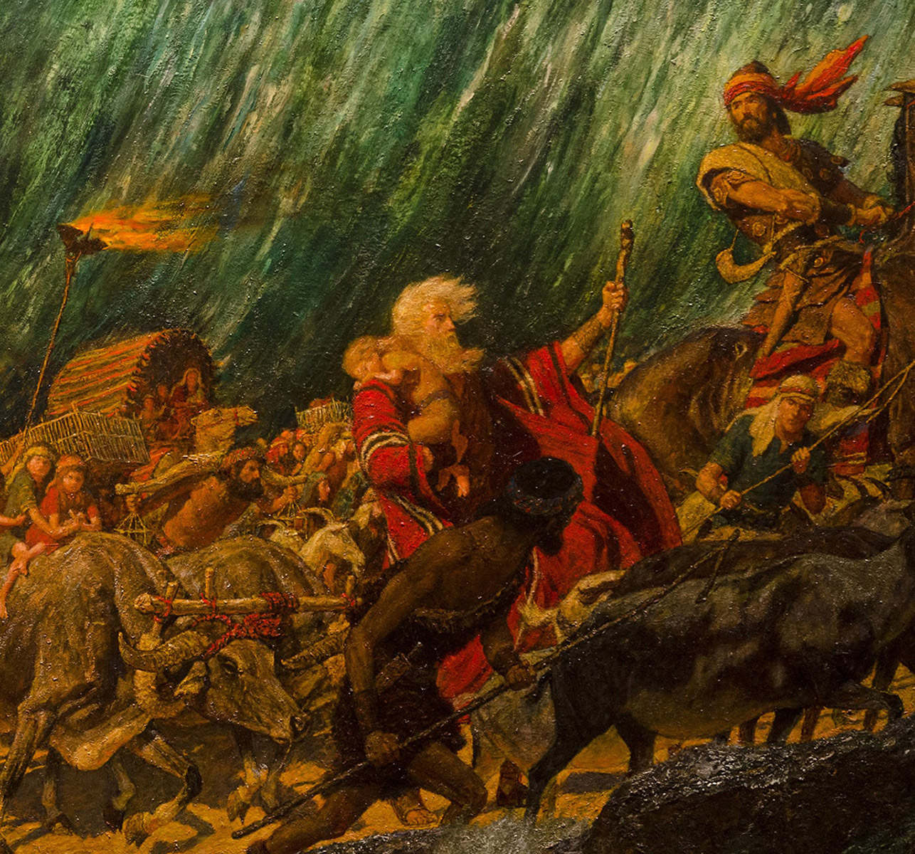
This next painting was pretty epic to see in person. Quite large and full of great action. The colors are really intense in this painting. I love how all the lines and figures are leaning to the right of the piece, mimicking the wall of water behind them.
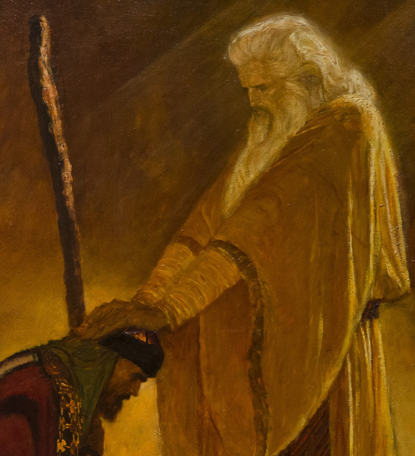
Friberg’s framing of Moses, his white hair against the dark background and his red robe, really catch your attention in person.
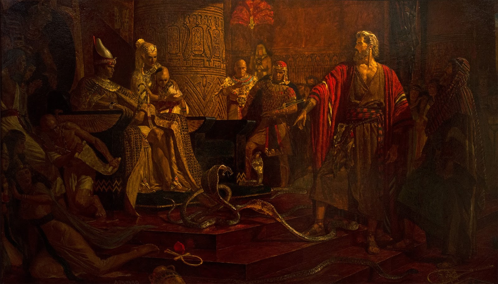
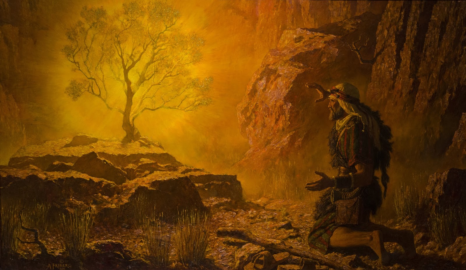
I love this next painting. This might seem out of left field, but it really reminds me of Brom’s work, which I also love. There is a restrained use of color and values here that is shared with some of his work.
How epic is that hair!? You would have to have hair like that to defy a Pharaoh I think. The Pharoah would be thinking, “Man, didst thou see his amazing hair?!?” while all the Hebrews are sneaking out the front gates. If they ever have a good cure for this shiny head of mine, I am starting day one on this hairdo.
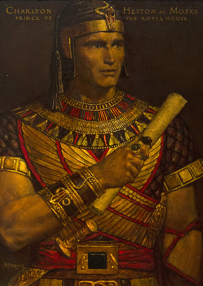
The next few paintings are just a few of about a dozen paintings of real actors in potential costumes for the movie. Charlton Heston as Moses
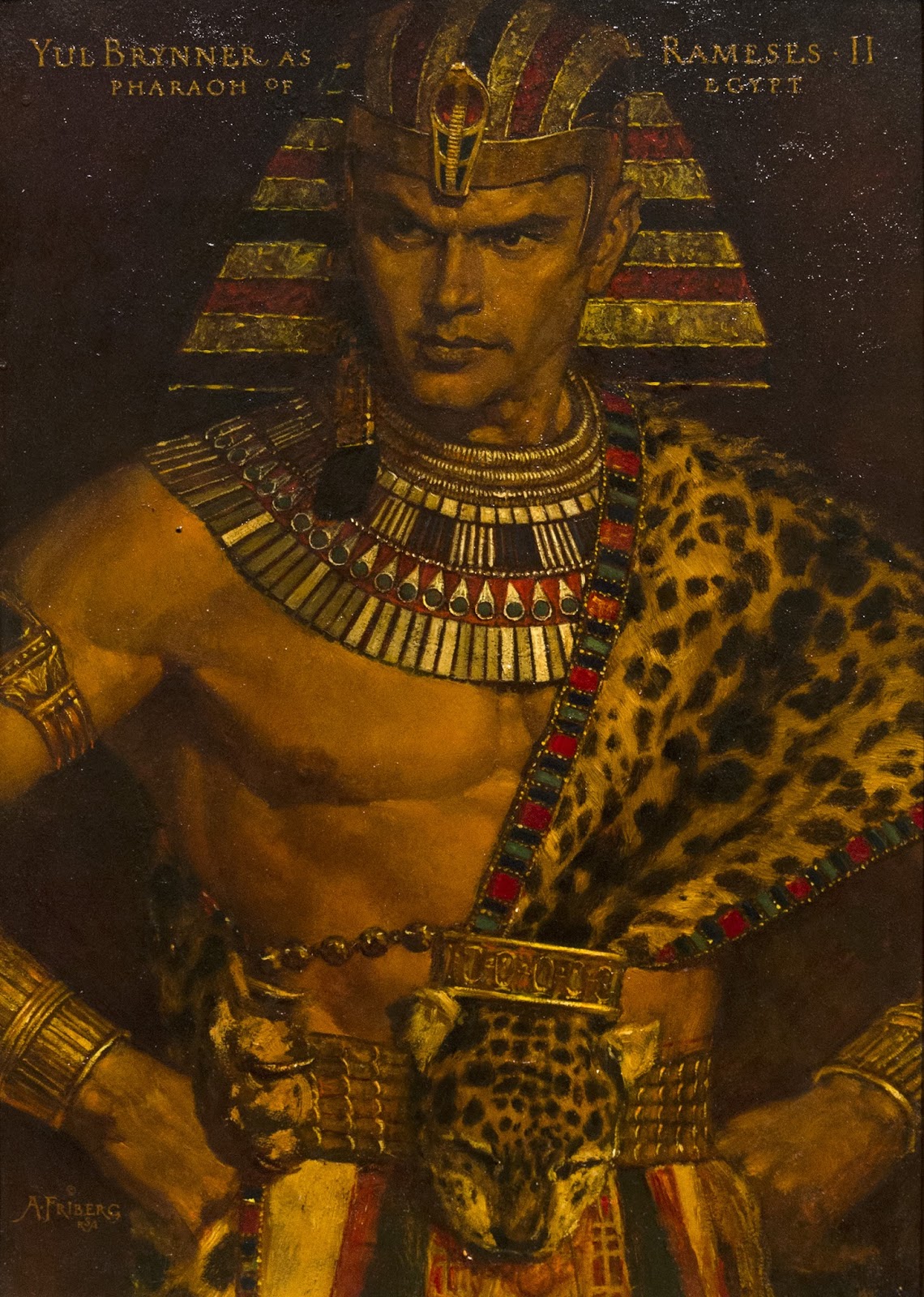
Yul Brenner as Ramses II. This painting is just awesome. Very powerful, great costume design and really captured a great likeness.
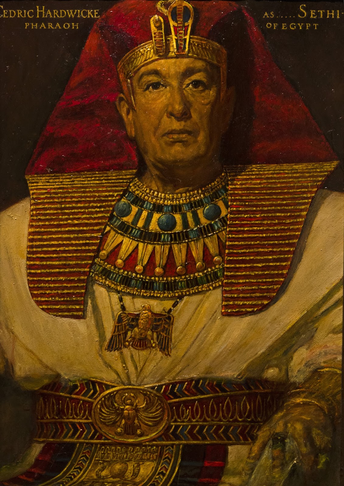
Cedric Hardwicke as the Pharaoh Seti.
I started to notice something interesting in Fribergs work. He has a definite and unique texture quality. Almost like the paint is put on when it is just starting to dry, but then the varnish and glazes give it a jewel/enamel like quality. On top of that, sometimes there is a transparent resinous texture on top of the paint. You can see it here. It is almost like amber. That glob in the middle had no pigment in it, just clear texture.
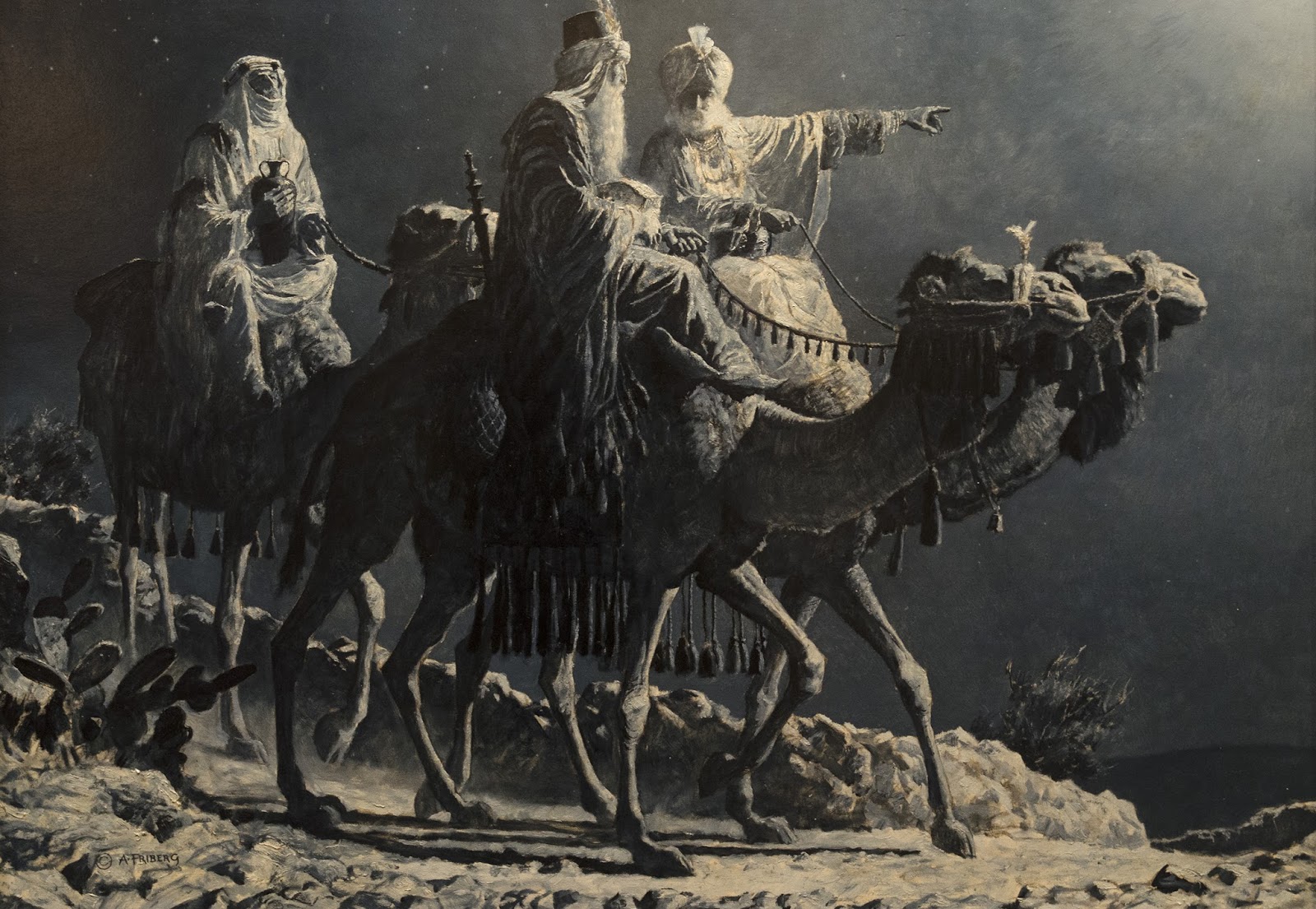
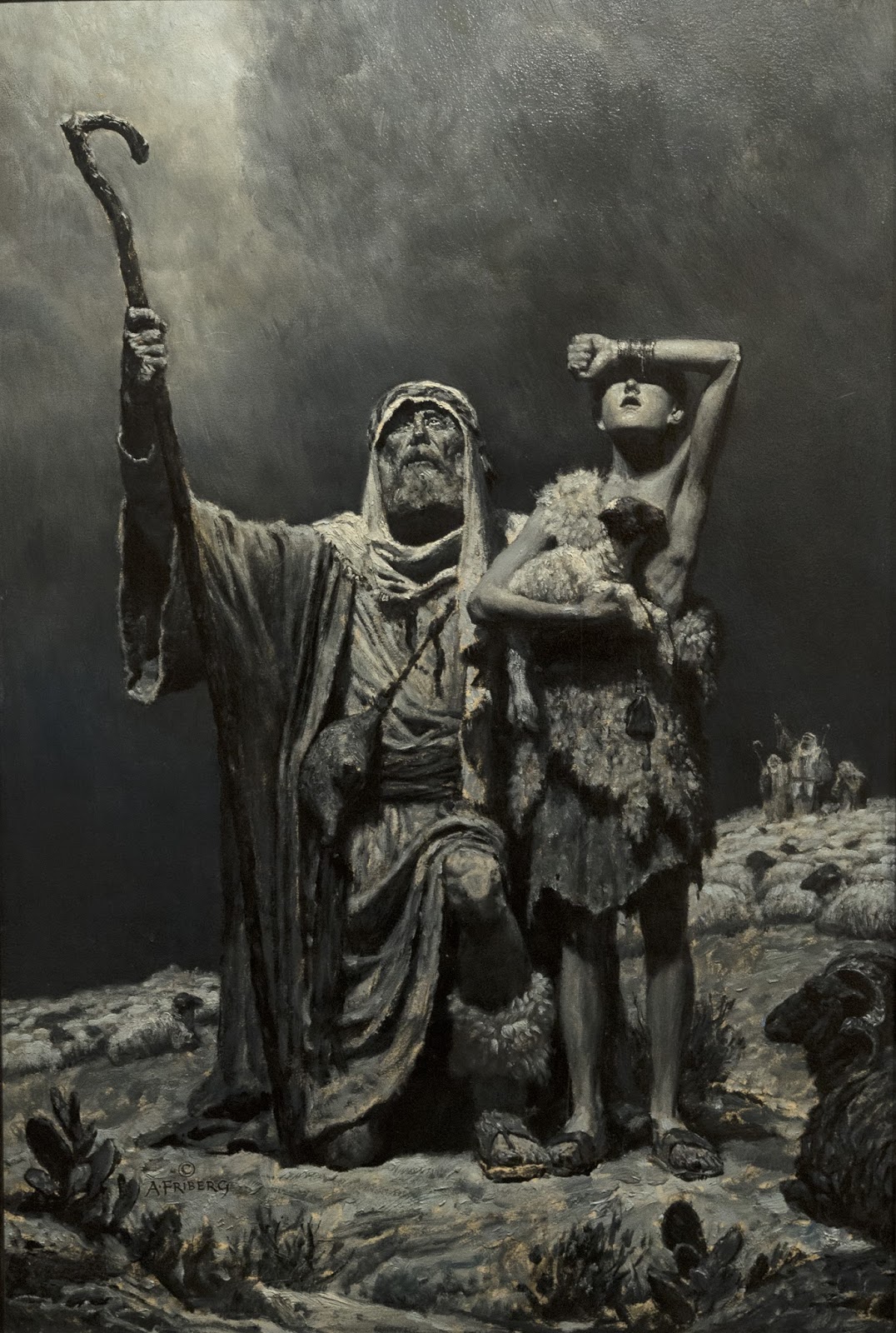
I love greyscale paintings. I fell in love with Edwin Austin Abbey’s black and white illustrations for various Shakespeare plays. These next few pieces have a wonderful dramatic feel to them. The subtle temperature shifts of warm and cool greys are very satisfying. Look at the gold necklace on the figure in the foreground. Just a small hint of warmth in the metal makes it feel like gold.
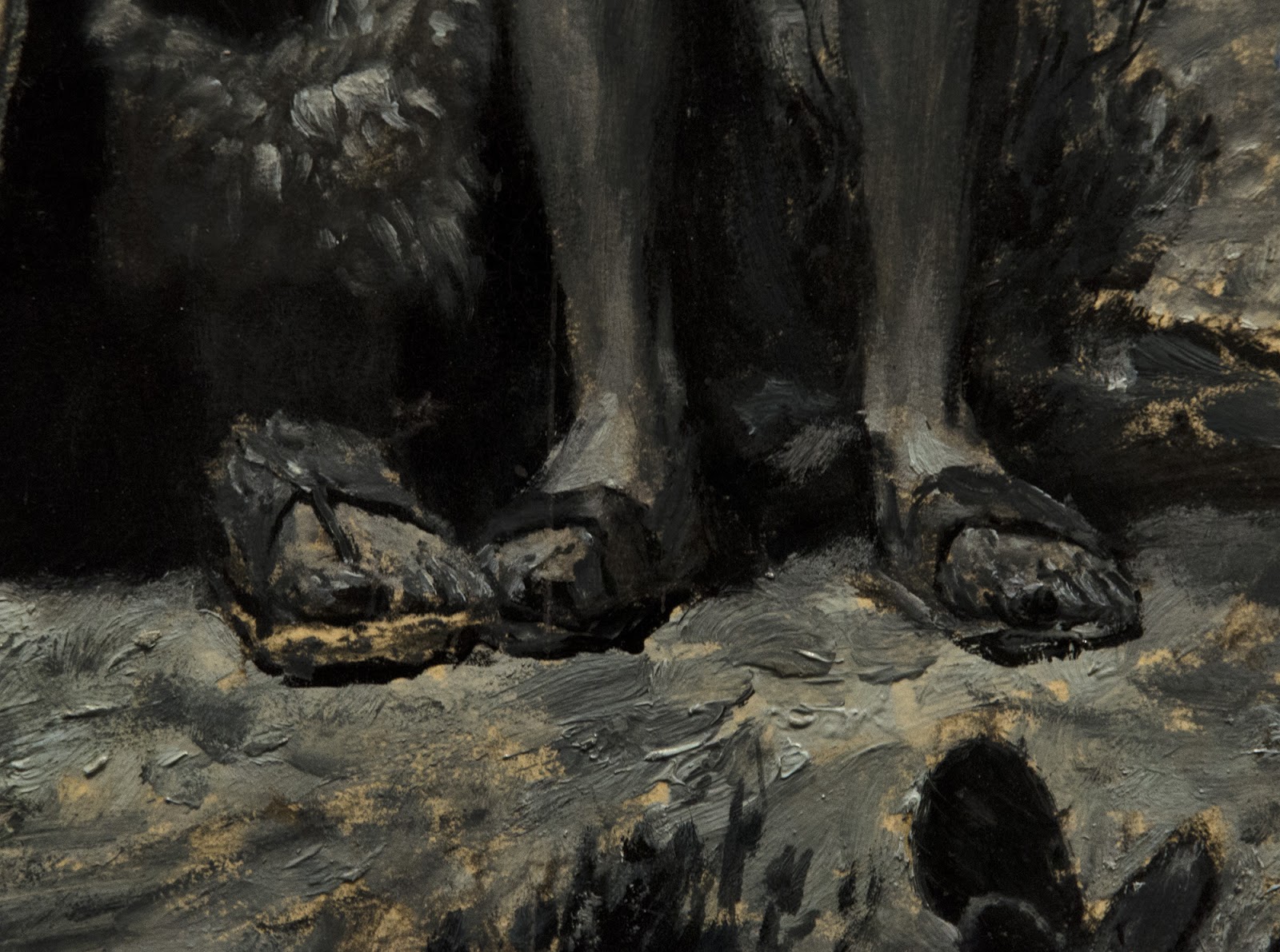
Look at this great close up of the shepherds feet. I love the quick and aggressive brushwork here. The illustration board these were painted on has since yellowed, but I like the effect.
That’s it for Part 1. Stay tuned for more!










Again, stunning contributions Mr. Lyon! Especially to one wanting to enter the industry doing work centered around religious themes.
Thanks Half! Friberg did some great work along those lines, for sure. I think you will enjoy the next part as well. Some of the mounties and horses he painted are pretty exceptional. Hard to beat that portrait of Yul Brenner and the Parting of the Red Sea though. If you get the chance and are in SLC, the show is worth the visit. Lots of originals!
Wow! Thank you for introducing me to Arnold Friberg! His compositions and lighting have blown my mind a little! Look forward to part 2
Excellent stuff once more, Howard. Great analysis. Can you give us an idea of the media sizes? He painted the Moses paintings on canvas, right? I'm assuming you're referring to his display at The Gateway in SLC: http://m.sltrib.com/sltrib/mobile3/56952124-219/friberg-arnold-commandments-exhibit.html.csp, up until January 1, 2014?
Wonderful post, Howard!
These are some impressive paintings. It's crazy to think these were executed for a movie- I guess everything early hollywood was Maximalist. Do you know if these were displayed anywhere around the time the film came out? It would've been a real waste not to.
Also, I see what you mean about that one piece feeling similar to a Brom illustration. The way the figures are drawn are pretty different, but the color and sense of atmosphere is very similar. Swap out the Israelites for some erotically handled barbarians and monsters in bondage gear and you've basically got one of his book covers.
Thanks for this post Howard! allways love Edwin Austin Abbey, but I never saw this images. Absolutely beautiful!
Yeah, you can see the influence of Howard Pyle (through Harvey Dunn) with the light and dark shapes in his composition, can't you? I love the composition on the 4th painting, the one of Moses and the daughters of Jethro. It is cool how he moves your eye around in a large ellipse, with the staff in the air, the arched figure on the left falling back, the guy on the ground, the sheep and then the figures on the right. It is almost like a large cup, holding the central figure in place. Good stuff!
Thanks Lester! The portraits of Heston and Brenner are about 14″ x 20″. The painting of the parting of the red sea is 34 x 114 inches. Almost all of the pieces were on canvas, but some were on illustration board. From the paintings I have seen, he liked a medium to fine weave linen. Yep, that is the exhibit. If you can make it, definitely go!
Howard, you are a man among bloggers. Not to diminish anyone else, but these posts are just awesome.
Gorgeous paintings! Didn't Harry Anderson also do concept work for The Ten Commandments?
Great Post – I was in that group meeting with Friberg at BYU years ago – but you just posted a bunch of paintings I've never seen before! Thanks Howard!!
Thank you Arnie, it is my pleasure! I have found that when I attend an exhibition with writing about it in mind, I learn much more and make more thorough observations.
Erik, here is an excerpt from a book I have on Friberg –
“The oil paintings were meant to serve several purposes. Their use as tools for planning the film was only a partial role, especially since more casual and less time-consuming sketches would have served the immediate production need. Equally important was the publicity value DeMille derived from the oils paintings. He created what he called “The Friberg Room” where he hung many of the artist's framed works. Reporters and photographers were brought in to see them, as DeMille pointed out that the motion pictures was of such magnitude that it could be captured only in rich paintings by a powerful major artist. This was a unique approach to the planning of a film, and the publicity it generated was of great help to the picture's success.”
Ariel, my wording was poor. The final black and white images aren't by Abbey, they just reminded me of his Shakespeare paintings. All the paintings are by Friberg. Sorry about that, I see how the way I wrote that paragraph would make it seem as if those pieces were by Abbey. Thanks!
I am a huge fan of the Ten Commandments, and these conceptual paintings are just jaw-droppingly awesome. Just….wow.
Okay that makes sense. Commissioning a series of paintings like these would have done a lot to bolster the film's reputation as a piece of “High Culture”. Its a similar principal to all of the cool viral marketing strategies that have come to the forefront of advertising over the past decade or so. A well produced tie-in event or product can really capture people's imaginations and some of that excitement can be used to get them interested in the main attraction.
Wow. nothing says “Remove your sandals. You are on holy ground.” like that interpretation of the 'Moses before the Burning Bush'.
Wow. nothing says “Remove your sandals. You are on holy ground.” like that interpretation of the 'Moses before the Burning Bush'.
My favorite religious painting of all time is Friberg's “Peace Be Still.” He also went all out with the superhero physiques when illustrating the Book of Mormon for the LDS Church. I guess that makes sense considering he was commissioned by the church's primary (children's) organization. Love it.
Awesome post Howard. I am looking forward to this exhibit soon. I too had a chance meeting with Friberg at our local art supply store. Check out my tribute here: http://gregnewbold.blogspot.com/2010/07/remembering-arnold-friberg.html
Friberg was one of my earliest influences in becoming an illustrator–his heroic Book of Mormon paintings were something I used to pore over for hours as a kid, marveling at the intricate settings and costumes–he made the stories larger than life, and I loved everything about them. I haven't seen a lot of these paintings though, can't wait for part 2!
Greg, that is a great post. Funny that he wasn't supposed to be driving and was out making a surreptitious art supply run. 🙂 Thanks for sharing that, I really enjoyed reading it!
Erika – It sounds like we share some common inspiration. I had those paintings on my wall and they still fascinate me. I need to go take some pictures of those paintings next time I am in Utah. In part 2, I have some good shots of his Mountie paintings that I think you will enjoy!
I did some checking and I couldn't find anything about Harry Anderson doing work on the Ten Commandments. If he didn't it doesn't look like he was credited. He sure did paint some epic paintings from the Old and New Testament though! His commercial illustration work is among the best and some of my favorite work too.
Super Great Post!!!!
Now Press is a full-service company that provides clients a wide range of make alternatives and the top quality posting available anywhere, with cost-effective choices to meet up with a wide range of business posting needs. Whether it's simple dark & white-colored documents or a full-color selection or flyer, you'll find a posting remedy that suits your project requirements at a price you can handle. Now Press is a system of highly-skilled and knowledgeable people, with cutting-edge technological innovation and devices that can organize the stage of rate, flexibility and abilities you need. And should you need large-scale posting alternatives, Now Press has the resources to meet up with your needs.
Color Copies in Washington, D.C
Pronto Press is a full-service printing company that offers customers a wide range of print services and the finest quality printing available anywhere, with affordable options to meet a variety of business printing needs. Whether it's simple black & white document or a full Color Copies in Washington,D.C, you'll find a printing solution that meets your project requirements at a price you can afford. Pronto Press is a network of highly-skilled and knowledgeable people, with cutting-edge technology and equipment that can match the level of speed, flexibility and expertise you require. And should you need large-scale printing services, Pronto Press has the resources to meet your needs.
One easy way to decorate a nursery is to use an image from art history. Many western painters have painted for children, such as this painting, by English artists Stanley Spencer, most popular famous paintings, should look good on the nursery wall.
It's available as a canvas print of any size to be delivered to your home, from wahooart.com. It's affordable too.
An Argyle wall! A canvas print such as this one of the Isle of Skye, painted by an American painter of the late 19th century, William Trost Richards, may take you right back to the wilds of the home country and go well with your Scottish wall. It can be ordered from wahooart.com.
Great post
As a believer in the veracity of Scripture, and the perpetuity of the 10 Commandments, I love the painting of Moses receiving them. It's the most beautiful I have seen.
Is it a Creative Common image? Would I be able to use it as a partially obscured background on a flyer advertising a free book?
Peter…marinepics@hotmail.com
As a believer in the veracity of scripture and the perpetuity of The 10 Commandments, I just love the picture of Moses receiving them from the hand of God…It's the most beautiful I have seen…I'm pleased to discover the name of the painter. May I ask if this is a Creative Common or royalty free image that I could use as a partially obscured background for a flyer advertising a free book?
Thanks…Peter