In the first part of this series I shared with you the initial sketches that I gave my client. When I work for a Publisher, I typically do just 3 sketches, and email them to the client. But because my client was actually commissioning an original work of art to hang on his wall, I did things a bit differently.
Firstly, I did a LOT more sketches than usual. Secondly, I mailed him printed copies of the sketches. Mailing versus emailing some sketches may not seem like a big deal, but it actually makes quite a big difference. Because I was sending him print outs, I was able to enlarge them to the actual size I had planned on painting them. Looking at a life-sized painting in person is a completely different experience than seeing a small image of it on your screen. This way, the client could tack the sketches up on his wall, sit back, and see which one he liked best, taking their intended size into account.
My client got back to pretty quickly, and said he liked sketch #3 the best.
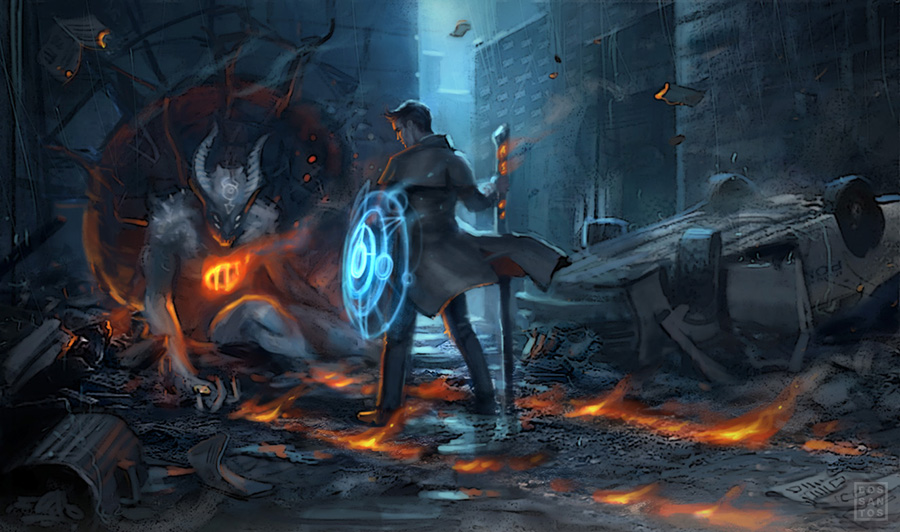
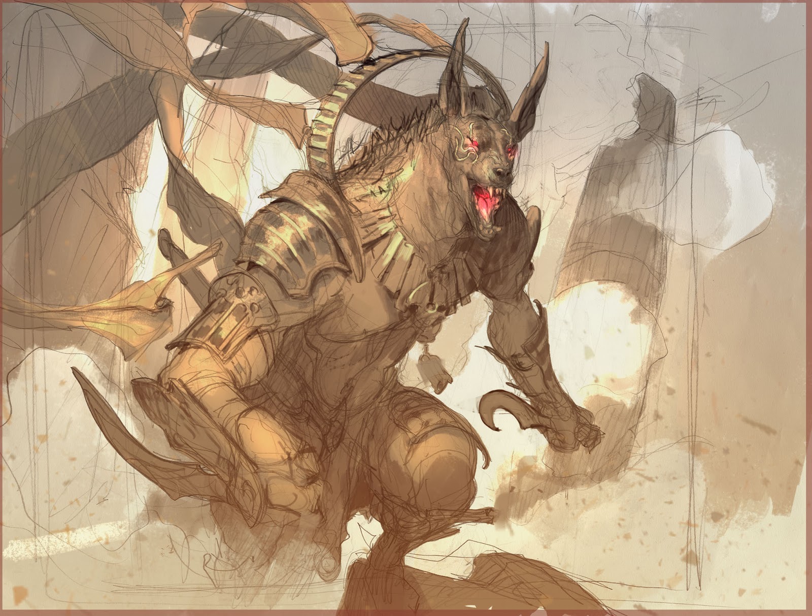
Now that I knew which sketch he liked, my next goal was to find out WHY. We emailed back and forth a bit and discussed what he liked about the concept and why he selected that particular piece. He said he liked how resolved the scenario was, and that the image seemed more like a movie still, rather than a ‘pin-up’. He also liked the idea of adding the demon Lash I included in a previous sketch, and wondered if there was any way I could add her to this image as well.
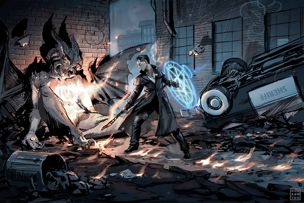
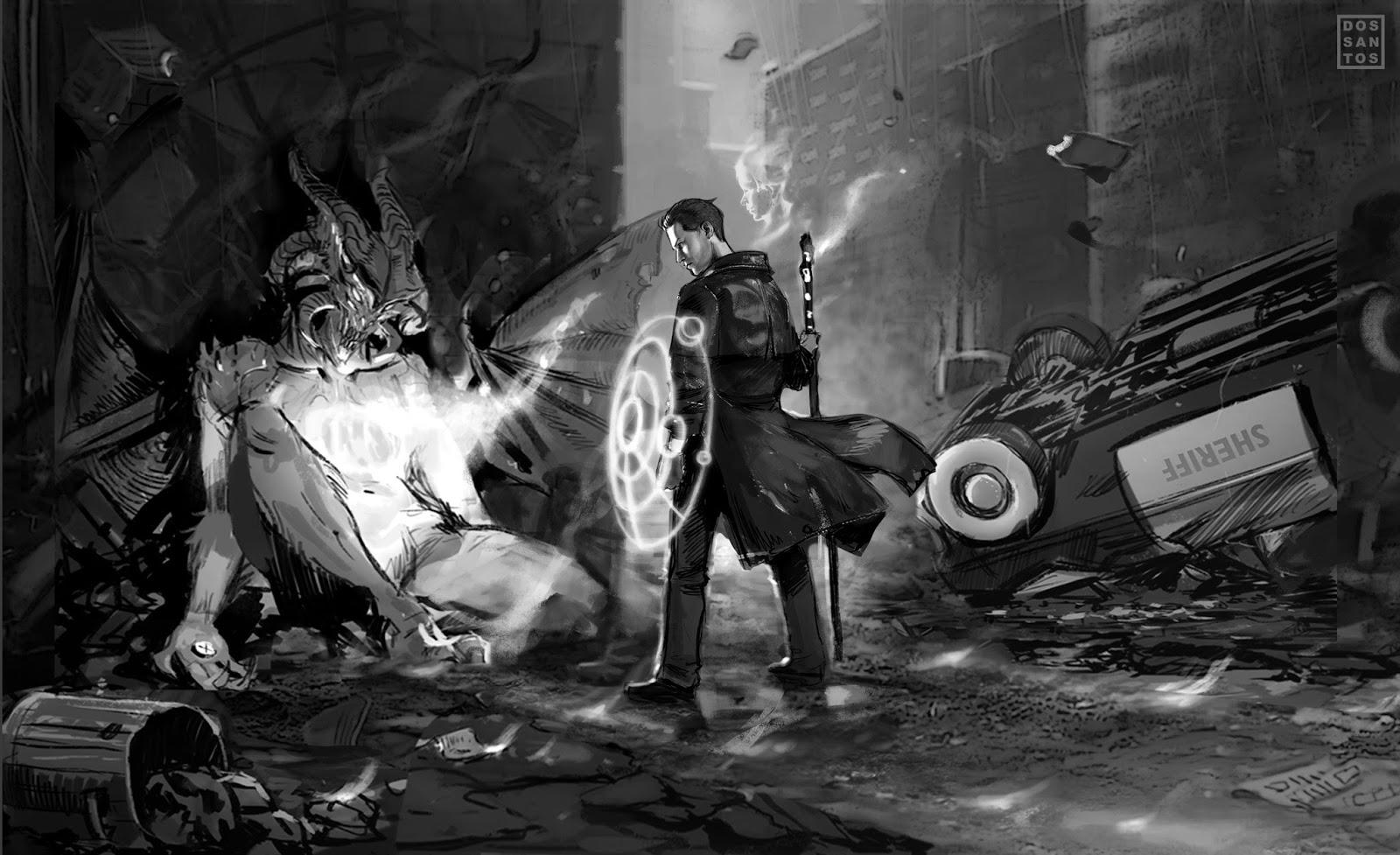
From there, I went about revising the sketch, and offered him a variety of poses to choose from. I also made two notable revisions in these sketches:
Firstly, I turned Harry’s chest toward us in two of them. I did this for two reasons. One, I wanted try to show Harry’s pentacle pendant, which is an important part of the story. Two, I felt it would be better to have the warm light of the fire, and the cool light of Harry’s shield on opposing sides of the figure. That way, the colors would compliment the form, rather than compete with each other.
Secondly, I slipped the visage of Lash’s face into the flames, whispering in Harry’s ear.
Because this painting is ultimately a portrait of Harry, I wanted to make sure I refined his actual ‘look’ a bit more in this second round of sketches. To help me do this, I shot some reference of a toy model. I also purchased a head specifically for this piece that I thought was close to how I envisioned Harry looking.
I really love using miniature models for reference. Not only is it pretty fun, but I feel that it helps me explore more options, and break away from my usual solutions. Rather than just imagining a pose, I was able to physically place my toy model in a variety of real poses. This helps me ‘act out’ the scene in my head a bit, and quickly eliminate, or expound on, any silhouettes and lighting schemes I find interesting.




Very interesting! Nice seeing the WIP stuff, thanks!
It is intriguing to see the process of scetching and how much time u put in it. I usually go with the first scetch…or with variations of the 1st idea at least. Not that I dont scetch, I do in fact, but my 1st is often my best. I rly like this behind the shoulder angle of the initial scetch and it seems like the reason why this looks so much like a movie shot but I think you are loosing it in the secondary scetch push, even though the chest-towards-us pose is actually great. Also the whole behind the demon was a great element- it screams out “Powah!”. These sets u do with the miniatures are also great, it does help one “act out” the scene and explore variety, in fact I wander how dont u get lost in the process. I'd instantly put the camera angle in his feet, do an overexaggerated pose of epicness and totally destroy the image 😀 Great post, I love the whole thing.
One question – what is the reason behind the composition (your hero is in the centre). I also tend to do that often but I dont know why, what do u actually win by doing that? Ppl often preffer those 3/4 angles of attention and golden angles u name it, but I find the central composition as good as the rest. Does it make the hero appear more stoic, or is there smth in the balance we dig subconsciously? Tnx
The sketches are looking fantastic, the fallen demon's pose works particularly well. Really looking forward to seeing this one progress!
Thanks for giving more examples of how you're using those miniatures as you work. I'm definitely going to get one or two in the near future.
Nice illustration too! 🙂
This is such a silly question, but here goes: where did you get the clothes for your mannequin? (I just recently purchased a similar 'doll'.)
I usually wouldn't stick the main figure in the center of a horizontal composition either, but for some reason it worked for me here. If it was just Harry, probably not. But because I was balancing the demon, Harry, and the car (all of which are close to the same size), I think centering the figure kept him a bit more compositionally dominant.
You can get that stuff anywhere. Even GI Joe clothes fits. But try looking at http://www.monkeydepot.com/ for better stuff.
I see it now, thank you 🙂