This month I had the great experience of spending time with Dan Dos Santos at Illuxcon. We had a fun conversation in the bar one night talking about Muddy Colors and I admitted that the Artist of the Month blogs that I’ve filed on modern painters had created a bit of an outcry amoungst the more ardent traditionalists. We got to talking and I joked that I had been wanting to do a blog on Robert Rauschenberg, but was afraid that I would get lynched by the fans. Much to my pleasure and delight, Dan lit up, and admitted that he was a huge Rauschenberg fan, and he encouraged me to write this blog!
When I was an art student, I was not an illustrator. In fact, my school didn’t even offer illustration. I was a full-on, post modern artist, focusing on assemblage works in the vein of Motherwell, Keifer, Schnabel and one of my favorites, Robert Rauschenberg (1925 – 2008).
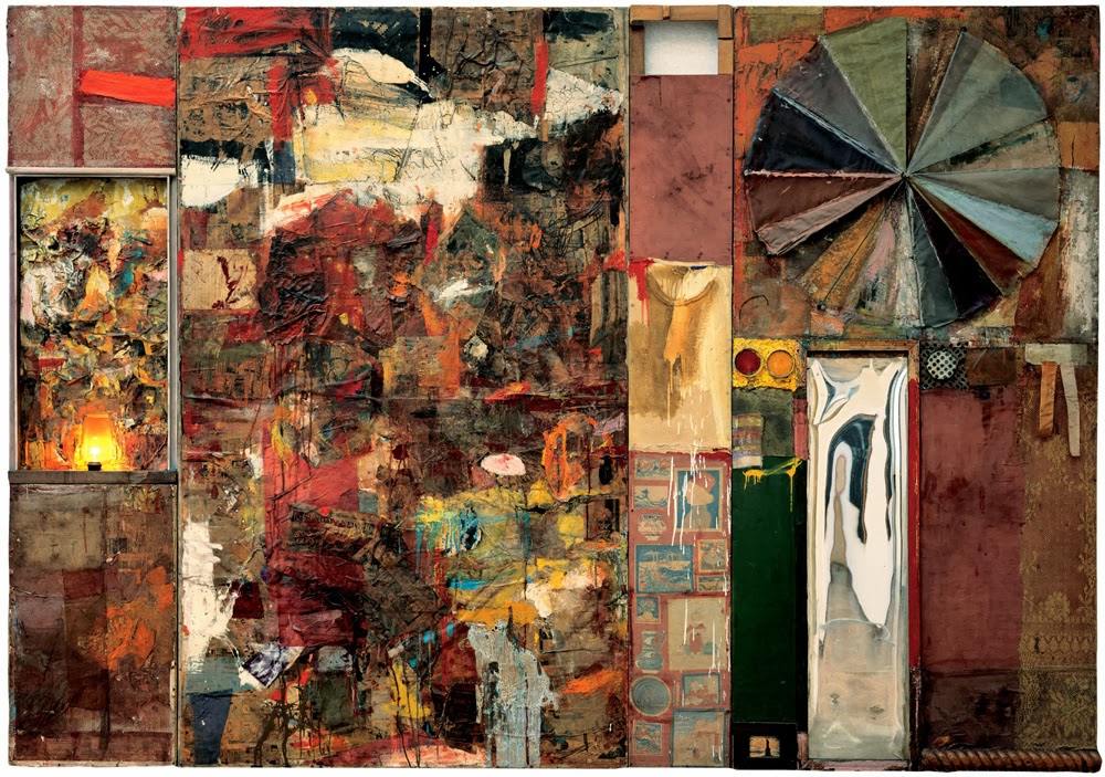
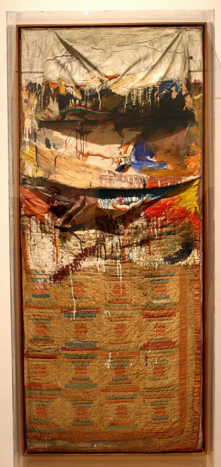
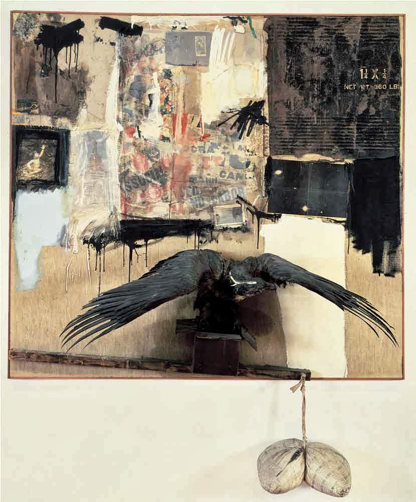
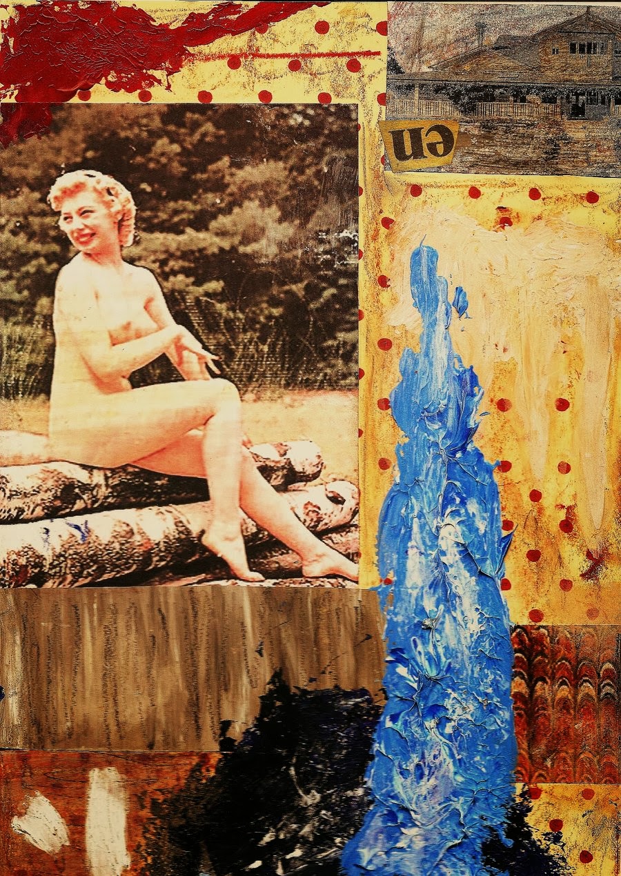
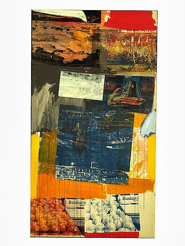
Rauschenberg was an archivist of New York. His assemblage and collages of his period are relics of the time. Living in lower Manhattan in the 1960’s he would often wander the streets and pick up found objects from his neighborhood and work them into his “paintings” calling them Combines, because he was combining found objects into a single work. They became time capsules of the world around him. His Combines are considered modern master pieces, and if you ever have the opportunity to see them in person, its a unique experience.
I became enamored of Raushenberg as a student, and loved his use of texture and found objects to create depth and volume to his paintings, with breath taking compositions. Dumspter diving and skulking through junk shops became a favorite pastime to find some unique object to add to my work.
Later, as a novice illustrator, I would often utilize what I had learned from Rauschenberg in my illustrations by incorporating collage and objects into my paintings. (Why render a facsimile of leaves when you could just attach actual leaves into the image?) Quickly, I began to realize that art directors did not appreciate paintings arriving in their office with sticks, dirt and broken glass collaged into the illustrations, so I eventually removed all of those elements for a purely painted smooth surface that could be reproduced easily on a drum or flatbed scanner.
More than a decade later I had begun to adopt the digital medium and immediately became re-inspired by Rauschenberg. Digital painting aloud me to scan found objects and photos and layer them into my work in a way that was almost identical to my student assemblage work. Broken glass, crumpled newspapers, concrete, metal, text, wood, leaves, everything was now available as a medium and perfectly reproducible to a commercial client. Many people who look at my digital work are often surprised by the texture and depth I’m able to achieve, and I explain to them that its because there are often dozens of layers of texture and elements combined into the image that produce that effect. Every time you find a cool texture file or photo online and combine it onto your painting, you’re channeling Rauschenberg.
Rauschenberg is one of the most inspirational and influential artists in my career. If you look closely at some on my digital work you can see pieces of assemblage and collage peeking through, thanks to Mr. Rauschenberg. Today, as I evolve back into oil painting, I am deeply inspired to re-connect with my roots and begin to incorporate assemblage into my traditional fantasy work.
Go Forth and Learn!
WOC
For an interesting intro lecture on Rauschenberg and his contemporaries view:




This is some really interesting stuff to look at. I wasn't familiar with Rauschenberg before, but I'm glad I am now! I'm a fan of art that hews close to this aesthetic, I think mostly because it's so far removed from my own sensibilities. Makes it always fresh to my eyes.
I wonder if Dave McKean is directly influenced by him at all? His covers for Sandman, Arkham Asylum, and others share this sort of aesthetic – in fact, if I remember right, one of his Sandman covers is pretty much a shadow box, 8 inches thick with various layers and panels placed inside. It looks…difficult, to photograph. But it makes a difference!
Another great choice William. Interesting thought about McKean Drew. Maybe some Cornell influence too.
I'm really glad you decided to go ahead and post this! As someone who went back and forth between the illustration and fine art departments in artschool I'm very familiar with the enmity and misunderstanding that can exist between people in those two worlds. They often times don't have much to do with one another in their aims, but I think its important that people in the commercial and fine art worlds at least try and understand and respect one another for what they do well.
Looking at contemporary art with an open mind won't necessarily make you a better illustrator, but it can help to inform your sense of history and understand why you are doing things the way you are. Artists didn't start painting orcs and space ships in a vacuum after all.
I've always preferred Jasper Johns work myself, but Rauschenberg definitely had more to offer in terms of interesting texture.
When you look at modern art you might not always be able to glean anything you can directly apply to illustration like this, but it will nearly always being worthwhile in some way.
If the intersection of modern art and illustration is something anyone else finds interesting I recommend checking out animation veteran Hans Bacher's blog http://one1more2time3.wordpress.com/
He casts a wide net as far as influences go -I think I encounter a new obscure name every time I check his blog- but you can really see his consistent aesthetic sensibilities throughout. For me his blog has really highlighted the similarity between early European modernism and background design in animation
Oh, I'm almost certain he was. I know he also studied under Baron Storrey, and the influence is really apparent in his early work. If you don't know Baron's work, check it out. You'll undoubtedly see some modern influence there too.
Chiming in. My graduate exhibition (Studio Art-Illustration at CSULB) is a few days away. I'm so exhausted, so forgive any mis-typing please…as someone who has begun a teaching career and worked as an illustrator for about 7 years in film, fantasy publishing, and figurines I feel like I may have something to contribute.
Should we, as commercial artists, see what Rauschenberg's work looks like? Or can we see what it is? The combines he worked on were generally composed of found objects/pics, with paint used to transform these odd constructions into something that challenged the art world of his era. He took the crud he found on the street, reformatted it, personalized and found it to be art. As an illustrator (myself included), do you see your work and can only state what it looks like? Does our art only depict things? Can an illustrator's art be a thing unto itself? Can our work be an entity, flat or dimensional, that seems to have a life of its own? I really hope that we can see illustration beyond a pictorial window depicting commonplace symbols that point to a suggestion or punchline. I hope we can get past any desire for our audience to say “I get it”. Not that we would speak in a visual language so deeply coded that only we can appreciate it, but maybe something between. Maybe a visual language that prods questions from our audience, rather than handing them answers. How can illustration be an entity of both fact and feeling? Can we make images or objects that convey the essence of an idea, rather than just denoting icons in an illusionary window. Try to look at Rauschenberg's work without seeing textures and images that can be put on stuff to create a visual effect. Instead try to see the work for what it is. A blending of common everyday-life objects that are given relation to one another through construction and mark-making. From here you can begin to unfold what facts and feelings you may take from it. Let's try to ask ourselves questions about our work. Are we creating an effect to look at, or a sensation to be near? Brief and probably jumbled I'm sure….but I have a strong hope that great illustration is beyond depiction.
Thanks for bringing RR to the table.
This was a great article. Rauschenberg is one of my favorites. Whenever I see his stuff though I'm reminded of Kurt Schwitters – my favorite Dada artist. Folks might want to check him out too: https://www.google.com/search?q=kurt+schwitters&source=lnms&tbm=isch&sa=X&ei=Uj1HUrPUBoXMqgHJmICYBw&ved=0CAkQ_AUoAQ&biw=1127&bih=639&dpr=1
Thanks everyone. I agree that I never understood the vitriol between the fine arts and commercial arts. For me starting out, I didn't realize they were regarded differently. Its like sculptors and the pottery makers being at odds, who cares! Just make cool stuff, and keep your eyes and mind open!
Thanks everyone. I agree that I never understood the vitriol between the fine arts and commercial arts. For me starting out, I didn't realize they were regarded differently. Its like sculptors and the pottery makers being at odds, who cares! Just make cool stuff, and keep your eyes and mind open!
It is great that artists like Rauschenberg are presented on Muddy Colors occasionally for a different point of view. I can see how his approach to art was an original viewpoint and a challenge to the established norm. He certainly made his mark in art history. That being said, he is among those artists who usually have to be “explained away” in order to be appreciated. One needs to be taught what is so great about the work, instead of appreciating the work at face value, which is sort of odd I think. Like Tom Wolf's book, The Painted Word, so aptly observes.
I know that Rauschenberg has a lot of fans. To me personally, I mainly have an issue with his aesthetics. Intellectually I get what he was doing, but I find his actual art sloppy, with unappealing colors, and basically fugly. And I know I'm not alone with that observation.
Heh, about halfway down, I saw the one with the raven and thought 'Hey, that looks like a piece that I saw when I was younger–called Canyon. Probably something inspired by it though, as I saw it in some tiny museum in central Uta–hey! it -is- Canyon!' That piece made a pretty big impression on me when I saw it–I was probably only 11 or 12 at the time and hadn't really begun to consider art as anything more than something that got me a little extra attention when I should have been paying attention to math. I think it was my first time seeing a 3d assemblage bigger than 2 feet across, and I thought it was the coolest thing in the world he'd put an actual raven on it.
I understand your thoughts, its difficult sometimes to appreciate art that isn't pretty or easily understandable, but I find that once you try to simply appreciate modern or conceptual work for just being what it is, there's not a lot of explanation required. I often have to remind myself that just because I don't like a painting, doesn't make it bad, and inversely, what I like, isn't always good. I like Raushenberg for the same reasons I like to look at artist's palettes, (in fact often I prefer to look at the palette rather than the painting), it shows the raw process the artist goes through. In this case, its all on the canvas, there is no palette. I think its fun to look at, pure, and child like, technique is abandoned for process. Glad your keeping an open mind. As long as your opinions are thoughtful.
I understand your thoughts, its difficult sometimes to appreciate art that isn't pretty or easily understandable, but I find that once you try to simply appreciate modern or conceptual work for just being what it is, there's not a lot of explanation required. I often have to remind myself that just because I don't like a painting, doesn't make it bad, and inversely, what I like, isn't always good. I like Raushenberg for the same reasons I like to look at artist's palettes, (in fact often I prefer to look at the palette rather than the painting), it shows the raw process the artist goes through. In this case, its all on the canvas, there is no palette. I think its fun to look at, pure, and child like, technique is abandoned for process. Glad your keeping an open mind. As long as your opinions are thoughtful.