-By Jesper Ejsing
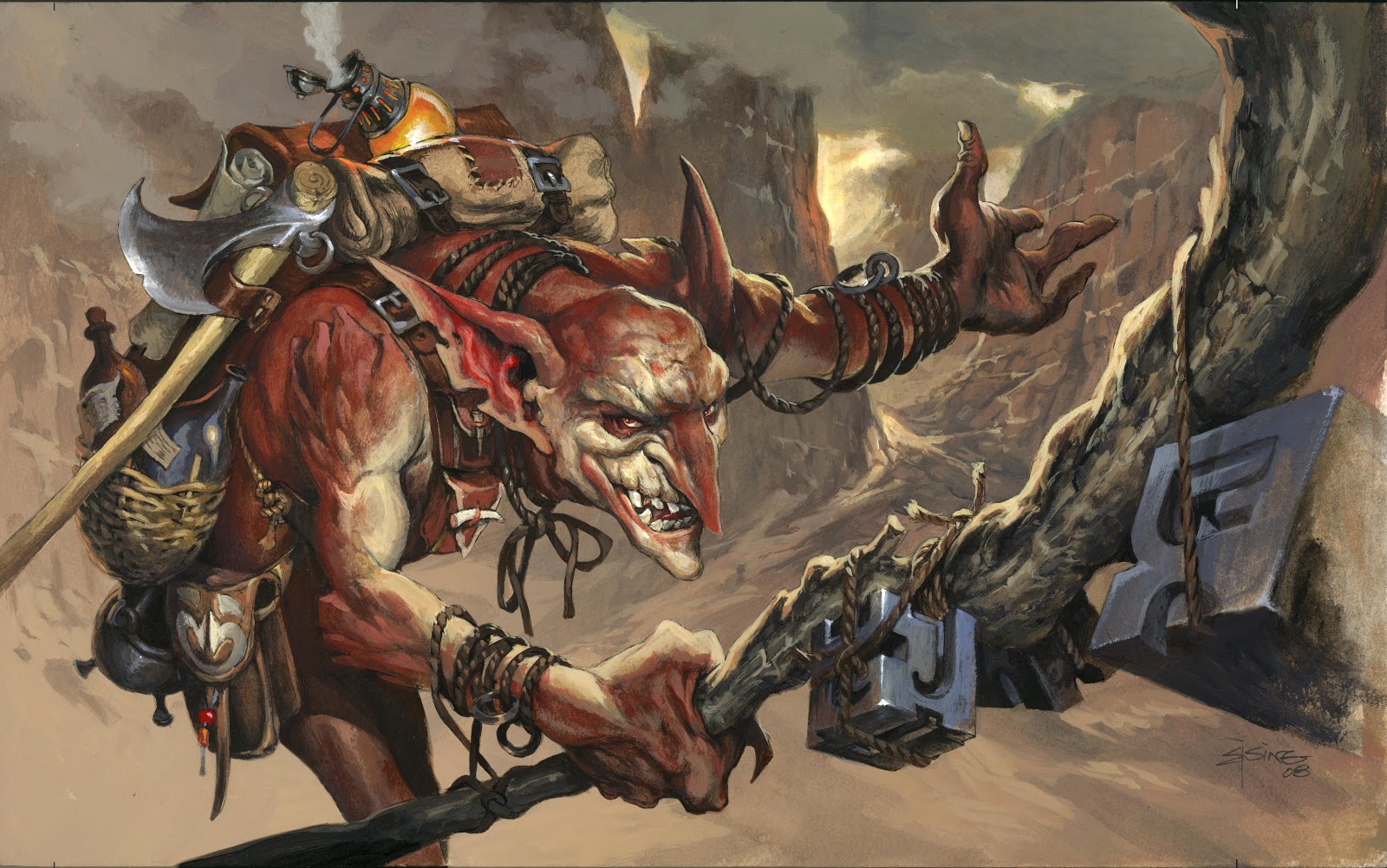
This illustration for Magic the Gathering, is a kind of a twin to the Baloth monster I showed some weeks back. The description was a charging beast with hooves and giant horns.
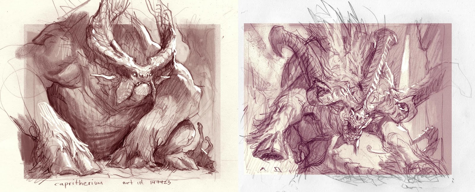
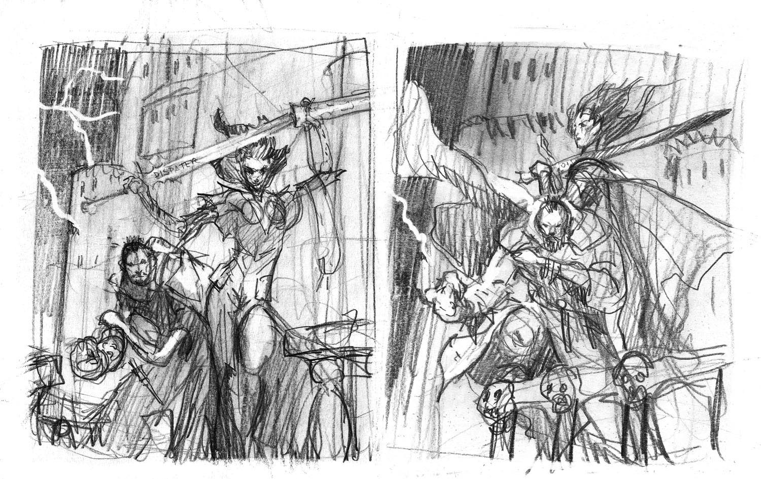
I did 2 sketches. One, which you could argue is totally wrong, since it is resting and looking mean and badass, but not charging at all. And one with the full-on charging pose.
Jeremy, my art director picked the charging one ( not surprisingly since it was the right answer to the assignment) sometimes I wonder why I think my off-suggestions are going to work. I KNOW they are wrong but I fall in love with the sketches and toy with the idea that they could be wonderfull pictures.
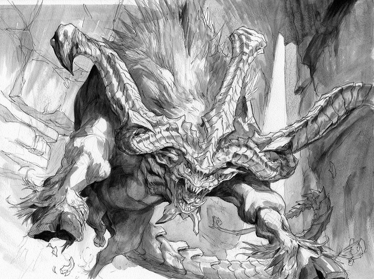
Well; for the face of the one that was approved I was inspired by a bat face and the jaw/face structure of a moray eel.
I transfered it to board and inked it and added greytones in black acrylic.
The colors for this one is, once again, a result of having done a couple of previous paintings in a more dull or muted down pallet. So with this one I wanted to go all in. What I really aimed for was to keep all black or even dark colors away from the background to make the environment seem light by strong sunlight. Also I love when the colors vibrate and comes alive without the use of value contrast but by the temperature and the color contrast. Notice how close the values of the colors are in the rock wall and yet how many different colors it consists off. That is something I have been concentrating on for the last many years. Creating interesting vibrant textures with many colors but within the same value range.
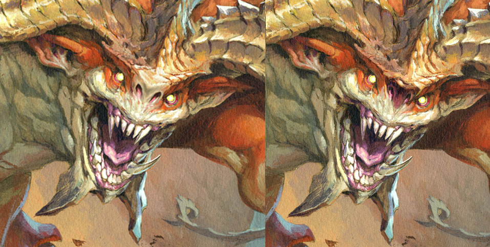
When the image was done I thought it looked too cute. the black snout made me think of Disney’s Stitch figure. So I changed it digitally before sending it off. I am very glad I did. I constantly try to drag myself out of Cute-town. This time I kind of got a few steps before they dragged me back…
If anyone have questions to technical stuff I would love to go into details; just ask?


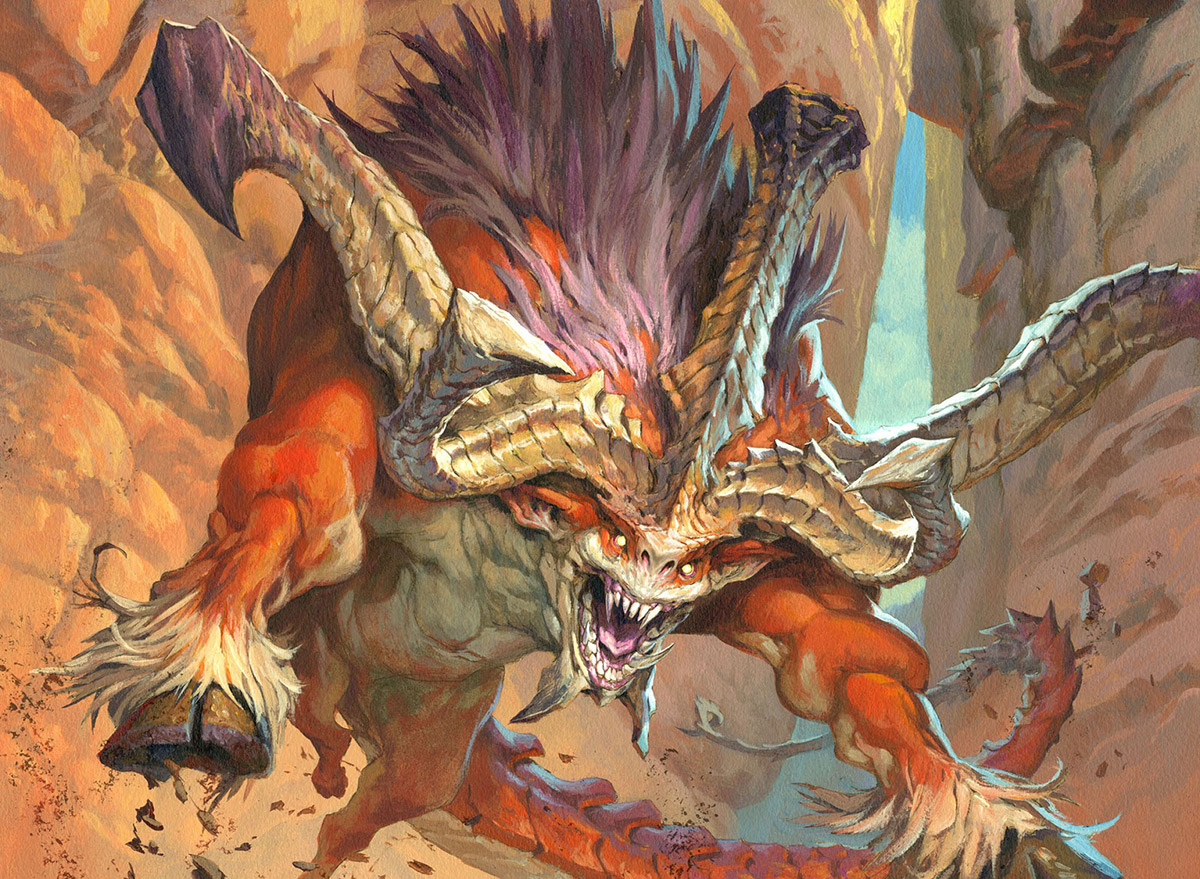

Wonderful painting! Energetic and powerful.
The very light surrounding is surprising, one would expect a dark painting with really dramatic lighting … but it makes it unusual and exciting. Well done!
Seriously love the first sketch! A really mean and confident bat-ass 😉 Think it was a valid scenario sending it along to the art director. Who knows, maybe the art director hadn't thought of it and could end up liking it. Two minds are better than one.
Astonishing work!
I am actually reading all your muddy color posts on your work process, learning all I can. I can't thank you so much for sharing that!
If it's not too bold, I'd love to know how do you paint from the value step to the color in acrylics? Like do you start with transparent colors and finish with opaque strokes, or vice versa? I'd love to read you going into details, actually! Not that you're not already giving lots of them!
Love the work. I would also like to know the stages of how you added color to your painting while retaining your under drawing and value. This has been one of my biggest learning disabilities and every time I try it, I tend to either ruin my drawing, or paint over important lines. Thanks Jesper.
im always looking at your work, and there was always something to that i could see that a old master had, and i couldn't think of the artist until one day it hit me, you have the story telling and action staging that reminds me of the elegance of Frazetta.
your scenes always make me want to know what happens next, or damn he/she is dead for sure
That first 'off-suggestion' sketch is just brilliant- these massive beasties have such great personality when at rest 🙂
I wish you did the other scetch too, it looks rly cool.
G'day Jesper, Although a beginners question, how did you transfer your initial sketch to the board? Do you use a projector, trace it or print it out. I'm always curious how other artists do it.
Cheers,
Rick.
Jesper,
Your art is amazing. Do you have original art for sale? Could you send me a list?
Thanks
Andy
You guessed right. I start of semitransparent by laying down the dark part of a color, then I go lighter up until the highlights. When I started I was using washes all up until the very end of the lightest part, but these days I kind of skip to the thick paint right away. I like the very dense and heavy thick way of painting in texture. I think I better do a full update about this subject soon.
What you are saying is deffinately the right way. I had teh same problem in the beginning. I was covering up way too much and it started getting fuzzy. Today I cover stuff up very ealy on in the process and the line underneath and teh greytone act mor elike a guide than a solid thing to stay.
I would suggest you tried keeping the color very transparent in teh beginning. I got some colors from the brand Golden that are very fluid and almost watery. they are very potent but still very easy toe use for washes without thining out, if you know what I mean?
One more thing: I mask out the figure with Frisket Film, to allow myself to be more rough and bold with the strokes inth ebackground. I do not need to be carefull or anything since I peel of fthe masking afterwards and leave a fine linedrawing.
it is pretty simple: Take a photocopy; smear the back with pencil, place it onto the board and start tracing over all the important lines. You then pushes a rough version ontoth board: Ofcause you have to redraw all of it on th eboard afterwards since th etracing is nbot very precise. But I actually try to transfer as little as possible to keep the drawing fresh. Sometimes I just redraw it on th eboard if it is not too complicated.
When painting on paper I use a lightbox for teh first rough transfer.
Yes I do sell paintings. Mail me at ejsing@illustration.dk
Great work! how do you plan your compositions? or do you just go straight in after choosing your thumbnail direction.??