This illustration is from my upcoming book on ‘How to Design Characters’. For this demonstration, we’ll be using Vellum paper and black and grey Prismacolor pencil.
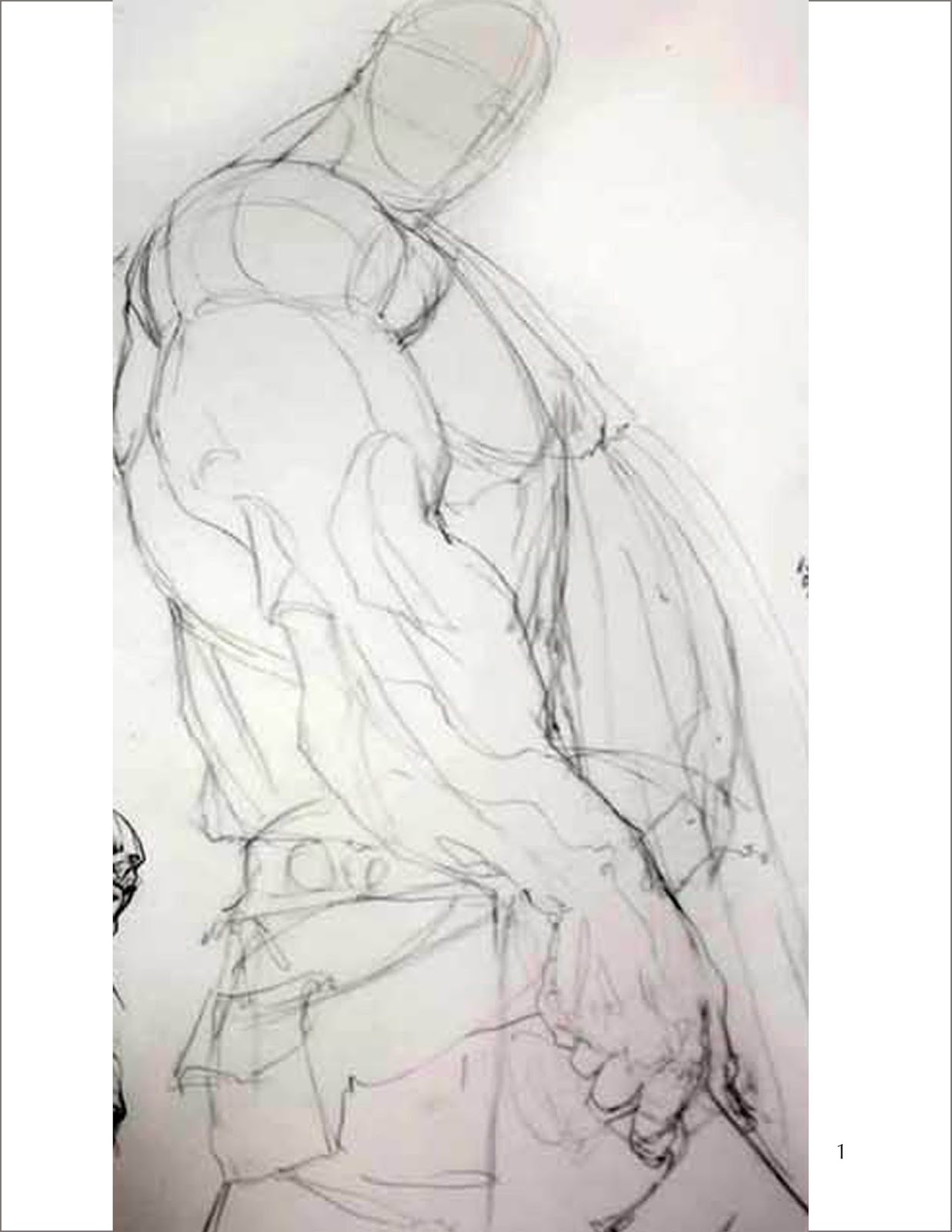
Step 1. The thing I do first is figure out the composition and block out my main character.
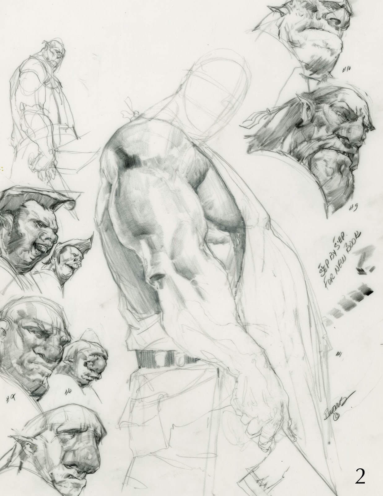
Step 2. I experiment with different heads for the character on the edges of the page. After I created the head I liked, I erased the others and redrew the head onto the body. I begin to chisel out his arm and torso.
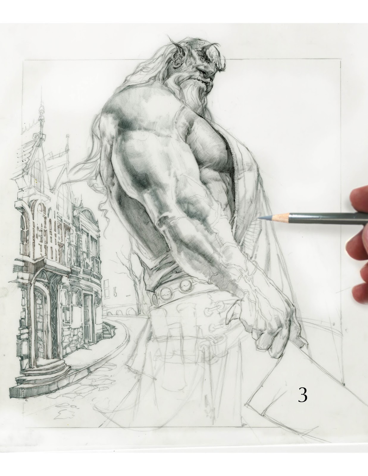
Step 3. I define some more of the value in his musculature and his costume with the grey pencil. I’ve now completed the head and move on to the background. I thought a provincial European city might look fun.
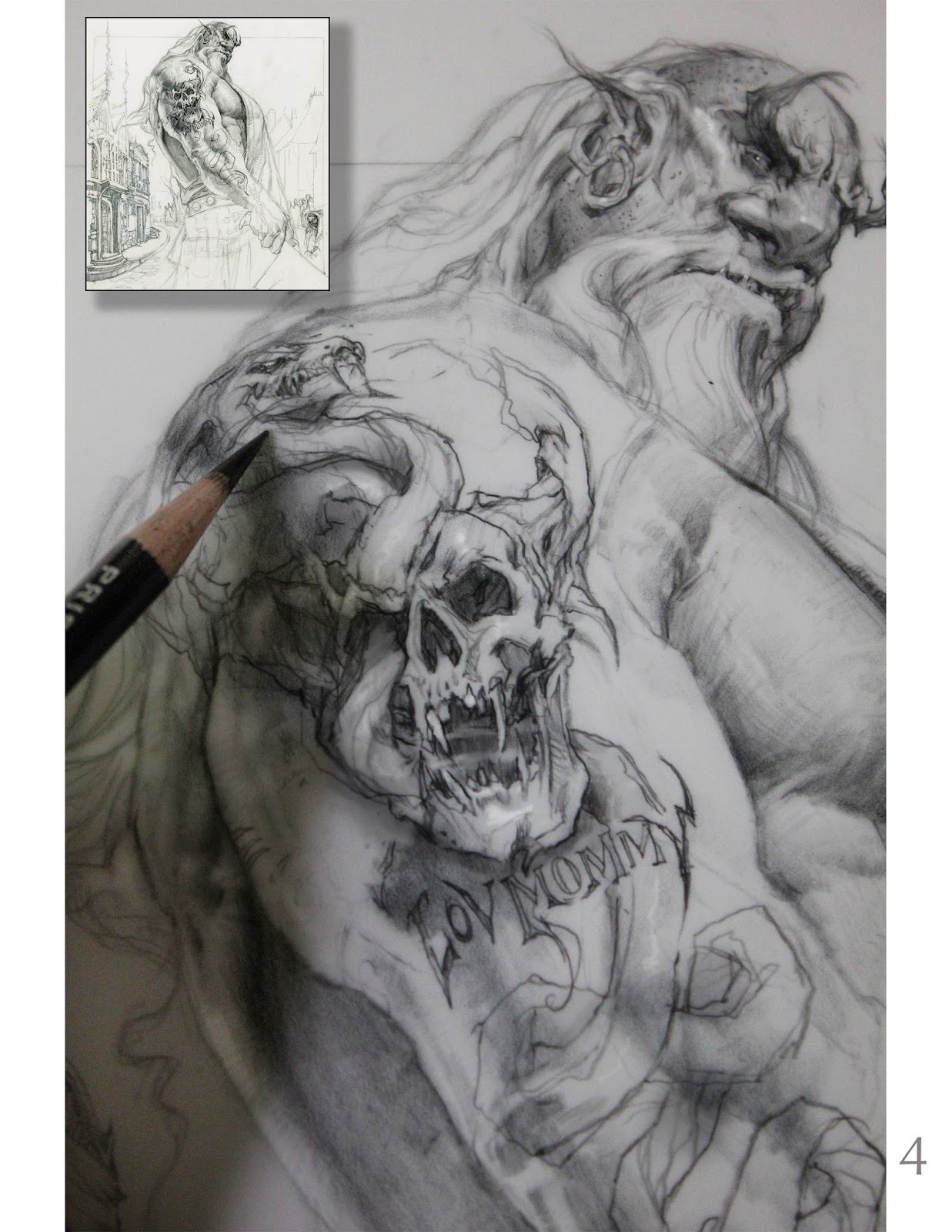
Step 4. Here I start to design a tattoo for our hero. I thought it would be cool to have a snake emanating out of his veins and bursting through the skull.
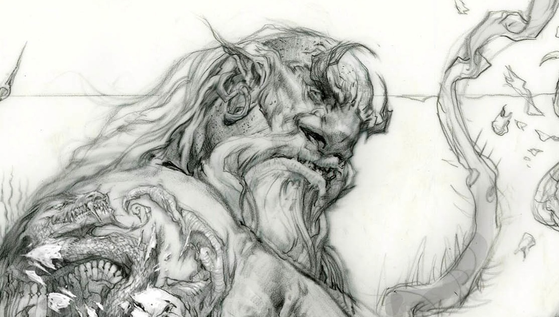
Step 5. Here is a close up of our character. You can see the evolution of the tattoo. Instead of having it come out of the skull’s mouth, I decide to have it slither through the eye socket.
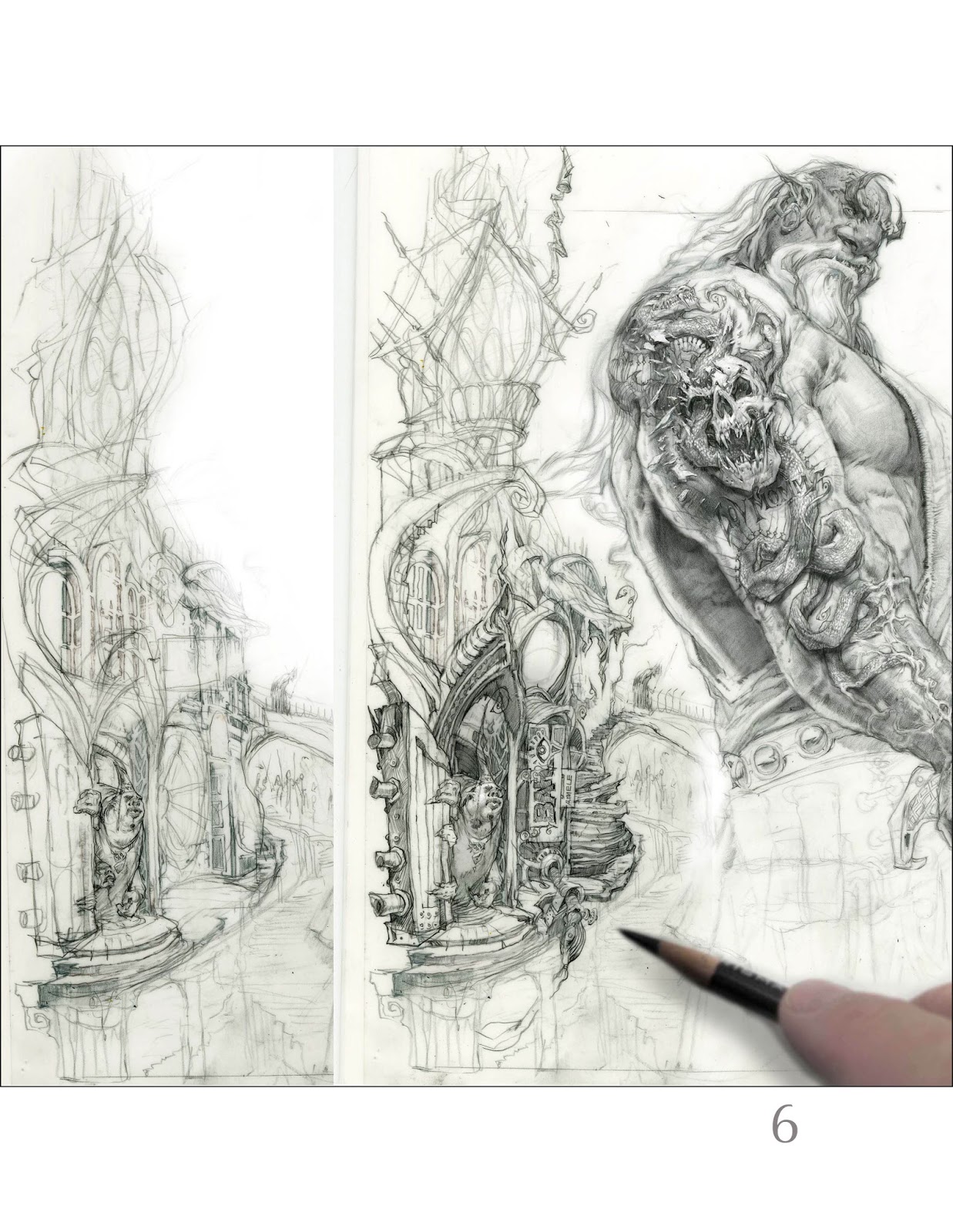
Step 6. In this step I’ve completed the majority of the tattoo. I wasn’t happy with the initial city backdrop because it didn’t seem whimsical or creepy enough. I wanted to push more organic forms into the architecture versus the traditional village structures.
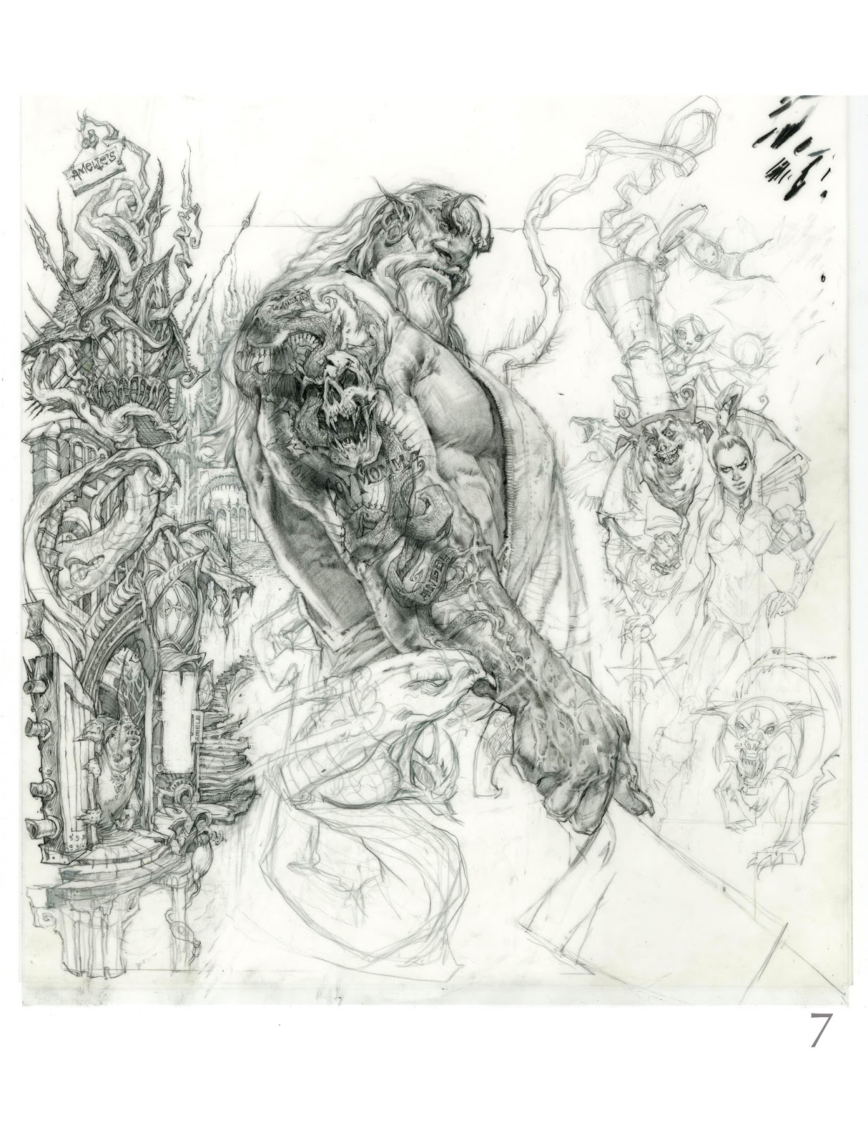
Step 7. Here I start to develop the creepy little critters and people that inhabit this village. As you can see this is a three pillar composition; the city and the crazy inhabitants book-ending the main character.
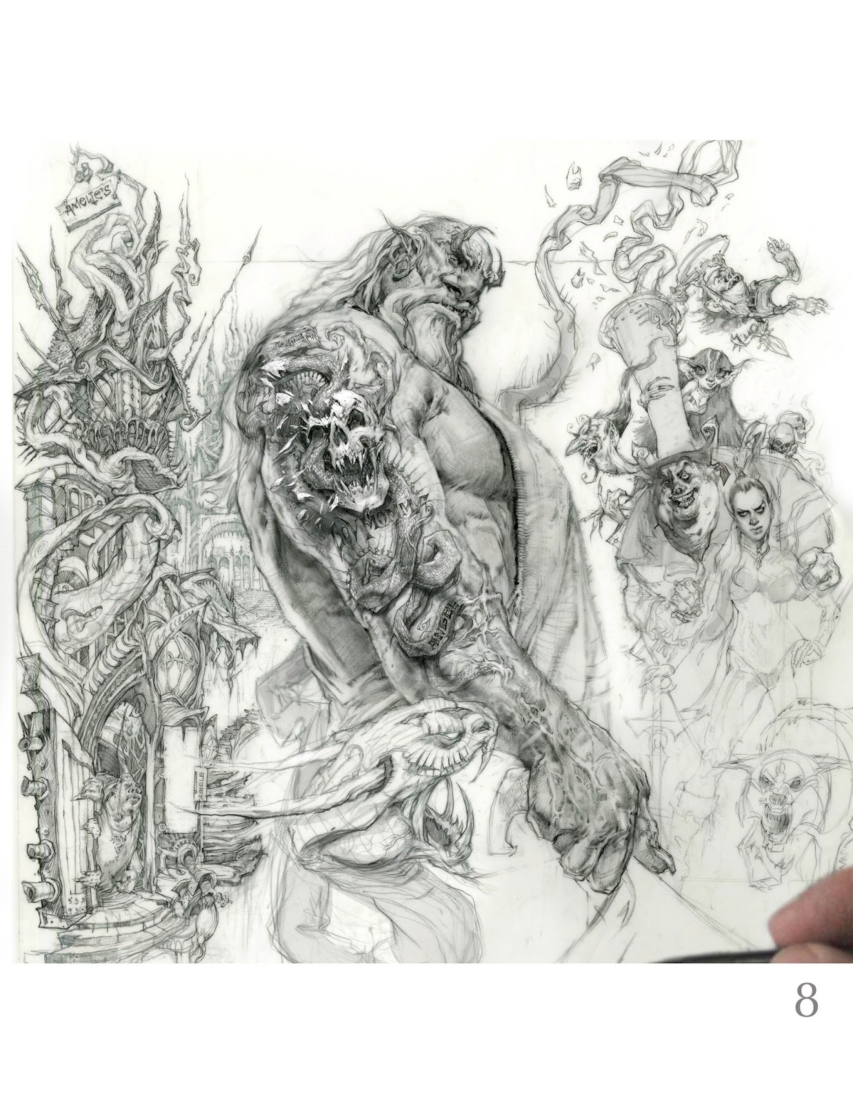
Step 8. The main character is almost finished along with the city and now we’re going to start having some fun with the bad guys. I wanted to make sure that every single character expresses a different attitude towards our hero. I decided to have a wicked dragon-like snake pop out of the pig mayor hat and try to bite our hero. Compositionally, it ties in all three pillars while adding depth, perspective and drama to the picture. This whole illustration is about designing your characters and keeping them whimsical and playful.






Thanks Mike! The progressions are really helpful and it's inspiring to see how you “play” with your characters(lov Mommy tat-snark). Awesome!
This is fabulous! Thanks for showing the scale by including your fingers and pencil–so much detail in so little space–how Do you do it!
Another great post Mike. Everyone you've put on here is exceptional. Your one hell of a creator!
That draftmanship, those huge changes…it is awesome. The way the snake head on the tatoo turn around the form- you are a master idd
Hey thank you very much guys!! Sorry, I did not reply on the last post I was having problems with our feed, but now we are up and running.
cheers Mike
Thank you to,
Sal, Suzy, Viking Myke and Gollorr.
cheers
Mike
How long does each stage take you? I'm working on becoming more efficient. Also, do you like to do most of your work in one sitting or spread out? Thanks in advance!
Thanks Mike awesome draftmanship! How do you keep your paper looking so intact after all the rubbing out? I work on Bristol paper and if I do one small alteration the surface feels like its had it!
Thank you Cassy and AvP,
this is for my new book so I work on the drawings in-between projects, an hour or so here and there. I think I have a total of five or six hours invested in this sketch. And the paper I use is Dura-lene it's expensive but I love it and it's super durable.
cheers
Mike
Also, you can see more of the step by steps on my Facebook page.https://www.facebook.com/mike.butkus.9
Mike Butkus Introduction to Character Design: Know Your Basics.” If you enroll with the link below, you'll also save $10 on your first class! http://skl.sh/1izoj2O