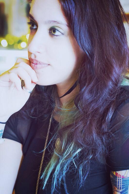
Muddy Colors would like to introduce you to our newest contributor, Lauren Panepinto.
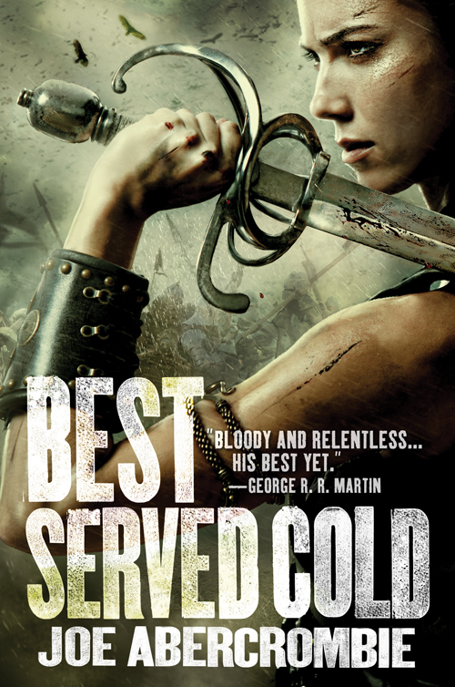
Formally trained in Graphic Design, Lauren has a Bachelors of Arts degree from the School of Visual Arts, NYC. After school, she quickly went on to design book covers for St. Martin’s Press and Doubleday Publishing Group. With years of experience, her enthusiasm and expertise quickly rocketed her to the top of her game, where she now holds the very esteemed position of Creative Director for Orbit Books.
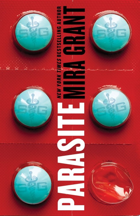
Lauren is also responsible for one of the most clever covers I’ve ever seen, which she created for the Dystopian novel ‘Parasite’. When I saw this cover on the shelves, it literally stopped me in my tracks.
Being a Creative Director means a lot of work. To be as active in the community as Lauren is, doing constant conventions and portfolio reviews… even more so. So I am extremely thankful for Lauren’s willingness to add to her already impressive workload, and share her insights with all of our readers.
I hope you will all join me in welcoming the inimitable, Lauren Panepinto.
For more info on Lauren, check out her interview with Sam Weber HERE.
And her interview about ‘How to Contact an Art Director’, HERE.



Welcome to the club Ms Panepinto! I hope you have a great experience at MC.
Dan, I'm confused by this sentence. “I am a firm believer that the ultimate goal of commercial illustration is to produce a great cover… not just a great painting.”
Maybe this is the fine artist in me struggling to understand, but what do you mean by that? Isn't a good painting or good book cover all-in-all a good composition?
Welcome Lauren! Good to have you onboard!
JJP
Not necessarily. Even though a great painting usually results in a great cover, that's not always the case. If it doesn't allow adequate space for good type, or doesn't attract the right audience, or doesn't stand out on the shelves… I don't feel it is fulfilling it's true purpose.
welcome welcome! Thanks for sharing your experience with us!
Hey Lauren! Really excited to see you starting here. Not only because the more girls the better!!
Welcome to the mud, Lauren! I greatly look forward to hearing your insights. I've heard your name around, mainly via Marc Scheff, a truely Awesome Horse. As a newcomer to illustration(fresh meat?), I am excited to hear what you have to say, both as an artist/art director and as a lady. I'm all about the well rounded viewpoint! Thanks for sharing your time with us!
Thats awesomesauce!
Thats awesomesauce!
Welcome! I went over to your site, which is beautifully designed (looking forward to seeing more of your work on there) and I absolutely LOVE your flowchart resume! I cant tell you how much I hate wordy resumes that make people sound like titans of industry when they were really responsible for changing out the toner in the printer. Anyway, that really made my day, looking forward to your contributions here.
Welcome, Lauren! A perfect choice for a much-appreciated move towards a more balanced roster, Dan.
I'm looking forward to your posts Lauren.
Well said Dan, like you need to hear that, everything is about context. Thanks for bringing in Lauren!
I really enjoyed hearing her on Sam Weber's podcast, “Your Dreams My Nightmares.” What a great addition!
Your podcast with Sam Weber was on of the best! Welcome. 😀
Hey Sam, that's a great idea for a future post, I'll add it to the list!
<3
haha yes, I spent all of my funtime extra energy designing the site, and haven't gotten around to putting the portfolio shots in. terrible, i know. But I really cat take any freelance if I wanted to….cleaning up my web presence is my summer project! (ARTISTS: Do as i say, not as i do! ha)
aw thanks!
I definitely want to get in to the Women In Fantasy Art conversation straight away! (adds to future post list…)
Marc is an Awesome Horse, and a brave soul, as he is sharing a smART school summer session with me starting July 1! Good luck to him…and to our fresh meat! I mean, new students…
Lauren! Glad to see you're on board. All the best!
Cool! Welcome Lauren!!
Welcome and congratulations Lauren! I look forward to your posts.
Love your work at Orbit and can't wait for your posts!
Welcome aboard, Lauren!
Really enjoyed your interview with Sam Weber and I'm definitely looking forward to your insights on the industry from a woman's perspective and an Art Director's perspective!
Welcome aboard. I too enjoyed your episode of Sam Weber's podcast, and I also enjoy your book covers. Can't wait to read more of your posts.
OK, so the cover of Parasite that Dan posted above made me think “Huh, that looks interesting…” Followed by “Oh, wait it's supposed to make me think that. Ack! It's working!” Another victim of successful Art Direction. Welcome!
Welcome Lauren 🙂
AAAAAA, there's little lamprey mouths on the caduceus pills! Brilliant! Wish I'd thought of that for Witch Doctor. Totally made my day.
You should've seen it in it's natural habitat! The colors, the large shapes, the coating… everything was just working for that cover.
Welcome Lauren 🙂
oh my god, the effects i got away with are totally design swoony…..the pill bubbles are embossed (and the crushed one is embossed to feel like it's crushed) then the cover is glossy with a dot pattern of spot matte coating, to make it feel textural like those pill packs generally are. <3
creepy little tapeworm heads, actually….they're really cool, design wise: http://www.meddebate.com/wp-content/uploads/2013/03/pork-tapeworm-cysticercosis.jpg
Ahhh… Designer Pr0n.
Welcome Lauren! Excellent Q&A 🙂 Gotta step up my game and get some submissions ready. Moohoohaha.