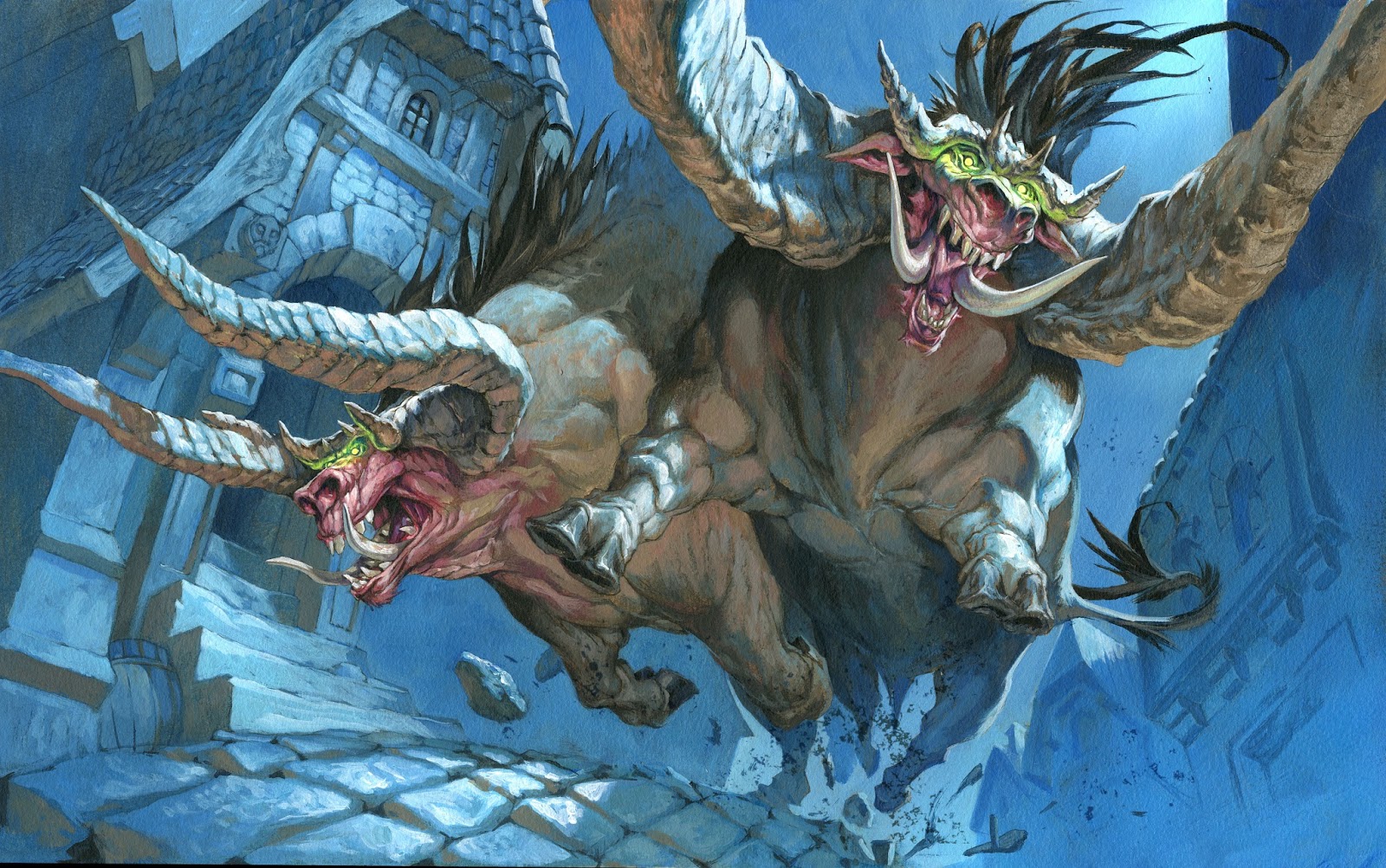
This illustrations is for Magic the Gathering – a set called Modern Masters. It was done with acrylic on 25x40cm watercolor board.
I was asked to do 2 monstrous forrest bull like creatures charging through a street with cobbled stones. To get the charging effect pumped to the maximum I pulled the viewpoint low so that we are almost looking up under the belly of the beasts. I used a fisheye lens to enhance the effect. It create a very dynamic angle.
I zoomed in on the figures to have the horns being cropped. It creates the illusion that they are so close to the camera that they will not even fit into the lense. You are just about to be run over.
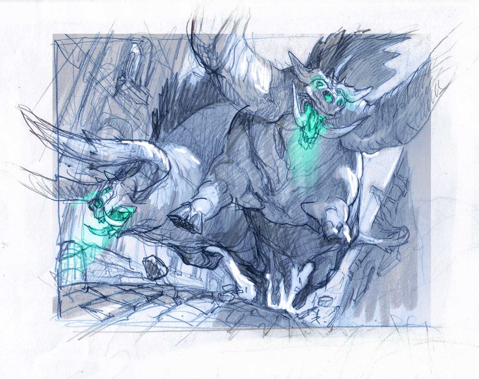
I knew I was going to make this image a night scene so I right away added the grey tones to get an idea of the strong white moonlight and where to place it.
I have had a bad habit of using rimlight too automagically over time. Sometime I just added it as an effect I known is working by simply drawing a white line along the shadow area of a figure. if the rimlight becomes too much of a line it looses the illusion of being light. So in this picture I tried to have the rimlight eat into the silhouette of the figure whitening out larger portion of the mass than simply along the ridge of the figure. This way it looks more like light. One more thing that Ilove is to have figures cast cast shadows onto each other or it self: Like in the head of the bull to the right: His face is casting shadows onto its own horn. The green light is the magic that has called these 2 bad boys out from the forest.
When going to colors I wanted to keep it very limited. Also I tried building the image up by using areas of warm and cold colors. Notice the brownish color on all of the areas that points away from the moonlight? I started adding it to the copplestones because I thought they looked too flat. I liked how it looked so I added it to the undersides of the beams and roof. Especially the bottom side of the horns I used warm brown to get the highest temperature contrast to the bluish white of the moon light. One more noticable thing is the level of details. I used red as a guidance to the eye around the faces of the figures, but I also painted the faces much more detailed and textured than the rest, to get more attention here. the further away from the faces, the less temperature contrast and details…all down to the feet that becomes blue silhouettes.
The green in the eyes of the bulls I would have liked to be able to leave out, but the color is important to the card. It shows that these guys are enchanted by green magic.


Wow, Great painting, and thanks for the walk-through of your thought process in setting up the painting.
Jesper, Great work/process as usual! Thanks for sharing.
This is beautiful! I really appreciate the areas with little to no detail, and it sends the message that these monsters will be the last things your eyes focus on before you're trampled.
Thanks for the post! I really like the way you deliberately compose your images with color. That's something I'm trying to learn to do more of with my own illustrations. Your work is an excellent example of that. Keep up the great work!
-Will
I love the valuable info provided in your article. I will bookmark your blog and often check back here.