 |
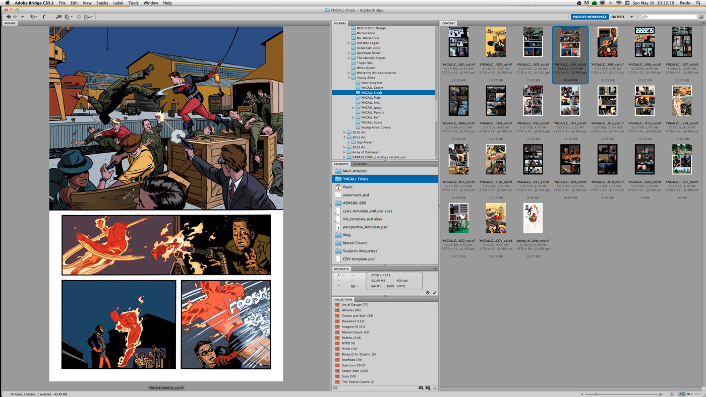
| Finished pages from my issue of Young Allies |
As with any pursuit that spans several years, organizing projects, new and old, can grow to be a daunting task. I use Bridge, Adobe’s asset management application, to keep a decade’s worth of professional work in some semblance of order. Why use this instead of the Finder on my iMac? Because it does much more than just keep things organized.
First of all, the previews are big and beautiful. Because Bridge is the same place where you can set (and unify) the color profiles for all of your Adobe Creative Suite programs, what you see is what you get. You can view a file at full screen by pressing the space bar, and full resolution by clicking on it. It does it instantaneously, so you don’t have to wait for large files to open in order to see all the details. While the Finder has gotten better over the years, it still gives me strange colors, especially for CMYK files (and will do even stranger things to layered files with channel masks). As with the Finder, you can label files with colors so they’re easier to spot. Hitting return opens a file, and you can also designate which programs open which types of files.
“Collections” are another simple but effective tool for keeping things organized. They allow you to group files together without moving the original from it’s home folder. That means I can put all my Spider-Man artwork in one collection, while still keeping the stories organized by story arc and year. This is also where I keep frequently used photo reference. I’ve got collections of athletes, NYPD, Rooftops, and suits — all subjects that I draw fairly often.
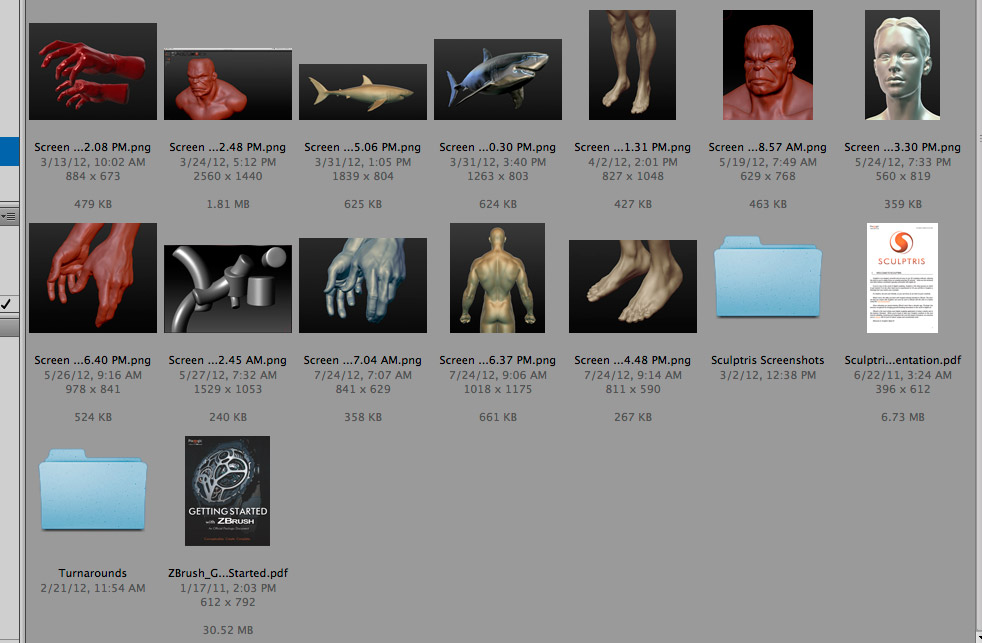 |
| My various Sculptris maquettes |
“Favorites” is a familiar concept, but since this is separate from the Finder’s “Favorites,” I can keep things strictly professional. Any files or folders that I use often get a link here (you can drag and drop things here, or select “Add to Favorites” from the right-click menu). This includes my templates (pages, covers, and perspective), Sculptris maquettes, my blog folder, and paolorivera.com watermark. It’s a simple concept, but it makes things very easy to keep track of.
Metadata is available in its own panel window, but can also be shown beneath each and every file according to your specifications. I like seeing the file name, date, pixel dimensions, ppi, file size, and color mode (RGB/CMYK) at a glance. As for naming your files, your client may have their own conventions, so always ask at the beginning of a project. I also have my own 3-letter codes that I append to every name. While not necessary, these work well for me. The important thing is to keep consistent to your own system.
lyt: these are layouts and preliminary sketches, often numbered when many iterations are required.
cmp: digital composites, where I finalize things like perspective grids or type.
pcl: pencils
cyn: the cyan print that I send to my inker (my Dad)
ink: his inked files
flt: the “flats” that my assistant sends me (basically a rough color pass)
col: the final, colored file that I send to the client
But all those benefits aside, the real key is automated tasks. I most often use it to create jpeg previews of uniform size that can be easily sent to editors for review (or uploaded to my blog). You can do this to entire groups of files thanks to batch processing. I’ve even used it to organize lectures, collecting all the images I want to show, moving them into order, and renaming them numerically to open in another program like Preview (and in my last lecture, I did the whole thing right from Bridge). All of these tricks can be found under the “Tools” menu.
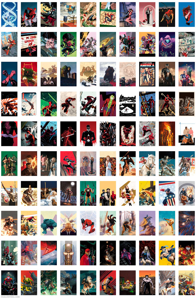 |
| 100 Marvel Covers. 2002-2013. Various mediums and sizes. |
I’ll leave my favorite feature for last, which is especially important for illustrators who work in series. When you click the “Output” button at the top (also accessible under Window: Workspaces) the entire format changes. You’re then free to select any number of files to create a pdf or web gallery. Both are fully-customizable with parameters like columns, rows, spacing, pagination, background, and format. I used the pdf feature to organize my first 100 Marvel covers, shown above. As for the web gallery, there are many styles to choose from, and if you have your own web site, you can even upload it directly from within Bridge. Here’s a link to all 20 page layouts from my Daredevil #1 issue.
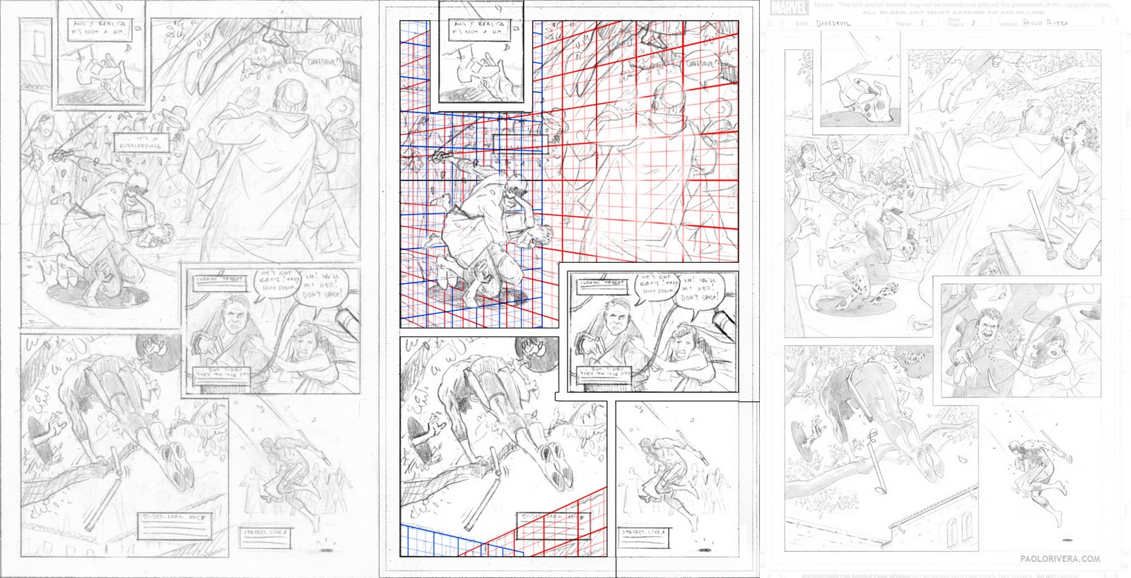 |
| Daredevil #1, Page 3. 2011. 1: Layout, Digital Composite, and Pencils |
While this post may have been on the more technical side, it happens to be the digital tool I use most since it’s the primary way I interact with myriad files. If you have Creative Suite and have always wondered what in the world Bridge is used for, I hope this will give you some ideas. (Adobe has recently revamped its business model into a monthly service called Creative Cloud, but I’m still using CS5 at the moment.)
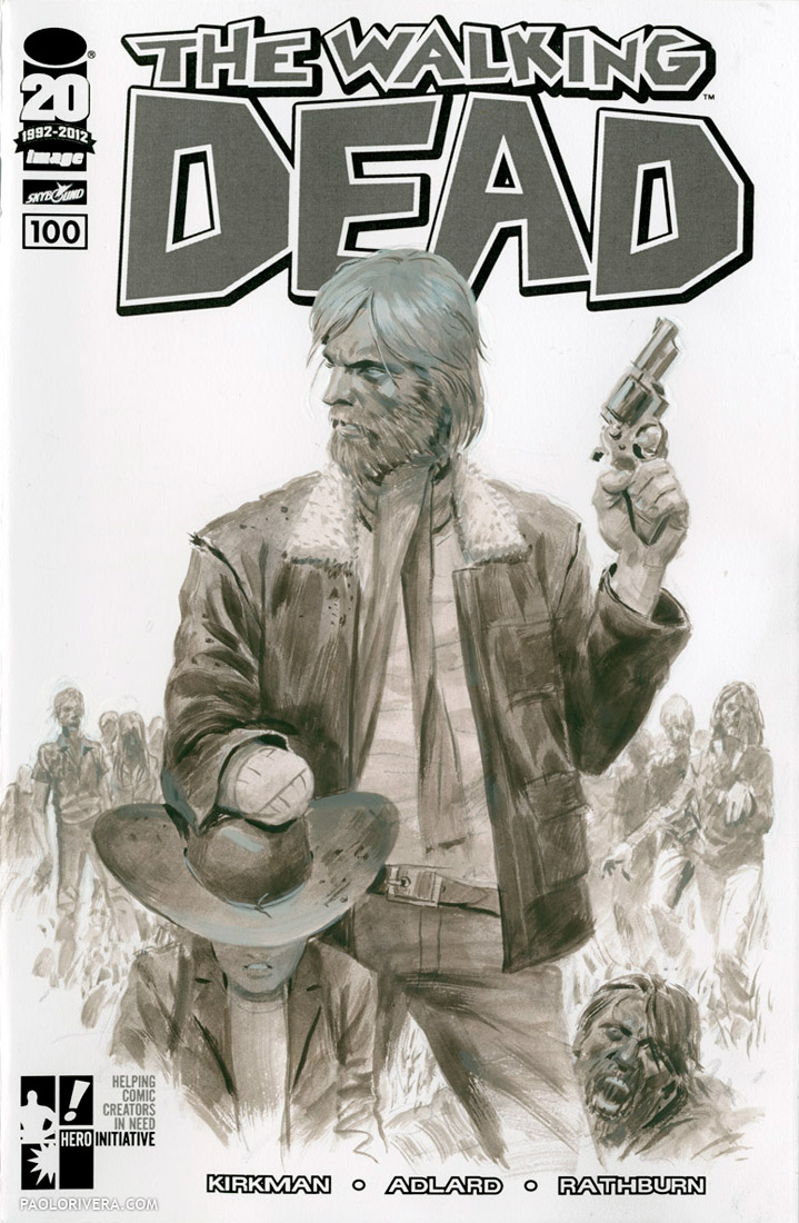
P.S. I hope you don’t mind my plugging an auction for a good cause. My painted sketch cover to The Walking Dead #100 is now open for bidding. All proceeds go to the Hero Initiative. Have a great Memorial Day!
 |
|
The Walking Dead #100 Project. 2012.
Acryla Gouache on sketch cover, 14 × 10.5″. |


thanks for this Paolo, I'm hoping this will help with my workflow 🙂
This is the same problem I have with my studio. I have to stop and organize and there are just too many other fun things to do. So Paolo, I'm hoping you'll fly on over here to Boise and set it up for me. Seriously I just opened Bridge and it looks like a great idea. I'll fiddle with it today.
This is great information that I hope to be able to use someday. However, the first image you posted with the colored page with the Human Torch takes me in a completely different direction. I was just at the Phoenix Comicon and saw a demo from HiFi color about how they digitally color a page. Their approach, with massive fading, highlights, day glo colors and special effects seems to dominate a lot of comics these days (and it's one reason why I don't read many comics these days). You can hardly see the inked image underneath. Contrast that with the beautiful, flat, but sophisticated coloring you show on that first image, and in other examples you've posted. I'm not really looking to create an argument, but would you comment on these two very different approaches and whether there's a trend one way or another?
Yo man, thanks for this post. These are the type of posts that keep me coming back to Muddy Colors. I was getting tired of Br sitting in my applications folder collecting dust, now I feel like I have a bit of a head start in learning how to use the program.
Belinda: My pleasure! Hope it works well for you.
Bill: I'm on my way.
Andre: Glad I could help. I've still got plenty of apps collecting digital dust. Manga Studio Pro and ZBrush are 2 that I want to learn, but never find the time to work with.
Douglas: When it comes to coloring, there's no accounting for taste. I've always been a fan of simple, flat coloring, with classic, two-tone shading. The other approach is the most prevalent, but the flat style isn't going anywhere. I've seen the more rendered coloring look good, but it has to have a matching penciler and inker.
Anyway, I'm glad you like my take on it. I'm planning on writing a post or 2 on digital coloring, including a couple videos about how I make my color choices.
Thanks, everybody!