This is becoming an old painting. It has never been printed except for in Spectrum 19. The product it was made for has not been published, and Atari who commissioned me to paint it has now closed down.
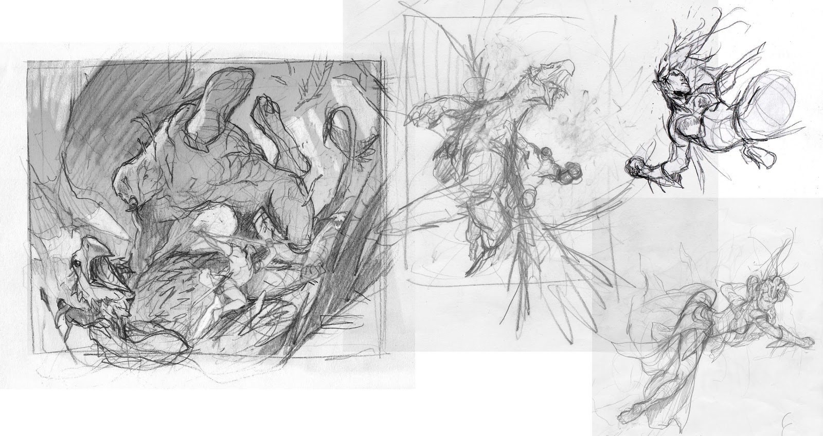
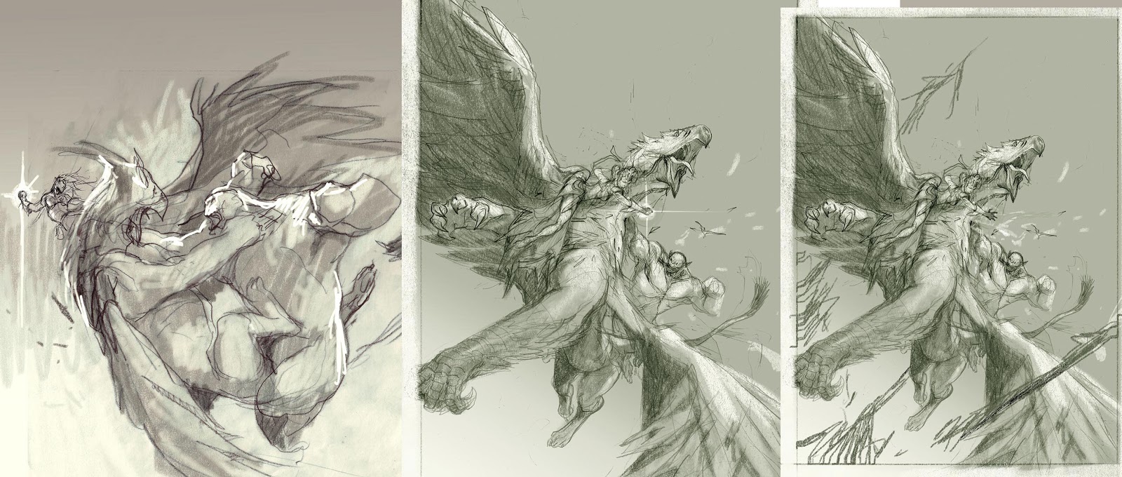
Here are some of the stages I go through.
I keep the thumbs around 8 cm tall. I end up submitting the one I like best. In this case the image with the griffin pinned down, Blood demon holding it by the neck about to throw the killing blow. If you look closely you see I placed the female rider on its neck/back readying a spear thrust, right before she herself is crushed. A last chance perhaps.
The thumb was rejected because it reminded too much of the counterpart cover that I was commissioned to do at the same time. It had a silverdragon crashing down a mountainside with a mindflayer and a purple knight. Also I kind of misunderstood the sizes of the two adversaries. The Demon needed to be much smaller. I still wanted to do a dynamic almost falling fighting scene to make it theme up with the other one. The next thumb I submitted was the one with the demon hanging on the back of the griffin while punching it to death. I tried adding three tops to pull the action into the part where they are just about to crash compared to the first one up in the sky. In the end I got frustrated with it. One of the guys at the studio came in while I was transferring the sketch to a board and said “ It looks more like the demon is riding the griffin cos they are friends. Not that he is killing it.”. I sat in silent fury for an espressos time and then started erasing the whole thing. Next time I’ll show you how it ended.
Point is, sketching is an ongoing process, like an excavation of muddy soil where you try to reveal the truest form of a story or setting by chiseling away nonsense and unclarity by using the tip of a pencil. The further you dig, the bigger the treasure.



Awesome stuff -love the way you effortlessly make all the scenes so dynamic.
You could have swapped the woman and demon around? Not that I thought it looked like the demon was riding the griffin -don't listen to the guy in the studio again!
You say 'pencil' but the background at least looks digital -am I wrong?
Amazing work. I discovered your blog last week and I really enjoyed with all your works. Keep it up!
The dynamism in your layouts is incredible, especially the gesture of the figures. Can't wait to see part 2.
hi Ejsing
and saw how it turned out because it was published in the expetrum 19 luxury stay and these sketches are very good
Yeah it is pencil. But I add the greytone digitally when I need to send it to an ardirector. It helps he reading of the figures and adds a mood and light. I really do not wanna waste time cross crossing my sketches too much. Most of the real drawing happens when I am drawing the thing on the board. I want to keep it as fresh as possible on the painting surface rather than having a perfect sketch.
btw. Effortless is certainly not what it feels like when I am redrawing things for the 25th time, but I am glad it looks that way.
“Point is, sketching is an ongoing process, like an excavation of muddy soil where you try to reveal the truest form of a story or setting by chiseling away nonsense and unclarity by using the tip of a pencil. The further you dig, the bigger the treasure.”
Brilliant! I completely agree and I think your second thumb/sketch is better for it. They feel more airborn in this version. I'm exited to see it in color; I'll have to seek out the finished illustration.
Do you know what is best video editor app get a complete guide from inshotproo.com .