Well, if I wasn’t in trouble before for painting sexist covers that objectify women, I am pretty sure I will be after this one.
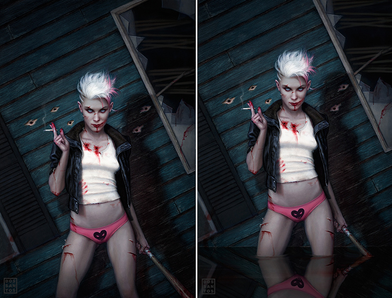
A few years ago, I painted the cover to Diana Rowland’s ‘My Life as White Trash Zombie‘. None of my usual models actually fit the description of the heroine, Angel. So, in order to achieve the kind of look I wanted, I actually used photographs of three different women. I took features from each of their faces, and homogenized them into a single face that I felt accurately portrayed the character in my imagination.
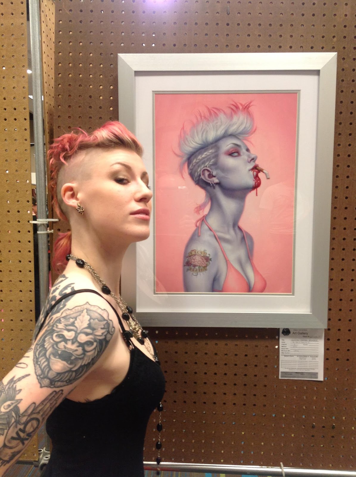
Little did I know, that the girl I made up actually existed. This past Summer, I met ‘Comic Book Girl 19′. She came up to my table at Dragon Con, and proceeded to tell me how people have repeatedly brought to her attention the similarity between her appearance and that of my character. She stood in front of my painting, and sure enough, she was a dead ringer!
CGB19 and I stayed in touch after that. She is a talented artist herself, and the host of an absolutely brilliant show called ‘The Comic Book Girl 19 Show‘, in which she reviews all things comic book and pop-culture. (If you’re into comics, I highly recommend it!)
So when I got the call to do the third book in the White Trash Zombie series, guess who I immediately thought of using for a model?
That’s right.
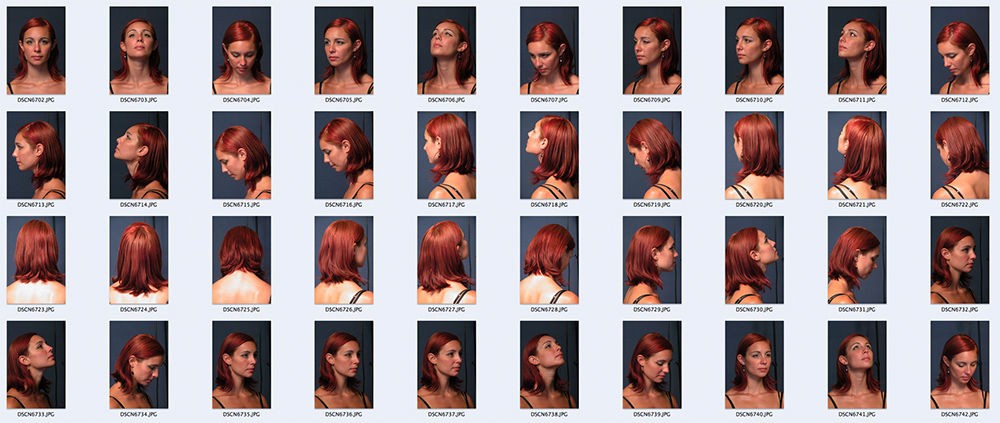
Just one problem… CBG lives in California, and I live in Connecticut. There is no way the book’s budget is going to allot for a trip across the country. So I did something I’ve never asked someone to do before… I asked CBG to do a photoshoot on my behalf, and email the photos to me.
Now normally, I would never ask someone else to take my photo reference for me. Because I paint so realistically, I feel a lot of the picture making actually happens through the camera lens. Cropping, eye level, lighting, pose, costuming… there is a LOT to account for. And quite honestly… I am VERY picky.
There are two reasons I felt confident in asking CBG to help me. Firstly, I watch her show all the time. So I know she is an avid cosplayer, and I know she can definitely sass it up in front of the camera. Secondly, the show is REALLY well filmed! The videographer, Tyson Wheeler, does all the lighting, filming and editing himself. It’d be an understatement to say he knows a thing or two about taking nice photos.
So I emailed CBG and Tyson the approved sketch. I also sent along a few photographic examples of the kind of lighting I was looking for, and ultimately, left the rest in their capable hands.
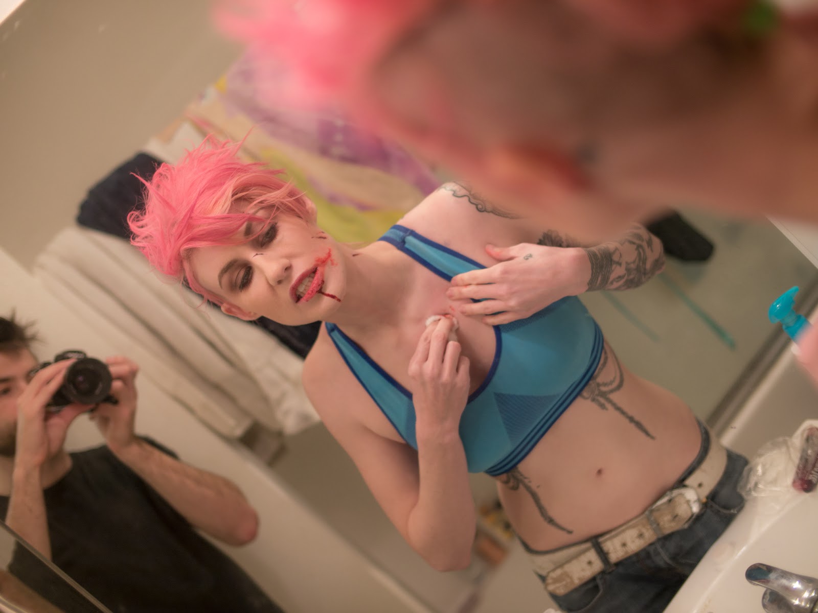
What I was expecting was some simple snapshots in a leather jacket. What I got back, was amazing. CBG and Tyson did a full blown photoshoot, with complete costume and make up! Suffice it to say, the two of them made my job VERY easy.
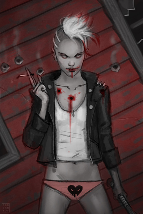
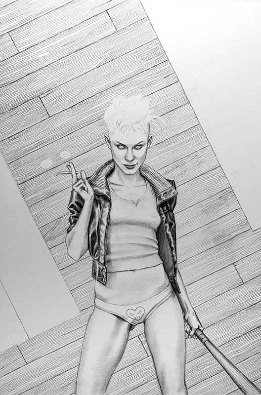
Once I had the photos in hand, I proceeded as usual with my piece. I used the photos to revise my sketch, and then project the image to the board.
I knew I was going to be painting quite thinly on this piece, so I actually spent a lot more time than usual on the drawing. With a highly rendered drawing like this, you can just glaze a bit of color, and the image starts to come together very quickly.
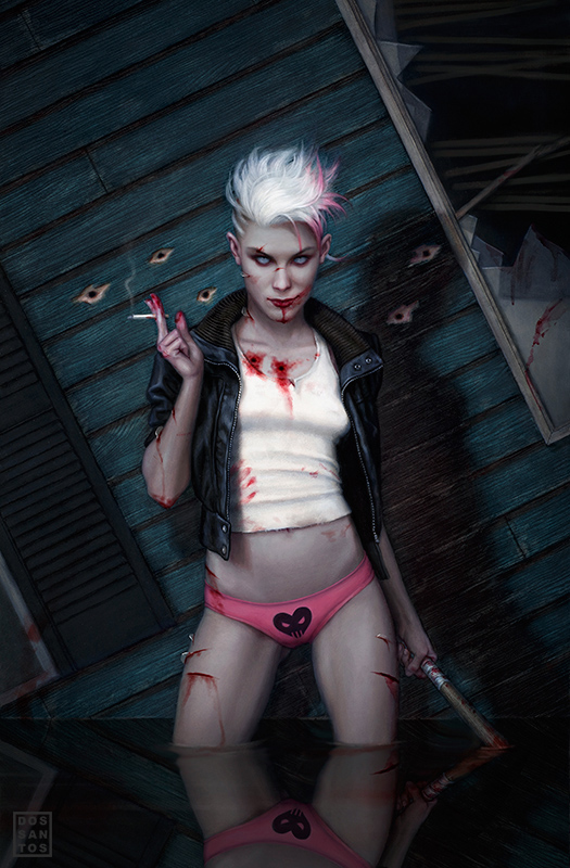
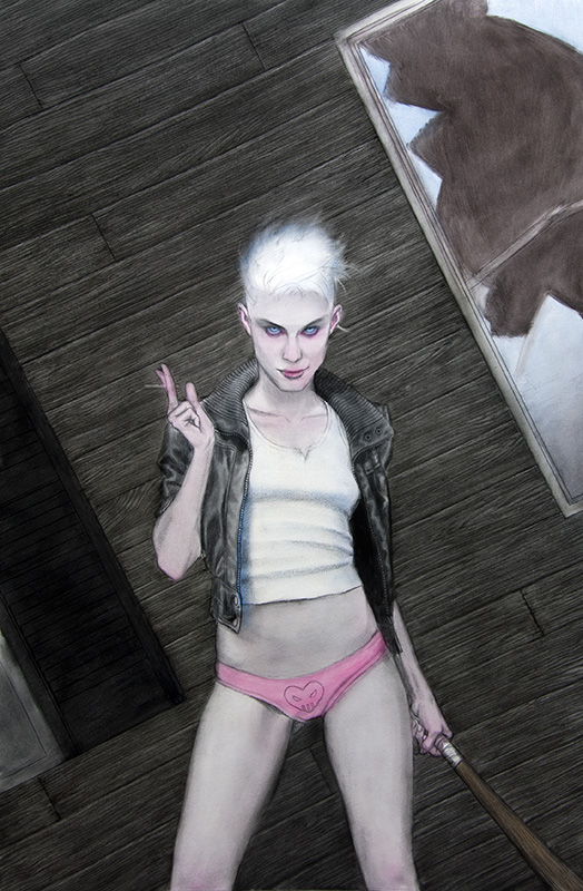
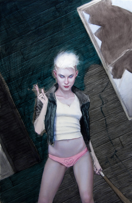
Initially I was going for a grey/black/pink color scheme in order to compliment the first cover in the series. But half-way through the painting, I decided the background would look better as a blueish-green instead of grey. Fortunately, I was able to just glaze that new color right over the already dry background. This ability to work very transparently is one of the great benefits of oil paint.
A few more coats on the figure, and the painting is pretty much done.
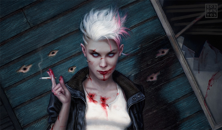
The image was originally supposed to have Angel standing in flood waters. But because of my indecisiveness about the background, I decided to leave the water out of the original. I didn’t want to change my mind about something, and then have to completely redo all the water too. Instead, I added it digitally at the end, and let the client choose between the two versions.
And finally, here is the completed image with type treatment.




Possibly your hands down most entertaining post. Good art. Sexy woman. Brilliant. haha
But seriously, interesting.
I love the zombie covers, some of my favourite paintings ever. This one seems a lot darker, less pop-art, but I love this one too. The details you get in your work just blows me away, how long does it take you to get from the sketch to the finished painting? Thanks for posting!
This is my favorite of your White Trash Zombie pics. Excellent painting and a very cool story.
Great post! This is my favorite of the Zombie covers as well.
Great piece and a great post! How exactly did you go about doing the initial drawing beneath the paint? Did you create your sketch, project it on to the board and copy it over in graphite, and then go into more detail before you started in with the washes?
Dan, you sexist exploitative pig! Shame on you: SHAME! Translation: I LOVE this! 🙂
Her boobs aren't big enough. If you really want to go on the list do it right. This is a great post, story, and piece Dan.
Dan, this is a great post! Thanks for sharing! Wondering though, what did you use to thin your oils?
I literally bought a book from this series based on the cover artwork!! I know do not judge a book by it's cover but in this case I was not disappointed!! Since then my Wife has bought me a signed copy of the DragonCon poster!! I love your work!!
I typically spend 2 weeks per piece, sometimes a bit longer. In this case, I spent about 3 days on the drawing, and maybe 7 days on actual paint. the rest of the time is spent sketching concepts, reading manuscripts, taking reference photos, etc.
I'm happy to hear that!
That's precisely it. I do all my sketching digitally, so I can infinitely revise. Then I project or transfer that sketch. The transfer is pretty crude, usually just a silhouette and big shadow shapes. But it's enough to ensure my proportions are accurate. Then I go in and really render, sort of filling in the blanks.
Turp and Linseed oil, mixed equal parts.
Glad to hear it! I hope you're enjoying your print.
LOVE, ComicBookGirl. That shot of her with the painting is fantastic.
I hadn't seen tthat BBC article, thanks for link!.
It's great to see the discussion on this is still going, many of us (fans of SciFi/Fantasy and of art) have been calling b.s. on the artwork for a long time.
Why the artists go with cliche and ridiculous rather than creative/outside-the-box is, I'm told, mostly a matter of money, meaning whoever signs their paychecks. So, the SOS* is on the publishers and companies as much as the artists. They like the box, it works for them.
The fans who are seriously over it can only dismiss them, and look for artists with more going on than that and throw our support their way.
* Same Old Sh*t
Hey Dan! Great piece! What illustration board do you typically work with? Since I'm shackled to a computer all day I've decided I need to get back to my roots and start learning new traditional media. I've got watercolor down but I really want to conquer oil and acrylic next. Any tips? (if you want you can just email me: melissakochart@gmail.com)
Thanks! And keep kicking ass!
Melissa, I'm glad to hear you're debating painting traditionally. It really is rewarding in a way digital isn't. I use a primed illustration board. I highly recommend Strathmore 500 series. In fact, I don't use anything else. 3 thin coats of gesso on each side, and it's ready for any medium you want!
I agree with Bill- the bigger, the marrier.Great piece as always, not surprised at all actually- would be much more surprised to see a bad piece of yours, but that would probably have the same effect on the universe as deviding by zero…while on the topic, should I be the first to go anonymous and say smth bad about this work to get the things going again? Come on ppl, trolling makes the economy work 😀 Just kidding, let's not make a YouTube out of this 🙂
You can certainly try… but I think you'll find it difficult, as I turned off anonymous posting.
I love it!!!
cheers
Mike
Very cool. Thank you for sharing your process.
Uncanny!
Kudos Dan. I'm interested in using a projector. The Artograph Digital Art Projector LED300 looks ideal. But I don't have the $700 to solidify that idea. Got a suggestion for an affordable method to project an image onto a board? Also im curious as to what type of projector your currently using. I appreciate all the help that you & the other professional contributors provide.
I enjoyed your first White Trash Zombie piece but this pose is wonderful! Sorry, I'm a woman but I love sexy tough babe covers! She is great! Thanks for sharing the info and the pictures.
You can get a cheap Epson projector for like $500. It's what I use. The problem is, the pixel height is only 600 pixels or so, and since all of my images are vertical, there is very little detail in the image. Though, that's probably a good thing. To date, one of the best quality images I've seen comes from old overhead projector (like what your math teacher used to use). You need to print your sketch onto a transparency, but the result is sharp. If all else fails, just graph it out. That's what I do half the time anyways.
epic work..thanks for sharing .. truly inspiring 🙂
Great story, it all fits so perfectly.
I remember your first post on the cover CBG19 is standing next to and the controversy over it. Controversy is good.
I liked, to my surprise that cover, but I like this one even more. You are right on the background color, the green makes the figure come alive. Great art.
I'm glad you did,I mean it 😉
An inexpensive enlargement method is to create or scan your art into the computer, enlarge it so that it is the same size as your painting surface and then print it out using the “tile” option, which is available in most print dialogue boxes. This will print the entire piece onto several pieces of paper which you can trim and tape together, giving you an accurate repro at the size you need. Shade the back of the taped-together result with graphite or a number 2 pencil, tape the piece to your board and trace over the front with a pencil or pen. Quick, cheap, reproducible. One other advantage: You can flap it back over your board at any time and re-trace any areas that might have gotten distorted or covered over.
Great post!
The glass shards in her face did it for me…lol
🙂
Awesome piece Dan! The pose is super confident and the strong diagonals really make a cool unusual composition. I like that you added the blue-green to the background. So if your characters are mysteriously turning out to be real, maybe you should avoid drawing any unstoppable alien face hugger type creatures.
Hi Dan! I've admired the skill you employ in your work for ages and this is probably my favourite cover of yours I've seen. The colours are astonishingly beautiful and well put together, and I only wish I could see it in person and not just through a screen.
I read the bbc article, and as a young women I'm used to aligning and identifying my appearance with countless female figures.
In mainstream media and also (actually especially) from 'alternative' forms of art, there is a disparity between how I am and how my gender is depicted, celebrated, and used as a marketing tool.
This hardly puts me of sci-fi but I do find it quite alienating. I rarely see a piece of art come close to representing me. While a certain degree of sexism is inescapable (it is how our whole culture operates after all) I wish it wasn't always necessary to objectify the main character, if that character happens to be female.
I couldn't help but notice that your background resembled rockwell piece that was included in your previous post “appreciating rockwell pt 3” http://muddycolors.blogspot.ca/2012/01/appreciating-rockwell-pt-3.html
i'm no trying to discredit you, i'm guessing it was probably by choice. just something i noticed.
It's funny, I noticed that too… but not until AFTER I painted it. I think because I had originally intended for the background to be red, and then grey, that it never occurred to me. After I made it Viridian, I thought 'This looks familiar'. Then it dawned on me that I had seen Rockwell do it. I even went back to make sure that I wasn't being too derivative, just in case. I decided it wasn't so close as to be considered derivative (otherwise I would've canned the idea), but I'm certain it subconsciously inspired me. Not to mention, that I hadn't planned on putting water in the piece. That was the AD's idea.. which really makes it look similar! Oddly, it was a Mead Schaeffer painting that I was intentionally pulling inspiration from. Someone once told me that 'Your first idea is usually someone else's'.
I see a lot of Angel in MMA fighter Bec Hyatt. http://fighterjournal.com/wp-content/uploads/2013/01/bec-2.jpg
fantastic, I really enjoy your work and site, Muddycolors is great. I've just discovered and started to get into Comicbookgirl 19.
Wow! This is really great! I was reading up there in one of the comments, how your transfer your images to the board. I was curious about how you did your sketch from photograph. Do you sketch over the photo in Photoshop or are you freehand sketching all the way? Either way, I am a huge fan of your work!