First, why working with opacity ? Well, it’s a good and simple way to paint very smooth gradients and blending colors. Of course it’s not the only way but if you want to achieve very clean results, I think you have to try this…
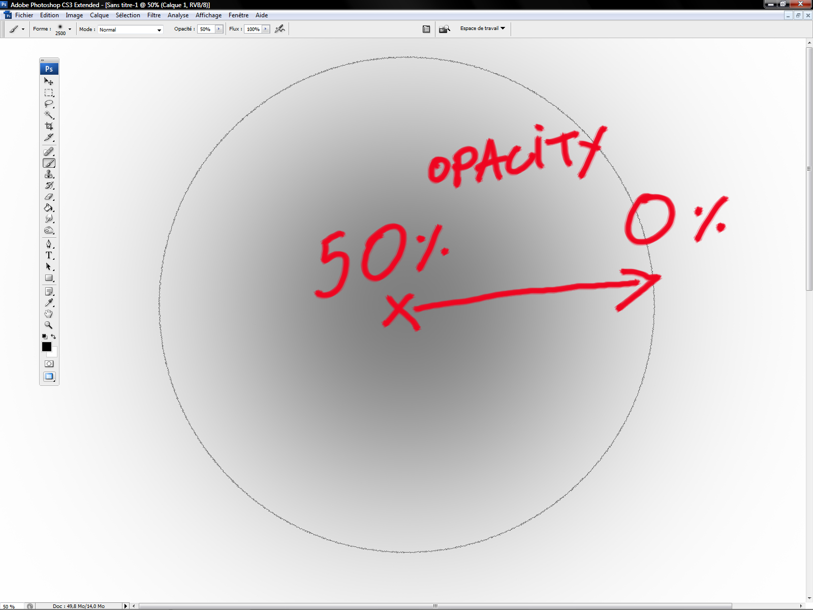
So what is opacity ? You can adjust the opacity of your brushes and the opacity of your layers, it’s the same in every softwares. If you decrease the opacity of your layer, it will become more and more transparent. If the oacity of your layer is equal to zeo, you will no longer see it …. Simple.
If you work with a tablet, the opacity will depend on the pressure of the stylus. It’s quite impossible to work well with the opacity by this way. Try to NOT USE the stylus sensitivity. Yes, I know, it sounds like hell for a lot of peoples but belive me, it’s the good way to proceed.
In order to emulate a traditional airbrush, I use the soft round brush most of the time. The soft round brush is a standard brush, you can find it in PS, Painter, The Gimp.
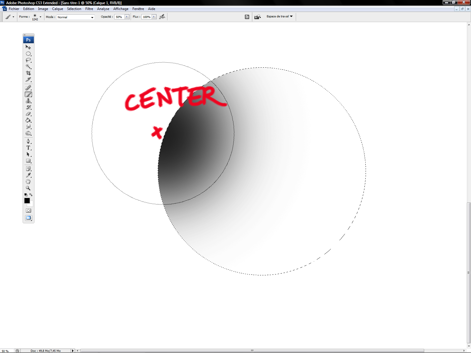
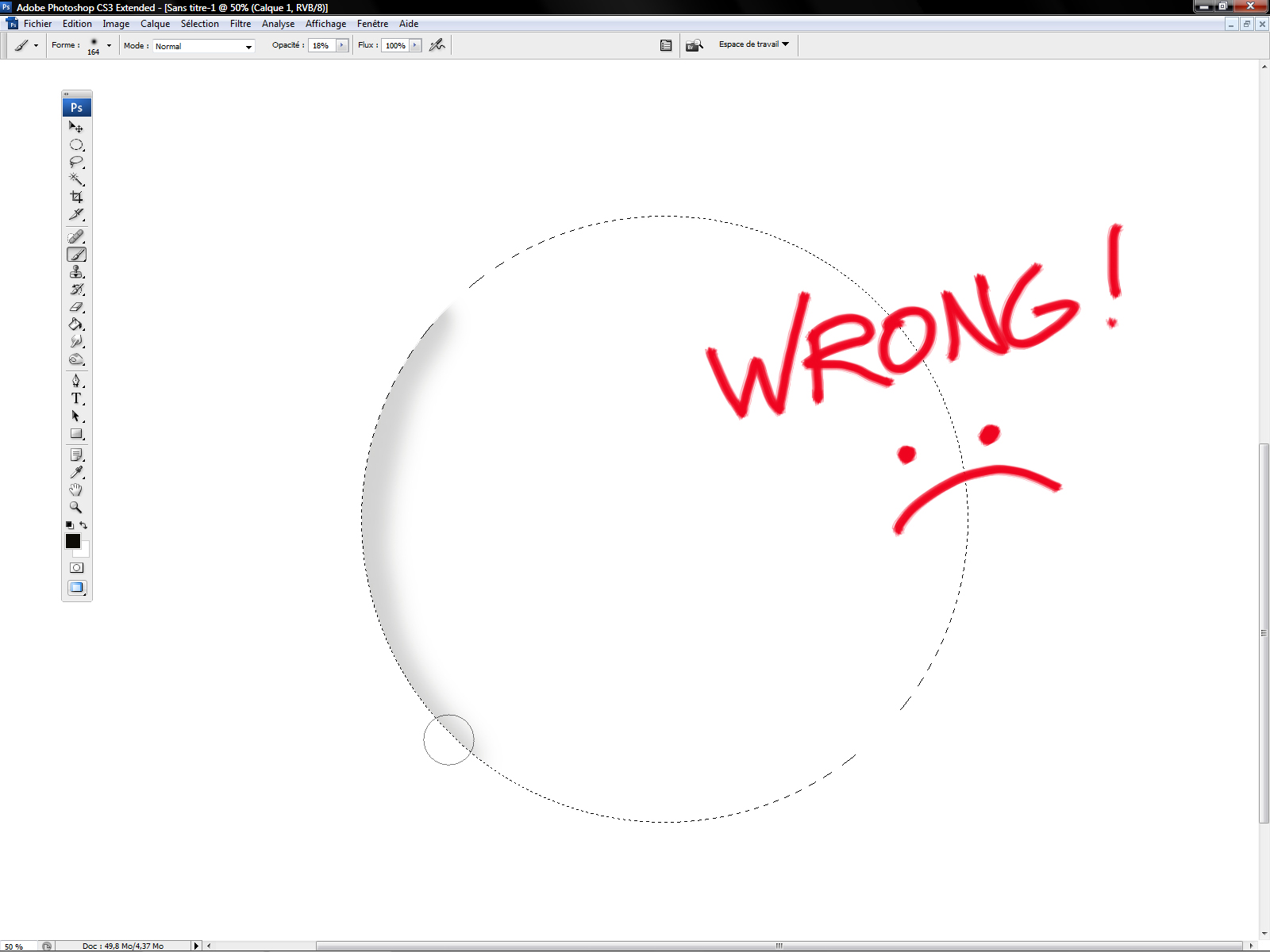
Choose the size of your brush wisely. On big objects, work with big brush not with a small one …
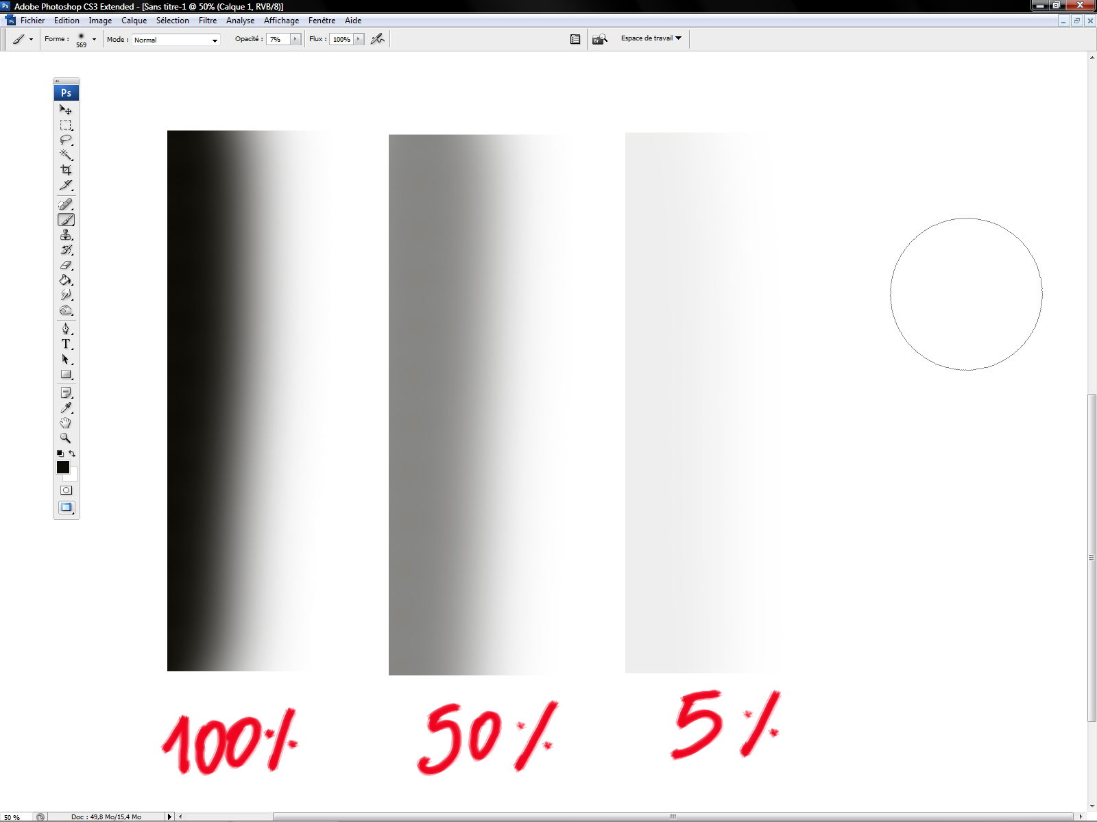
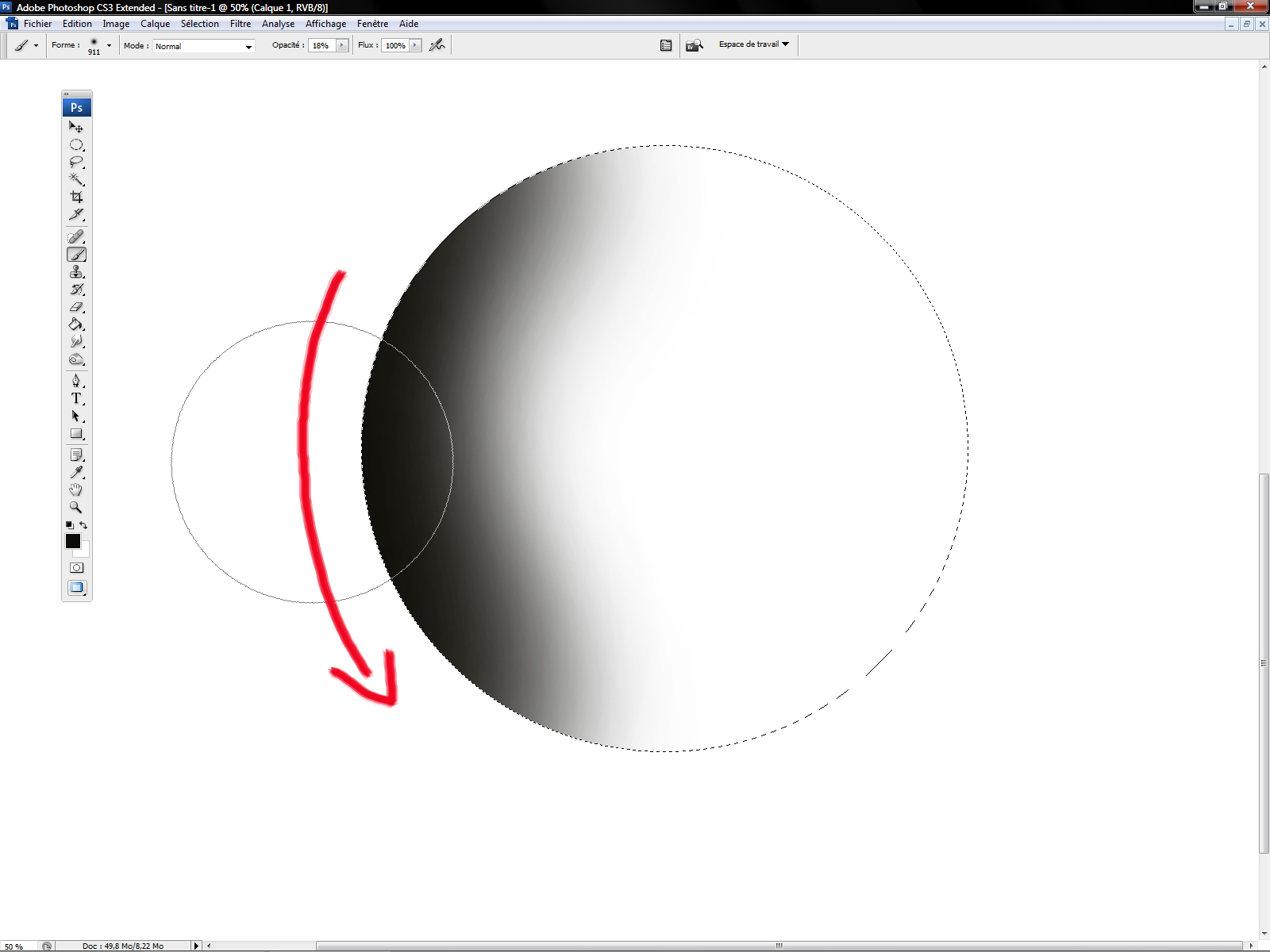
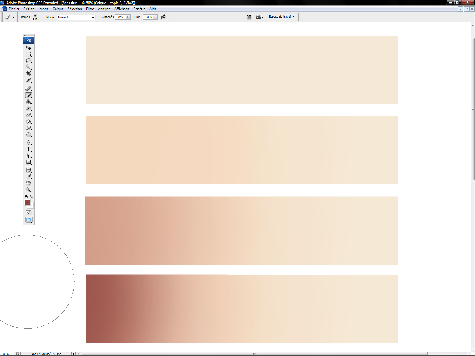
With a low opacity, one stroke is not enough …
With several strokes, it will be good.
_________________________________________________________________________________
Example : Cartoon nose
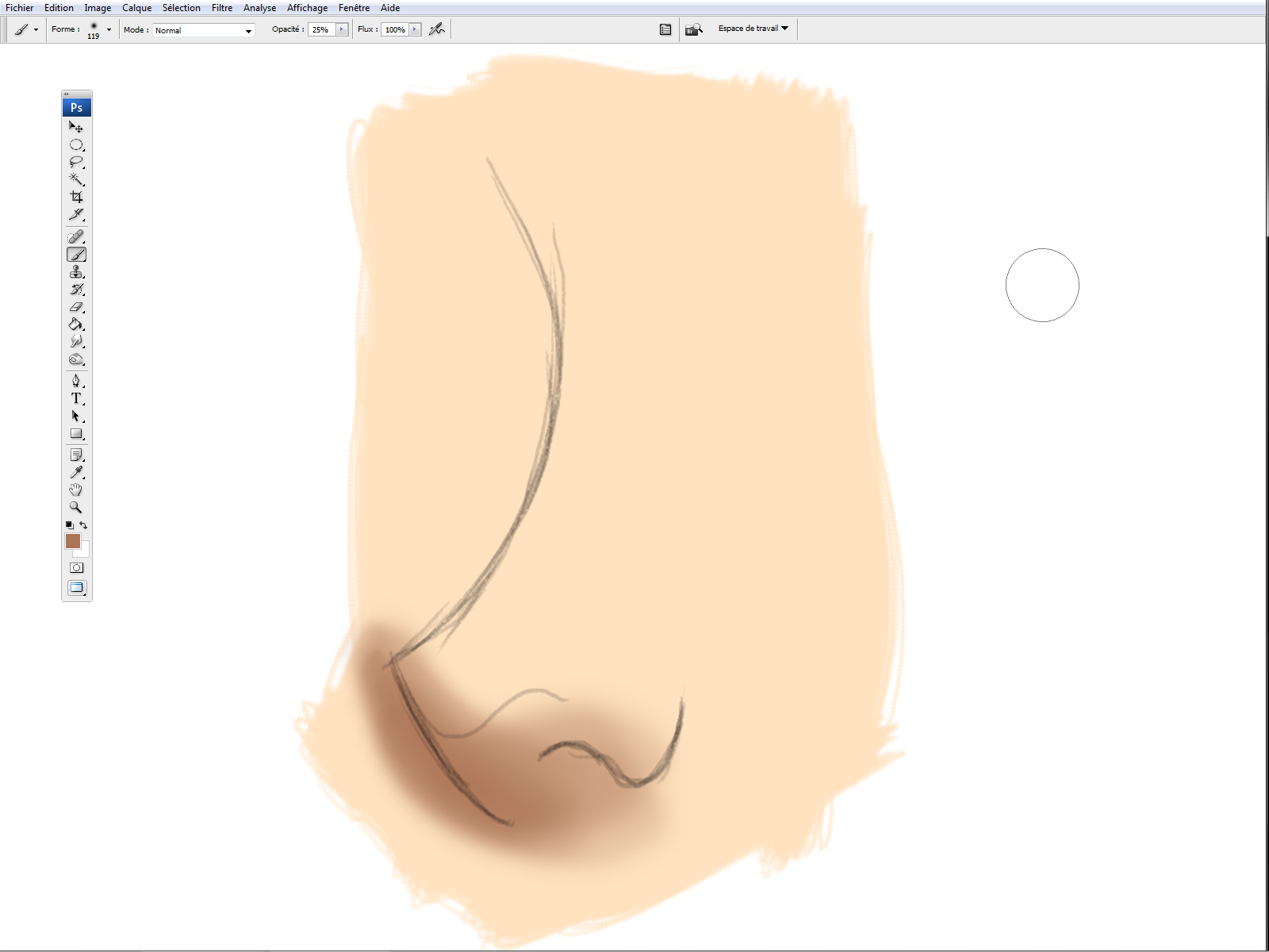
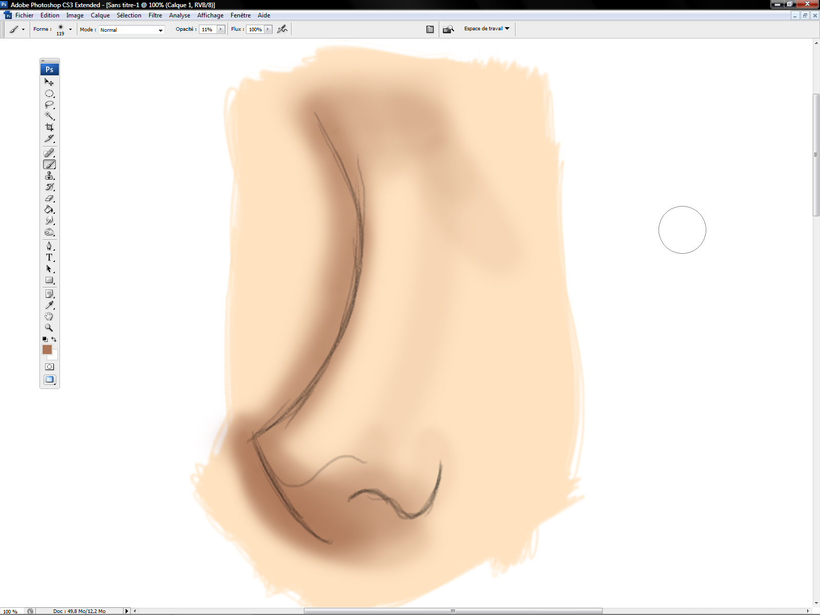
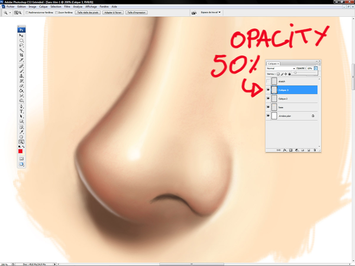
In this picture, I already created 3 layers. One for the sketch (on the top), one with my basic skin tone and one for my soft round brush strokes. The opacity of the layer of my sketch decreased litle by little.
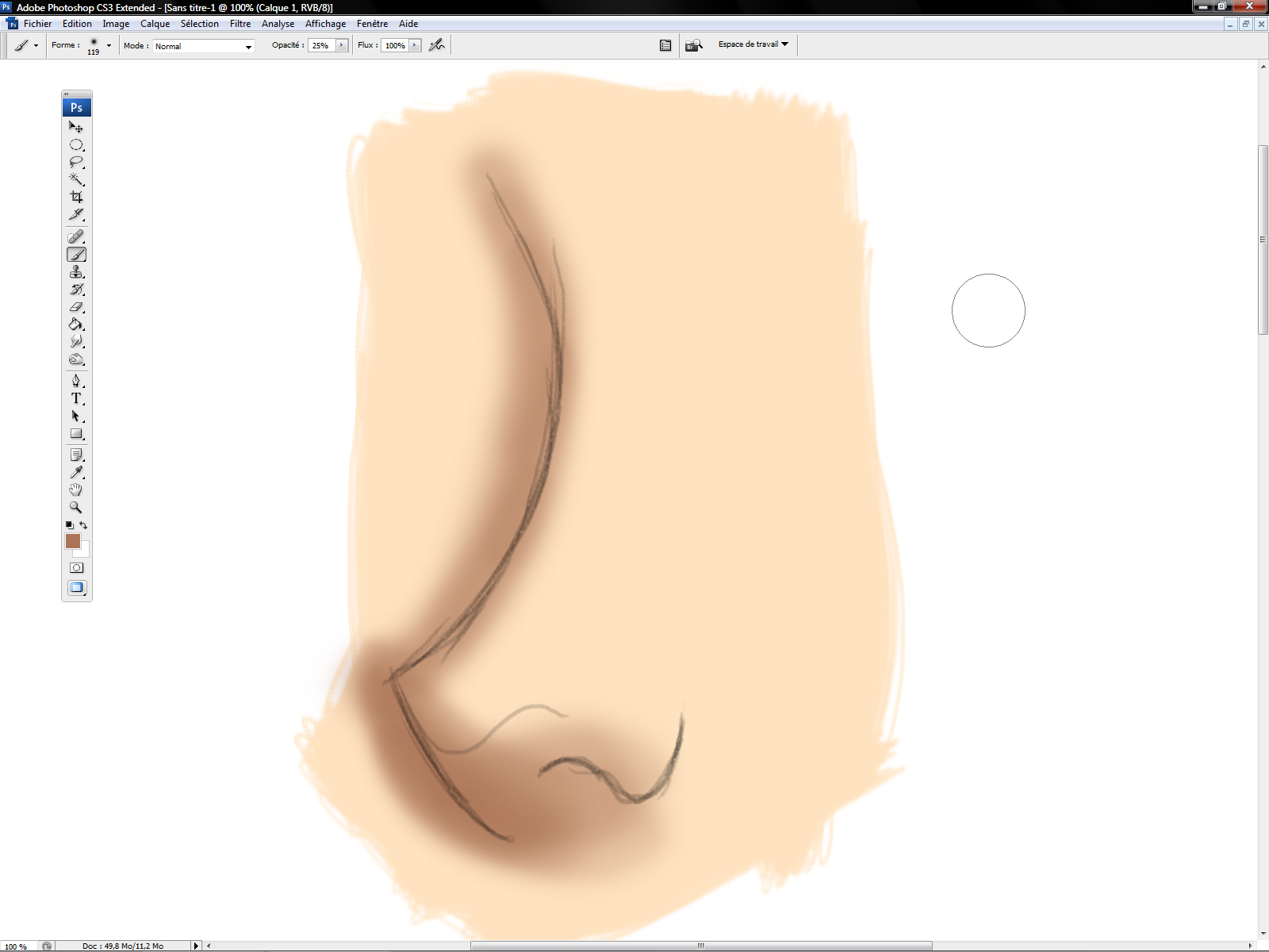
I started witth a dark brown with very low opacity, about 10 %.
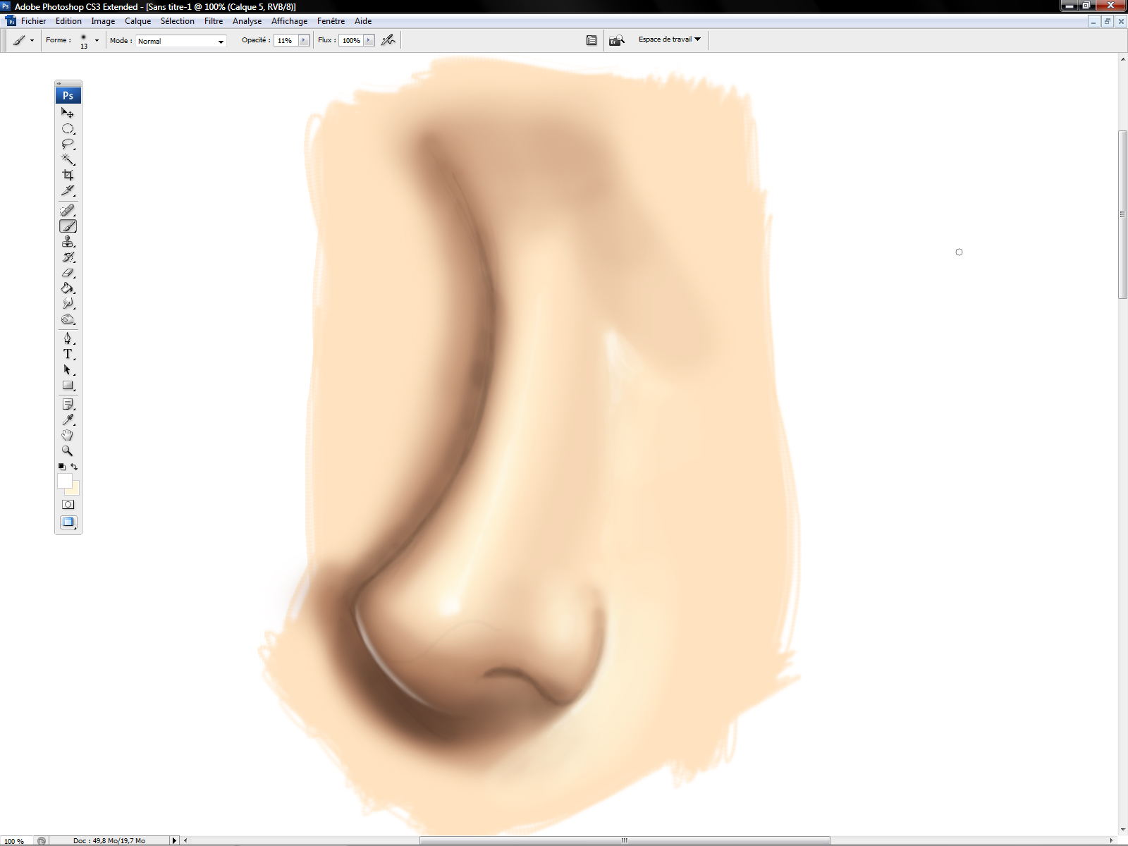
I added the shadow with a less red brown than the first one (opacity about 10%).
Then I painted the brightest part of the nose with a pale yellow (opacity about 10%).
I added the reflective part of the nose with pure white.
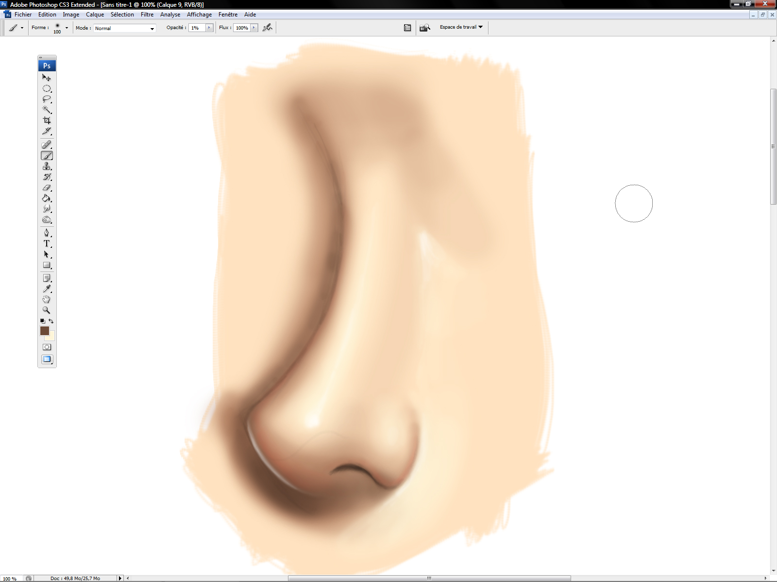
A little bit of red to emulate the scattering surface. Work carefully with very satured tones, look at the opacity …. 1% !
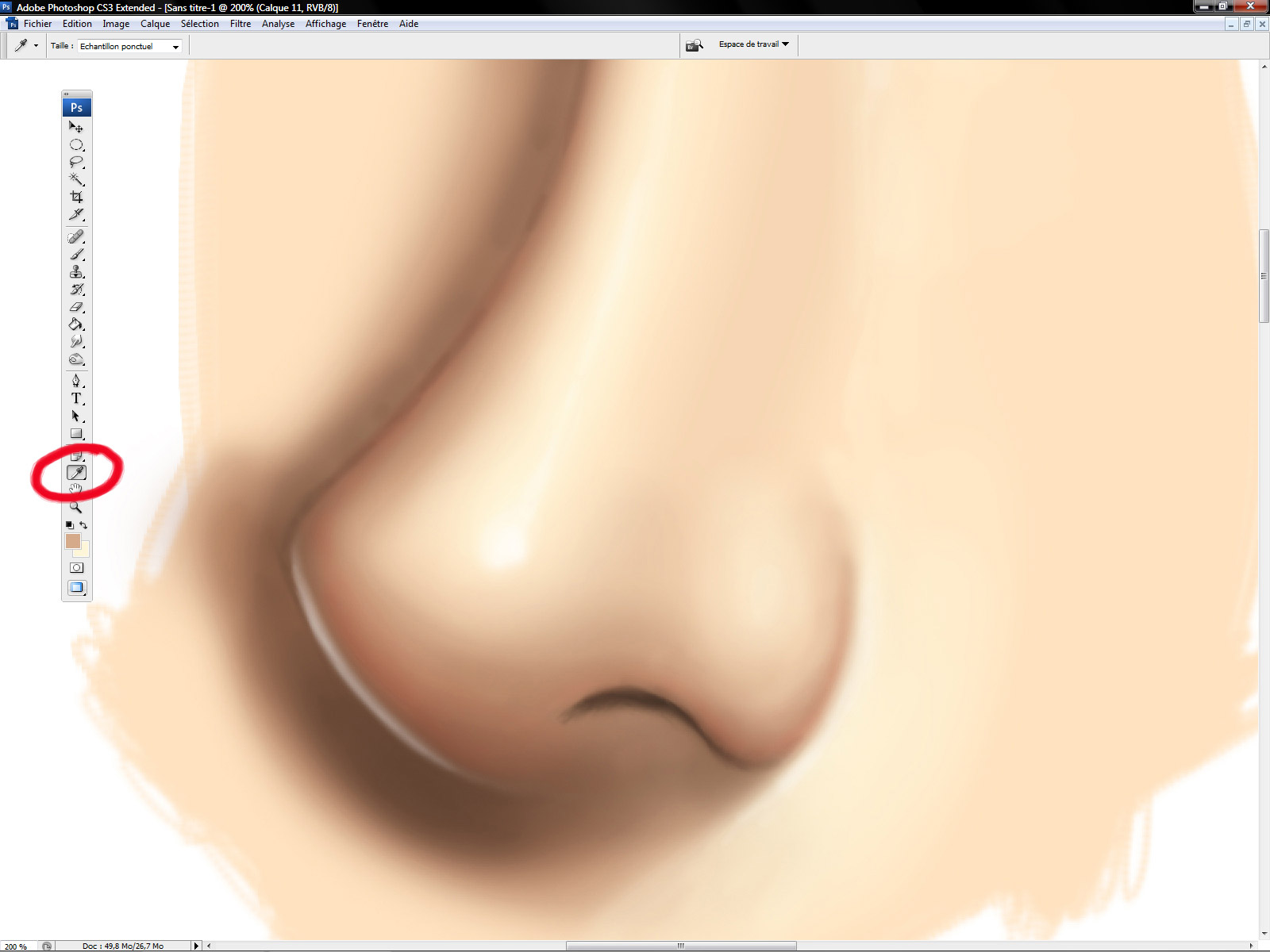
The eyedropper is very useful if you want very smooth gradient. Pick the color and do small strokes with very low opacity.
You can work with the opacity of the layers too. If you create several layers for each tones for example, you can adjust all the pat very quickly.
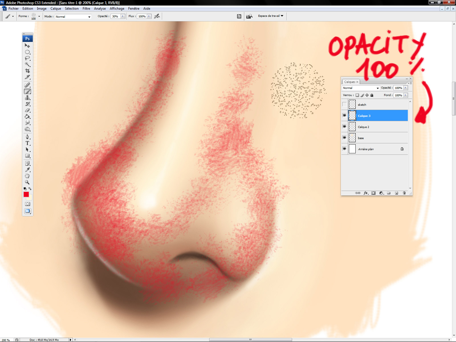
For example, If you want to add a little bit of texture on the skin (and a little bit of red in the same time), you can start with 100 % opacity brush …
Then decrease the opacity of the layer. Sometimes, it’s quicker like this …
_________________________________________________________________________________
I know my method could seem strange but I use it for … a very long time (*cough*) and I think it’s a good way to achieve very smooth results.
If you want to see the way I use to work, take a look on this:
http://www.livestream.com/sergebirault/video?clipId=pla_058a44c7-6d3a-46b9-a426-443d00b0d66b
As you can see, I spend my time changing the size and the opacity of my brush … and I don’t know any shortcuts 🙂








Hi Sir,
Sorry for that early comment removal.
Nice post but I have to ask about the opacity thing. Isn't it better to use flow instead of opacity? Lowering the flow can have less pigment going out of the brush for a better blending. I usually work with flow since I get less hassle from going through the opacity change again and again.
Then again, this is your way of doing it and I've seen a very nice result out of it!! Cheers!
Very low flux ? Well, perhaps with with a textured brush but not with the soft round brush ^o^
Yeah, low flow is better for texture. I did write about that here: http://crimsondaggers.com/forum/thread-1111.html
And yay, thanks for this! I have been wondering it for a while. Going to give it a try!
Yes, but as I said, it's not a good idea if you want to do clean gradient ^^
to quote what you said Sir, “Well, it's a good and simple way to paint very smooth gradients and blending colors.”
i think we got the wrong one there when you meant it's not a way to smooth gradients..hehe..no harm at all sir! i love this blog and i'm learning a lot from everyone's post since i discovered muddycolors!! wooooohoooo!
and oh, i have this post here: http://godgavemeart.blogspot.com/2013/01/a-digital-portrait.html
mostly used sofy round brushes. hehe. the hair thing isn't working for me yet. but i saw your post about the hair (http://muddycolors.blogspot.com/2012/12/how-to-digitally-paint-hair.html) so i'll try to do that 😀
Thanks for the post! I am learning tons from these.
Cool technique, I'll surely give it a try! 🙂
About the shortcuts, I use them all the time and they are very helpful:
-Numbers 1 to 0 (over the letters, not the Num Pad) will change the oppacity. If you press “1” the oppacity will change to 10%, “2” will set it to 20% and so on. “0” is for 100%. If you hit two keys quickly, you'll set that oppacity (23, 56, 78, 93, whatever…).
-For changing the brush size you can use the two keys right next to the numbers, on the right (in a Spanish keyboard they are “'” and “¡”, but they change with every local keyboard). Hit one to increase the size and the other to decrease it.
Hope it helps! It really saves a lot of time! 🙂
Serge,
When will a tutorial of how you choose the colors?. If you previously create a color palette, which is the method that you use to choose the suitable color based on the picture?.
Congratulations as usual!.
wOW Pretty cool tutorial…helppful!
Cheers
I don't use prviously created palette ^o^
🙂 Its a pleasure to read these tutorials.
Thank you for sharing this knowledge, its indeed a very personal approach , and in the right hands no one can deny that it works wonders.
Gotta give it a try!
i tried out using opacity on one of my digital paintings and i like the glazing effect. thank you for the tutorial!
showed some of my high school students the technique.
Hello, in the anatomical YOUR Mastered this difficult topic, concerning what kind of use, which use books. Etc?
Thank you Serge for another great tutorial piece. Serge has for years been sharing his techniques and strategies. He's remained relatively consistent over the years with his traditional airbrush-to-Photoshop approach. I think one thing people forget is practice. Get your Gladwellian “10,000 hours” in with your artwork and you'll notice your skills improve. As for what sizes Serge works with – he's posted that hundreds of times on his Facebook page and in the articles.
My advice for working with large pictures – 15k pixels or more – is getting your RAM up pretty high and using an SSD as your main hard disk. Photoshop is so quick on my 2012 12-core Mac Pro with 64 GB of RAM and a 6GB/s SSD.
Also, Serge uses an older PC with an Intuous tablet – over a new PC/Mac with PS 6, lots of RAM and a Cintiq HD. Just goes to show that he's not only got talent, but he's mastered scalability. If you are running an older piece of hardware – work in 8 bits. Serge mentions working in 8 bits.
Also, if you want to retrace Serge's steps – learn traditional airbrushing. Look at Meinrad Froschin and Steve Driscoll and get a feel for traditional airbrushing to get a mental picture of where Serge is coming from. Much like Rembrandt, airbrush artists – the great ones – layer paints with light opacity and then scrape and erase away paint before going into more layering. This method can be applied to modern day Photoshop.
What I learned today from Serge is not using the Stylus's sensitivity – interesting. I thought that was the allure to using the pen's sensitivity – but Serge is right if you're going for a very clean opacity gradient.
Best Beautiful Cars, Latest Hot Vehicles, Strange Cars, Super Cars Model, Funny Cars, Car Latest Models, Cars with Girls, Cars like helicopter and Most Speed and Expensive Cars
WorldLatestVehicles.com
Nice! Going to give it a try!
The OPAX-1000 Opacity Tester system provides on-line opacity testing for container manufacturing. The Opax opacity meter works with a wide variety novo curve
Nice post, Thanks for your very useful Information, I will bookmark for next reference
Appearance of transparent products is dependent on their scattering properties. The BYK-Gardner haze meter is widely used for appearance measurement opacity meter