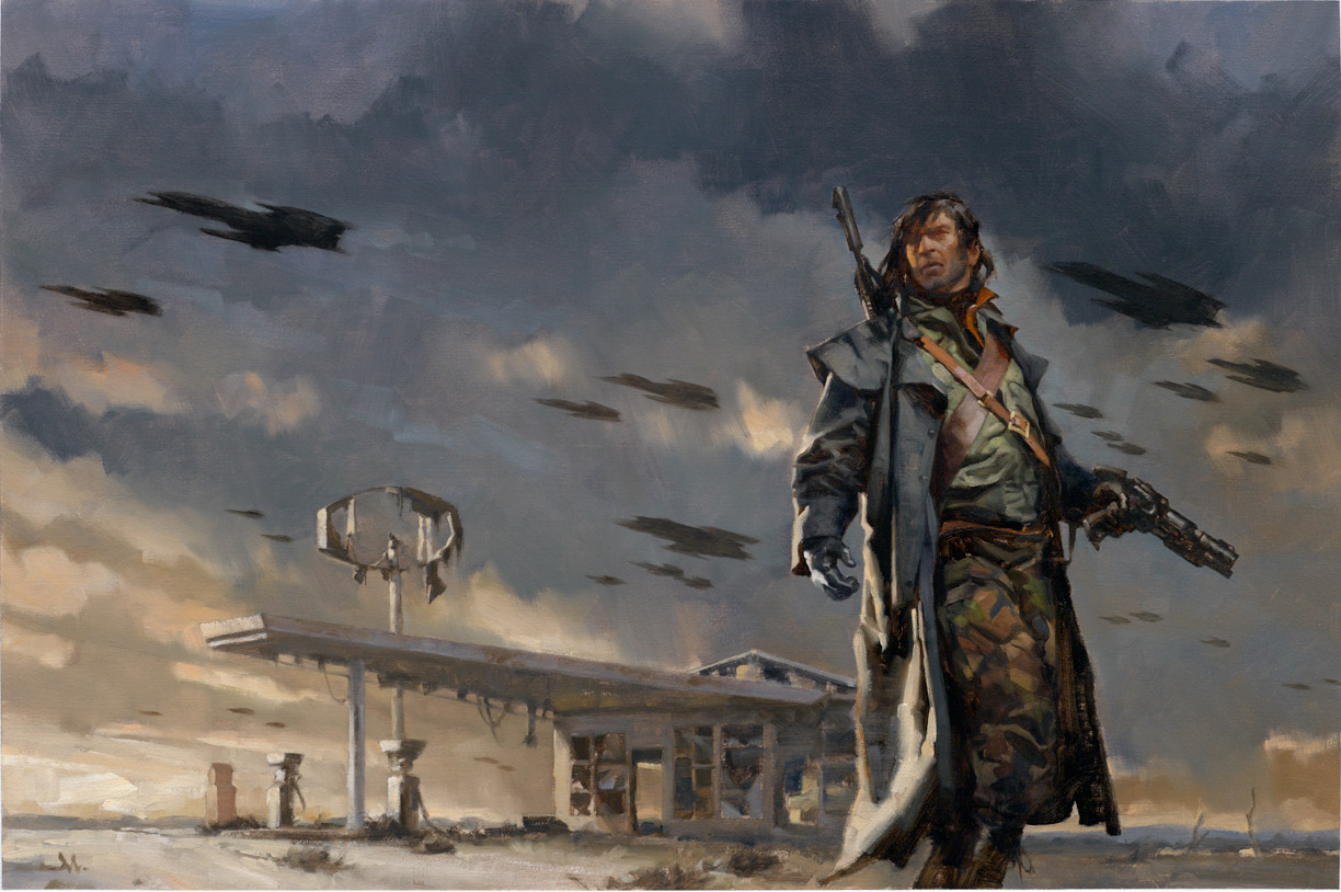
Finally got a chance to work with Matthew Kalamidas over at The Science Fiction Book Club. This one’s wild: alien vampires attacking earth, with a Road Warrior vibe, across a post-apocalyptic Iowa landscape. Gas station and/or grain elevators in background. ‘Can you work-in some attacking ships?’
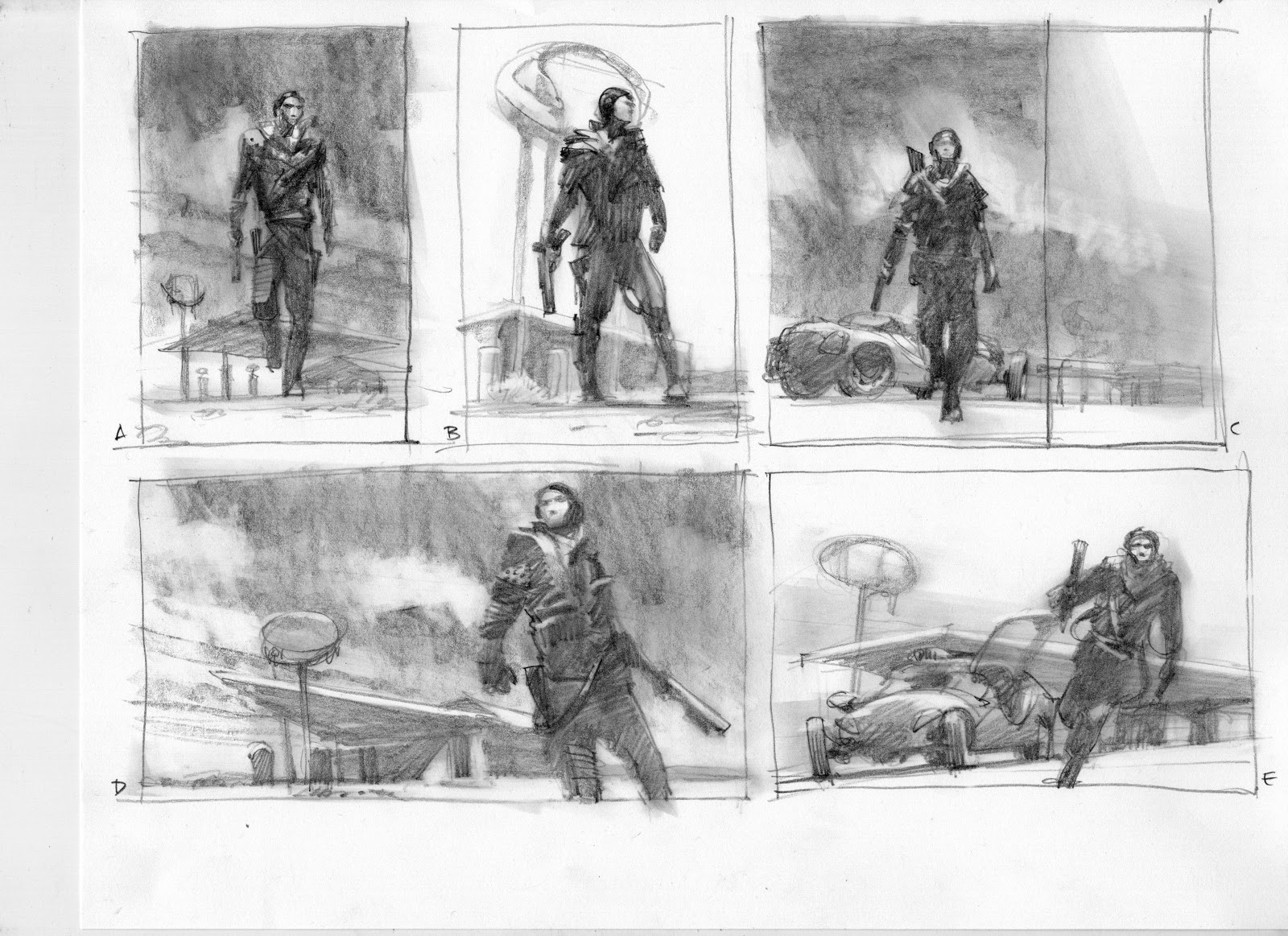
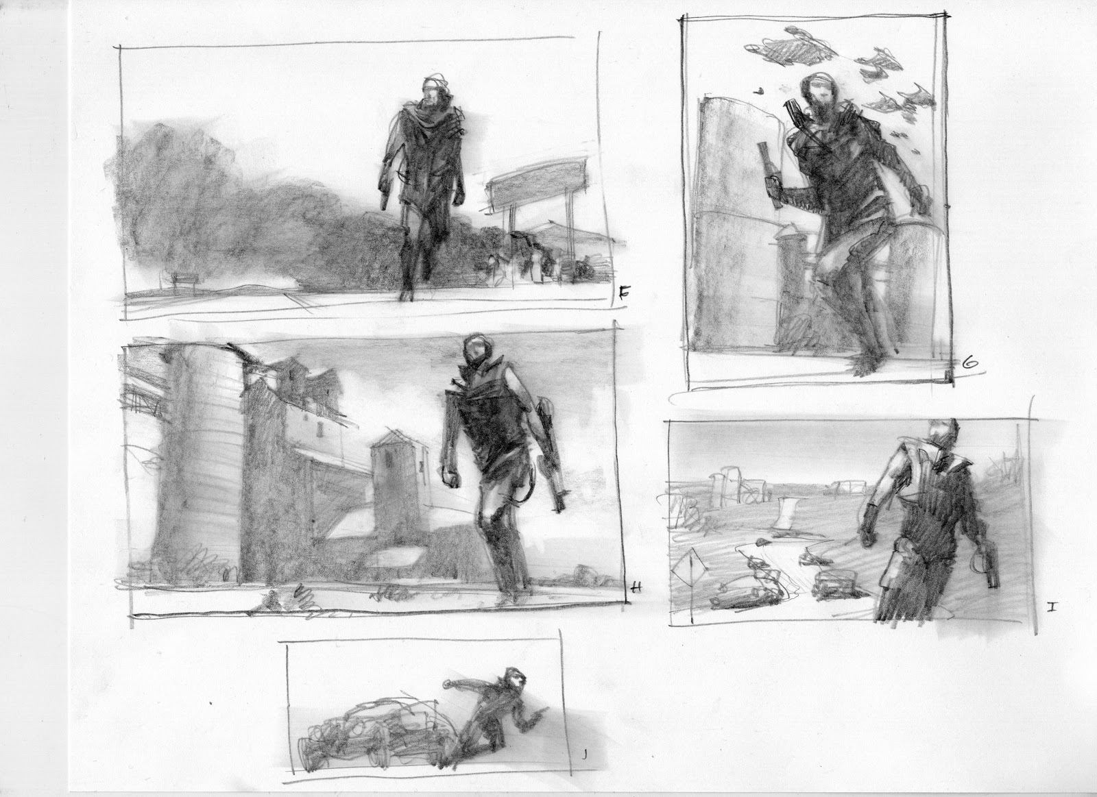
Thumbnails first. Here’s the first set. Two pages exploring possible compositions, elements, lighting conditions. Composition always comes first for me. You name the elements, I can place them. But nothing interesting happens until the composition is built.
Starting with the figure silhouette, I then toyed with a jerry-rigged car as a middle-ground element, developing the body language of the main, semi-paramilitary, leathered-up hero. Worked on just the right movement. But should he be standing confident or middle of action? Burning gas station? Need the alien ships, so I gave that a shot as well.
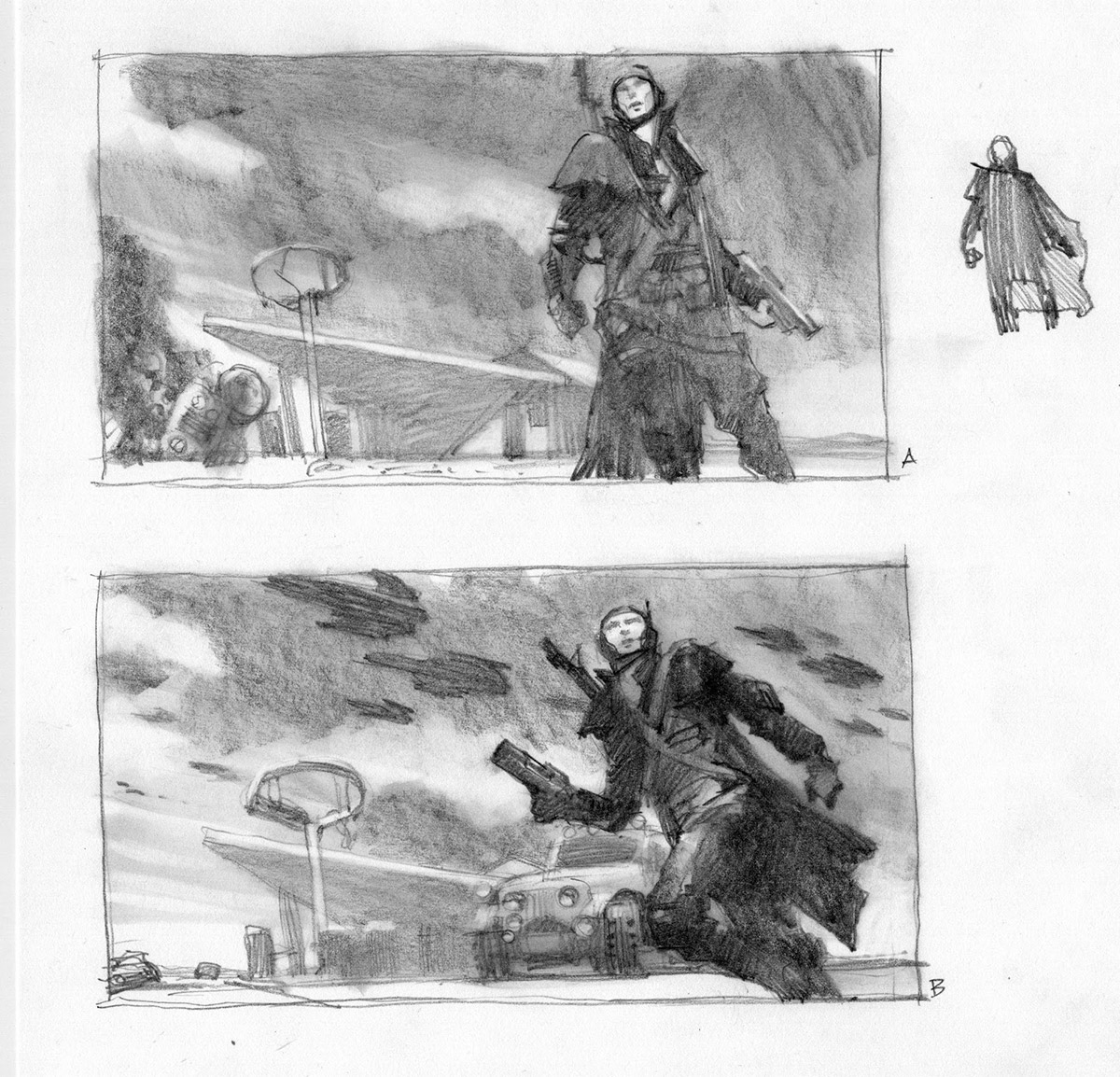
I showed these to Matthew so I could find out if I was on the right trail. With a few suggestions to follow one of the thumbs and give the figure more movement, I proceeded to show him two more developed, larger sketches.
They decided to go with A above, the more reserved-but-ready pose, as there would be a set of three books and we’d ramp up the action on the cover as the series continued. Matthew also specified more accurate costuming for the main character: longer hair, no balaclava, no headset, add duster, more military clothing. Don’t forget: add ships in the background.
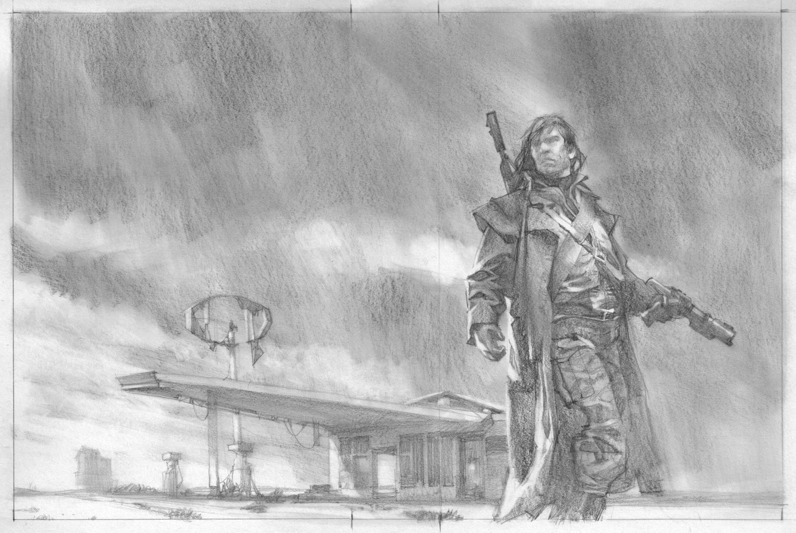
I piled on some clothing and shot reference to work from to get the layers right and gave Matthew this final sketch. Dang… I forgot the ships.
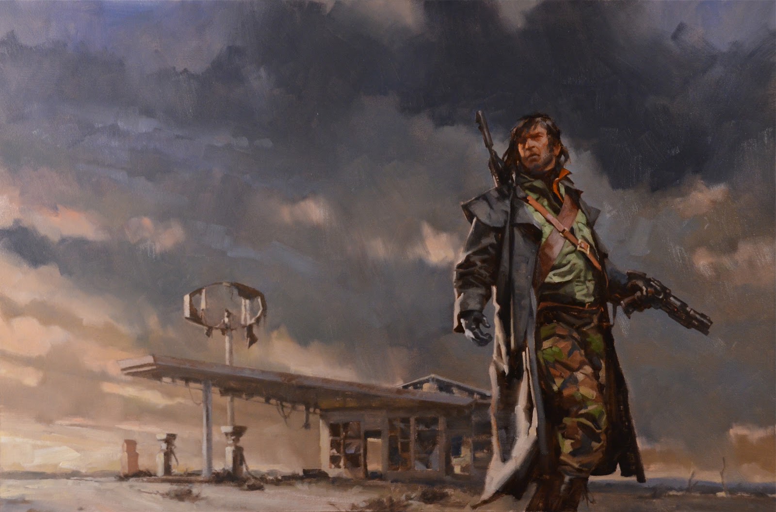
Got the go-ahead, with a request for the ships in the sky. No problem. Started painting. Elapsed time: 10 hours. Finished late at night…and forgot the freakin’ ships anyway.
Next morning, I showed Matthew and he loved it, but had a request: please put in the ships. One forehead slap and a little more time, and the ships were in…..and fun to paint. Looking forward to Book 2!
(Main photograph at top: Gamma One, NYC….those guys are dead. on.)



Greg, are the actually colors closer to the first or last image? I actually like the warm/cool relationship in the last image better than the cool on cool of the first, but my screen may be off too I suppose.
I was thinking the same thing about the colors. I can 'feel' the scene better in the last picture, it feels a little less lively in the top one, but both are great, don't get me wrong.
I am amazed at the speed with which you painted this. I'm so slow it's ridiculous at times, but I know a lot of that comes with practice and familiarity with forms. Thanks for the shot in the arm, gotta work for what I want.
Always a pleasure to see your process!
Very nice! Love the muted tones and harsh light from the left … 'into the unknown / outcome to be decided' type of effect. The camo of the pants is gorgeous!!! The gas station becomes a ship all on its own. Just brilliant!
However … only 10 hours – that is extremely humbling.
Great cover! Love the design of this one.
Greg-
You might have a broken link to a couple of your jpegs
Hey, that turned out well! It was so fun to see your sketches @ the workshop. I dig the colors!
Thanks, all!
The last shot is my quick blast to show the AD. The color is juiced up a tad. I think the client will likely saturate the image when it goes on press, so better to be a little dull at this stage, to compensate.
It's a tough thing to estimate…..while I paint, and even after, when it's shot. Fine line. For this one, I bet it picks up more color on press, so it should come out juuuuuuust right. : D
'put in the ships!' lol, this could be the start of a new internet meme. i can see it already…
Awesome cover, Greg! Great to see you doing some full-on Sci Fi. And those thumbnails, MAN! Great and inspiring stuff! Looking forward to seeing the rest.
Great!
The final sketch could easily have been the cover too (other than the 'no ships')!
I actually like the subtle light swoosh coming off his head in the sketch.
You thoroughly worked everything out before beginning the painting.
Haha “Finished late at night…and forgot the freakin' ships anyway.” Great piece anyhow, i love it. THose pants with their big raw stains and yet having debth- a lot to learn from you by just observing a singe trouser leg!
Very inspiring and eye opening at the same time. I am amazed at what you are able to accomplish in ten hours compared to what I accomplish in ten hours….I have a lot to learn still. Nice work Greg!
The art makes me want to buy the book regardless of subject matter. lol What size is the painting?
thanks for sharing.
It's about 29″w x 20″h…..
Hi Greg, can i ask how you deal with the title placement in book covers, any kind of sub composition guideline? Thank you very much
The sketches were fascinating. Thanks for posting these.
(And I kind of wish the spaceships had remained forgotten, as they appear nowhere in the text.)