As many of you know by now, I love to collect art books. In fact, I think it’s safe to say that my interest borders on a compulsion. I have a lot of really cool, and hard to find art books, and I’ve always wanted to share some of them with you guys.
For ages, I’ve meant to do some video flip-throughs for you, but always postponed it because I just wasn’t set up to do it properly. My tripod isn’t the right size, my studio is too dirty, my camera has a horrible microphone… you get the idea.
Well, I’m still not set up to do it properly, but I figured I’d do it anyways. What’s the harm, right?
I promise that in future reviews the video quality will be better, there will be less glare, and I won’t be breathing into the microphone like an asthmatic dog.
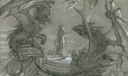
To start us off, our first book review will be ‘Elysium: The Art of Daarken‘. This book just came out a few days ago, and I thought it may be good one to start with since many of our readers will likely be hearing about it over the next few days.
‘Elysium’ is available for purchase on Amazon: http://www.amazon.com/Elysium-The-Daarken-Mike-Lim/dp/0956817130/


Awesome review Dan! Thanks for taking the time to do this and if at all possible may I request more review in the near future.
Wooooow!!!!
This is great! When I shop books in a store I always flip through them a lot before making a decision, so buying art books online without some trusted opinions about them can be risky! To that end I started a blog reviewing the books in my humble collection: artbookshelf.blogspot.com
I'm glad you've decided to start reviewing your art books too!
Thanks Dan, I will totally pick that up.
Thanks for sharing the book review, Dan! Mike's work looks great from the video here, might just have to pick this one up 😉 Great price for a hefty book indeed.
Nice! Book reviews in video form is very effective, and you're doing it very well. Gives confidence that the money spent on the book is worth it, to prospective buyers.
One point I disagree with though … the layout. Black pages with the artwork on, its very Ballistic Publishing-like. It is great for displaying artwork, which is the point here, so I'm not calling it bad but 'done & done'. If my portfolio was as huge and good as this, I would go the extra mile. There are many examples out there that create more inspiring books, like Paul Bonner's 'Out of the Forest' or the Merlin book by Rossbach, Aleksi & Istin, or D. Giancola's books.
Just saying.
I know some people prefer making the layout more prominent, in order to make the book itself feel like a work of art (Felix and Rossbach, like you said, definitely come to mind)
But personally, I don't like when there are textured or complicated layouts. I feel it overshadows the art. Black isn't ideal… but for me, you can not beat a plain grey background. Let the art be the star, not the design work. Dorian Vallejo's book is a nice example of this. It's just pristine. In fact, there sometimes isn't even a piece of art on the opposing page so as not to compete.
Makes sense. Guess that is part of the beauty of it all … many different types of books, with varied styles of layouts.
For sure. And for me, the -type- of book definitely dictates the layout. Like if there is a theme throughout… a complete story. You just totally gave me an idea for the next book review.
Thanks for the input. Actually, my background is about a 60% grey with some painted texture on it. When my publisher sent me my advanced copy, it came out more like an 80% grey. I brought this up with my publisher saying I felt that it was too dark, but they felt it was the better option.
Personally speaking, I like art on dark backgrounds, so it is a matter of personal taste. It wasn't that I didn't “go the extra mile,” it was that I liked the background I went with. The Merlin book is amazing, but each page is designed and laid out specifically for that illustration. Honestly, I didn't have that kind of time on my hands. I would have loved to come up with something as beautifully designed as the Merlin book, but I just didn't have the time. I had a strict deadline to meet with the book, so you can only do so much with the time you are given.
I almost forgot, here is a link to a picture of my book (please excuse the moire pattern from the digital photo).
http://daarken.com/blog/wp-content/uploads/2012/09/wotc_01.jpg
You can see that the background is not black at all.
I cant wait to put my hands on this one. W8ing for it to come any time now 😛 I think this is a great idea-the whole book review thing. There is nothing more magical and inspiring for me than an artbook- actually holding the art in your hands in the early sunday mornings :] Can't wait to see what you have in stock, Dan. I am sure you've collected some rares over the years. I'd be expecially thankful if you review this Merlin book you guys have been talking about.
Very nice art book! Hope to have a copy soon! As for you Dan, nice review, simple, easy to follow and effective! 😉 Keep it up! I am also publishing a book, and there will be a special hard cover edition… May I have the honor to send you a copy? (If not for reviewing, just that you have it in your collection 🙂 ) Cheers!
It would be my honor, Isis.