So I have been busy working on some new imagery for DragonCon 2012. I will have a booth there (as will fellow Muddy, Dan Dos Santos.) If you will be attending, stop by and say hello.
It will be my first year at the convention, and I want to make a good impression.
So I canned my original idea of Ninjas vs. Bears, it seeming out of place for this event, and went with something more traditional. (I am not ruling out Ninjas vs. Bears for next year’s Spectrum Live though.)
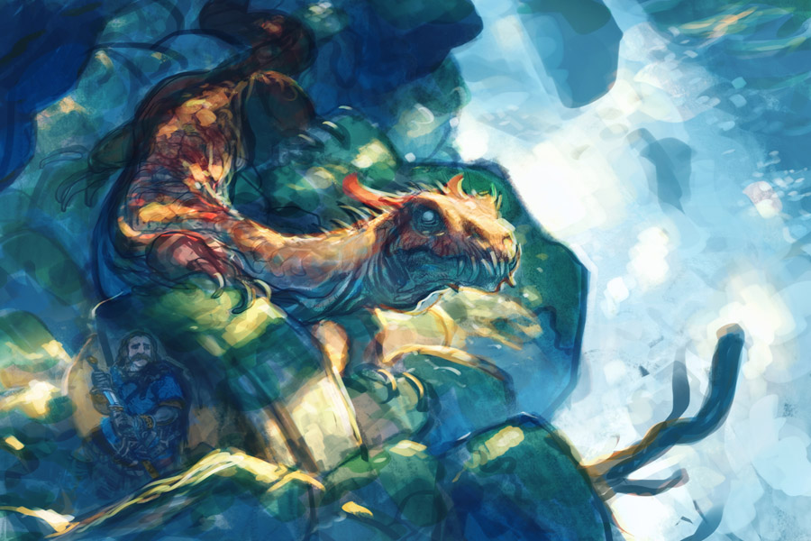
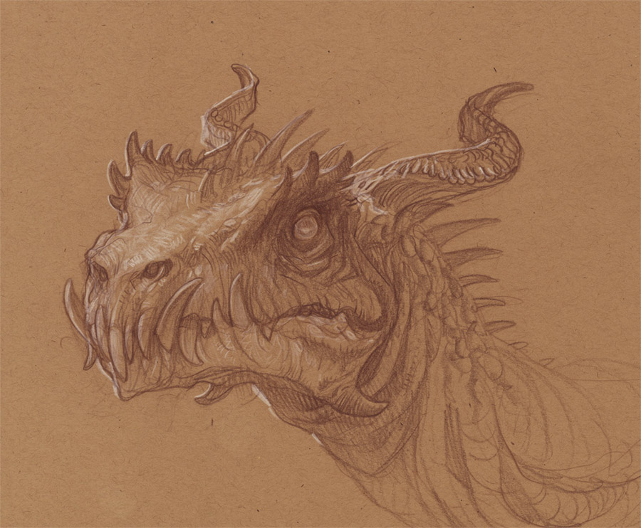
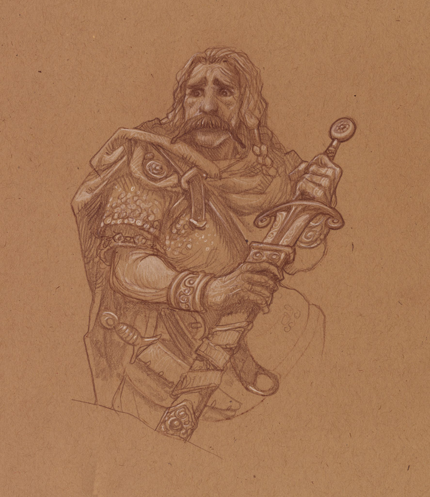
These are my studies for a more DragonCon-themed image. This one continues the thread of; if I was a player in some fantasy story, I’d probably be the guy who made the really dumb mistake and got us in all this trouble.
In this case, our hero is thinking, “maybe this wasn’t such a good idea after all,” as he tries to quietly draw his sword. The dragon has its head up, suddenly alert.
Next week: Watercolor and Final.


Justin, I am also that kind of adventurer..if only because I love to get a close up look of the designs on really awesome looking enemies! (Usually the large ones beyond our level).
I'll be attending DragonCon this year and I shall keep an eye out for the finished image! I'll hopefully be able to make your character design panel too. It'll be great to see some faces from the blog there.
Now to get my paintings for the art show done. Ah!
Love it. I guess it's the warm tones and sharp definitions that really make the dragon's head pop forward. The drawings are gorgeous too.
Pretty awesome, the colors are beautiful.
I guess you wanted the knight to look inferior.
I did an OP for a more aggressive knight and posted it on my blog, I hope this is okay
LINK
I just find it more interesting if some light hits the knights face and he is ready to strike (also the sword as compositional line and eyecatcher. Ah and I repeated that nice orange on his armor.. yeah)
Knight: “I knew I should have taken a bath last night! I should have factored in a dragon's sense of smell!! Rrrrgh.”
Wow, I'm a lot closer to Atlanta than Altoona, so maybe I should just come down & hang out for the weekend!
And if you don't mind me asking, what kind of layers did you use for that digital comp? That lighting is just amazingly good.
Will
You should definitely drop in! I will be doing some demos too. I will talk more about all that in later post.
As for the comp – I do these differently than my other stuff. Since so much carving is involved in actually manhandling the composition into the right shape, I tend to use a lot more normal and hard light layers. Hard Light is a great way to punch up colors and value. I might do a progress series of one of these comps next time. They aren't very exciting really, but I go about them in a very different way from my other stuff.