By Justin Gerard
Sometimes, in spite of all the precautions and idiot-proofing, I still manage to bungle things.
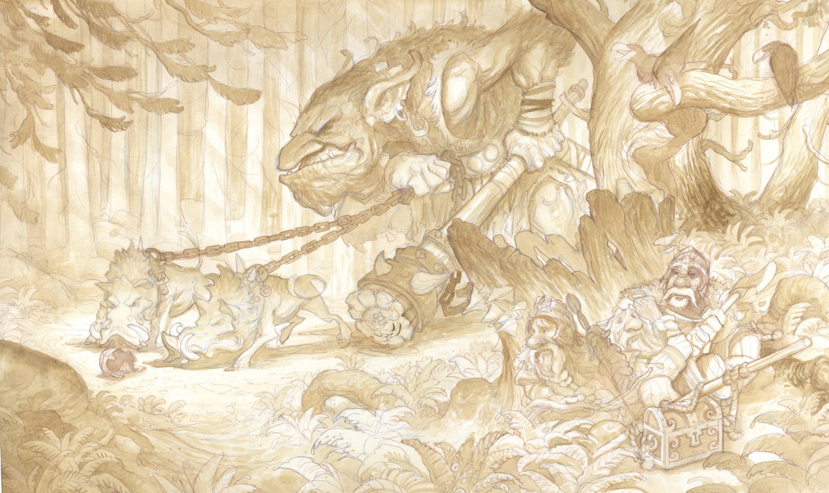
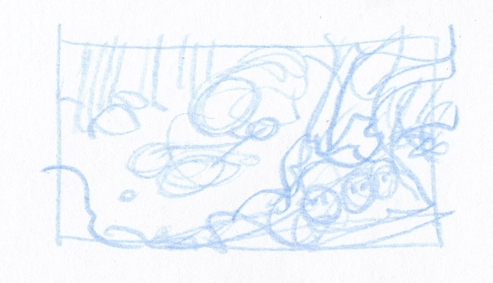
In this case, I got halfway through the initial washes of the watercolor before realizing that I had screwed up the composition and it was really hurting the image. Since I wasn’t under any particular deadline for the piece and I hadn’t gone that far yet, I decided to start over. Under other circumstances I would have tried to fix it by painting in the corrections or reworking it digitally. Since I had the time though, I decided to repaint it.
Here is part of why it was bad:
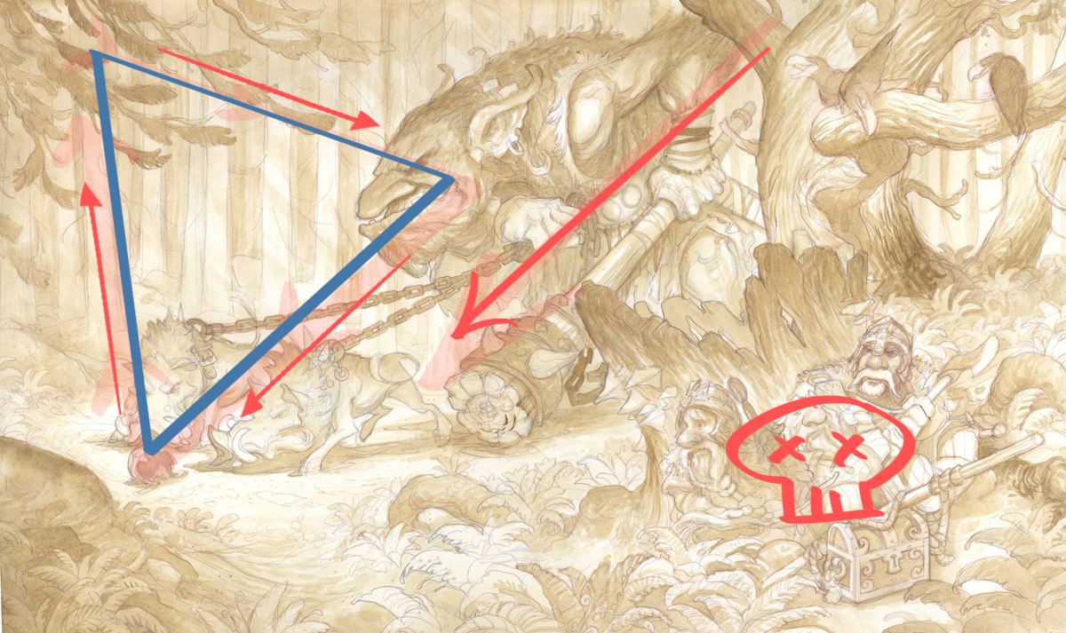
THE TRIANGLE OF DEATH
A triangle of death is an area of the image where the composition allows the viewer to get trapped and leaves part of the image as dead space. In this case, the foreground branches at the top left lead down to the troll’s face, which then points down to the boars and the helmet. This would be ok except that the sharp verticals in the background trees pull us back up into those branches, creating a self-contained compositional form that splits the image, leaving the dwarves, who are a main narrative element, as a separate dead space.
The strong red arrow in the middle shows the line where the image gets split. This can still work if you have text that goes in your image, or if this image were to be intended for a wrap-around book cover. Since my goal was a stand alone poster image, this compositional dead space was a failure.
How to solve this?
I didn’t want to monkey with the characters, because I really like their arrangement and their relation to one another. So I decided to employ a classical solution that has been used by artists for centuries:
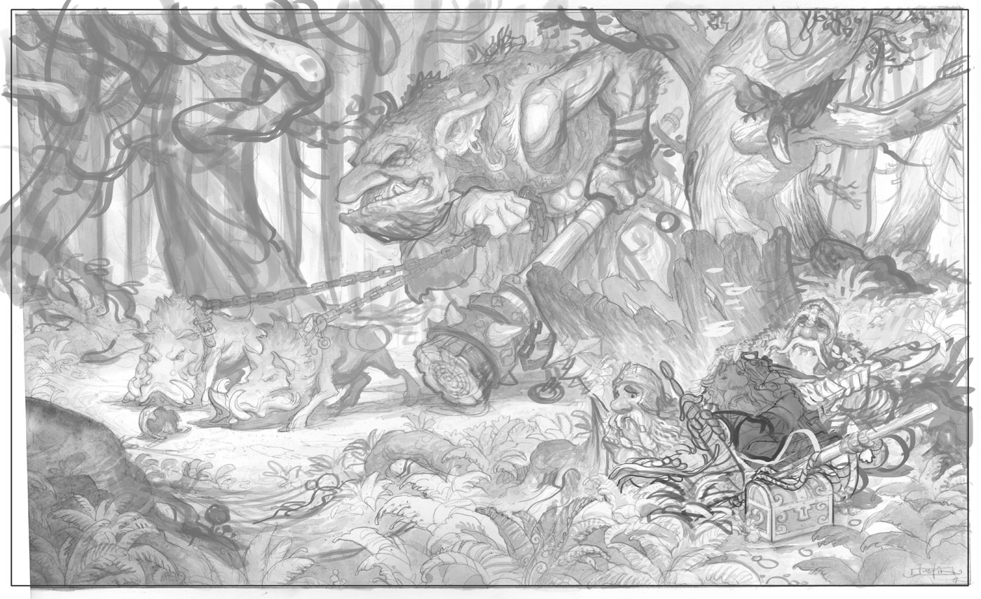
When in doubt, add more trees.
When in doubt, add more trees.
Reworked Composition
By placing the organic tree shapes over the boars I am able to break the Triangle of Death and keep the composition moving, while at the same time adding more interest to the image itself. The reworking also gives me a chance to play up the more foresty aspects of the scene to deepen the environment (as was suggested in the previous post’s comments.)
Thanks for all the feedback everyone!
Thanks for all the feedback everyone!
Next: Tight Pencil Drawing


great choice! in fact you didn`t add more tress but added “real trees” on what before felt a bit like a wallpaper^^
so far my favorite work from you
cheerio
The new composition is much better for my taste! I look forward to see more! Thank you for sharing your work with us in this way. It is very instructive and formative.
Misterbenoit French Fan
Takes a keen eye to catch something like that when there are so many elements heading in a great direction! Those trees are a pretty clever solution to the problem – I'll have to remember that!
how strangely appropriate. While walking the dogs and thinking about my current commission, that was exactly the same conclusion I came to, I need to add trees.
Thanks so much Justin!
Great post Justin – Composition is one of those things that I sort of cringe when I think of it. Not that I don't rejoice at the idea of a wonderfully balanced and well thought out composition, but I cringe at the fact that there is so much to consider when composing a piece! I'm glad to see that that struggle isn't just something that plagues us beginners though.
So, did you finally realize that it wasn't working after letting it sit for a day? And I'm assuming the rework was digital, so how will that affect the overall quality of the underlying drawing and the appearance of the finished painting?
-Will
I thought it was awesome before but as you explained the situation I completely understood and now I don't see the original the same. It was actually a really neat experience…sorta like an “aha” moment (cliche i know!)
I really like the adjustment. Thanks so much for teaching!
and I totally feel what Will Kelly is saying 🙂
Lol, those new trees r absolute win. Not only do they fix the composition lines, they also balance it, as it was kinda heavier in the right and they ALSO add more atmosphere. Total win i tell u 😀
nice to show the mistakes…we learn more from them
Thanks
Very cool to see this being done. Its like seeing the girl in the red dress for the first time, but only after being told she is there. Strange.
Wonder what would happen to this image if the Troll & Boars were entering the image from the left.
Justin, you're right about that triangle of death! In fact, I think it's so bad that you should mail me the original, and I'l…. “Dispose” of it for you. Just let me know where to send my address.
Zach
I definitley see the difference. The second piece flows much better. Nice save!
I really like this post. Composition is one of the most interesting argument in painting and this is a new thing I will take care about in my illustration. Thanks so much
Thanks for all the feedback everyone!
And Will, yeah it failed the overnight test.
It seemed great when I did it. I was thinking, wow this is so much fun! Then the next morning, in the light of day, it didn't seem so great. It seemed more like I had made a terrible mistake.
The rework is digital, but it is just a comp. I will be doing a completely knew drawing in pencil from scratch now. So none of this will get seen in the final. (thankfully)
Hi Justin
Here is what happened
Image #1 Instant focus on Trolls head, eye goes left see hogs then eye then notices Drawves hiding
Image #2 Instant focus on trolls head gets lost a little, eye is hunting.
I think this is because the big shape of the trolls head is competing with the big shape and interest of tree you added rather than dominating the small shapes and little interest in that area.
I really like the second composition more, but now I'm wondering if you should consider moving that helmet down and to the right a bit. This will cause the boars and the troll to swing to their left and lead them down-stage, where a confrontation with the dwarves will quickly become inevitable. You've got all the visual motion rushing down and left at the moment and it's all across the view.
Nitpicks, I know, that's a wonderful idea and drawing and it's always easier to critique someone else's work than start from scratch.
Fantastic! It's great to see not only your willingness to rework it at this stage but also the improvement it had on the composition!
This has been great to see so far, thank you so much for sharing the process.