-By Dan dos Santos
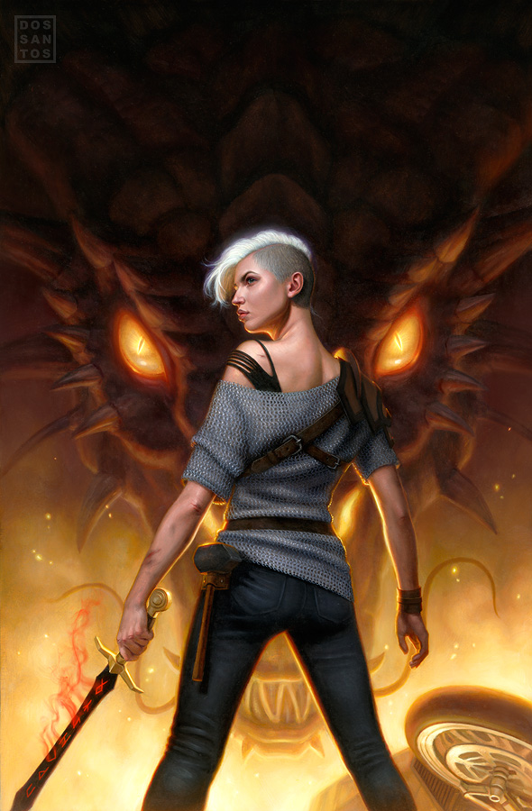
Here is a new piece I just finished up for Tor Books, for the novel ‘Forged in Fire’ by J.A. Pitts. This piece is the third painting in the ‘Sarah Beauhall’ series, the second of which I shared recently HERE on Muddy Colors.
With the exception of the dragon’s eyes and the red smoke emanating from the sword, the piece is painted entirely in oils. Though, I expect now that I’ve figured out what looks good, I will probably go back into the painting and make these adjustments to the original as well. This is quite typical of the manner in which I work. I usually get to a certain stage in the painting where guesswork is really detrimental to my deadline. So instead, I take a photo of the painting, bring it into Photoshop, and figure it all out there. Once I find a solution to my problem, I go back into the original with a concise game-plan.
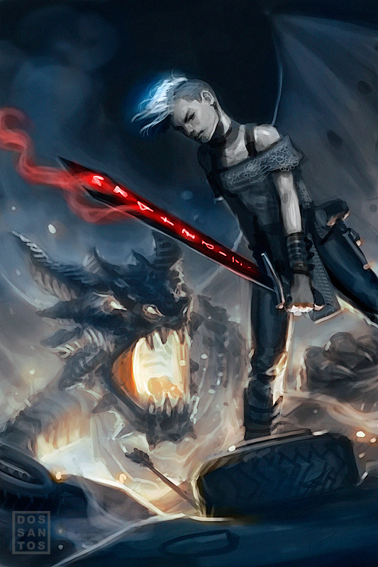
I submitted four different sketches for this job, a little more than my usual. Below is one of the alternate concepts that was unused.
The cover concept proved to be a little bit tricky. Despite being set in modern day, the heroine battles a dragon while clad in traditional chainmail garb. Meanwhile, druid-loooking henchmen with magical abilities battle all around her. Because there were no real modern cues in this scene, it threatened to make the cover look like a high fantasy novel, rather than urban fantasy. To avoid this, I opted to omit the druids from the painting, and instead insert the Ducati from the second cover. It may not be as accurate to the scene, but I do feel it better captured the flavor of the story as a whole.
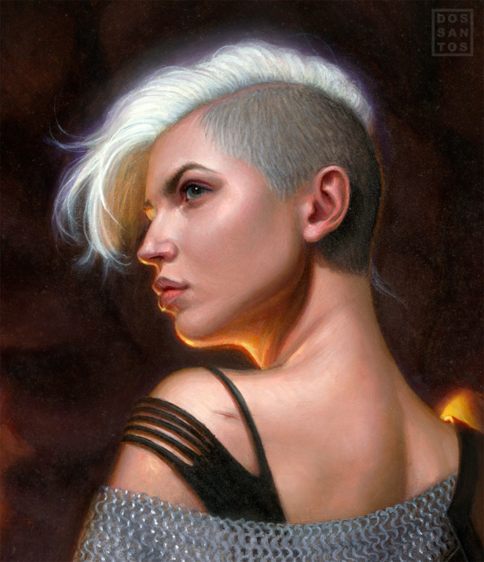
Lastly, here is a detail of the painting. In it’s entirety, the original art measures 18 x 27 inches.




My sister loves the series. Whenever I see her reading these books, I just get a little smirk on my face.
Dan, this turned out really great. I especially love the vertical dark to light transition you have going on here.
Looks great Dan! The texture on the chain mail is wonderful and the lighting is fantastic!
The play of cool and warm colors in her skin is awesome, I need to learn how to do that 🙂 Your the man Dan.
nice pic, love youre work 🙂
funny that she almost locks like me haha (but shes mutch cuter :P)
I've never understood these types of compostions. In both pieces it seems like she is posing for a photo shoot and not participating in the action going on behind her. Can someone help me out?
@Andre: It's called 'pin-up'. Think of it like a movie poster. The poster usually focuses on the actors, and eludes to a story. It doesn't typically depict a literal scene.
I have done paintings like what you mentioned, but they are far less successful as covers. The look like movie stills, or concept art, and lack the same iconic impact.
@Dan,
Thanks man. I've seen pinup work in the past, but never with so many story elements. Usually it is just half dressed girls in provocative positions. I feel dumb, but it makes more sense now.
Dan acho sua arte impressionate!