By Justin Gerard
For those of you who keep up with the comings and goings at Hogwart’s, the Gallery Nucleus is having a Harry Potter Tribute Show July 9th – August 1. I was asked to contribute a painting to the show, and having thoroughly enjoyed the novels myself (via the fantastic audiobook performance by Jim Dale) I was eager to work on one.
When I started thinking, which scene should I choose? I realized that there were far too many great ones and couldn’t make up my mind. In the end I wanted to focus more on a specific character.
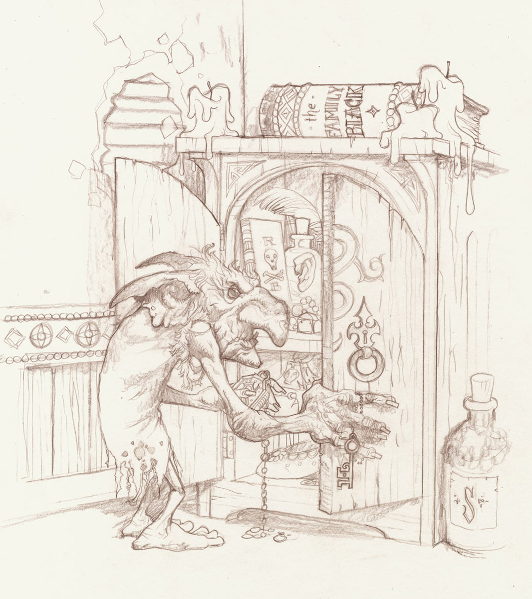
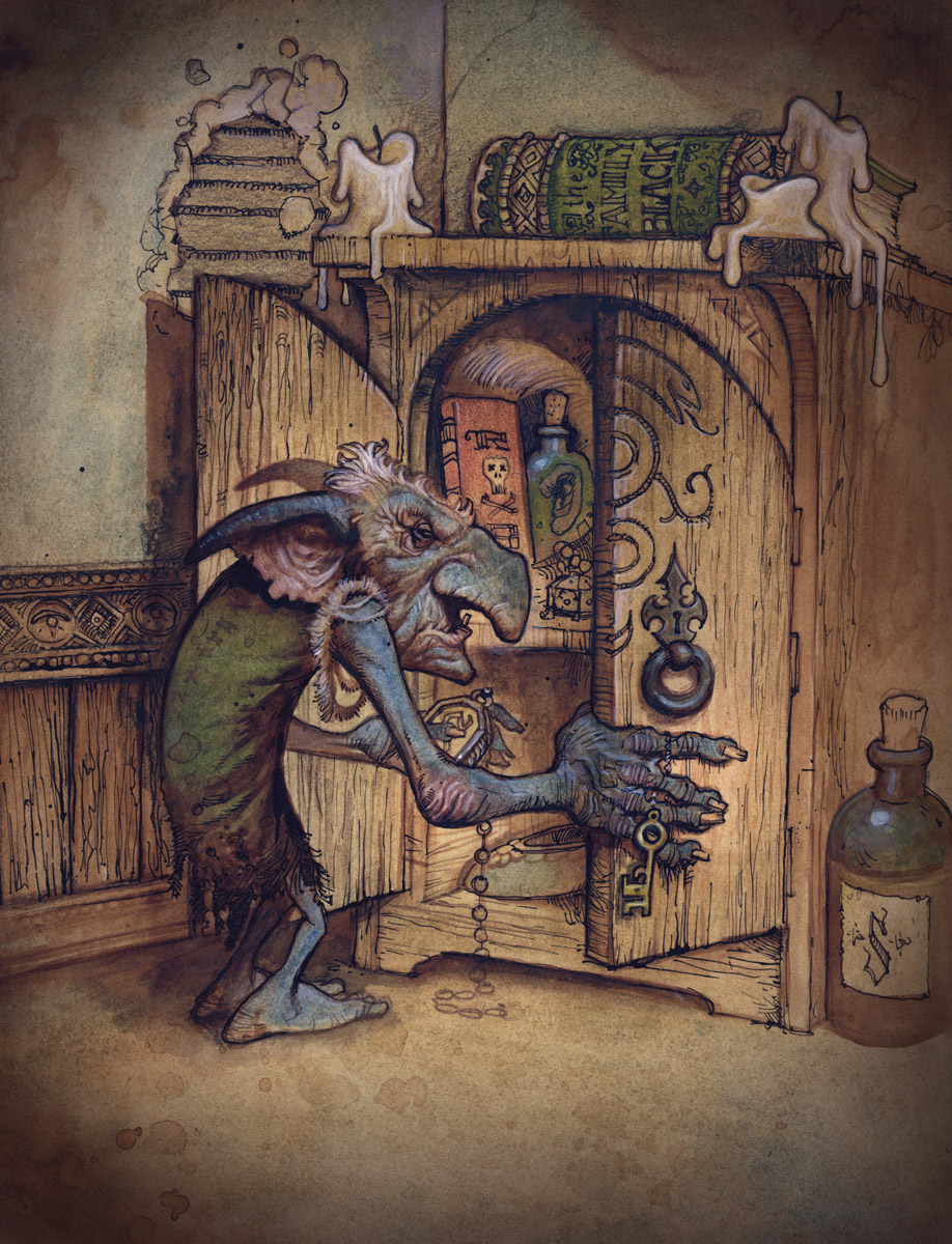
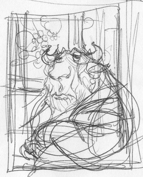
I landed on the misanthropic house-elf Kreacher. His story of Master Regulus and the locket is one of my favorite moments in the latter parts of the series.
Drawing on Bristol
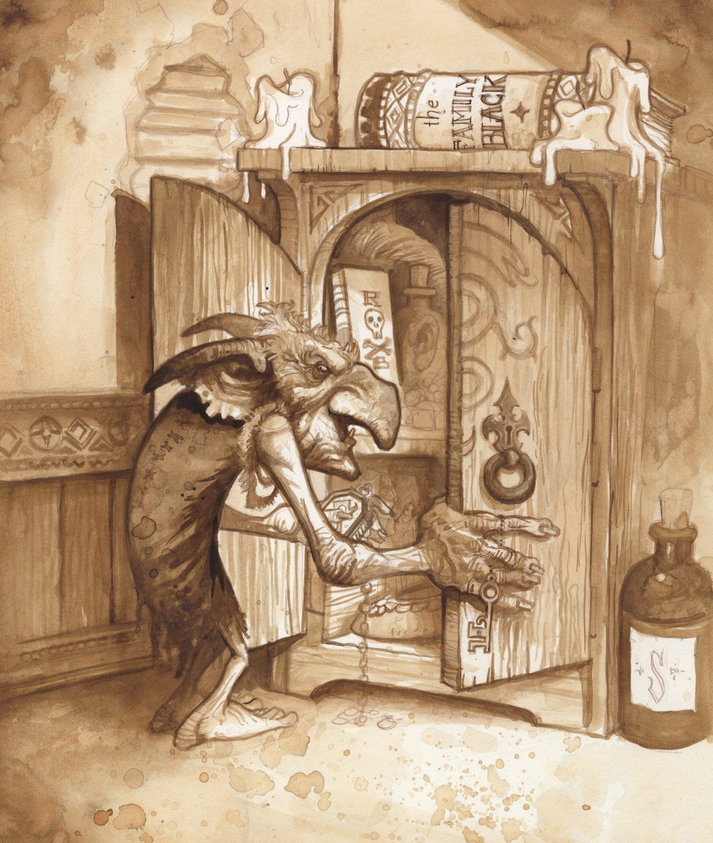
Inkwash over pencil
(I did not end up spray-fixing this one, and you can see the pencil has all but vanished.)
“Kreacher”
9×12
Watercolor and Ink on Bristol




One of my favorite books, beautifully captured – love it!
That was also one of my favourite moments in the book, love how this came out. Big fan of your work Justin!
I really love the way this has turned out, and more so your process. I work in watercolor all the time but haven't tried it this way yet. It really makes me want to give it a go.
Also, this reminds me a tad of Omar Ryann's work. I love it!
Wish a I had had time to be part of the show. The Potter stuff has a lot of possibilities. Really nice piece Justin.
Doing the underpainting in ink gave a real richness to the watercolor. Pretty cool.
That's pretty sweet! I have a question: did you color it in digitally or did you make color washes on top of the sienna inkwash?
Love how the ink really punches through the watercolour on the Kreature's face.
Kreature! This is great. I enjoyed the audiobooks narrated by Jim Dale, too. (Currently listening to the complicated Game of Thrones, and wishing it was narrated by Jim Dale).
This is great – I love your technique of the underpainting first and various media on top for paintings. I plan to try it soon on my own work. What I admire about your paintings is that they are both complex and simplified at the same time, if that makes any sense. Can't wait to see the show you are putting together for the fall! Thanks for all the inspiration!!!
Hey that looks really awesome. The whole painting feels very “Petar Meseldzija-ish”, and I like it!
When you say watercolor and ink, are you using washes of ink like watercolor? And at what stage are you using it?
Keep these awesome posts coming!
-Will
🙂 Wonderful!! Pardon my ignorance… did you mean to not 'fix' so it would blend together and be lost? And, if you don't mind ~ what pens + inks do you use? The textures you've created and your choice of watercolours are down right enchanting!
Thanks for sharing!
That's a pretty cool watermedia piece there.
I still have yet to read the final HP book.
Thanks for all the great feedback everyone. It makes me want to do more in ink and watercolor.
Sean,
No digital this time around. The last layers were all watercolor and then ink again over all to pull up some of the linework. However, I do really like the look of digital over watercolor and ink.
Will,
Yes, at that middle ink stage I was using it very much like watercolor. I would dilute it as necessary to get at the more subtle passages. I pulled out the ink twice, once before and once after the watercolor. (Which I know seems like a lot of hassle to have to keep going back and forth, but I like the overall final effect and am not sure if there is a better way to go about it. I need to study Rackham a little more…)
James,
I purposefully didn't spray fix this one, and after I finished the inkwash stage I regretted that. The paper is more receptive without it, but in the end I just really like seeing at least some of the pencilwork showing through.
The pens and nibs are the cheapest, most basic art store ones out there. I can't remember the names of them and the logos are worn away, but they aren't anything special. (I should probably invest in some good ones if I keep doing more of these.)
The ink is Liquitex, which I like a little more than FWi if you plan to the pigmented/acrylic ink route.
-Justin
It's actually Kreacher not Kreature, but you couldn't have known from the audiobook 🙂 Great piece overall. I like how you can practically see the care that's been put into it. The colours shift in temperature so nicely and subtly, especially on the walls and ceiling but also on his garb as it falls into shadow. Keep up the good work.