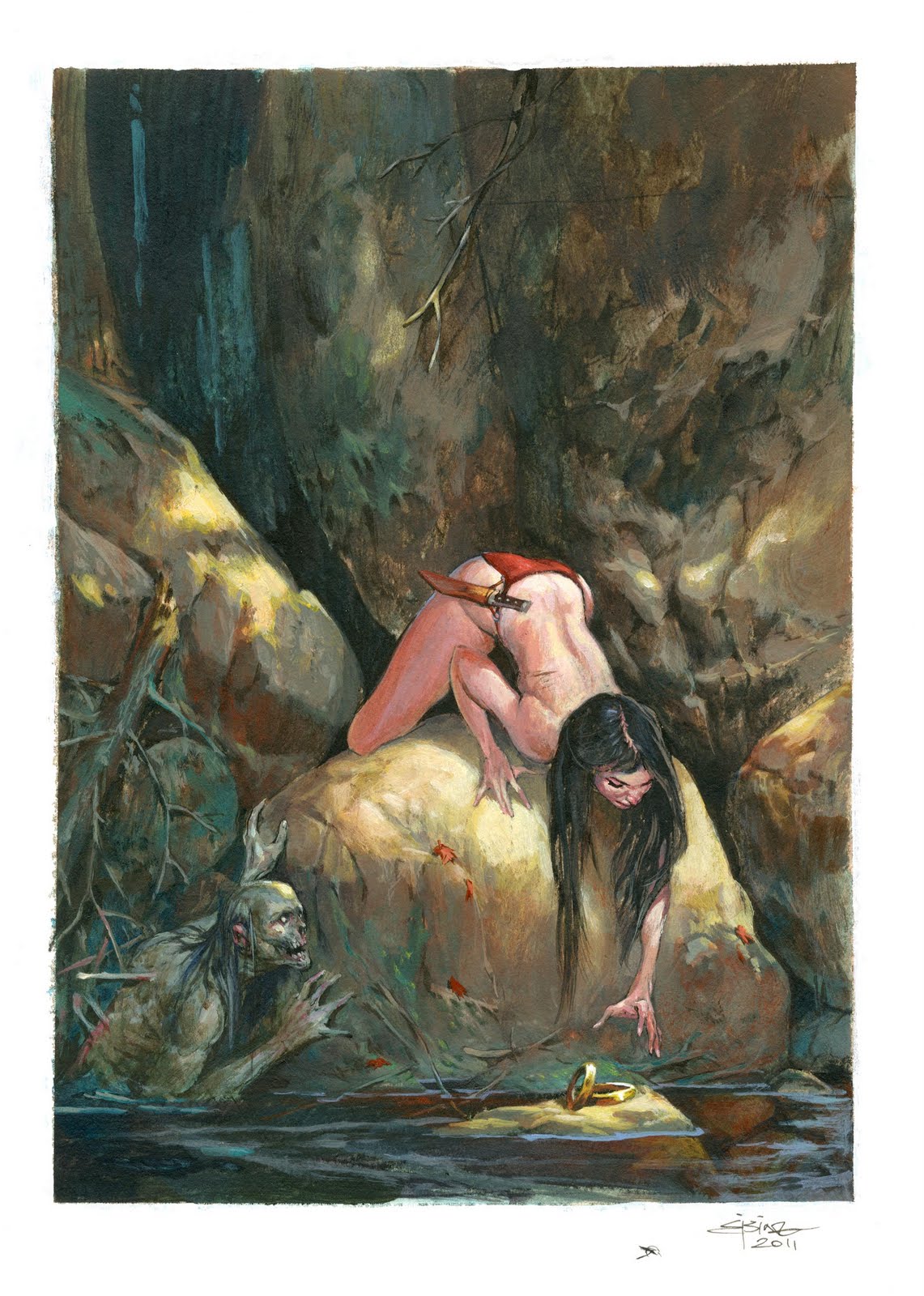
I was deeply honoured to be asked to do a painting for the MicroVisions expo. Fully conscious of the artists that has contributed in th past, I set out to do something difficult but close to my heart. I was going to do a little story in the picture and thus resisting the temptation to do a barbarian babe portrait ( which is always my first choice in doing an unbound assignment or when I am asked to: “hey can you do a fantasy-art drawing?”)
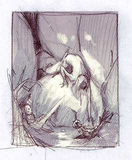
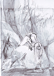
I wanted to do something evil and creepy but with more mood than core, and finally I decided on something that would allow me to still fit in a barbarian babe. I sketched a loose thumb of a nude girl reaching for jewels hanging out on a branch, maybe placed there in the sun as a bait. In the shadows underneath the rocks and half covered in water hid the zombie, that had placed the jewels. The nude would not only be because I could, but because the soft skin would show her as being more vulnerable and less protected.
I took it around at the studio and Christian Højgaard, a comic book artist, pointed out that the lack of involvement or gesture of the zombie might read wrong. It would simply look like there was just a dead guy lying in the water washed up against the rocks. Certainly not as frightening as the sorry I had planed. Also I abandoned the idea of necklace hanging in branches. It didn’t look placed enough. So I switch it out with a flat rock and made the jewels to be bracelets, thick and solid gold. ( the original was going the be very small so I needed something big and visible.
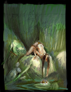
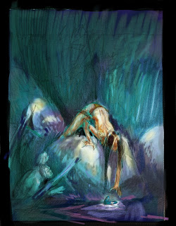
Next I did the real sketch. I placed things more correctly and tried out 2 different colour themes.
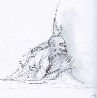
Once again I asked around at the studio and got 50-50 for both versions. Next step was doing some more precise sketches of the 2 figures. The zombie came right out in first try. The eagerness of him was very important. I wanted him to look hopeful, even if it is not a very common thought for zombies, I am guessing.
The female sketch was okay, but I was already anxious to get the face right. I asked on Facebook if anyone in the Copenhagen area wanted to pose in bikini for a zombie painting. Apart from a couple of guys volunteering I got one really good contact. Sabina came around the studio the day after and posed in a ring mail bikini I just happened to have lying around my work area. The photos proved to be both a help and a curse. I sketched 2 different versions of the photo but the pose seemed to die or look boring when I went too close to the photo. So in the end I just took some of the photographic elements as the face, hair line in the scalp, butt cheeks and foreshortening in the arm, and placed them within my initial sketch.
With the 2 figures sketch on separate papers I copy pasted them in to the thumb sketch in Photoshop. I think it is a good think to sketch the different figures separately after the thumb and after you know what and how they are supposed to look and pose. This way you can do sketch after sketch until you get it right, as opposed to doing the whole sketch on one paper. ( yes I did that years ago. Sketches all in one paper in 100% until someone pointed out that it was a waste of time, effort and paper. And I was introduced to Thumb-sketching ). It takes the pressure out if it and lets you aggressively power every single figure for what it is supposed to do. Only when every figure is fully sketched to its potential, I combined them digitally. In this case it is not that difficult, but had this instead been a battle scene of five figures you can see how much benefit it is to separate them. Also It cheats the mind to concentrate on small bites instead of the whole cake.
Next step. Ordinary I would transfer the sketch the hard way on to board or paper and thus drawing it a third or forth time. This time I tried a little trick taught to me by the honourable and talented Steve Prescott. My fellow fantasy artist friend and acrylic painter. He prints out the sketch onto Bristol paper. Sealing it down and closing the surface with matt medium. Well; I did not have a printer, so I used a copy machine to get it down to the Bristol. Problem is, when you do that with thick paper you can rub off the black and grey, so I let it go through another rtime into the machine for it to be warmed up again. The warm hardens the powder from the machine. You can also bake the paper for a couple of minutes to harden the powder. It is a trick we all used here at the studio years ago before everyone went digital and we used to joke around saying “Oh I just need to bake this illustration and it is done.” I did not use matt medium. I like the paint to soak into the paper.
Lastly I found the Wyeth painting that originally inspired me to this painting. I looked hard at it for 2 minutes and then removed it to avoid copying.
The final painting is really nice. And I was proud to deliver it to Dan and Irene.
Lastly, you can buy this painting on ebay today if you place a bid on the auction.




Very painterly, I enjoy all your work but this shows a real confidence of stroke that steps outside the controlled feel in a lot of your rpg stuff (which of course fits that genre). I hope you push in this direction more :)… Awesome.
Beautiful painting Jesper! Great insight to your process, and I loved the bit at the end about the Wyeth piece.
This is one of my favorites. For some reason I always felt guilty about sketching my figures separately and then combining them in Photoshop, you just took all my guilt away. : )
Great piece for a great cause Jesper. I remember doing this and thinking what a great group of artists to be showing with. There are some great ones on this list including you.
Man, I with I could buy this, well maybe next time.
I thought almost every acrylic painter sealed the drawing before actually applying the paint, it's what I've been doing, I'll see how the acrylic behaves soaking into the paper.
Beautiful painting! I immediately got the sense of the NC Wyeth influence, though a different piece of his than the one you chose. And not so much that I felt you were copying him. Well done.
Jesper, this is by far my favourite painting of all that's to be auctioned. And I like Felipe, wish I had the funds to buy it too! Thanks for showing us your method for arriving at this great piece. This kind of step by step example means a great deal for us that don't have access to the learning facilities of this trade(we are like sponges!).
Cheers,
Rick.
$1046 on ebay! Nice work, Jesper!
Little known fact: zombies use bait to hunt. Hmm… now that gives DMs something to use as an encoutner hook! Great work and it was awesome to observe your problem-solving through-out the picture. 🙂
Congratulations, Jesper, on generating the most $$ for the Student Scholarship Fund this year! Way to go!
Thanks Arnie
I was just happy to be included. It is not everyday that a boy from Denmark gets to hang his painting anywhere in NY. Not the least in Society of Illustration. I am super proud.
Great to hear how you progres your work. And great it now can help some students 🙂
Great paint man, I love it. Congratulations!!!
very amazing post, I like It, Thank you for presenting a wide variety of information that is very interesting to see in this artikle, good job adnd succes For you
paket karimunjawa januari |
paket karimunjawa februari |
paket karimunjawa maret |
paket karimunjawa april |
paket karimunjawa mei |
paket karimunjawa juni |
paket karimunjawa juli |
paket karimunjawa agustus |
paket karimunjawa september |
paket karimunjawa oktober |
paket karimunjawa november |
paket karimunjawa desember |
paket karimunjawa 2 hari 1 malam |
paket karimunjawa 3 hari 2 malam |
paket karimunjawa 4 hari 3 malam |
Homestay karimunjawa |
homestay karimunjawa |
homestay karimunjawa |
hotel karimunjawa |
paket hotel karimunjawa |
karimunjawa hotel |
paket wisata karimunjawa |
I like It, Thank you for presenting a wide variety of information that is very interesting to see in this artikle, good job adnd succes For you
paket honeymoon karimunjawa |
Paket Honeymoon karimunjawa murah |
backpacker karimunjawa |
paket karimunjawa murah |
wisma apung karimunjawa |
jiwaquest resort karimunjawa |
menjangan resort karimunjawa |
nirwana resort karimunjawa |
dewadaru resort karimunjawa |
hotel escape karimunjawa |
Blue Laguna inn karimunjawa |
puri karimun jawa |
karimunjawa inn |
alchy cottage karimunjawa |
paket dIving karimunjawa |
paket murah karimunjawa |
paket rombongan karimunjawa |
paket natal dan tahun baru karimunjawa |
paket wisata karimunjawa murah |
paket natal karimunjawa |
paket tahun baru karimunjawa |
paket idul adha karimunjawa |
paket lebaran karimunjawa |
paket idul fitri karimunjawa |
article from a very amazing, Good Job, Thank you for presenting a wide variety of information that is very interesting to see in this artikle
paket bulan puasa karimunjawa |
taman nasional karimunjawa |
pulau karimunjawa |
cara ke karimunjawa |
jadwal trip karimunjawa |
hotel di karimunjawa |
penginapan di karimunjawa |
resort karimunjawa |
hotel di jepara |
panorama karimunjawa |
situs bawah air karimunjawa |
homestay karimunjawa |
hoemestay karimunjawa |
paket homestay karimunjawa |
homestay karimunjawa |
homestay karimunjawa |
paket diving karimunjawa |
penduduk karimunjawa |
tracking mangrov karimunjawa |
wisata di karimunjawa |
keindahan pulau karimunjawa |
tips berlibur karimunjawa |
indahnya karimunjawa |
pesona karimunjawa |
pantai karimunjawa |
Amazing post, Thank you for presenting a wide variety of information that is very interesting to see in this artikle
place of karimunjawa |
karimunjawa island beauty |
puisi karimunjawa |
pulau gosong karimunjawa |
sunset ungu karimunjawa |
kapal nazi karimunjawa |
keindahan wisata karimunjawa |
pesona laut karimunjawa |
indahnya tanjung gelam karimunjawa |
wisata pulau karimunjawa |
liburan ke karimunjawa |
surga pantai karimunjawa |
hiu karimunjawa |
sunset cantik karimunjawa |
karimunjawa menakjubkan |
snorkling di karimunjawa |
agenda wisata karimunjawa
boking paket karimunjawa
tempat wisata di jepara
pantai karimunjawa
indahnya pantai karimunjawa