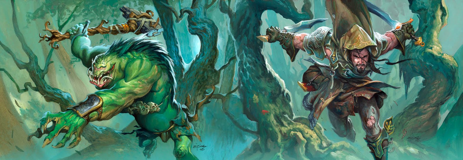
Two in One
Wednesday, April 27th, 2011
Today I want to share with you a painting that is actually two paintings. I did the Troll and the Ranger with only one other painting in between, and when I finished I realized that they were almost identical in colors and themes: I placed the 2 boards next to each other and broke out laughing. They fit completely together- in Photoshop i blended the board edges and voila! One painting.
It is actually a bit embarrassing. This way I found out that I am a lazy bastard that doesn’t even mix paint but use the same bottles and colors straight out the tubes. If I do not think about i tit seems I tap into the same theme of colors for woods, doesn’t it.
Seeing these two together made me realize that from now on I needed to be sure of a color theme before I begin. The first idea is usually not the best…it seems. From now on I try a bit more before settling on an idea. Keeping away from the first idea or at least twisting it or bending it is my rule from now on.


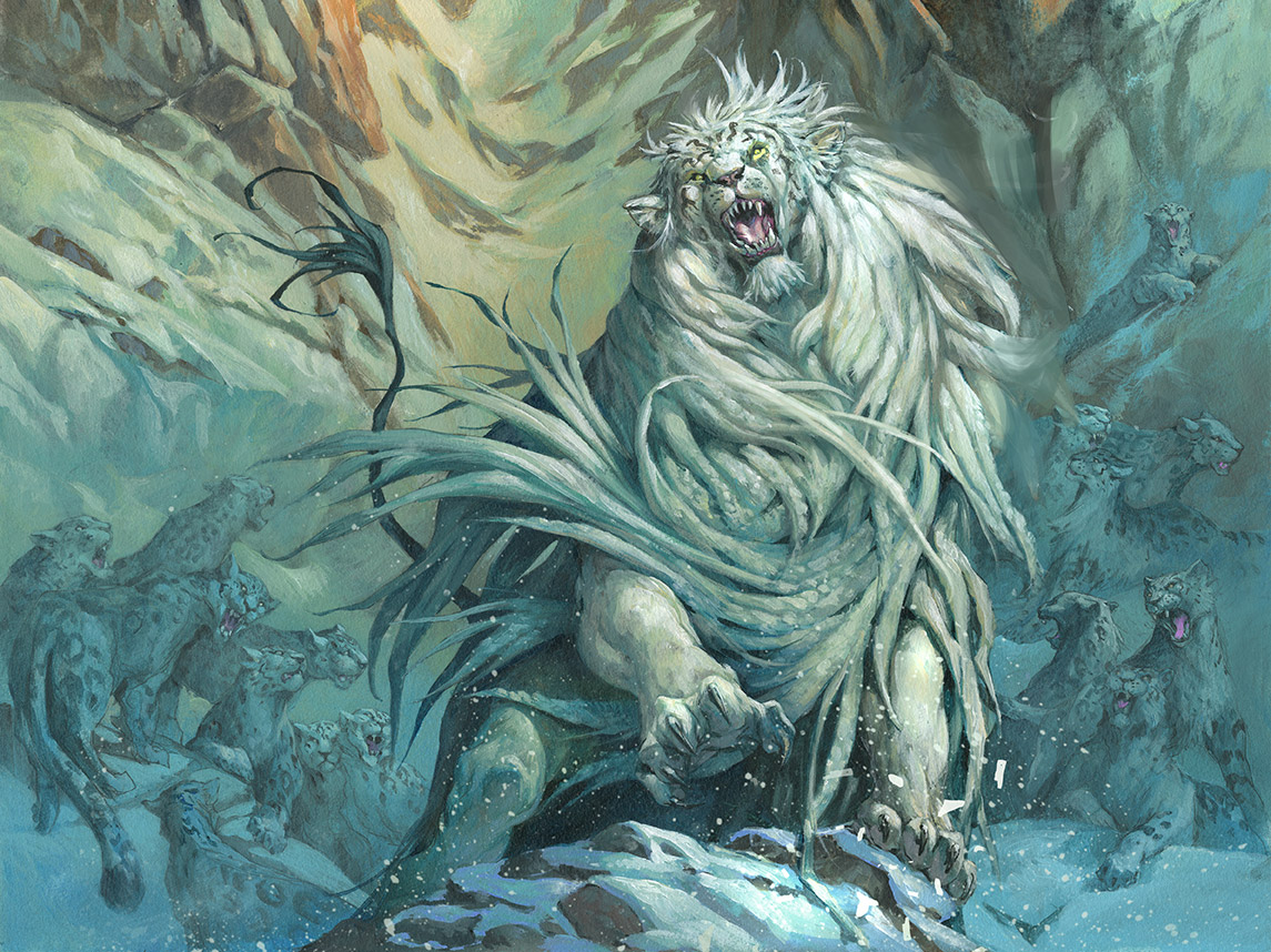


Don't feel bad- we are all creatures of habit and preference. It is good to note that you don't want to repeat those same color notes over and over though- and now you won't! I totally agree that making it a conscious choice of palette by creating a color comp is always a good idea- saves guesswork and problems later when you can't afford them.
Jesper,
I really see no problem with using the same color in both of these pieces and I like the diptych presentation. It almost seems intentional.
Actually, I've always liked both of those pieces. If you want to see a truly lazy artist, look around in the world of comic books.
Certainly there's nothing lazy about this guy.
http://www.nonplayercomic.com/p/nonplayer_22.html
I kind of like the colour scheme matching up. It also reminds me of the colour scheme you used on that board game with the giant ogre with the club on the front.
Both pieces are great paintings!
Hey Jesper, I wouldn't get too bent out of shape about the “default palettes”, some really great artists have made entire careers out of using very consistent palettes- Brom (who is a hero of mine) is the first person that comes to mind when I think of reacurring palettes. I'm sure doing quick color comps. would go a long way from breaking you out of your color habits otherwise.
I really love that teal palette with those notes of warm colors like the golds and oranges. It's all about the complimentary opposites! If nothing else, this isn't a bad portfolio piece for a wrap-around cover. 😉