-By Jesper Ejsing
Color roughs are something I put a lot of value in. Colors set the mood. They tell a story as much as the drawing does. To me, the color choice has never been easy or something I have taken lightly, but over the years I have developed different palettes that I like and that I tend to use more often.
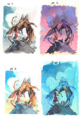
Take a look at the 4 different color rough I did for a dragon painting. Number one is a cloudy day, and number 3 is a sunny day. ( Looking at them now I wish I had gone with the cloudy day ) The number 2 and 4 are more evening/night but with an oversaturated color palette.
I think it is 4 totally different paintings and it is only the colors that has changed. They were all done with acrylic on a print of the same drawing.
I am not one of those artists that can see it in his minds eye. I do not see much in there actually. I need all of it to be out on paper in front of me to be turned and held up in the mirror to see it in inverse. I need to take the paper with me into the other rooms and ask the other guys at the studio what they think? Well, so I need the color roughs to make up my mind. Sometimes I need to do them just to be able to see what I definitely should not do.
What a colororough do for me is simple. It let me relax when I am painting, so that I can concentrate on anything else but colors, since I already sorted that part out.
And here is the best thing. Since I make the color roughs on a print of my initial drawing on the board, I can fuck up, print a new one, and fuck that up too, if I want. I can try stupid color palettes just to see if it could work. I can pump and saturate the colors dramatically and do stuff I would never dare do on an original, because if I fuck up: I print out a new one. The color rough takes out all the stress and the “afraid of too much color” feeling. And it builds for bolder choices.
One other benefit is that doing the roughs builds up all the colormixing so that when I am satisfied, I can jump right in and start from the same palette.
I was always a huge fan of The Hildebrandt Brothers. The way they made ( Greg still are ) the colors so bright it almost hurts your eye got me to think about colors as something more than just adding’s to a drawing. I knew it was a lot more difficult to use strong saturations, but I figured why not get the hard part right first and then I can easily go down to the muddy colors…pun intented. Not much can go wrong in browns and greys, but pure red, blue and yellow! That is where it all gets excited. And I was a bit too excited I guess. I never had any training, art school or mentor, so I had to try it out by myself. Trial by error. My first covers was build up from only 2 contrast full colors. Blue vs Orange or yellow vs Purple. My own little cooked up theory was that if I only chose 2 colors, I couldn´t do that much wrong. I started adding an extra splash-color and things got interesting. And then I got my hands on a book by Tim Hildebrandt called “The Fantasy art of Tim Hildebrandt” and finally got some real knowledge. Since then, that book has been my only source of teaching about colors.
When I do a color rough I try to choose colors that fits the mood, but also has a wide range of colors. Take a look at the 3 roughs for my sea serpent painting. The middle just do not work. The colors do not say Deep Sea enough: more sand dune and arabien nights. That leaves us with first and third. I like the first since the colour from the magic in the tip of the wizards staff is a splash color not featuring anywhere else in the painting. But I do think the blue in the sky and clouds becomes too flat. The range and variety of the single color cloud is just not enough. So I went with number 3 since the background had a range all from cold blue-ish to greenish almost yellow.
I have collected a sample of some of my colororughs for different covers.



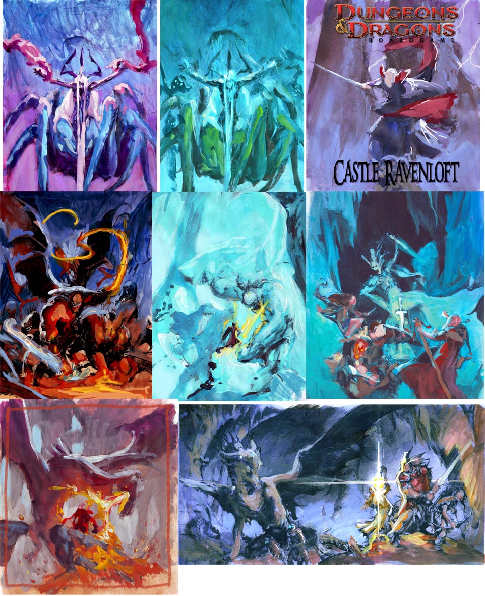



those are really fun to look at.
All of your color roughs are works of art by themselves, Jesper. If it's up to you, do you submit color roughs to an art director, or just black and white thumbnails?
These are great Jesper!
Might I ask what medium you are using on your comps? Looks like gouache. and do you use the same for your finals?
Loving your posts man!
thanks!
-adam
I'm so glad to see I'm not the only one that has a tough time envisioning things in one's 'mind's eye'. I've always got to do a color rough (or three or four) before I land on something I dig. Great post. Great work. Just…great!
I always mess up colors unless I take the time to plan them out beforehand, so you're definitely not alone there Jesper.
Awesome post, Jesper! Color roughs are totally important and I think they're one of the more fun parts of the process. Figuring out what mood you want makes all the difference. So cool to see your color studies, man!
Jesper, I asked you about your method for color roughs on facebook about a week and half ago and I'm glad to see now a detailed entry. I feel like color roughs are an unsung hero when it comes to experimentation. I'm soaking up your words of wisdom. Thank you for taking the time to share with us!
– Joey
This is something I've been making a point to do lately. And something I really need to keep pushing. This post came along at the perfect time. Thanks so much for sharing Jesper!
Thanks for sharing this. To be honest, I only bothered with roughs and preliminary sketches – it wasn't until recently that I started doing color roughs for color work. You definitely reinforce the point that it's suicide to go ahead to the final color piece without working out the scheme of things first.
Dear Jesper… I wish I knew what the heck you were saying about your palette in this video…
http://www.youtube.com/watch?v=yBVbkn1ZxEc&translated=1
another blog post maybe??
hey