I often say, ‘Draw dumb.’ (At least in the beginnings of a piece.) And what I mean by that is to turn off the part of your brain that thinks about detail, in order to leave your mind open to bold graphic choices and the all important ‘flow’ of a composition. It is the forest vs. the tree right? If I obsess details too soon, I lose sight of the entire painting, and it winds up looking like separate elements bashed together on one surface.
As soon as I start thinking about detail and hitting the reference hard, that is when things will start stiffening up. It is the nature of reality intruding on imagination. And in my work, the final result is (hopefully) a solid compromise between the two. That isn’t to say I am not glancing at a variety of ref here and there in the beginning, but no more than a glimpse. I want to be consumed with what is happening in my comp and not what is happening in the corner of my eye.
One way I do this is by NOT starting with line when conceptualizing a piece. Instead, I start with shape (Which I often add some chicken scratch too). My chief tools for this are the Photoshop lasso tool, and a wonderful, though often forgotten, little program called Alchemy. (Which, by the way, is FREE!)
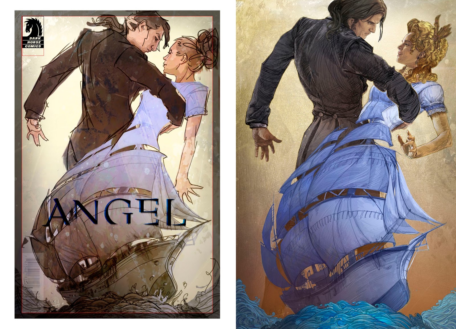
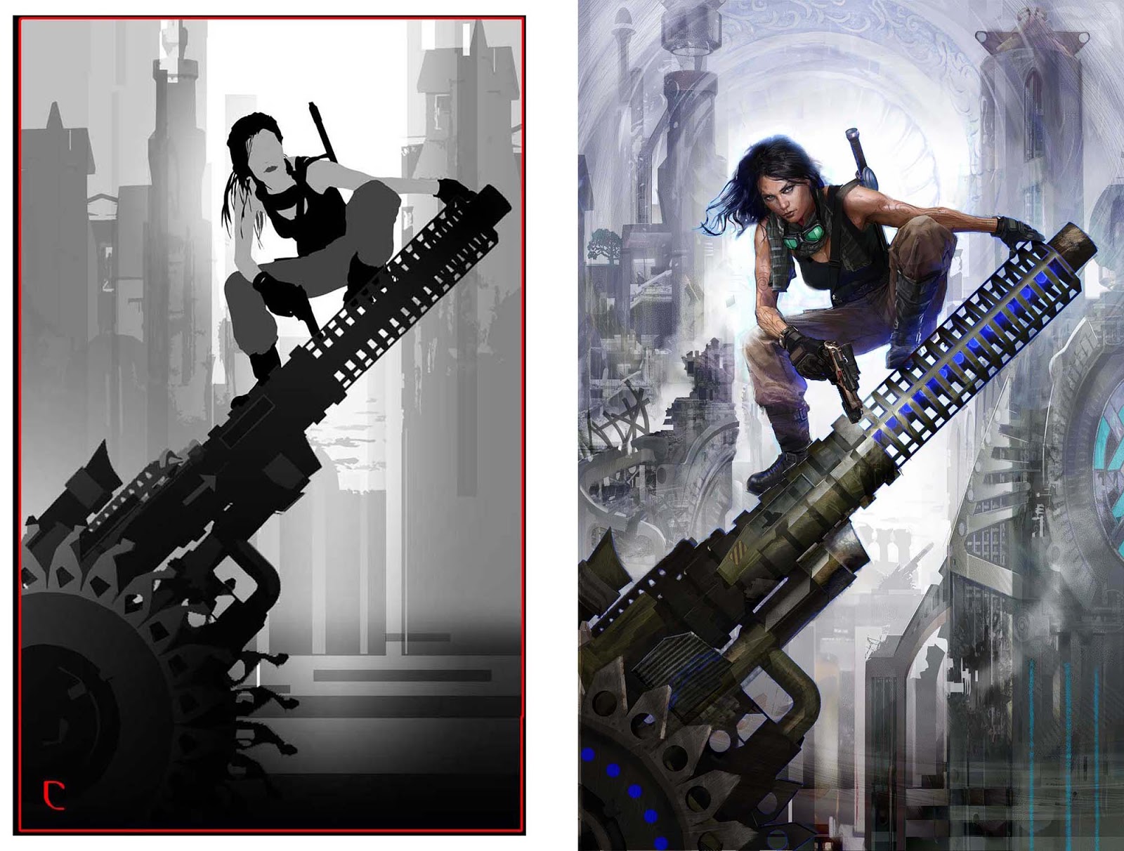
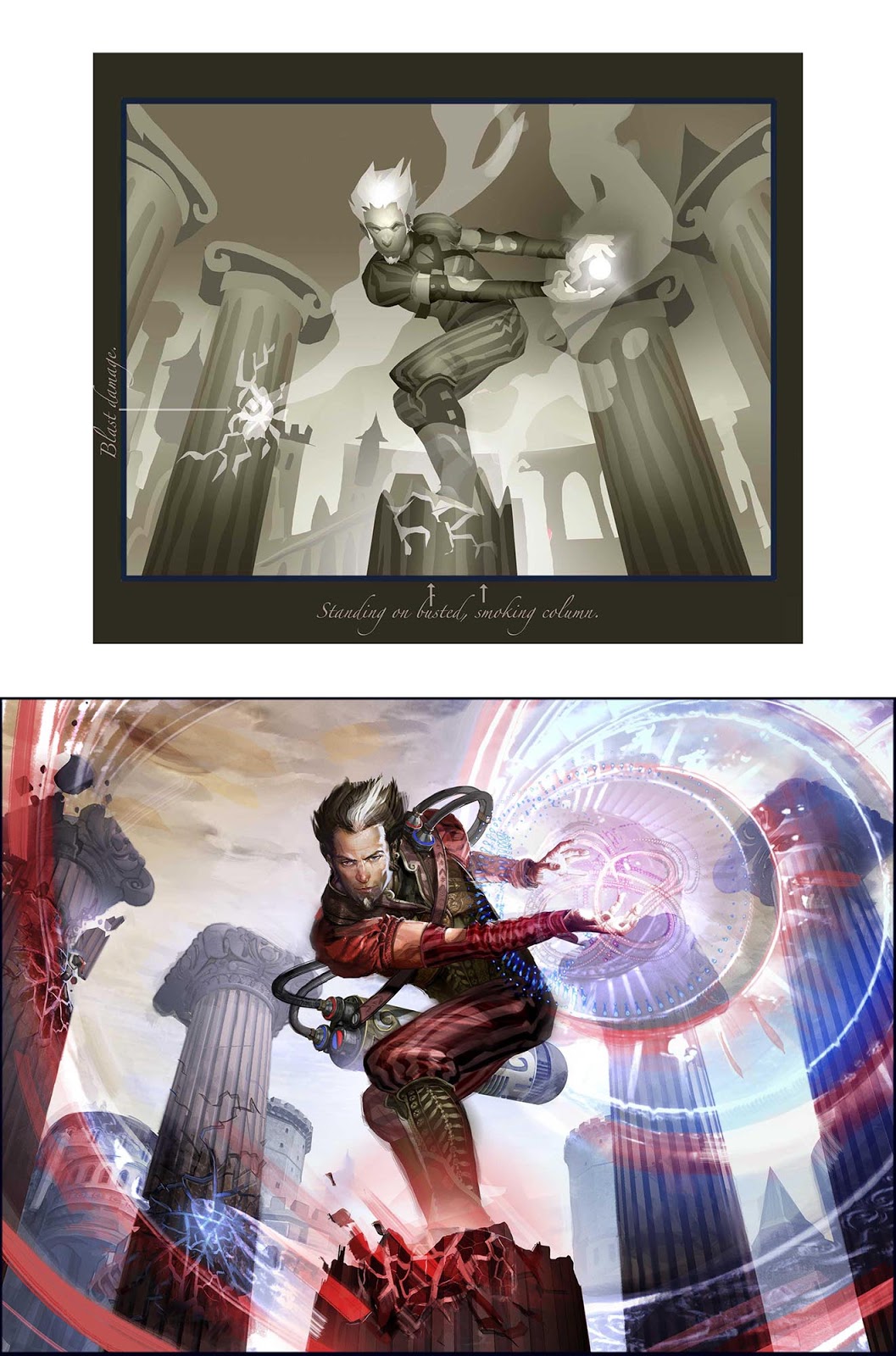
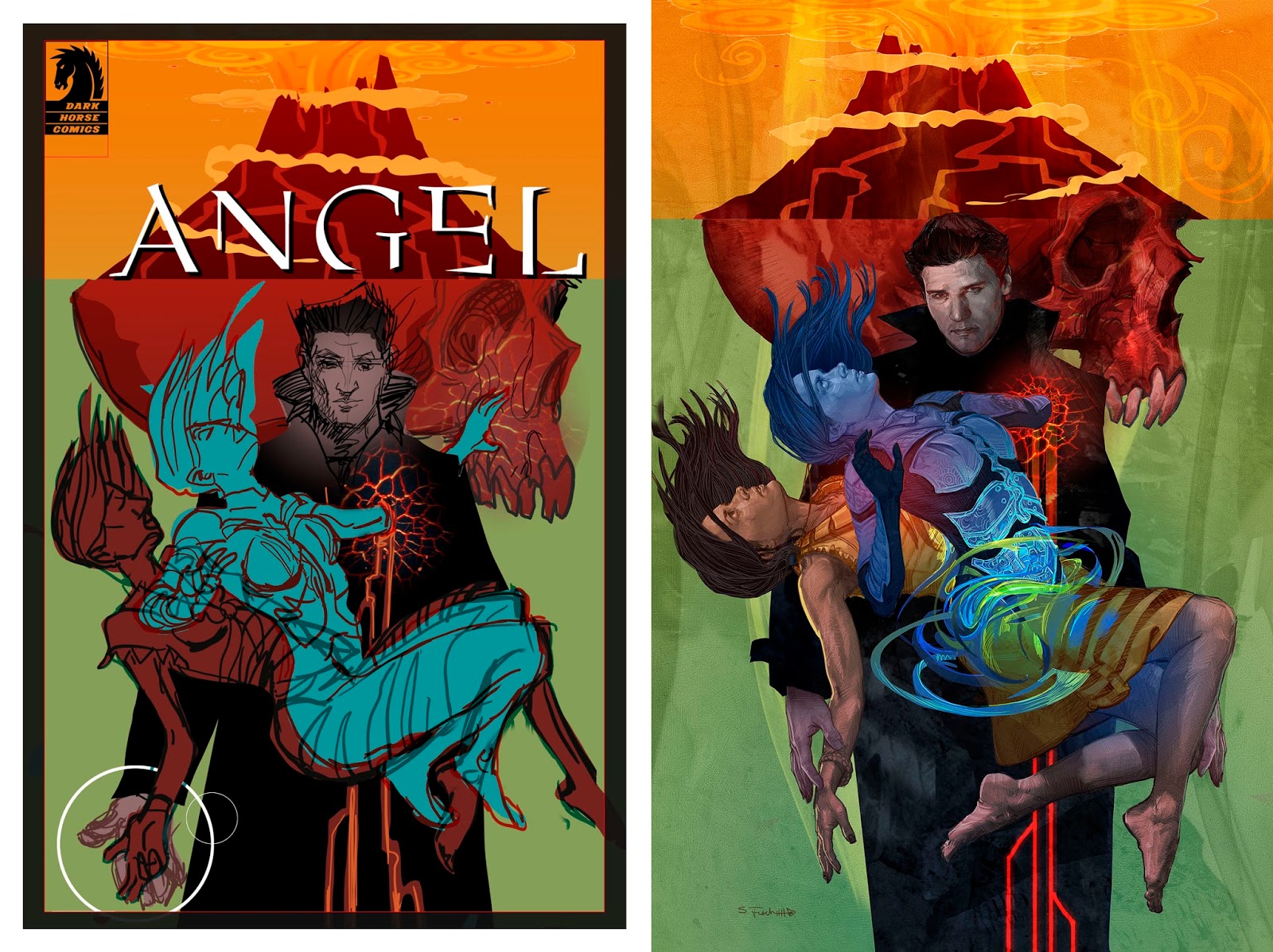
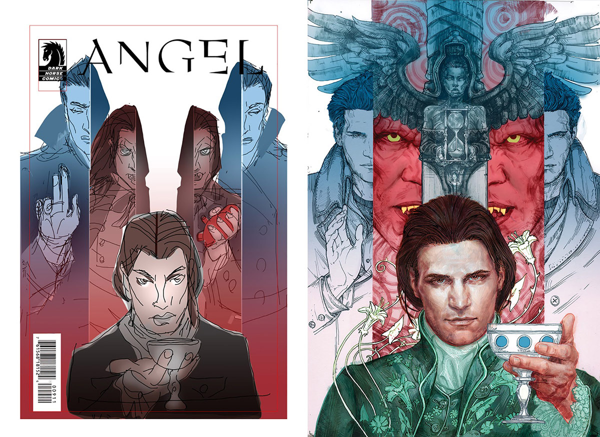
What follows are my original shape-comps and the final pieces. In the early stages I am concerned with flow, attitude, composition and value more than how well a hand is drawn or how much detail a costume has. We can ALWAYS refine. It is much harder to get back to the essence of a thing once it is frosted, has lit candles, and everyone is standing around singing Happy Birthday.
Here is a slide show of me building one of these shape-comps in photoshop, using nothing but the lasso tool, fill, gradients, brightness/contrast, and the all important Transform.
[youtube https://www.youtube.com/watch?v=6WyZSvUCGIU]
And here I build up a face in Alchemy to give an idea of how I use the program. I usually have my ‘Create’ tool set to ‘Shapes’. And as I get into it, I switch on ‘Gradient’ under the ‘Affects’ drop down. So essentially it is like drawing with a lasso tool that auto fills with value and gradients. (And I use the ‘Transparency’ slider to adjust opacity, which lets me build up.) It is the speed with which I can create, and the lack of an un-do (by design) that attracts me to the program. Forces you to commit and make your marks count.
[youtube https://www.youtube.com/watch?v=kfI_0lrFTtw]



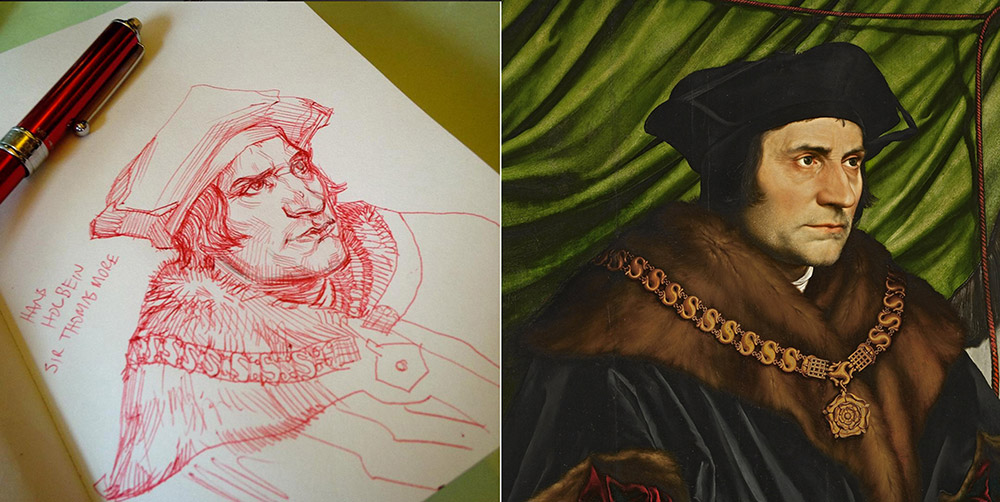
such a great post! im actually practicing value separation and grouping at the moment by tracing old masters illustration and trying to design the comp using values only, its really helpful coz i get to see where they place shadow shapes and why.
i think another great artist who designs with shapes is Sparth, he just makes me think why use line at all?
Alchemy is lovely and a lot of fun and a fantastic recommendation.
If you would like to try something similar with an iPad or Android tablet, I recommend Adobe's Illustrator Draw. It started life as Adobe Ideas the same day the original iPad was released and has developed very nicely since.
I use it for a lot of initial comping, on both my phone and iPad. Has a number of built in shape tools, plus ruler and French curves. Create color palettes, customize brushes, pressure sensitivity (with stylus), layers, and fill on tap. I particularly enjoy using it with the fills set to low opacity so I can layer shapes, then use the erase tool to refine them, cut them up. You can do very nice line work with it, but I really enjoy using it for “shaping”.
Very useful, and best of all, it's all vector. You can open the file up in Illustrator (or Photoshop) and polish up a design.
Thanks Thomas! I have yet to venture into the ipad platform for making art, but it is on my list of things to ad to the arsenal. I have a Surface Pro 3, and though I'd use it for mobile art-making, and all I've done is surf the web with it. Something about the pen, or interface (Or the fact that I never leave the studio and have my whole cintiq rig in front of me.) and it never became a part of my workflow. But I am loving the idea of an ipad pro and apple pen this year, and I will TOTALLY use this info, so thanks!
Sparth is amazing, as is Mr Robh Ruppel!
My pleasure sir! I also have a Surface Pro 3, and simply find myself preferring the drawing experience on the iPad Pro with the Apple Pencil, especially in the apps that utilize tilt sensitivity as well as pressure. It feels less obtrusive to me; the drawing apps are tuned for tablets, and it is (to me) a more comfortable “grab-n-go” device. I've the Cintiq at home and connected to the rig, but have found when I'm on the go, the iPad is perfect for ideation, and with an app like AstroPad (highly recommended), it can take the place of the Cintiq if I want to harness my laptop's full creative power. Eh, mostly. I still prefer the Cintiq when I'm in studio, but have found I really don't miss it if I'm in mobile-mode.
Drawing on the iPad when out and about has garnered me a few free lunches as well. Restaurant manager sees me drawing, starts asking questions, I let them play with it a bit… and they end up comping lunch! And what current or once starving artist passes up a free meal?
Obtrusive, I think that is exactly it. Working on the Surface Pro 3 felt crowded and clunky. I need simplicity in a mobile device.