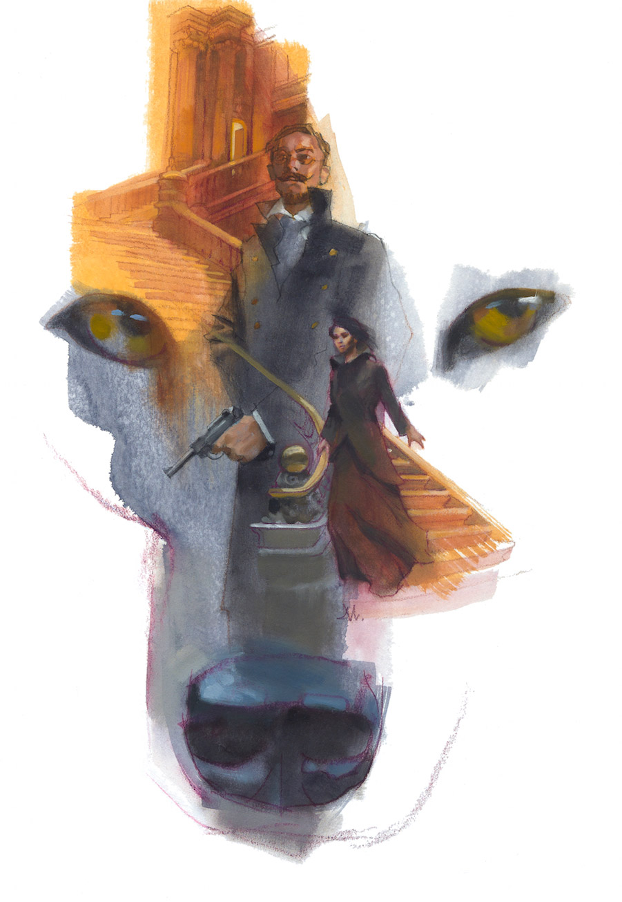
Another in the series of illustrations for the Michael Swanwick stories of The Mongolian Wizard for Tor.com.
These short stories take place in a world that’s one part Napoleonic, one part 1930’s Germany, one part espionage with a large helping of the fantastic, stirred with hard crime and shaken with the medieval. I almost never know where the story could go, but I’m hooked in a U-boat-captain-screaming ‘dive! dive! dive!’ sorta way.
I recently spoke with Michael at the latest WorldCon in Spokane, WA, and he mentioned that there’s many more stories to come based on these characters in this marvelous and familiar place. (It’s hard to wait.) There’s been a murder in “The Night of the Salamander” and it takes place in a palatial setting. But it’s not just any old crime.
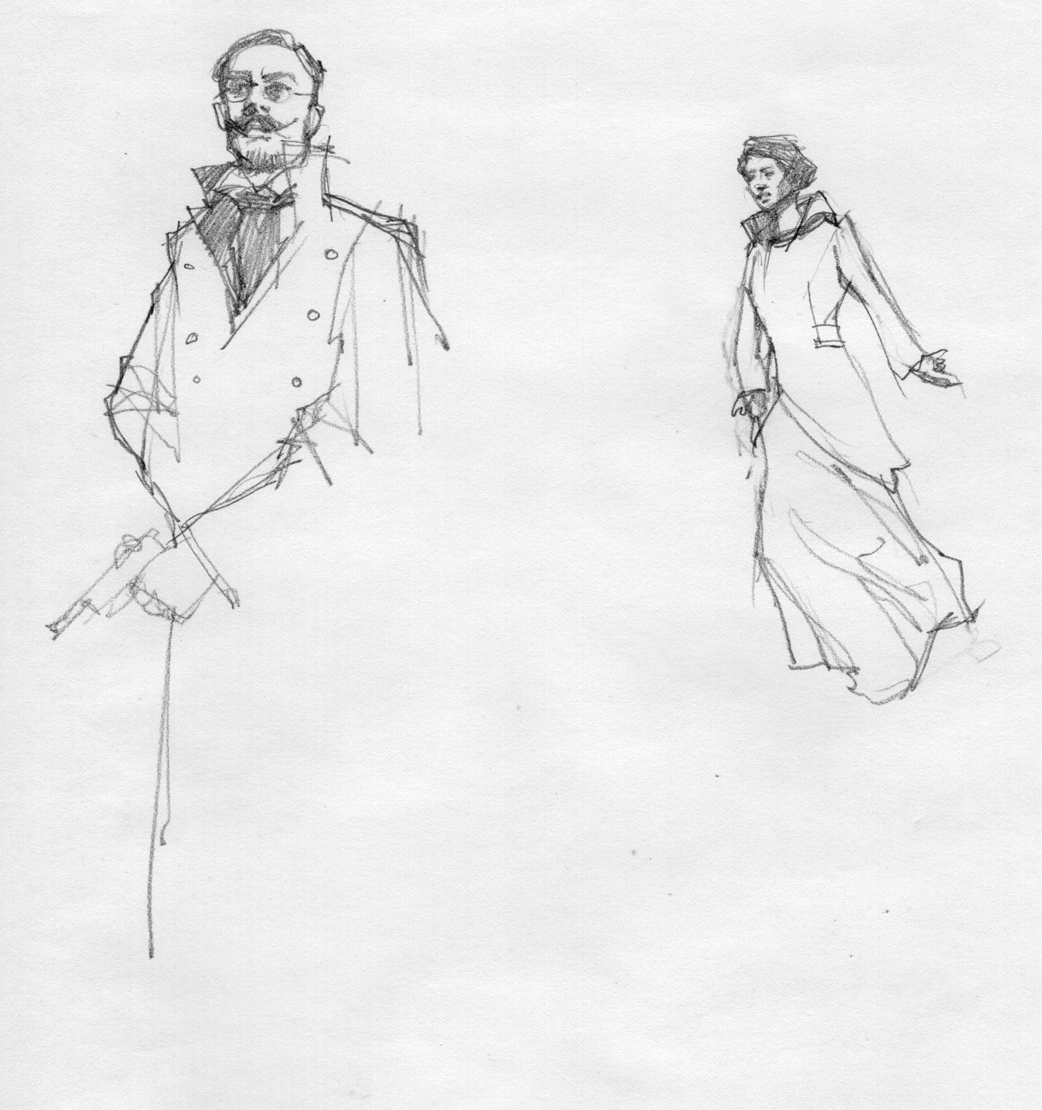
I like to wrap the composition around Ritter, the main character, but with plenty of room to showcase Freki, his telepathic wolf. This time, however, I chose a secondary character to keep from overusing Ritter. From there it’s a matter of bringing in elements conducive to the story such as more characters and main settings.
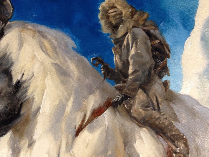
I projected my favored thumbnail sketch with pencil and Prismacolor onto an illustration board prepared with a watered-down mixture of gesso. When dry, it takes pencil like velvet. Then I mixed several pools of different colors of gouache and slapped (yes, slapped) them down with a broad brush, allowing them to blend in and out and run around, tipping the board to coax different effects.
Once dry, I came back in with liquid-y oils to continue the flowing effect. Once that set up, I came back in with opaque color.
The classic montage still works to draw a reader into such a varied and creative tale. I explored multiple groupings of elements, searching for just the right shape to the overall concept. A montage must flow not only from item to item, but as an overall elemental shape in itself, and lay on a page in an inviting way. I love the way the color invades the white of the background.
I honed my composition skills by working on montaged themes when I was a young illustrator. It drives one to be efficient and concise. If you’re looking to jumpstart your design abilities, study and then experiment with this effect.


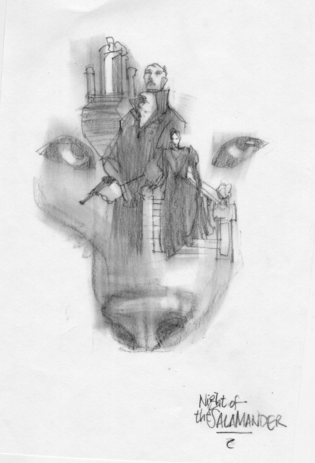

nice one. Whenever I see your new work it reminds me how much I miss seeing more traditionally designed and executed illustrations these days. This one has a real 1970's/80's illustration vibe . Maybe it's the big dog head 😉 but the pencil sketch looks sooooo Mignola, love it!
I thought it was very David Grove…nice.
Yes, I've studied David's work for years…love it, and I really enjoy working as if he would approve. We were close.
My thumbnails have been quite simplified for decades. But we all have similar patterns to other artists. The idea that everyone must be distinctive by singularity has been perpetuated by people who don't paint. It's an awkward position for any artist because of that.
Thanks for the compliment, though, as Mike is great. But mine didn't come from there.
I also thought of the late great Grove as well. Beautiful composition. I've a!ways wanted to use gesso on illustration board ever since I found out that it's what Drew Struzan does for his poster work.
I like the efficiency of all of it… composition, line, color, etc. Thanks for the heads up… I'm over thinking my projects…