Here are 3 easy tricks to getting a clearer read on you paintings. Why? Because you when you spend a lot of hours on a piece, you would like for people to experience your image without having to explain it to them first.
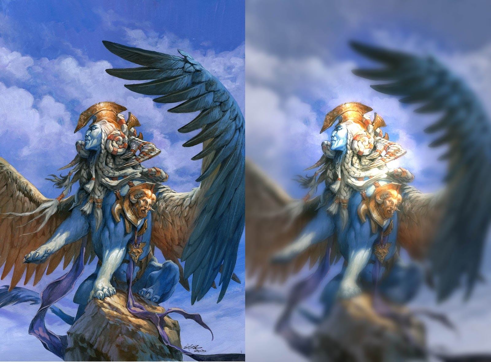 |
| This is the effect I am going for, but of course, not as extreme. |
The most important part of the picture is usually the facial area of the main character or the area of conflict.
This area should always be dominant to everything else. The focal area should have the most contrast, the most details, the sharpest lines and the strongest colours. Think of the rest of the painting as being submissive to the focal point. The rest should be considered as an area slightly out of focus with colours details and lines draining out of it. Like a camera lens in an old love movie where the edges are blurred and obscured.
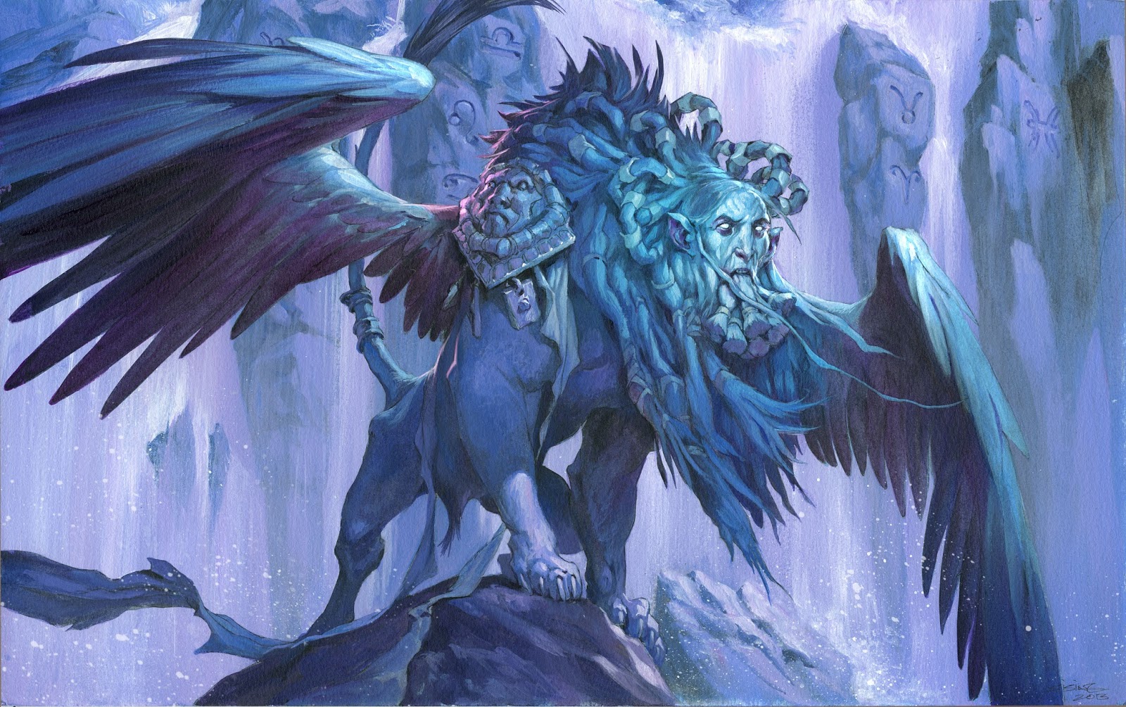
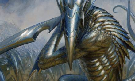
A clearly readable silhouette is, to me, the most important tool in composition. Take a good look at the silhouette of your main character and make sure that every limb is clearly readable, or that the pose and action is clear.
I often start with the gesture and see if I can strengthen it or remove elements and still clearly read what is going on. To me the hardest part is that I usually draw the figures bare/naked at first to get the motion or gesture right and then afterwards dress them in costume or design elements. The hardest part is not to cover up the limbs and the foreshortenings that made the pose read clearly.
In having a clearly readable silhouette you also need to consider the values. Light background with a darker figure, or the other way around, always works well.
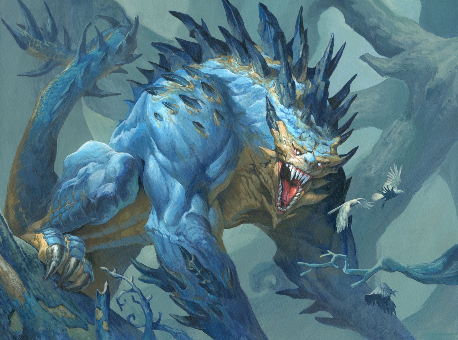 |
| Look at the difference between the tail and the face. |
I often think of Frazetta´s paintings while rendering. His way of becoming almost sloppy in the edges of his paintings at first struck me as lazy, but as I got older, and a little bit wiser, I came to the conclusion that it might be on purpose. I try to use what I learned from this when I paint backgrounds or lesser important areas of a painting.
If I use softer transitions, and smoother and more chunky strokes, I tend to focus less on that area when looking at the final painting. I call it “painting out of focus”. I try to squint my eyes and check to see if I can still read the shapes out of focus?
I use a really big brush, like size 12, to render ALL the background. I use an airbrush to spray water so I can make softer and smoother transitions in colours, all so I do not get too sharp or hard edges where I do not need the spectator to look.
On the other hand when I paint the face of the character I take the little brush and try to be as detailed as I can. In creating a textural difference, a hard vs soft difference, I mimic the way the eye works. The eye, like a camera lens, cannot focus at more than one thing at a time.
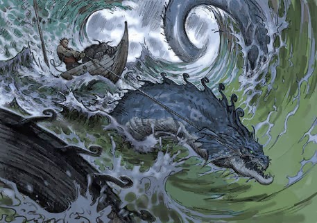
The piece above is perhaps one of the clearest silhouettes I ever did for Magic, utilizing all of the techniques mentioned here. It is also the image that reads the best in card size as a result.




Thank you very much for that insightful post Jesper.
Personaly i find a lot of refreshing answers to that problem into the work of these artists:
Ruan Jia:
https://www.artstation.com/artwork/nERRr
Wei Feng:
https://www.artstation.com/artwork/Ay9xq
Yang Qi:
https://www.artstation.com/artwork/16VlG
Tyler Jacobson:
http://3.bp.blogspot.com/-Ng-CNbPvGR8/VoG7SNgCOxI/AAAAAAAACHQ/wQYAyB-pb7A/s1600/Tyrant-of-Valakut—Tyler-Jacobson.png
Cynthia Sheppard:
http://cynthia-sheppard.squarespace.com/#/libra/
Not only they have different ways to answer that, hard to deal, problem (and they are probably struggling too despite the incredible qualities of their work) but they also manage to maintain a very beautiful surface and painterly look.
I believe that in these modern days of fantasy illustration there's a tendency to over-use bright and saturated colors and rely on magic effects and other spells to push the limit even further.
Instead of hiding or pushing down some parts of the artwork (by blurring, desaturate or loosely paint like you suggest) everything is pushed up!
The goal is to make catchy pictures and i understand that but it also reduces the amount of space you have to deal with these problems.
Last i think that the influence of marketing pictures has a lot to do with this, just take a look at some covers from video games or movies:
http://www.gamekyo.com/images_1/35c5f3abacf83b99c0c526f459da9de520141027154411.jpg
https://s-media-cache-ak0.pinimg.com/736x/78/72/66/78726686611e3c9b6cbe3f1ede601fcf.jpg
https://s-media-cache-ak0.pinimg.com/564x/01/31/a3/0131a3563a5fbd381111717f8c04d1c5.jpg
http://www.itfgaming.com/wp-content/uploads/2013/05/Bioshock-Infinite.jpg
Everything is sharp, perfectly defined and crafted, nothing is hidden or suggested, these pictures are more descriptive than narrative.
Maybe that's one of the keys here, focusing on what ou want to tell instead of how helps to make the good choices.