I recently completed a cover for the next book in the #1 New York Times Bestselling ‘Mercy Thompson’ series, written by Author Patricia Briggs. The cover was spoiled this week over on USA Today, so I figured I would share some of my process for creating the cover here.
This next novel is titled ‘Storm Cursed’ and once again follows the coyote shapeshifting protagonist, Mercy Thompson. Mercy must go up against an unknown enemy, facing deadly witchcraft in order to protect her pack.
This cover started fairly typically for most books in this series. Because the book is advertised so far in advance, there isn’t actually a formal manuscript for me to read when I begin working. So instead, the job begins with a call to the Author. The Author and I speak on the phone for several hours, going over the story, discussing specific events and locales, and in general, how these events shape our main character.
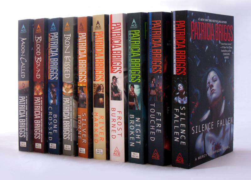
Once, I have a good feel for what the story is about, I go about sketching potential cover concepts. It may seem silly, but my biggest consideration when coming up with an idea is to consider what came before this cover. I have done a lot of Mercy Thompson covers now (even more than what’s seen above), and so I need to be careful no to repeat myself. I want to cover to look different than the ones before it, but it still needs to look consistent enough that readers know it’s part of a series. It’s a fine balance between consistency and redundancy.
From there, I begin sketching as many ideas as I can. I take the ones I like, and develop them into more detailed sketches, and abandon the dozens upon dozens of sketches that I don’t like. The ones that do make the cut usually develop into monochromatic color comps. Since I know what the type for this series already looks like, I sometimes add type into my sketches in order to give the Art Director a better impression of what the final cover would look like.
The Art Director presents the sketches to her team of Artists, Editors, and Marketing people. Collectively, they decide what works best for the book, letting me know if they have any concerns or revisions. In this case, they selected the second sketch. They liked that the cropping was similar to the last book in the series, but asked that I make sure I differentiate the two as much as I could through the use of color.
Once I have sketch approval, I begin the process of creating the original painting.
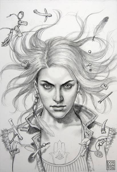
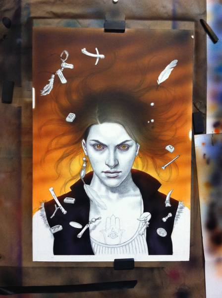
This painting began with a highly detailed pencil drawing. I don’t always work this way, but this series of covers has a specific look, and so I typically opt for a detailed underpainting to ensure everything goes as expected. Certain parts of the painting, such as the hair across the face and the tattoos on her arms, are deliberately left off at this phase, as they usually just get in the way of me painting the skintones below them.
After the drawing is complete, the rest is really just ‘coloring’. For this piece, I decided to do as much of it as I could using acrylic and colored pencil. These two mediums require almost no drying time, so I can work a lot faster than I could in oil paints, my typical medium. Below you can see the first pass of color which I applied using an airbrush. I created a mask to help keep any unwanted paint off the face. I then peeled it off and did the same for the sky while I painted the face.
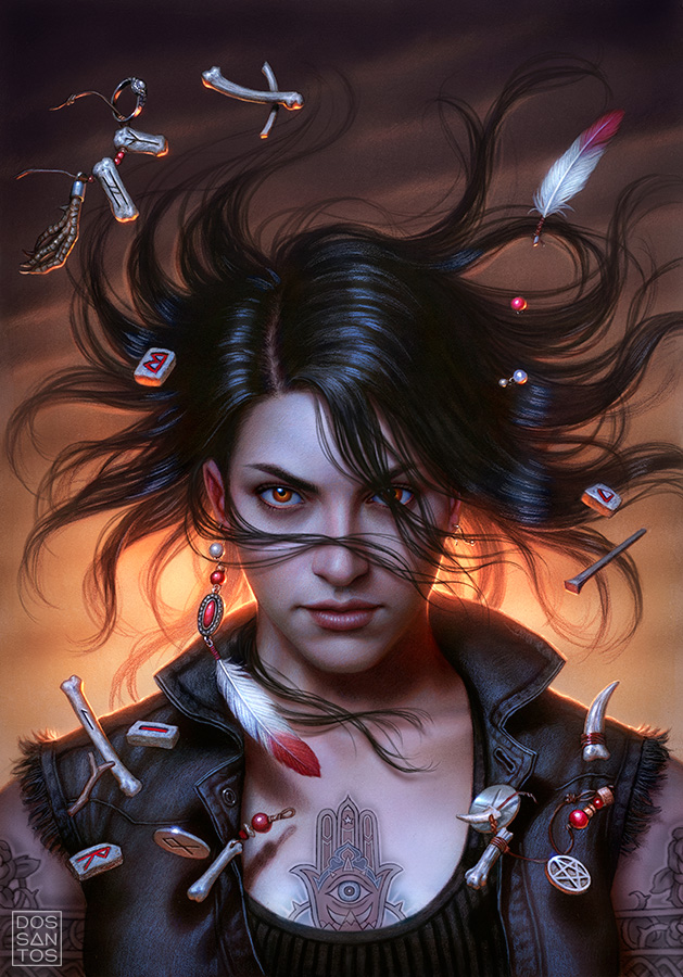
Lots of airbrushing, tons of colored pencil, more airbrushing, more colored pencil, and at least one pass of oil paints later… you get the final painting you see below.
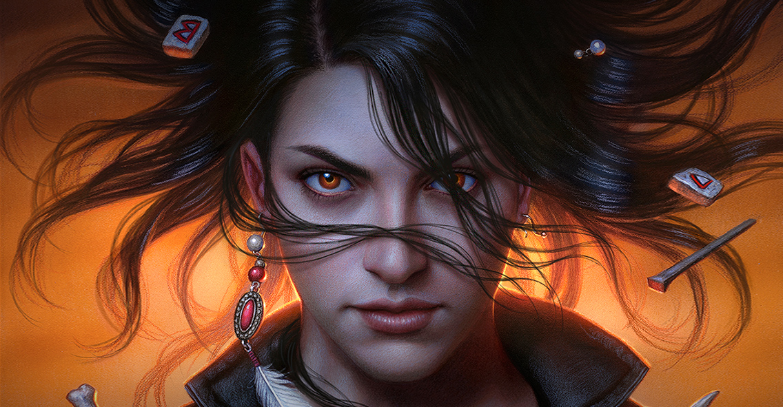
Although I liked the colors in this piece, and they were fairly accurate to the approved sketch, the Art Director decided they wanted something a little more eye catching.
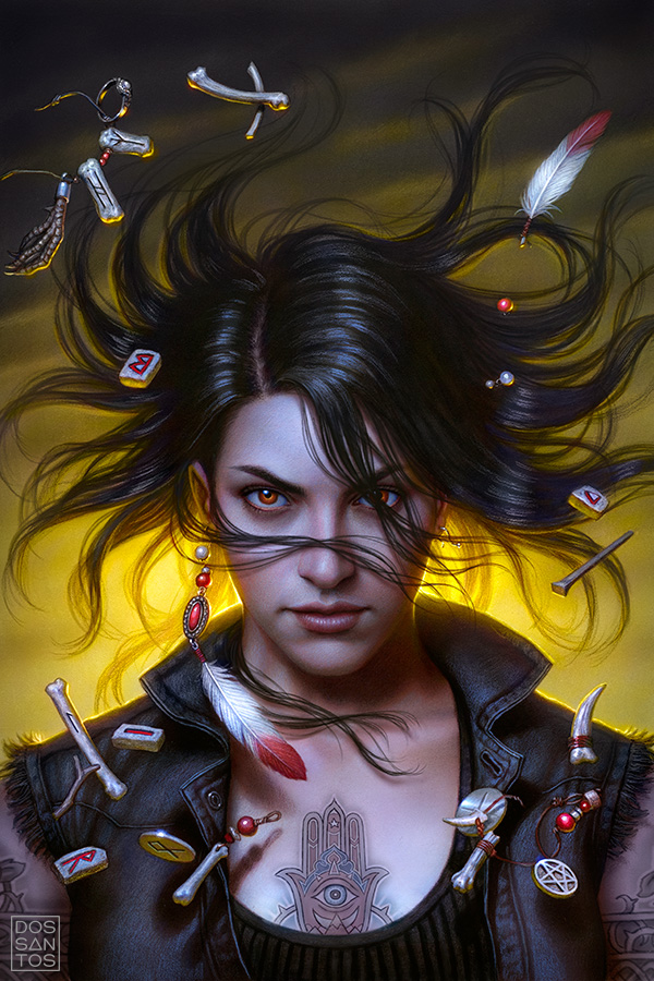
We experimented to several different color variations, ranging from grey to blue, to yellow. Ultimately, the publishing team decided that a yellow background would look really striking on the shelf, and also helped capture the sense of other-wordly magic.
It would be far too much work to make these color changes to the original painting, essentially requiring a completely new painting, so I make the alterations using Photoshop instead.
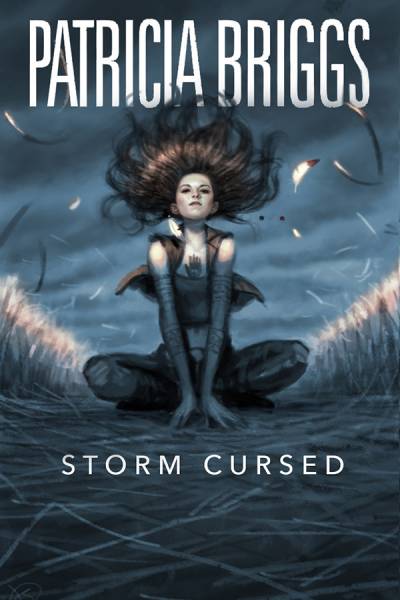
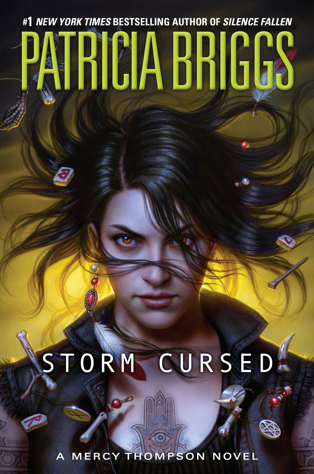
And finally, here is how the final painting appears on the cover of the book. You can see how the Art Director used the green type to help push the overall yellow palette in a new, even more vibrant, direction.
‘Storm Cursed‘ is the 11th installment in the Mercy Thompson series by Author, Patricia Briggs. ‘Storm Cursed’ will be available in March 2019 from Ace Books.





I like the orange one more.
Maybe it’s just me, but by changing the background color to yellow Mercy “pops” more. Both are exceptional tho!
I think that neon green/yellow combo is going to look really good in the stores.
Lovely. It was fascinating to read about the process.
Fascinating process. Did you use a different model for this cover?
No, it’s the same model. But I sometimes tweak features to suit my needs.
Thanks for the behind the scenes look. It’s amazing just how many hands touch a cover on its way to print…
Hmm. I don’t like the yellow, although it does pop her face more. This is definitely my favourite. I love all of the highlit swirly items.
Thank you! I really enjoyed reading and seeing the process!
Beautiful work! The covers always enhance the story. Thank you.
I love your covers and can usually spot them from quite a distance. That is usually followed by a beeline for the book it is on 😉 I saw one of your posts on your process for one of Gini Koch’s Alien covers and it is always a joy to get a peek into your world. I was lucky enough to win a contest fort the first 5 Alien covers and I get to see them framed every day on my walls. Thank you so very much for all the work you do and the amazing beauty you share.
The Orange one it helps highlights her eyes better!
Thankfully things like a major colour can be changed in PS, otherwise this would have been a “big ask”. Find the orange/amber to be more natural, but this isn’t a fine art commission … the yellow will have more impact as a cover on the shelf.
Brilliant work! Thanks for sharing.
I like the yellow cover best with the title. This is my favorite cover so far.
It’s always a treat to see a new Mercy Thompson cover! I really like the colors schemes–both the oranges and the yellows have their strongsuits (orange seems to be stronger as a stand alone painting, and yellow is better as a book cover.) It’s always so fascinating to see what differences a change like that can make. And I always like the cooler tones you use for her skin. I love it! 🙂
I really would have preferred the orangish cover art but I can see where a publisher would like the yellow better as it does stand out more. To me the orangey one makes her eyes look more menacing!!
Love all your covers in the Mercy world. This one will look fantastic on the shelves although I liked the orange background better.
Love the Alpha & Omega ones too. I’ve bought Dead Heat and Hunting Ground prints. Love them. Your idea of Charles was perfect. Did you use a model?
*protagonist, right?
Absolutely Beautiful! I really adore all the different covers you submitted. You and Patricia are my addictions. Thank you!
What happens to the original painting? Do you keep those? I wish publishers would do more art books collecting cover artists work. I’d love to see/buy a book capturing all the Mercy series. I’d happily do so for several of my favorite series. Great way to support the artists, too.
I’m working on an ‘art of’ book. Someday soon!
My all time favorite series and my favorite heroine. Love the cover and the process to get it is most interesting. Y’all should sell the art work.