While most of my work has been in film, theme park and book covers, I greatly enjoy doing print editorial work when the opportunities arise. I wanted to highlight one of my favorite paintings I did for National Geographic’s 125th anniversary.
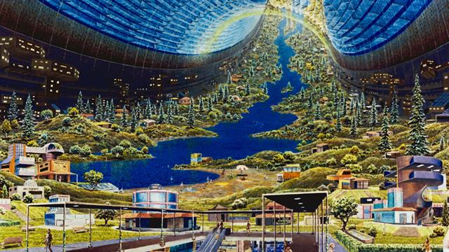
I was asked to rethink, in my own style, the various generation ship painted in the 70’s including artist Don Davies in the 1970s, to reflect all the new technology that has been explored and developed over the 50 years.
(Internal View of the Stanford Torus, By Don Davies)
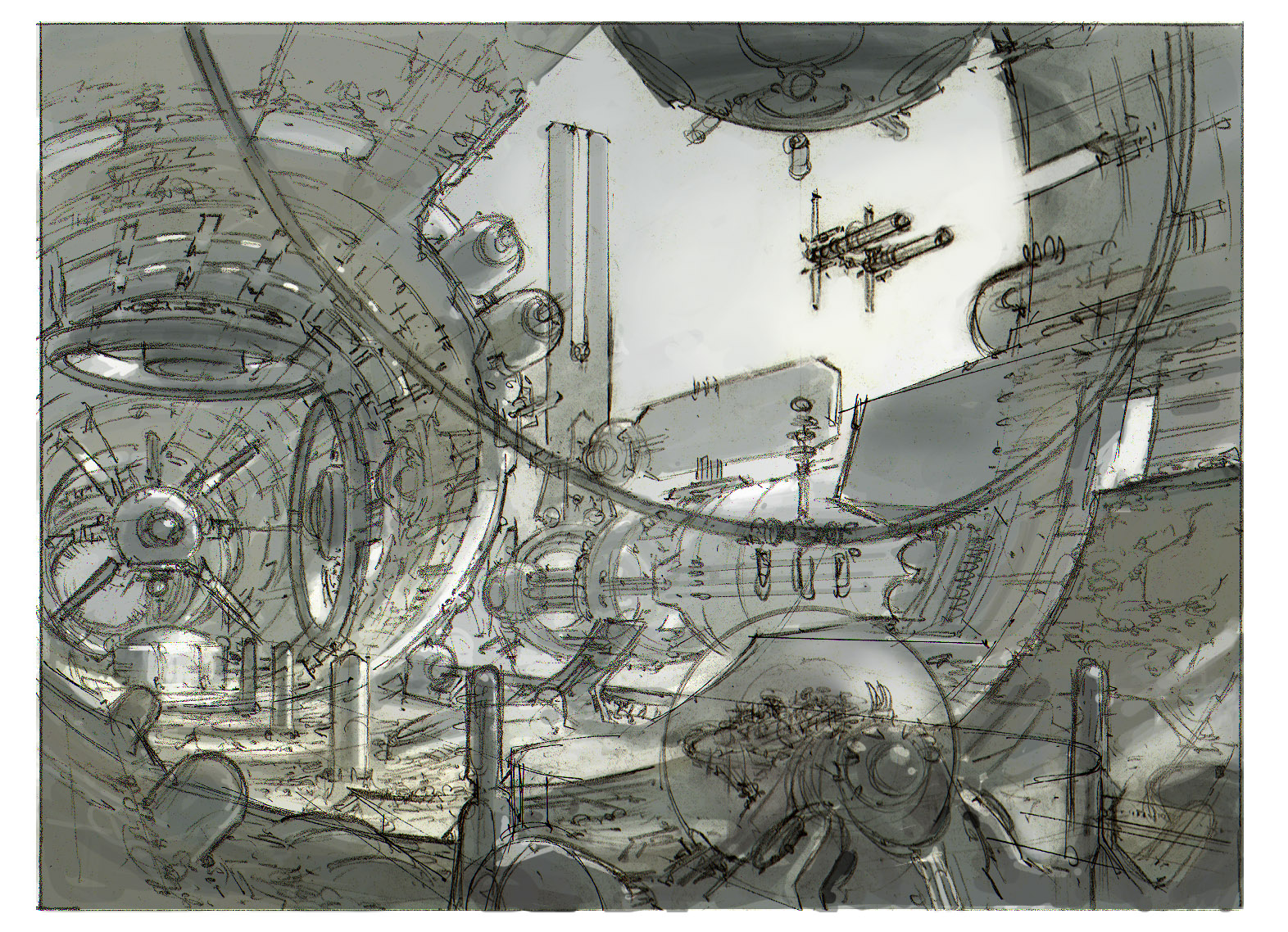
While they specifically asked for a view from the inside of the ship, I found it difficult to imagine what a part of the inside would look like without exploring the form factor of the whole ship. The habitat in the original concepts was intended to be inside massive, rotating cylinders, in perpetual movement to create artificial gravity. Each ship had several cylinders attached to each other, and to a main engine body that moved the enormous structure in space.
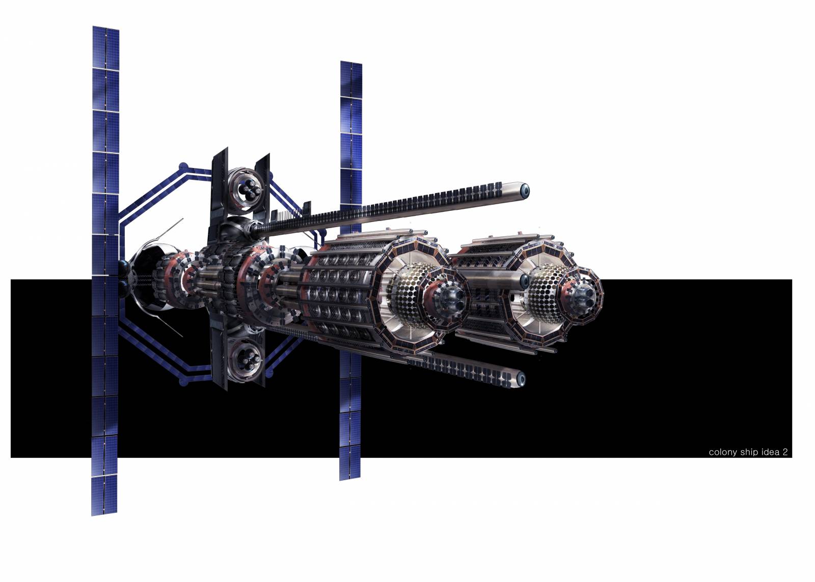
Because these colonies were intended to survive long distances, spanning multiple generations, the interior needed to be a world in itself, with everything needed to thrive, including basic necessities like farming and water, but also sports, culture – activities that build societies and communities.
The pleasure of creating this painting was that all the designs are purely speculative at this point, so like much of the work I do in book covers, I had full creative license to explore different shapes and structures and imagining what purpose they might serve – like the giant turbine at the rear, intended to be a massive atmosphere generator. I imagined that solar energy could sustain much of the environment, and with advanced nanotechnology, the environment could actually build and rebuild itself.
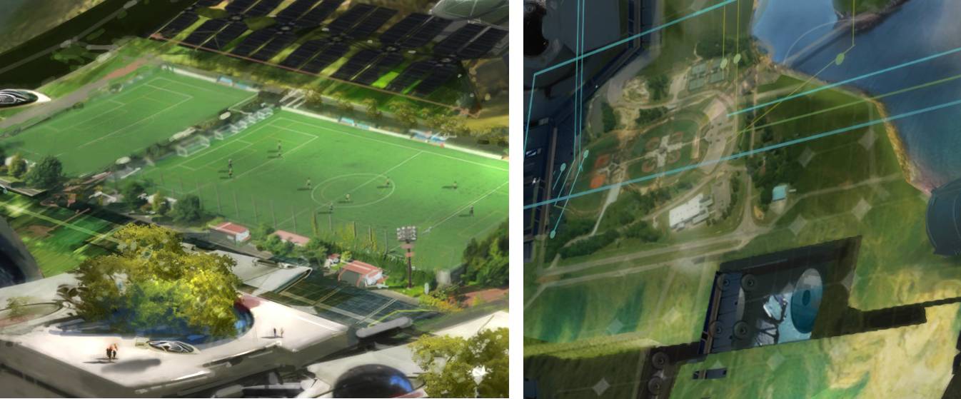
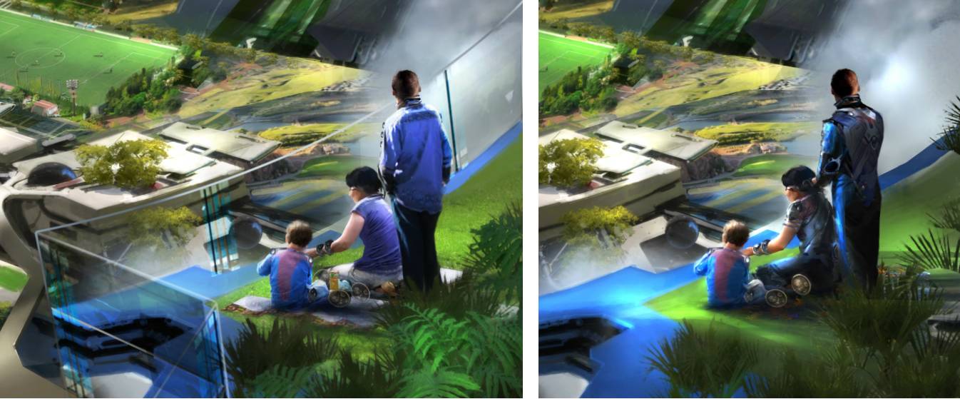
It was also an interesting balance between full techno-utopian license, and incorporating elements to encourage familiarity, association, and safety. So while there are elements that are completely generative and new, like the generator, or the building in the center, there are also elements that are very familiar to readers, like the football field and the houses which are modeled very similar to the suburbias of the present.
In that vein, I was asked to add a railing between the family on the bluff in the foreground, to create a sense of familiarity and safety, while still keeping to the futuristic aesthetic. My first version did not have any barrier, because I assumed that the artificial gravity technology would be so advanced that it would catch people if they fell, allowing them to free float.
As an artist, it’s not uncommon to need to accommodate some sense of the familiar when exploring radical new designs for the future. This happens quite frequently in vehicle design, the original concepts are often mind bogglingly beautiful and intricate, but largely follow the form factor and key elements that anyone would associated with a vehicle.
To me, this type of art provides a critical role in engaging a broader audience and encouraging them to explore the edges of their own imaginations and perspectives of what’s possible in the future. With all of the advances in technology and science in the works, designs like this help people conceptualize not just the technology itself, but see themselves in it, interacting with it, and how they could be positively affected by it.





Recent Comments