For today’s post I’d like to share with you an animatic process video of a monster I illustrated for my October Series, “Monsters and Maidens of Halloween!”
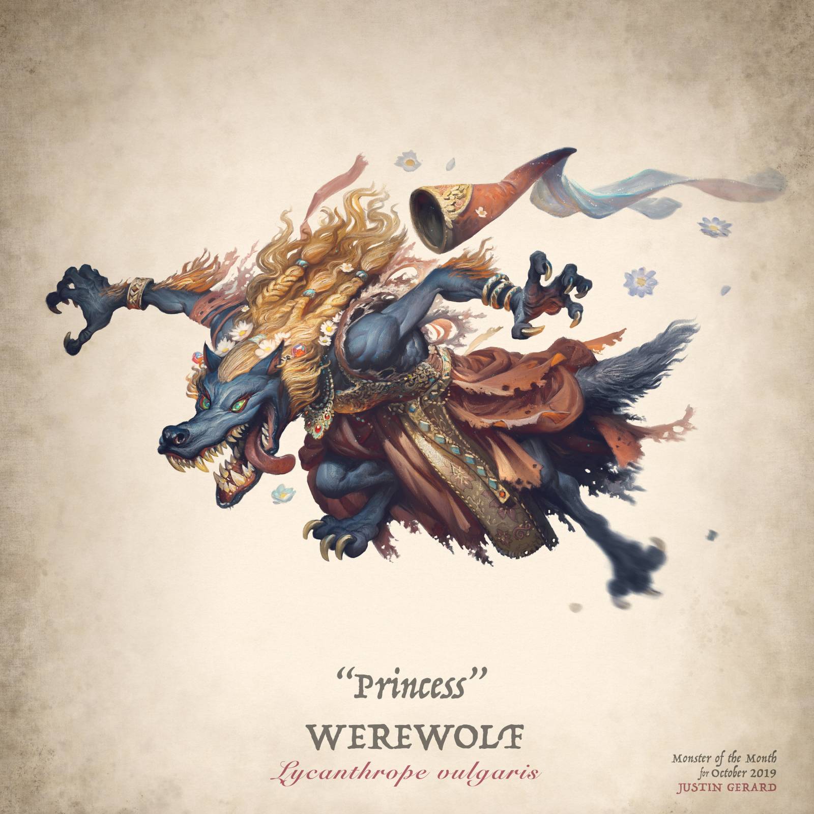
This particular monster/maiden is of “Princess” the Werewolf. She stayed just a *little* too long at the party, and well, now the moon is out and I’m afraid she is going to ruin her elegantly embroidered, hand-made gown… and maim several guests, rip a couch in half and absolutely destroy the kitchen. (Everyone’s been to at least one Halloween party that has ended this way. It’s not just me, right?)
Anyway, For today’s post I thought I would share the painting process for her and talk a bit about how it was made.
The image was created by first drawing the figure traditionally in graphite on bristol, and then colorizing her in Adobe Photoshop. As ever, I consider the drawing to be the heart and soul of the image.
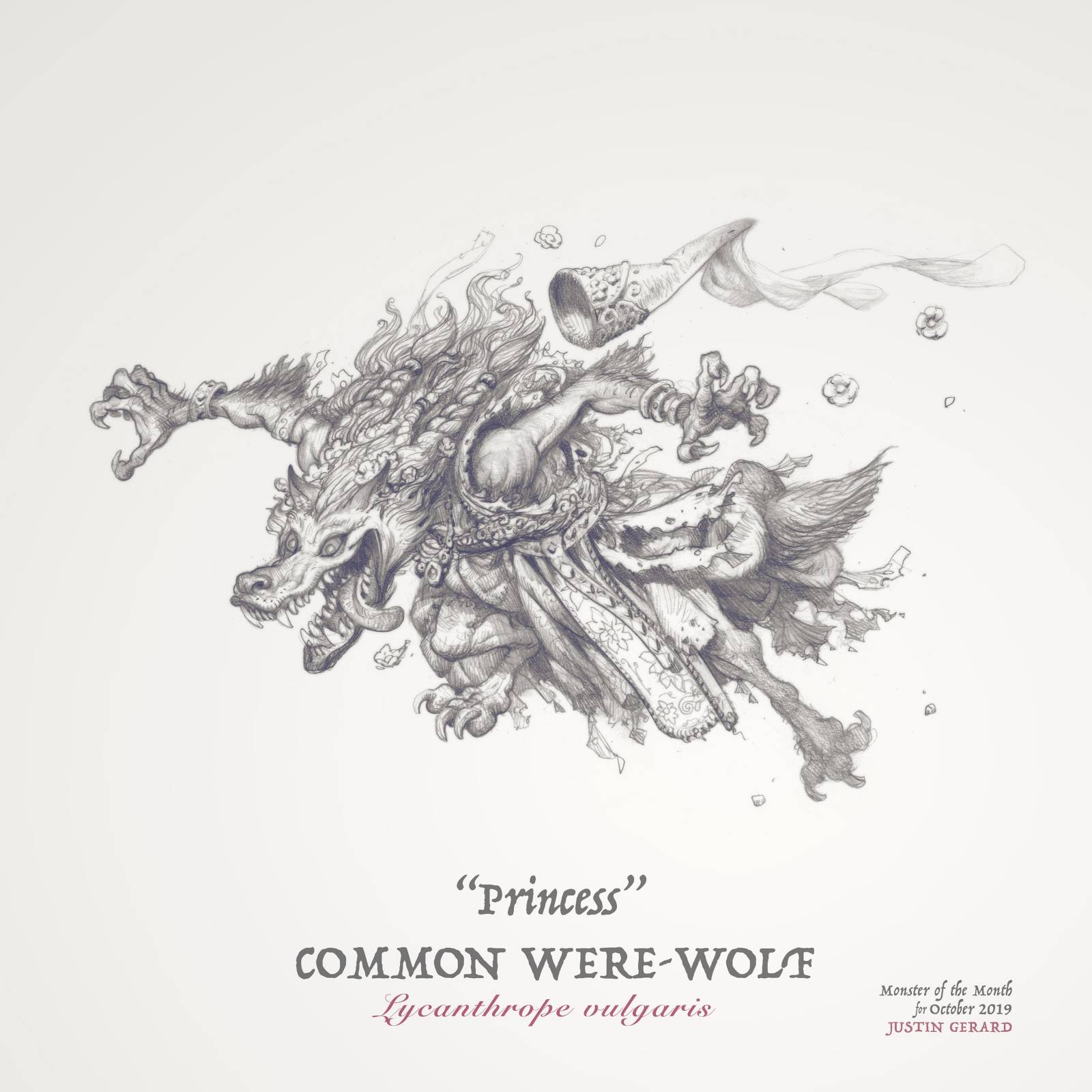
Traditional Drawing using 2H and 4B pencils on bristol paper
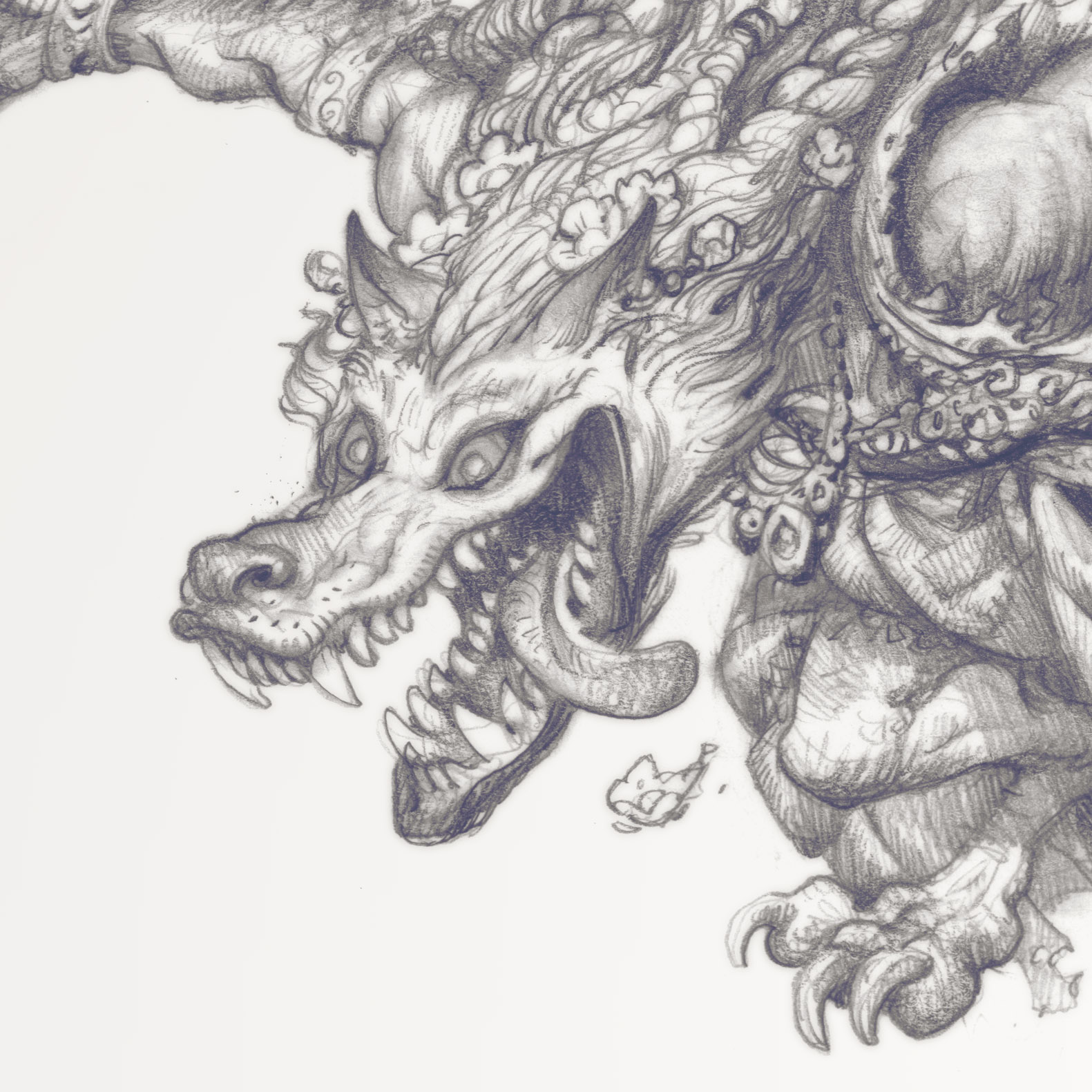
Close-in Detail of Drawing
Establishing a clean shape with well-defined shadows is one of my primary goals when drawing for something that will eventually have color added to it. When a drawing is meant to be the final product on its own I tend to take a bit more care of my mid-tones and shading, but for something like this all that extra information just gets in the way. I try to keep it clean and don’t smudge things or worry about getting in there with super light 6H pencil shading or anything. I probably should take care to erase out to clean things up a bit more (as you can see in her teeth, which are just not looking hygienic.) But at the same time I like the energy of having a few stray lines here and there showing other ideas and possibilities. I also don’t like to be preoccupied with cleaning up every little thing with drawings that are meant for color. These are the bones of the illustration, not the skin.
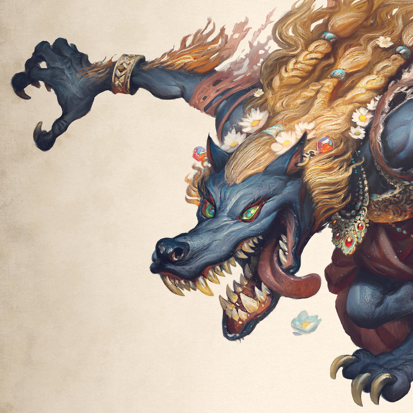
Now that most of the actual work is done, I scan it into Photoshop and begin to add color. The video really tells the rest, so I won’t belabor what is going on, but there is one thing that I did different in this illustration that I think bears mentioning: While most of my color work is done in very transparent layers, this image was done primarily with semi-transparent layering to slowly work up the overall figure. As I do this you can see me pushing and pulling the lights and shadows to try and slowly work up details. I like to think of it as adding spot lights to areas to slowly crystalize the forms.
The trouble with this is that I do eventually obliterate those nice lines that were so important to me early on. This used to terrify me, but now I’ve come to believe that it is important to let each medium be its own thing. If you try to hard to hang on to the pencil when you are coloring it, you lose the chance at a lot of amazing possibilities that turn up later on. You are locked into one roadmap with no possibility of other experiences along the way. So working with semi-opaque layering as I am here, there are a lot of moments where I get to change things or add little moments of detail here and there. If I allow myself to be locked down by the pencil I would miss out on some truly great opportunities.
I hope you’ve enjoyed this one! For more of the Monsters and Maidens series, check out my Instagram. I am slowly making my way through a long list of them!



Ha ha! I love the concept. I can certainly see how Cinderella would have ended differently if this is what happened at Midnight lol.
I think I would really have enjoyed that version of Cinderella!
Dude, you are getting way too good at this. Slow down.
Haha thanks Dan! 😀
Whoa! So the results of the “after party” are worse than the just the footmen turning to white mice, aye? And the progress on the animatic gives one the feeling that she might just finally pounce right off the page. Tremendous work. And looking at your Instagram art I love the harpy and werelizard. I hope a bunch of these will end up in a sketchbook at some point. This is a nice lingering Halloween treat. Thanks for the post.
Hey thanks Aaron! And yes, these are definitely going in a sketchbook (and hopefully more than just a sketchbook too) but I plan to get a few more of them done before launching it all!
Thanks so much for sharing this!
So what I take away from this article: 2H and 4B pencils … the first allows for sketching when the idea itself is still malleable and the 4B finally hammers it home, retaining spontaneous energy which could get lost of rendering too much with harder pencils.
If this is correct it would make for a much less cluttered sketching ensemble 🙂
Thanks again and looking forward to the final collection, which will be deserving of a full book (and you know it!)