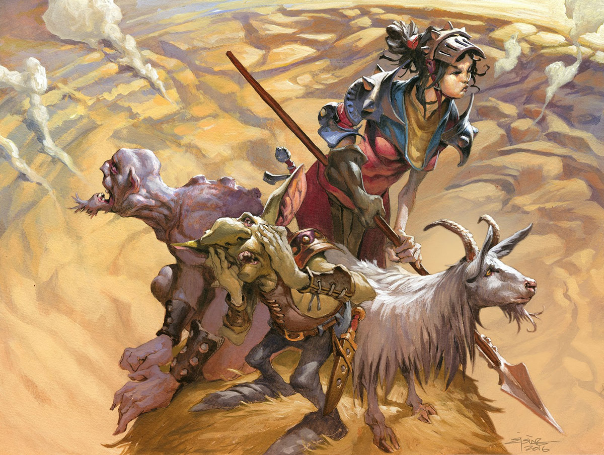
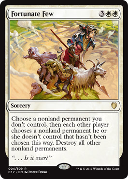
My newest Magic card “Fortunate Few” is out. This was a very fun illustration. The description of the card was: A huge destructive spell has crushed the landscape, leaving a big crater. In the middle, untouched are a Soldier, a goblin a Zombie and a goat.
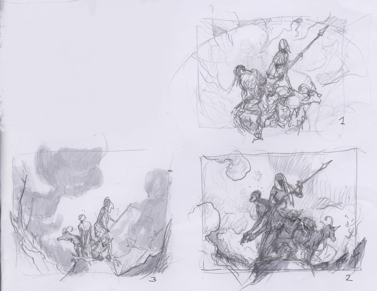
I knew I needed to treat the four figures as a solid mass or at least think them well together, since they would not be huge in the card frame. I tried 3 different sketches in order to try to bunch them together with a varied and interesting silhouette. 2 versions had a very low angle. That solution would let me have a very clear silhouette of a dark bunch of figures against a smoky light background. But the crater and the destruction would be giving less space and attention. The top down birds eye, would focus more on the destruction of the surface and would have a big crater to fill up all the backdrop. I let Mark Winters choose, and he preferred the birds eye.
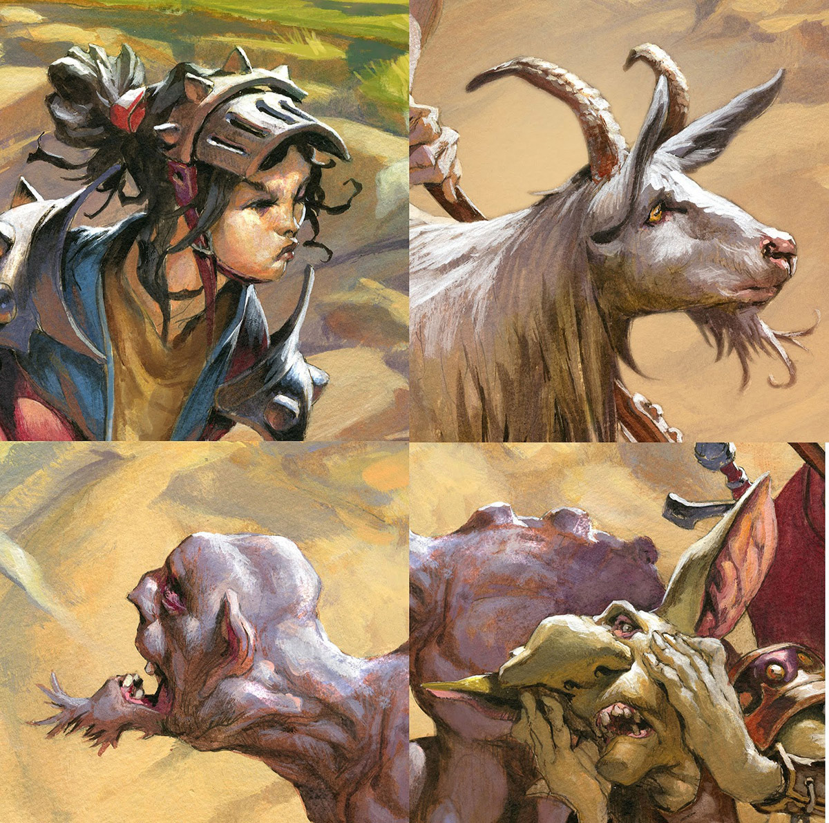
I knew he was right about it and settled in for a much harder illustration. The 2 other versions with a low angle and a mass of figures would be so much easier to solve. Drawing figures from a high perspective is just not something I have done a lot. But I decided to think of it as a challenge and started sketching. I also zoomed in a bit in order to be able to do some cool figure portraits.
I Planed the figures out so that the solar is higest and the zombie second down to the goblin and the goat. I really had fun making the figures act differently to the destruction. The zombie hasn’t quite figures out yet what happened, the soldier is determined and battle ready, the goblin in a scarred panic and the goat doesn’t seem to care much – being goat and all.
I inked the figures in water proof ink, added greytones in acrylic and started painting on top. the way I paint is very simple. I use lots of washes in the beginning, since I have a very tight black and white drawing underneath, as long as i use washes of paint in the being it only teints the drawing and colorise all the greytones. Later I start building light color on top opaquely until i reach the highlights.
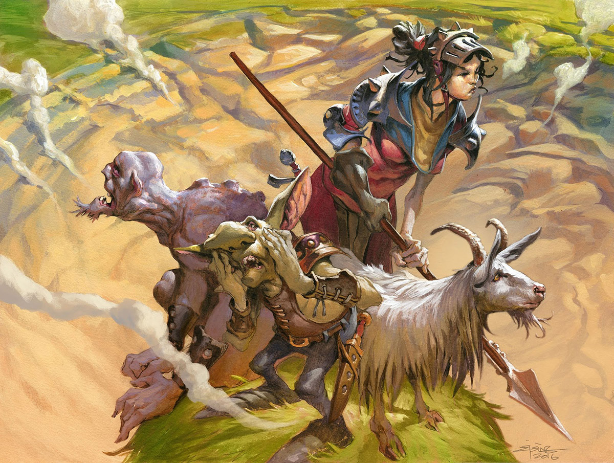
I used a very simplified palette of earth colours in a warm hue. After I submitted the final , Mark suggested that I added a green grass color to the untouched part of the landscape to further clarify the edge of the crater. That correction I did digitally.
This was for me a very fun illustration, because I got to do figures with a fun twist. A dear side track to my usual: Angry monster attacking you-paintings.




Aw hell that's amazing! That's showcase perfectly matches the charm of the card. Well done, plus a cool insight into card design to the art there of!