Prerequisite for this course: Type 101 for Illustrators
Returning soon: Type 102 for Illustrators. Sorry about that, guys, I was in a rush and neglected to have folks at Orbit edit the post before I published it, and we want to make sure I don’t share too much that our competitors could copy. Trade secrets and all, you know. It’ll be edited a bit and back up soon.
Continuing the series on Typography for Illustrators this week with something I get a LOT of questions on: Logos for Artists. There’s a few levels here, and before we dive in, let me remind you of a piece of advice that I gave in Type 101 — Less is More. If you’re not sure of what to do for your branding, then stick to Level 1: Pick A Nice Font And Keep It Simple. Because you do not want an Art Director (many of whom are designers) to wince at your branding before they even see your art.
Logos are one of the hardest things graphic designers can work on – you have to do so much with so little, be so clever, and so elegant, and give the entire character of a company or person in this teeny tiny bit of graphic design. And remember one of the main differences between Illustration and Graphic Design. Illustration is more like gathering everyone around and telling a story – they know they’re being told a story and it has a certain timeline. You can see what’s happening as it unfolds. Graphic Design is more like a subliminal message—typography especially—the viewer receives an unconscious emotion and story without them realizing it.
And with that, let me give you some examples of good artist branding. No, I’m not going to publicly shame the ones that make me wince. But if you’re worried that your branding is hurting you, maybe start asking around a bit. Or ask me at the next con you see me at. And I promise to be honest. (Remember though, you were warned.)
For every example I linked to the artist’s website, so you can see how the branding works in relation to the site as a whole. Notice how clean these sites tend to be. Let your art be the star, not the wrapper.
Level 1: Pick A Nice Font and Keep It Simple
The easiest thing you can do is pick a nice clean font, set your name in it, space it out a bit, and be done with it. Here’s some good examples. Try your name in all caps, small caps (when the letters are all caps, but the first letter in each word is slightly larger than the rest of the word) or upper and lowercase.
Extra credit to Rovina here, who not only used one of my favorite typefaces, Mrs. Eaves, but used a ligature! Swoon. Oh, by the way, did you know most good fonts have extra fancy characters? How do you find them? In any adobe program look for a menu under type called “Glyphs” — Yes, even in Photoshop.
 |
| Karla Ortiz |
 |
| Rovina Cai |
 |
| Kristina Carroll |
Level 2: Artist Signatures
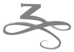
The artist signature is a time-honored tradition. And there’s no shorter shorthand to imply artist than turning your signature into your logo. But still, keep it simple. It can just be an initial, or it can be the whole signature. Either way, keep it simple, and keep it classy. Don’t have a signature that looks like graffiti — unless your work is graffiti-inspired.
 |
| Gregory Manchess |
 |
| Marc Scheff |
 |
| Cory Godbey |
 |
| Zelda Devon |
Level 3: Advanced Type Treatments
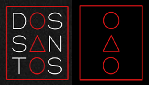
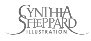
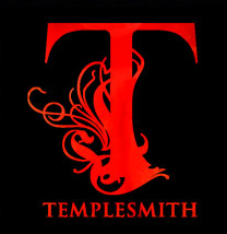
This is only for those who have some design experience, because these can go very very wrong. But when a type treatment is elevated into true logo territory it can be put to great use. Dan’s logo is really satisfying as a design because it works on multiple levels (shapes and letters) and stacks so nicely. Cynthia’s has a touch of dark fantasy to it, like her work. And Ben Templesmith’s is perfect for someone whose work is at least 75% tentacles.
 |
| Dan Dos Santos |
 |
| Cynthia Sheppard |
 |
| Ben Templesmith |
Level 4: Graphic Solutions
This can be a great solution for someone who has a style that can be easily separated into elements, or likes making a bit of spot art. I really like how Emily’s logo is a play on her last name. And miranda’s skull works as a rendered piece of art, but could also be turned into a flat graphic silhouette quite easily for flat usages. Remember here, you also still need a type treatment attached to the graphic. Here you really want to keep it simple and not have the type fight with the graphic element. Make sure that your type style and image are also giving the same emotion. You don’t want a typeface that says fun and lighthearted when your art is dark and gothic.
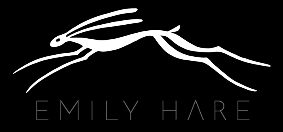 |
| Emily Hare |
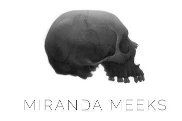 |
| Miranda Meeks |
(And for more examples check out my round-up of good examples of promos and leave-behinds in my previous post Address for Success)
So now you’re armed with some good examples of artist branding. Stop making my eyes bleed with overcomplicated graphics that are either super dated or actively fight against your art. Remember: when in doubt, LESS IS MORE.




Great advice, as always!
One note: I was getting all excited reading about the glyphs panel, but my Photoshop (CS6) does not have it. Is it only available in CC?
BINGO!! Nice one, Lauren. I talk with students about cutting down on how bold their signature is, but not sure they hear me. The surface of the work is really not the arena to showcase one's name. Let it work with the image.
They ought to understand this easily. Cool! Yay! Good one!
Greg
I think it was introduced in CC, yes. An alternative is to use a package such as word to write the glyph, and then copy and paste as text into PS. Not all fonts contain all symbols though.
I've been waiting for this post (my whole life maybe?)! Type and logos can be such confusing, wide-open media for illustrators with no graphic design experience, and you've really been demystifying them, or at least handing us a compass to navigate with! 🙂
Nice! These are great examples of logos. Cynthia Sheppard's in particular is just so awesome
Yes Photoshop CC is the first version with glyphs, but Illustrator and Indesign have had them for years
thanks Greg! Love your M initial.
Getting a good company logo should be considered by a start up company. Having this would not just help the company get recognized easily but it will also help them rank up like online with Google getting the image indexed. logo design uk
Excellent ! I personally like your blog and waiting for more articles like this
These can go horribly wrong, therefore this is just for individuals who have some design experience. However, a type treatment can be quite useful when it is raised into real logo area. Because it functions on several levels (shapes and letters) and stacks so well, [url=https://www.uklogodesigns.co.uk/]Professional Logo Design Company London[/url] is a highly pleasing design.
great blog
Cable TV continues to be a cornerstone of home entertainment, offering a diverse array of channels and content for all tastes. The convenience of having access to news, sports, movies, and more in one place is unbeatable. As we navigate the digital landscape, Cable TV remains a reliable choice for quality programming.
The term “companion animal” resonates deeply with pet owners like myself. It goes beyond a mere label for our furry friends; it encapsulates the special bond and relationship we share with them. Whether it’s a playful pup, a cuddly cat, or any other creature that has found its way into our hearts, companion animals bring joy, companionship, and unconditional love into our lives.
The discussion of “plastic storage boxes” in the context of an article about artist logos is intriguing. While the focus may be on artistic branding, the mention of practical storage solutions adds a layer of practicality to the conversation.
Consultant dynamics CRM professionals specialize in implementing and optimizing Microsoft Dynamics CRM solutions to streamline customer relationship management processes. While artist logos may be visually appealing, the expertise of a consultant dynamics CRM ensures that businesses can effectively manage customer interactions, improve sales processes, and enhance overall productivity.
Based on the patient’s condition and medical history, I highly recommend administering an IV drip. This method ensures precise delivery of essential fluids, electrolytes, and medications directly into the bloodstream, promoting rapid hydration and therapeutic effects. IV therapy is particularly beneficial for patients experiencing dehydration, electrolyte imbalances, or those requiring immediate medication absorption. It offers a safe and efficient way to restore vital nutrients and support overall well-being.
Any cool logo ideas?