Wow! Looks like May is already here?! Seems like the years just roll on by. 2020 feels like such a blip. Looking forward to the summer. Want to try to make a point to get our more and enjoy it.
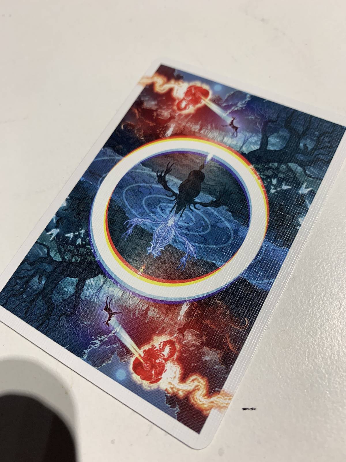
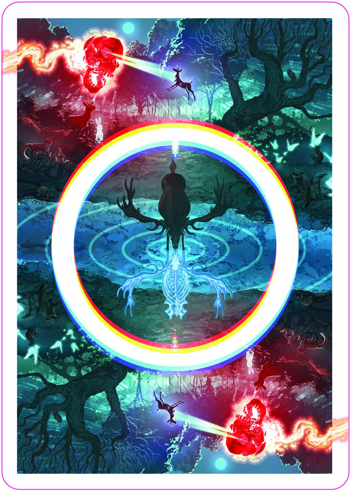
A while back, I had the opportunity to help design a set of playing cards for an Aesop Rock/Orbit cards collaboration.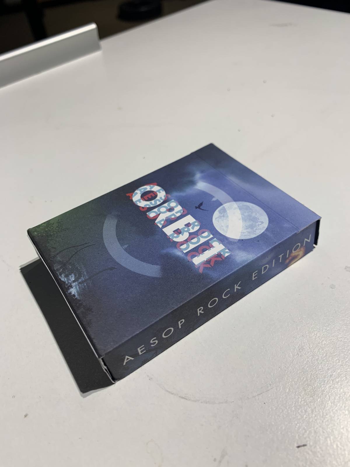
Until this came about, I had no idea, but there’s an enthusiastic community centered around doing tricks with cards. It’s called “cardistry”. one aspect of this scene is that they all use custom decks of cards designed specifically for doing tricks with them.
I think one of the coolest aspects of being an illustrator is the unique opportunity to learn about and apply what we do to so such a wide range of things.
For me, It’s a big part of what’s kept it interesting because it allows for you to keep growing and trying new stuff . Every gig has its own specific goals and requirements. Each is its own adventure, its own journey, and there’s always something to take away from it.
Its essential to educate yourself to fully understand the gig and align your vision with your clients goal. I’ve learned the hard way over the years not to skip the research phase, because the more genuinely and intimately you can approach whatever subject matter you’re depicting, the better it will land with your client.
I don’t just want the drawing to look correct, I want what I’m actually drawing to be correct. I want it to have little details and subtlety in it that someone with an informed understanding of the subject matter will think to themselves “oh wow he even drew that….” .The goal is to always exceed your clients expectations on the technicals AND to also bring something unique to the table. That’s why they hired you, right?
Will you always get it right? Of course not! But at least it’ll be evident that you tried. In which case they’ll look at you like a big dumb dog and hopefully just pay you because they feel sorry for you.
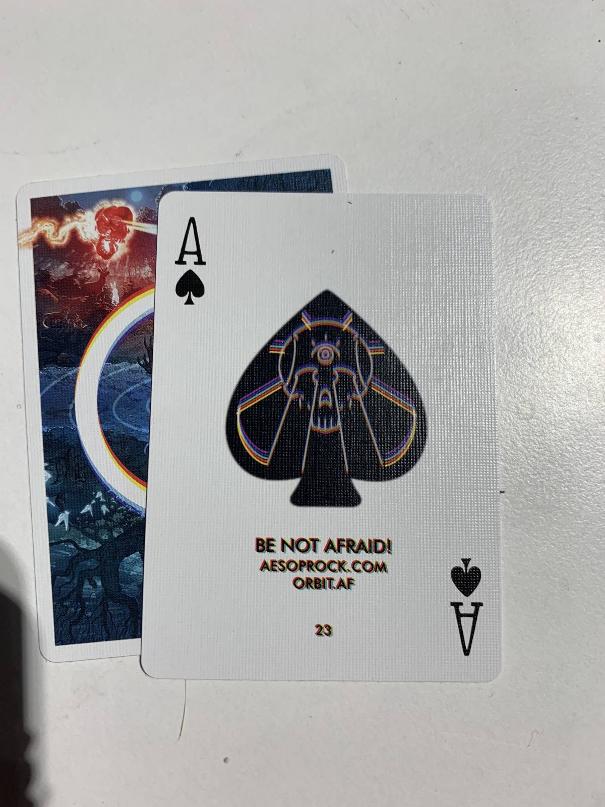
Anyway these cards. Not sure exactly how I got looped into it, but it was a relief because I was worried repurposed album artwork wouldn’t hold up at such a small scale. Ended up doing something similar in vein, but executed in more of a simplified rendering approach. One of the things they wanted to make sure of was that it looked cool when the deck was fanned out, so I extended the skull stuff into the border and all the way to the edge of the card, which isn’t something I would have done otherwise, but I think it actually does a lot.
Since this was my first card, I wasn’t sure how small or detailed you could get, so I tried out a bunch of stuff to get a better sense of what shows up and works best. I knew it wouldn’t all be visible at that scale, but was surprised at how much detail it retained.
They released yesterday and sold out within the day. (yay!) Was a fun gig and also kind of cool getting to take a journey into the world of cardistry.
Also, last post I made on here I’d posted up some VR sculptures I’d been doing, and mentioned that it might be cool to try to paint one as if it was a still life.
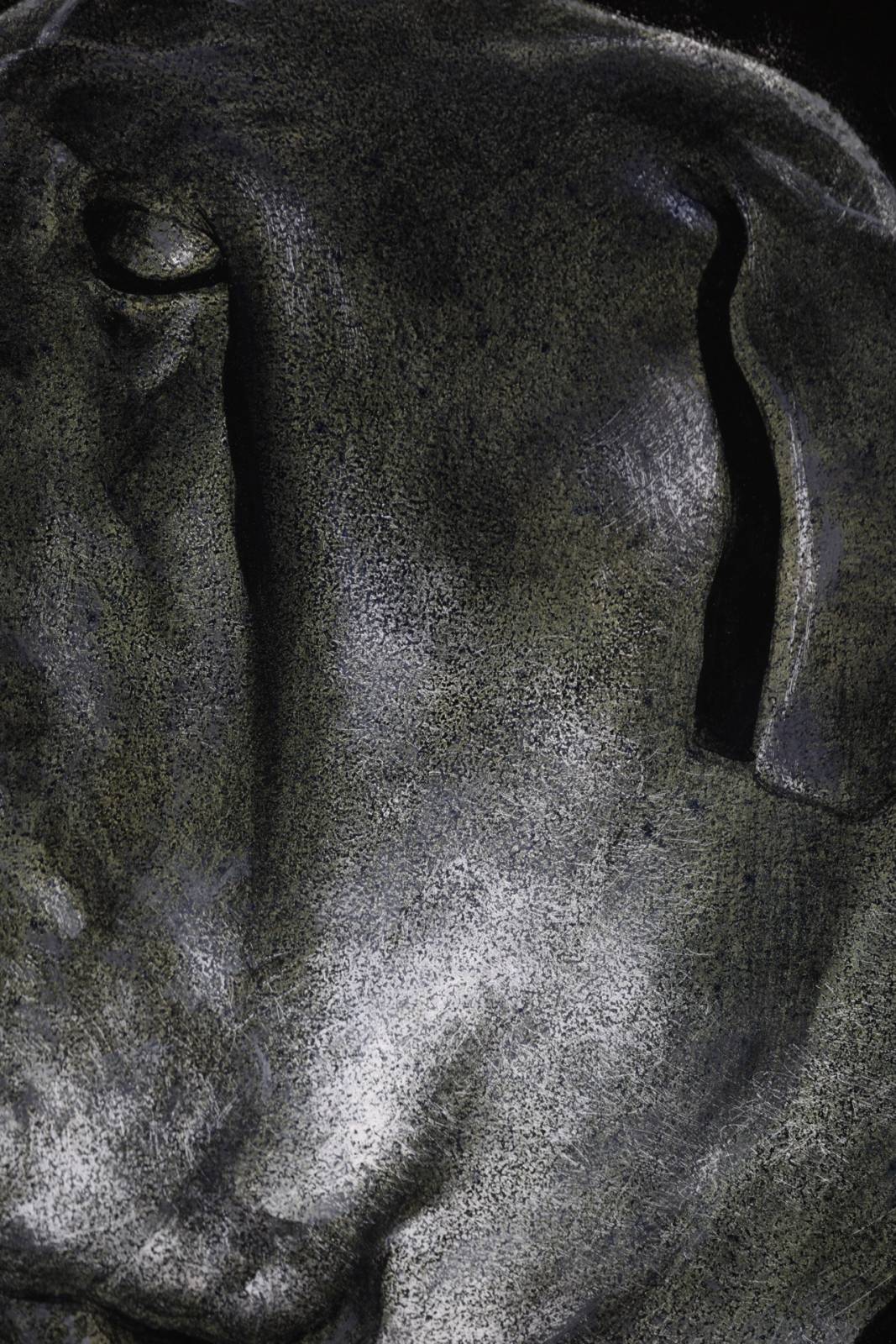
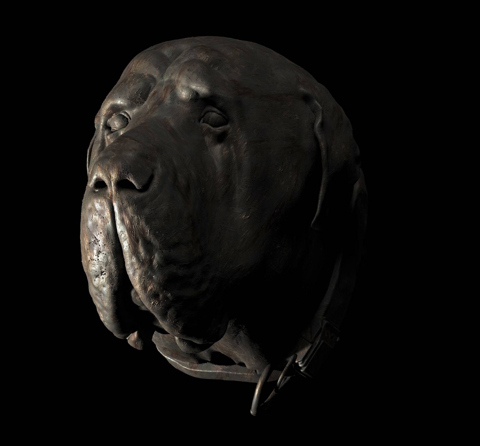
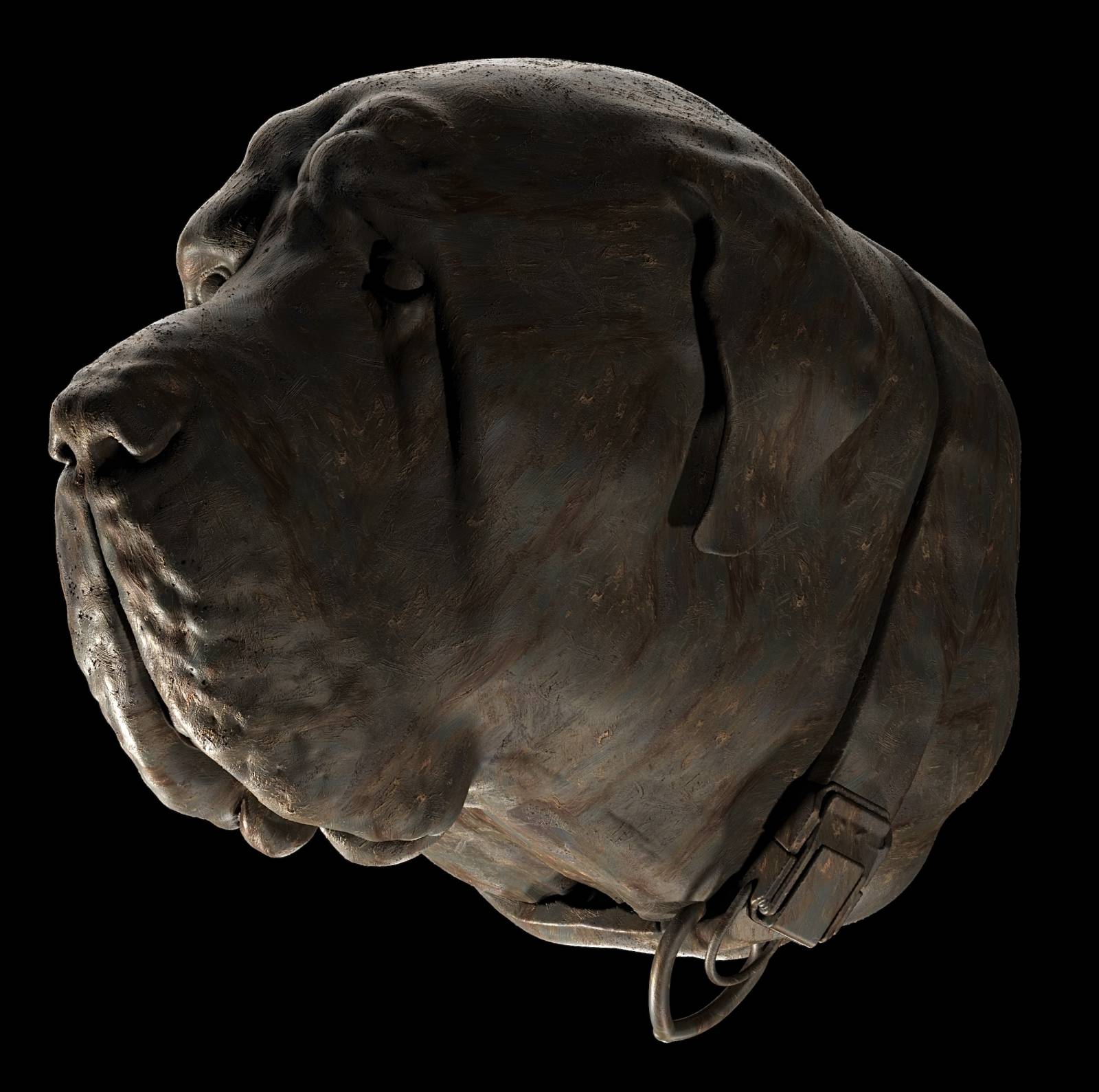
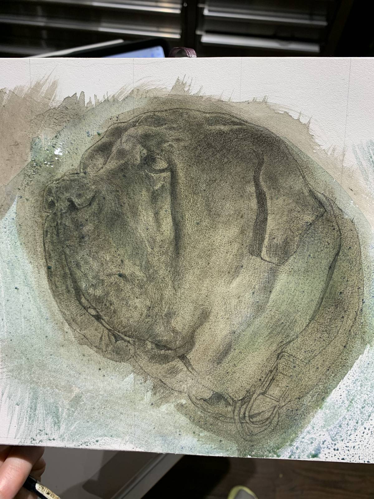
Well, I kept thinking about it, And Eventually made a sculpt of our dog, Bob’s head In Adobe medium, did a few renders in 3ds max, and then tried painting it!
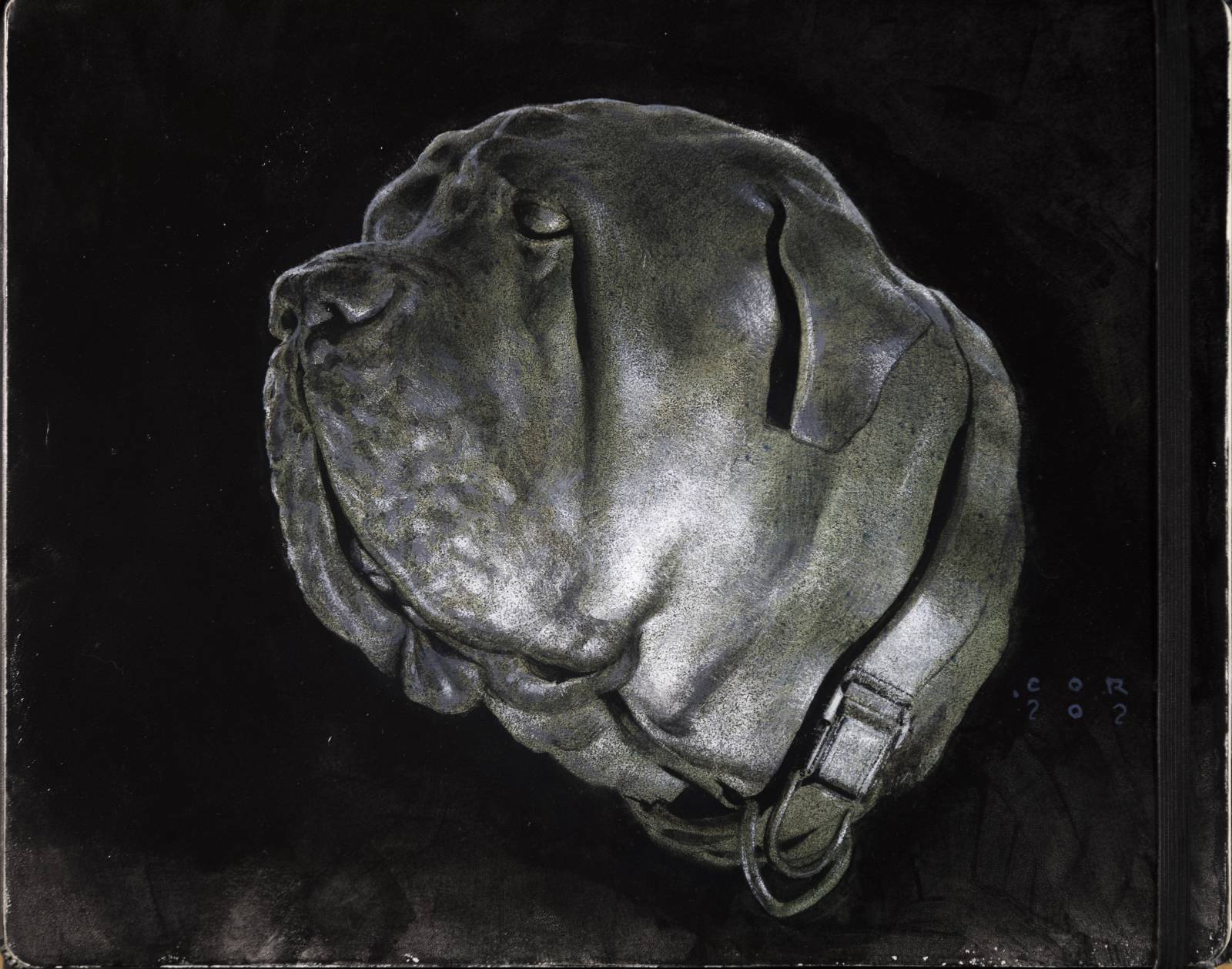
and the painting:
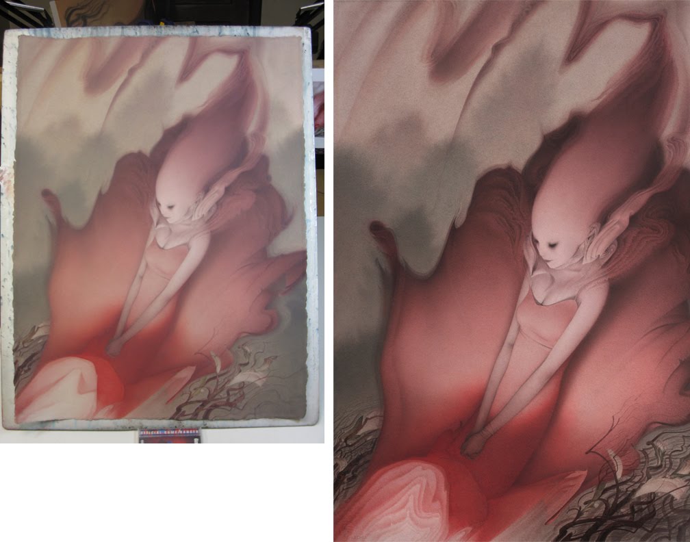
started out with a light pencil sketch that I sealed with a series of warm/cool acrylic washes.
Once I felt like I had the values and forms built up enough, I came in with sandpaper and carefully sanded out all of the highlights instead of painting them additively. the brightness and noisy transition helps to create a more metallic looking surface. I keep finding excuses to use sandpaper on my paintings.
Made for the upcoming moleskin show at Thinkspace gallery in SF this coming June. Should be a great show with lots of insanely talented folks contributing, so if you’re in the bay area be sure to check it out!


Love this one, and can’t wait to try sandpaper on something (that definitely goes in the “something I’d never have thought of” column!)
OMG! Im so flattered you like this one! Whats super funny is I got the bug to do this piece in acrylic washes after looking at a bunch of YOUR stuff! So thank you, and thank you. And I would definitely give sandpaper a try. its a cool tool for breaking the surface up and creating interesting textures. I use mostly 240 and 320 grit but will also sometimes break out the 150 grit if I’m really looking to make some changes.