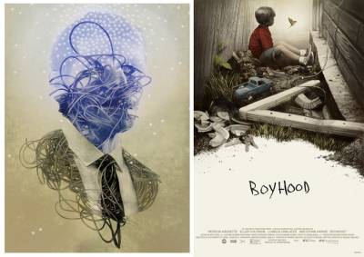
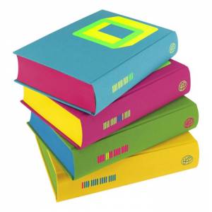
Two projects that could not be less alike together in one MC post today as we delve into the work behind the forthcoming Mondo?IFC screen print for Richard Linkletter’s BOYHOOD and THE ELECTRIC ANT of The Folio Society’s massive multi-book tome, THE COMPLETE SHORT STORIES OF PHILIP K DICK, and its own upcoming ltd print from Static Medium. (Both posters will be available this September and details to follow listed below this article).
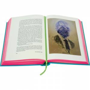
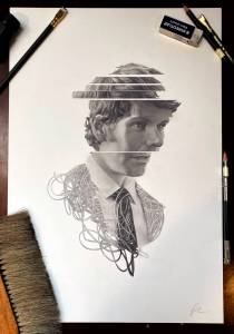
First up, Mr Dick! It was beyond an honor to be asked to be a part of this insane and gigantic museum quality expression to capture ALL of PK Dick’s short stories, from which nearly all of the films that were made of his work derive from. I was offered the chance to pick from among some offerings and in the end those were ignored and I was assigned what turned out to be one of my favorites of his, THE ELECTRIC ANT, wherein the main character comes to realize and test the fact that he is in fact not a person at all but a construct of mechanical parts tubes and wires. His whole consciousness is explored especially at the moment of it s collapse as he explores the idea of what might be real or not as an artificial being. It’s a marvelous tale, dark and super twisted, and one I immediately had some notions to chase down for it.
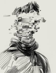
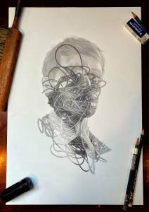
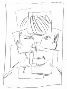
A portrait dissolving before us digitally was my first go at it, but it didn’t;t seem entirely right and perhaps even a little played out as a concept. I retreated to a kind of old filled plastic and heavy steel and tube approach of 1960’s tech, rather than something more current. The kind of smell and approach that you can touch and feel in an old NASA capsule or the rigging of a lunar rover from 80 years past…
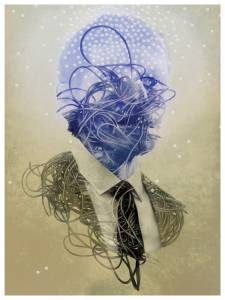
This was one that came together still required yet another approach that sort of combined some of these elements as the first approach seemed somewhat less poignant. This was Dick after all and getting more weird and little horrible was a thing that worked, and in the end when that came together it was a clear winning path forward.
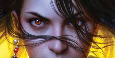
In the end, I wanted to keep to the concept over the literal here, as his unfurling consciousness spools out, bits of machine punch card holes making up more and more of the space in between his dying mind a person lost int he jumble of his own wires and mechanics. Like an old victorian ambrotype, I wanted it to look like a relic of alternate universe, as all of his stories seem to occupy where technological advances happened in an earlier simpler time that now seem quainter than our own today, and oddly even in their grim apocalypses, less dark than what our own outside world is shaping itself into. There’s a steady catharsis to that kind of thing I think that makes Dick’s writing even more relevant today as it is prescient.
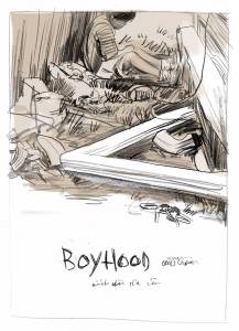
Linkletter’s now Oscar-winning BOYHOOD chronicling the childhood life, in near real time follows Ellar Coltraine’s Masin as he grows up on screen right before our eyes navigating the spikes and potholes of life in a dysfunctional family in Texas. If you think this sounds familiar to our own MEADOWLARK, also starring Ethan Hawke, you’re not far wrong there. Rick, Ethan and I all grew up down there in the Lone Star State and even weirder, Rick hails from Huntsville where our graphic novel is set. We all clearly have childhood coming of age issues we needed to excise, no doubt. But for this particular project, Boyhood was a much trickier thing to illustrate than you might first think. The one main rule I knew to keep to was to avoid the famous schtick of BOYHOOD- which was filmed in bits and pieces over the course of about 12 years so we can at the end, watch this life evolve right before our eyes on screen. Rick always felt if we got caught up in that method of the film over the story, he’d have failed to deliver a good and captivating film, so it was important to ignore that aspect and focus on the groom here and not his tuxedo.
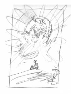
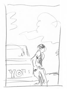
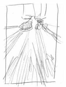
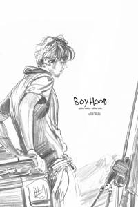
After the usual initial round of thumbnail sketches that largely focused in on an older Mason just as he lights out for his new life on his own terms, and a few swipes at a sort of scattered polaroid approach…. Summing up a whole life is no mean feat, so I first thought to encapsulate this journey by featuring it’s end as Mason explores the primordial terrain terrain of the Hoodoos in Big Bend State Park in Texas. That kind of moment that summarizes his whole life finds Ellar at a kind of resolve and peace with himself after surviving all his parents many failures. It’s not some swelling orchestra ending where deep knowledge and self awareness is unlocked in bombastic Hollywood fashion- this is Linkletter after all and that means a mire quiet subtle and realistic approach to the truth of these complicated and confused moments. Again, could not be more right up the Meadowlark alley of ours.
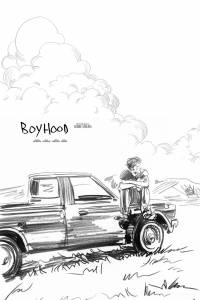
I actually began this project well more than a year ago as the graphic novel was being finished up and working on that book I think very much influenced the approach and understanding of the Boyhood project. I honed down on a couple of paths we liked, (Mondo’s express pleading to at least avoid showcasing the YO truck which for a good decade plagued the streets and highways of Texas down there), and developed some of these sketches further.
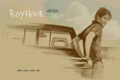
But for me the real truth of a project comes together when it can be seen practically, so I raced to start shoring up some sort of final versions of our approach… keeping to a classic Texas-tan and blue sketchy minimal dashing out of a poster as a means to express this unfinished life, and the raw incompleteness of his own person. We leave Mason in Big Bend at his true beginning as all early adulthood moments really are… the start of his own life after the childhood has passed on.
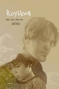
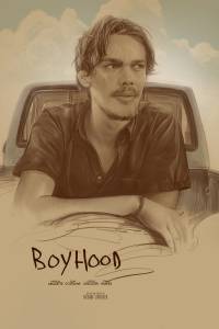
There was just something that wasn’t;t clicking for whatever reason. As much as I loved these final three pieces, the fact that we had time enough to really let it sit and lie down for a number of days and reproach, there was just always something… that felt less than about them. The long wide piece above remains a favorite, but it seemed in the end incongruous to the title of the film and an illustration needs to set and stand on its own merits more than these were doing, relying as they were almost entirely on the foreknowledge of the story it is meant to celebrate. It’s fine for a poster or a book cover to do this in some fashion, but it shouldn’t be the sum total of its narrative value. An illustration like this should invoke and tease more, be both a reflection of what the story is to a familiar audience but also entice a new one. While these did the former they failed in the latter… so back to the drawing board.
I had an epiphany in this midst of this mini crisis, and went back to this moment that for me was particularly true and reflective of my own at time tough childhood as my family was breaking apart and I sought solace in the crummy dead spaces in between my house and the neighbors where I could stash stolen Playboys and sci-fi fi novels and snacks and whatever else I didn’t want discovered. This moment in the film where Mason seeks some solace in the selfsame alleyway struck the most rising bell emotionally for me as a result so I simply chased it down.
We can overthink these things, especially when a project seems to be floundering creatively. Its a scary time lost in the panic of an uncertain dark and a lack of direction and for me especially in those times, a wrestling with the struggle by trying to come up with a thoughtful clever escape from it. I can talk myself into a lot of crazy BS in this process and this is when leaning on and listening to your brilliant peers, Rob Jones and Eric Garza of MONDO can really save one’s ass. I was no in the lodestone place and operating from a position of what FELT right rather than what might intellectually solve and they kept me on it, affirmed the need to return to the drawing board and come up with another path. Once we struck this one, we all knew we finally had it. It became a tabula rasa of his life’s experience and let me play with the fun bits of sneaking in symbols throughout Mason;s life… the car leyes to his dad’s classic GT that was sold out from under him, the wreck of fallen and forgotten bits of his own house, the truck he’d run off in, the plate tossed at him by one of his many abusive step-fathers… and the bird lighting off in front of him as a comfort of his future free from the rusty knife fight of his parents failure with each other and with him as he grew…
There’s a theme to be found between these two, a fellow seeking after himself trying to piece together who he is as a value agains the constructs he finds himself trapped within, but really the similarities stop there. It’s one of the things I adore most about my work… this opportunity to push and test my own ways of thinking of solving problems practically in illustration and always obsessively seeking some new and differential approach so as not to merely ape or mirror the subject I’m tasked with drawing, but show another side to it that refreshes them, and sneaks in a personal approach to celebrate the story’s heart.
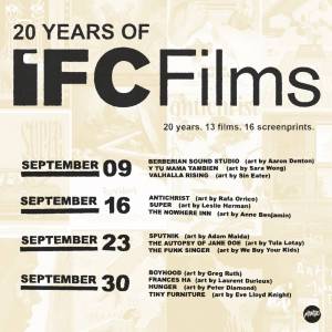
The IFC/MONDO 20 year celebration will be on sale weekly throughout the month of September, and you can learn more about it HERE, and the schedule for it below:
To see more work from THE FOLO SOCIETY’s amazing and sold out book collection, please go HERE. Static Medium will be releasing a short windowed release of only 50 hand signed and numbered 18 x24″ museum quality giclees with coming links for sale this Friday, September 10th at NOON EST. You can learn more about them and their wonderful work HERE:








Amazing work once again. Thank you for letting us see the process!