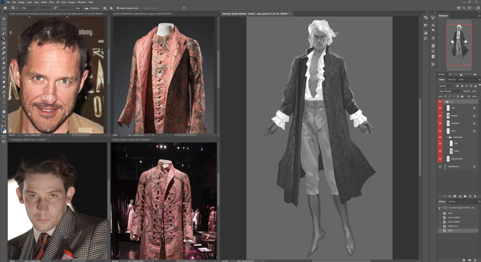
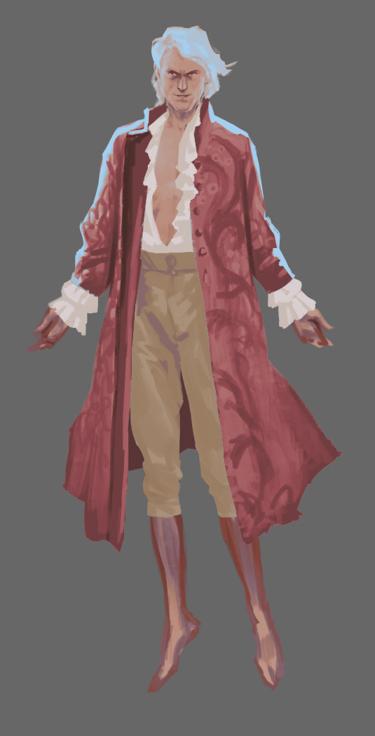
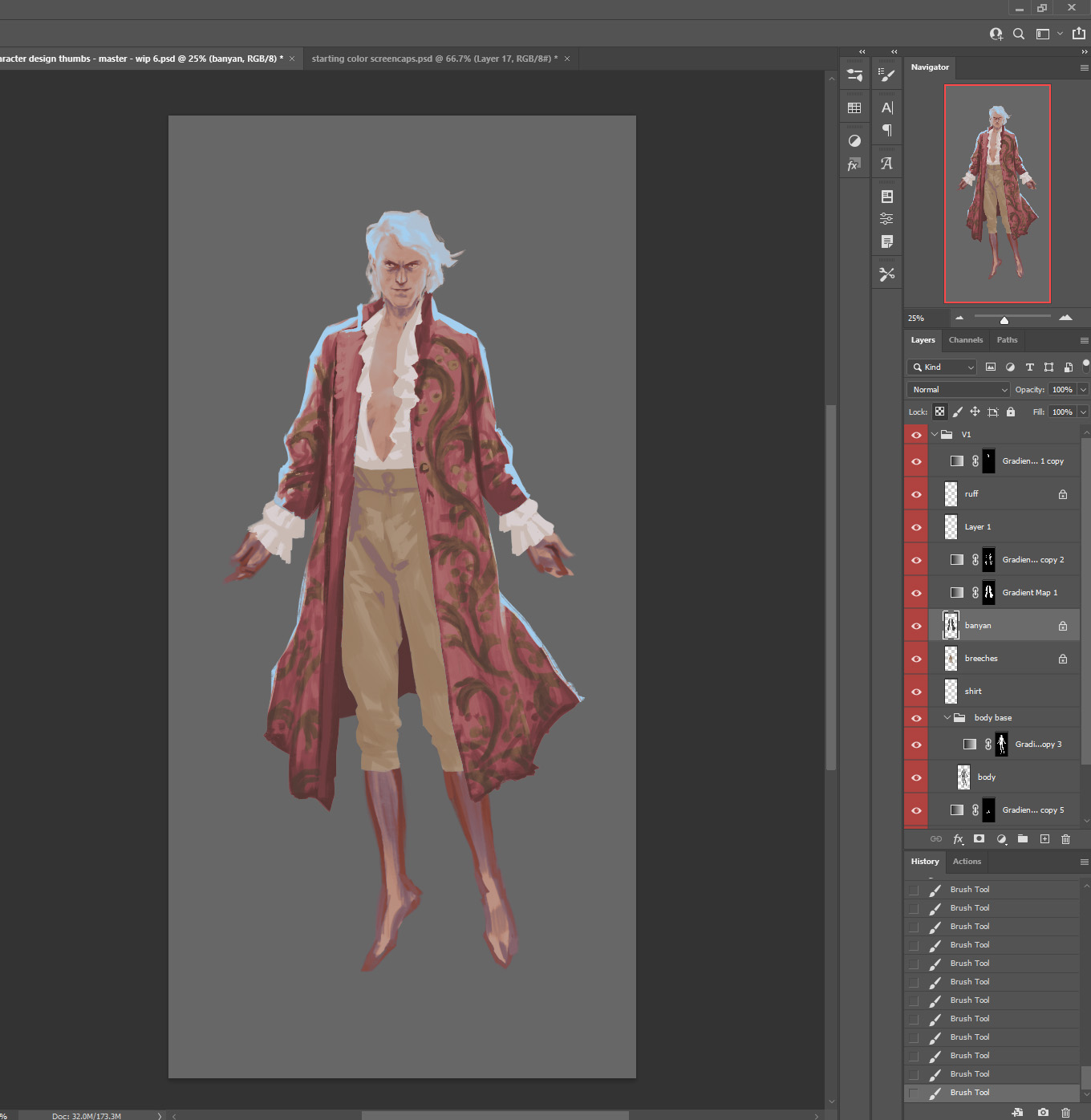
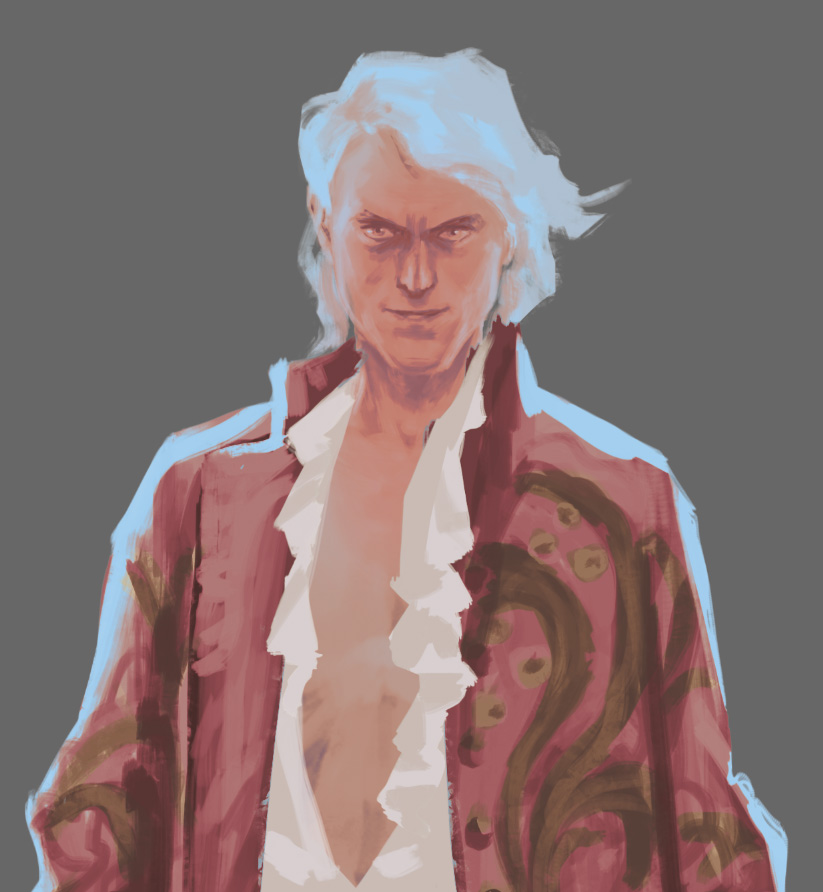
Hello again! I’m starting on the color stage for my character design. I’ve decided on a favorite of the three silhouettes and found more reference, in this case I’m in love with this salmon-pink brocade fabric, and set up my main references alongside my working file.
 The first step in bringing color to this design is Gradient Map layers. Since this design is multi-layered, I create a Gradient Map layer over the whole image.
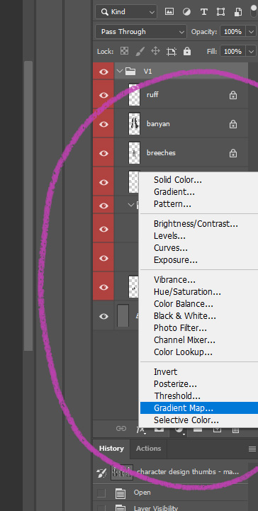 I have saved some favorite settings for gradient maps and often start with one of those, then select and change different colors to replace them, or drag and adjust the placing of them. Gradient map assigns colors by value, so by moving the color points it will change your value pattern. You can get pretty wild and crazy with color choices here, for better or worse – give it a try!
 My aim with this first layer is to set up an overall color scheme. After I feel like I have a good base to start with, I copy the gradient map and move one above each costume element layer in the design – which will look really weird for a moment but bear with me:
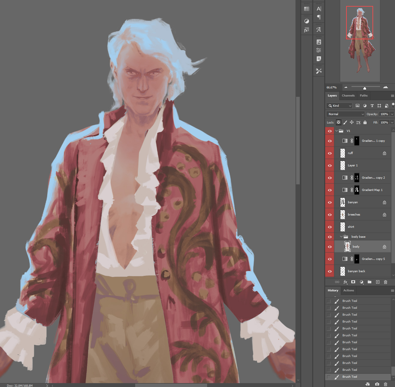
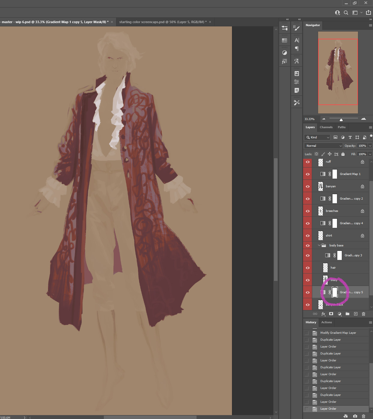 Then I click on the mask thumbnail of each gradient map layer, and then click and drag the costume element layer underneath onto the Layer Mask button. This will replace the selected layer map with the transparency of the layer you dragged onto the button.
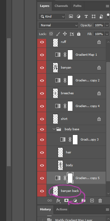 After doing that for each layer, you’ll have a tidy silhouette again.
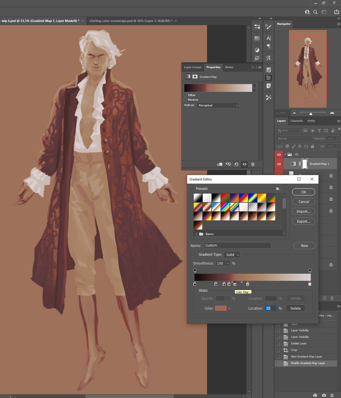
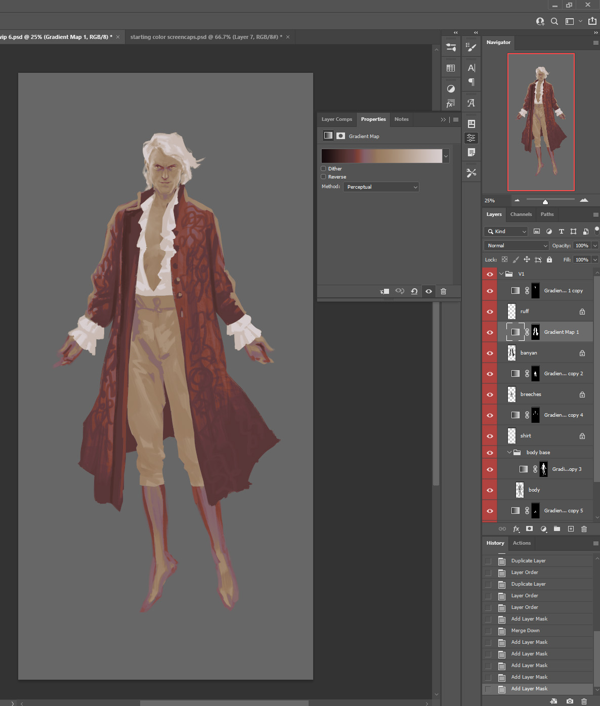 Then you can double-click on the gradient map layer for each costume element individually to edit the gradient map. Here I’m going to get a more pink overall color for the jacket/banyan. You can even use the eyedropper tool to try picking your colors from your reference photos or other parts of your own painting.
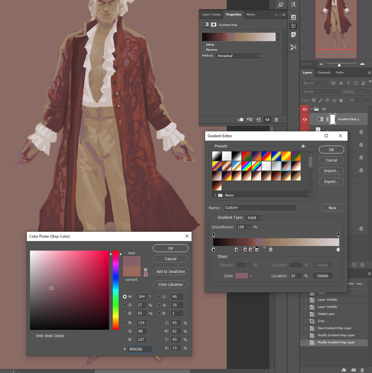
 Here I’ve adjusted the gradient maps of the body layer and the banyan layer, but I don’t like how the buttons are catching that pale blue I used for the rim light color. So, I’ll select the jacket layer, set my eyedropper tool to Current Layer (so that it will sample the black and white source layer rather than the gradient map layer)…
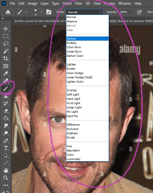
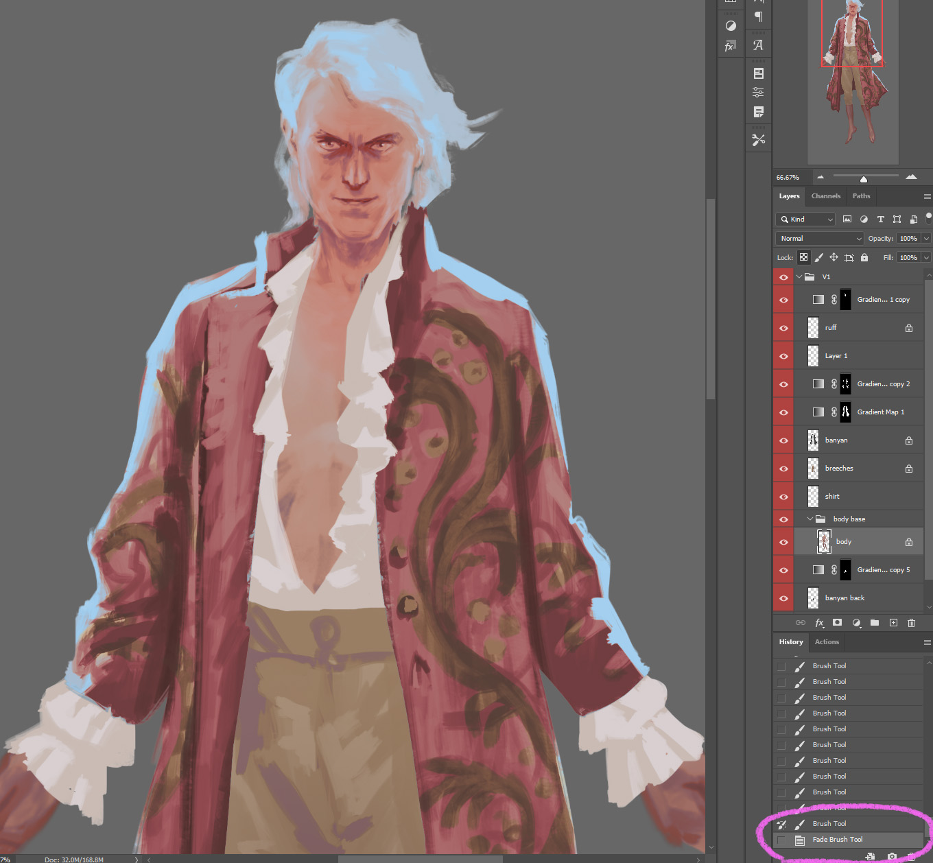
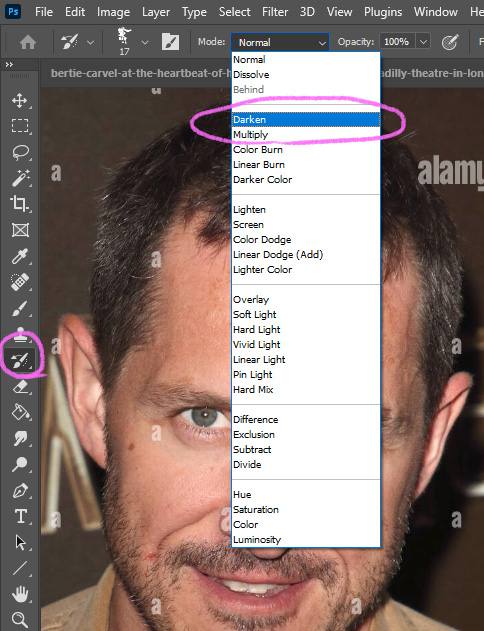
 And then switch to the Brush tool and set it to Darken:
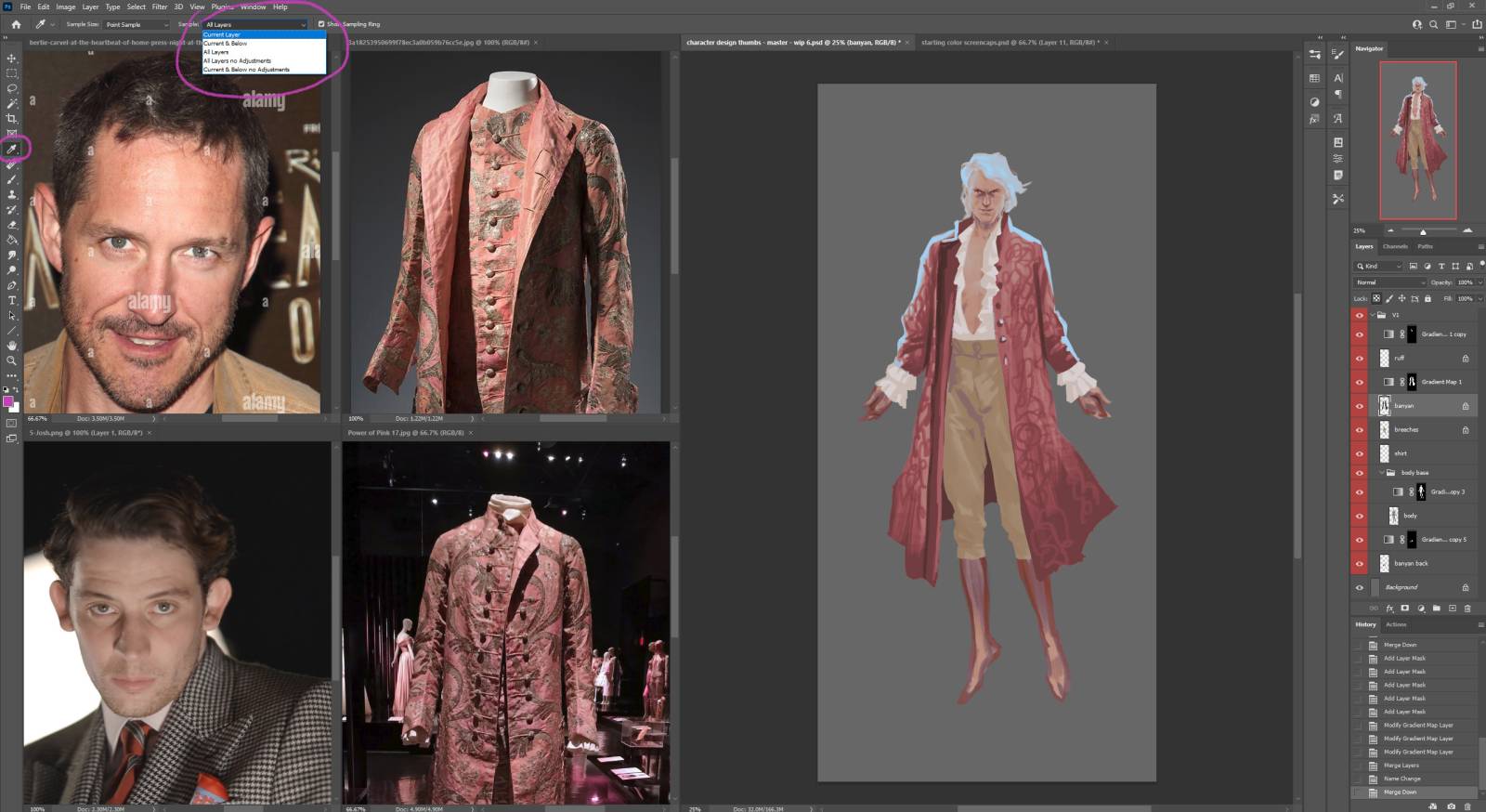
 And then I can use the eyedropper to select the color from part of the coat that is lighter but not light enough for the gradient map to make it pale blue, and then just paint over the buttons. I don’t have to be very careful or accurate, since the brush is set to Darken it will only affect colors lighter than the selected color.
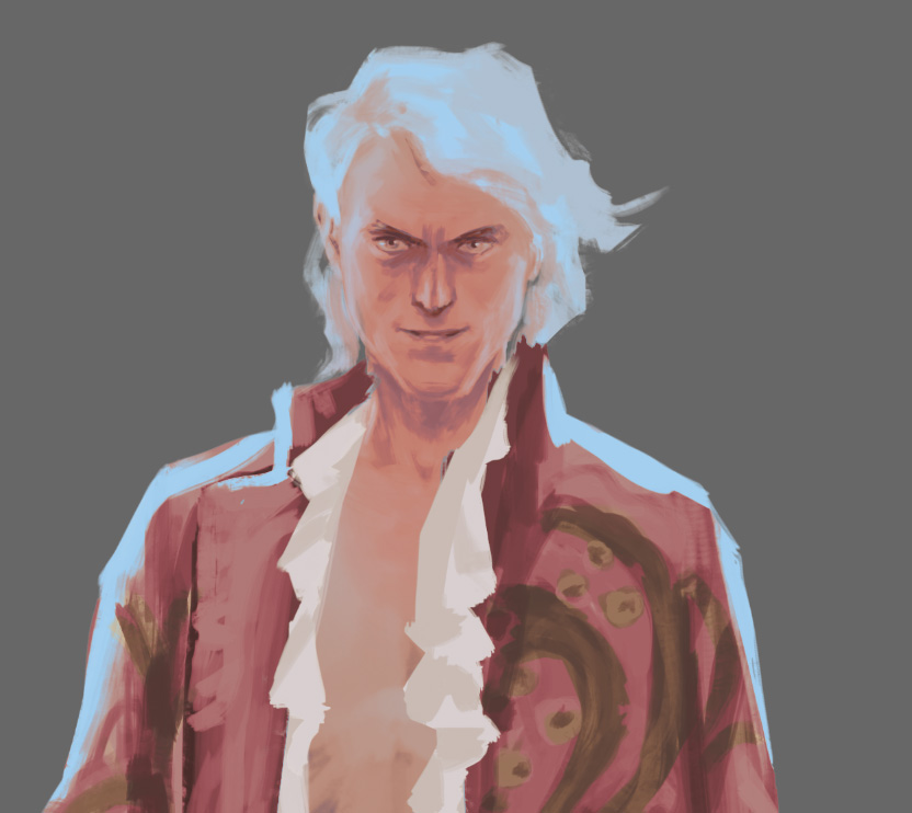
Here I’ve also started roughing in the fabric pattern I like from my reference, still using the eyedropper to paint on the black and white banyan layer underneath the gradient map. I’ve set the brush mode back to normal for that.
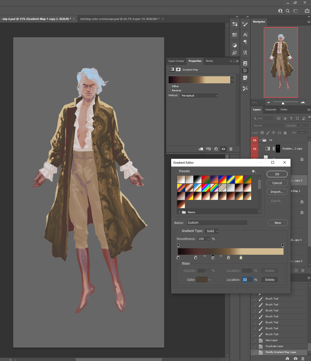
 Next, I want to get into the color of those botanical swirls in the pattern of the fabric. I start out by copying the gradient map layer that already has the banyan layer as its source, and then open and adjust the gradient map colors.
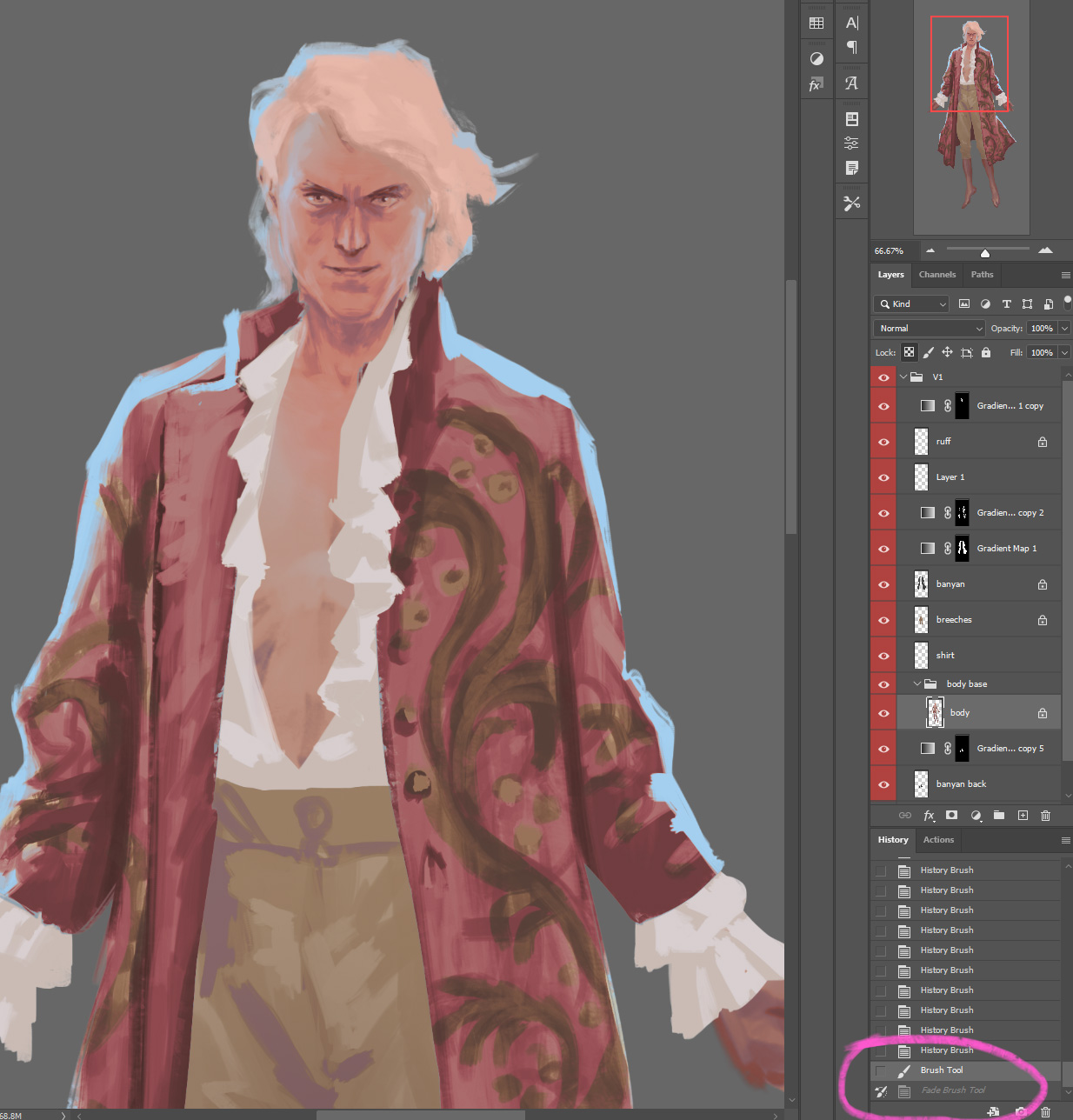
 Now I’m going to do another weird thing: History Brush. Painting on the layer mask, I use an opaque brush and paint black over the whole gradient map.
 Then, I select a source point in the History menu, in this case using the step before that big black brush step.
 Then I select the History Brush in the toolbar:
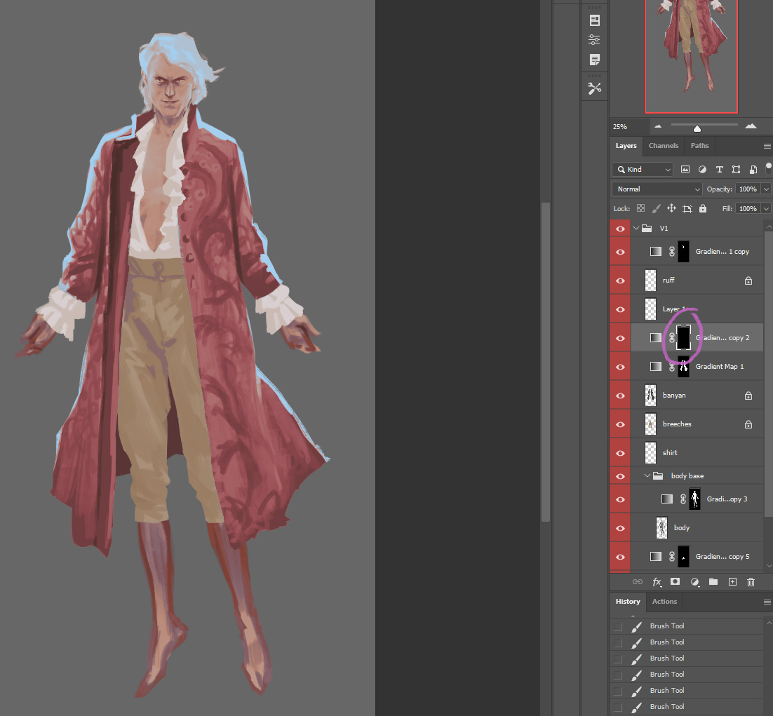
 Then, I can paint back to the history state I’ve selected. In this case the purpose is to paint the white back into the mask layer, which is the version with the more golden-toned colors for the floral pattern. By going back and forth between painting with the history brush on the mask layer, and painting with the regular brush and eyedropper on the black and white layer, I can block in that cool fabric pattern while keeping things easily editable in case I want to try more color options. I can do so easily by simply opening the gradient map properties of either the pinkish gradient map or the bronze-y colored one.
 Confusing? Yeah, kind of, I know. There are lots of different ways to do the same thing in Photoshop, but History has become one of my most-used tools. Let me dig into it a little more –
 Here I’ve flattened to gradient map down onto the Body layer, and then painting a little of the pink from the jacket over the face and neck. I’m not worried about losing detail here, because I can use some of my History tricks to bring them back.
When painting flesh I really like to do everything on a flat layer, rather than having multiple effects or adjustment layers, which get confusing. But convincing flesh tones require delicate and sensitive handling of both value and temperature! I adjust those aspects as I paint using brush modes and, as I’ll demonstrate now, Fade and History.
Since I did that big soft stroke of pink over the face in one brush stroke, I can use Fade. Fade lets you edit the previous step you’ve made in the image, in this case that one big soft brush stroke.
 You can change the brush mode and opacity – after the fact! Between Fade and History, you can start time-hopping as a part of your painting process. It’s so COOL!

After selecting the Overlay mode, I’m liking how that made the pink interact with the mid tones in the cheeks, but the darks are looking too red. So, I set the History point to before the Fade Brush step…
Then I select the History brush, set it to Lighten mode (again, I only want to affect the darker shadows, not the midtones in the cheeks)
 Then I paint over the middle of the face again. This replaces only those shadow colors with the color they were in the History state I’ve set, because they are lighter than the current color in the shadows.
 Things are still too pink in some of the shadow areas, I want to brink back the darker, less pink color I used to have in the eyebrows and eyes. So I’m going to set the History state to before I even did that big soft pink stroke –
 Set my History brush mode to Darken:
 And then paint the areas where I want that previous darker color:
 I’ve shown you how to paint from the past – here’s another crazy thing you can do with the History brush: paint the future. Here I’ve done a Color brush pass on the hair, Faded the brush stroke to Multiply mode, set the History state to the version *with* the Multiply stroke, but clicked back to the history state previous to the one I set the reference point to.
 Now, using the History brush, I can paint over the hair to darken it to that alternate future Fade Brush – Multiply version. You’ll see that Fade Brush history state just floats in the History menu ahead of where each History brush stoke appears in the timeline. Crazy, right?! It’s time wizardry!
 Again, you can get by painting digitally and never use these tools, or do the same thing with adjustment layers and masks. But Fade and History are a big part of my process for fast character design.
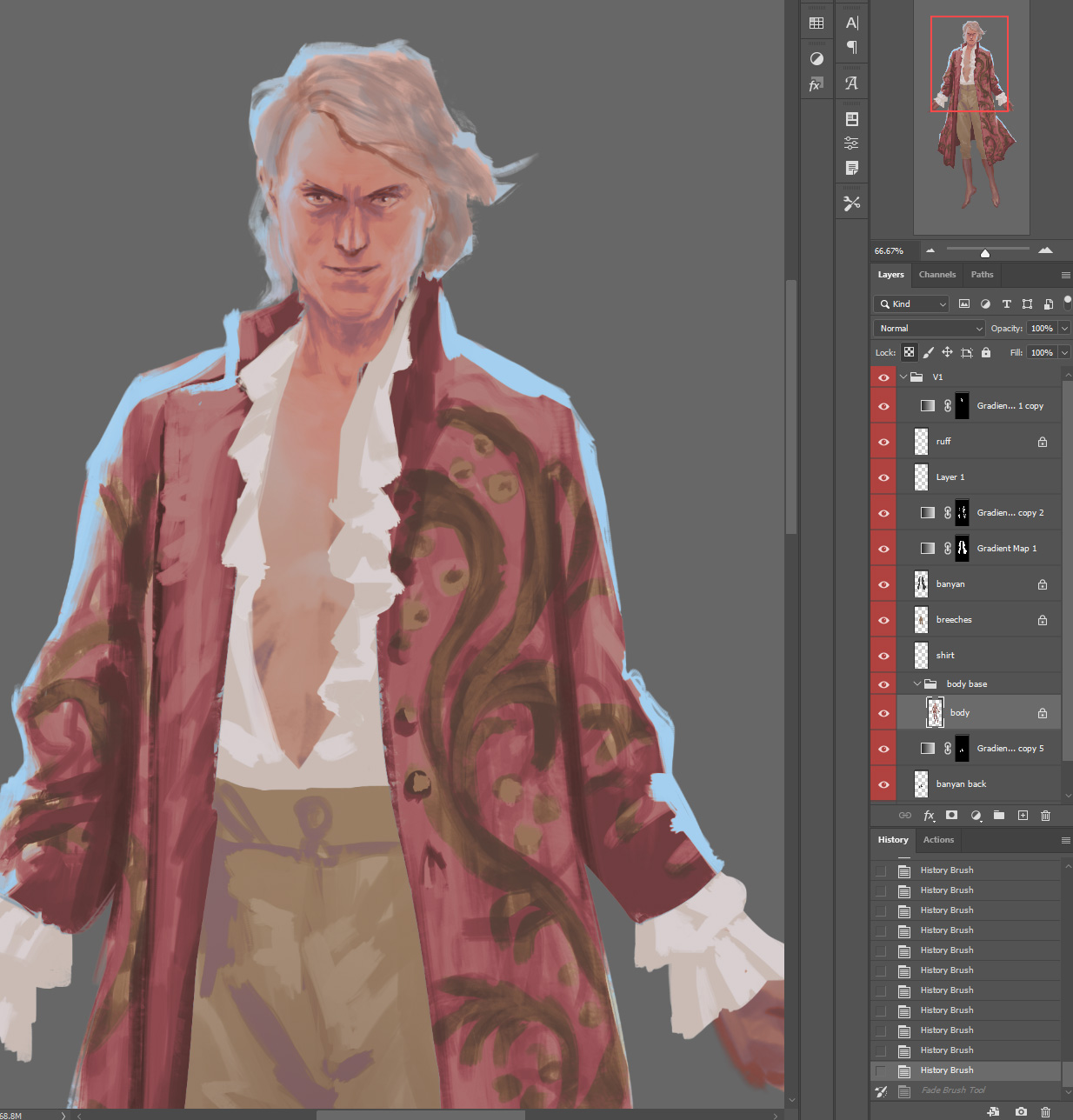
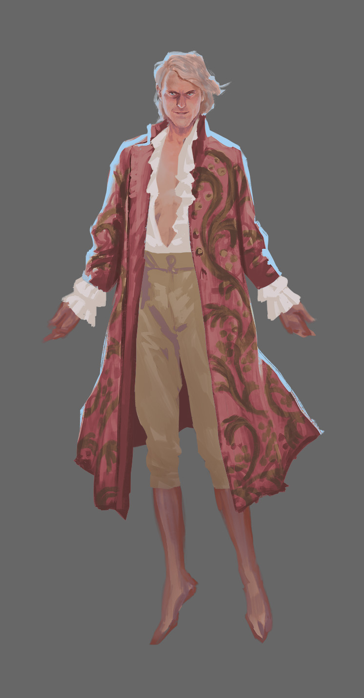
Here’s where I have ended up for today, after some more painting using History brush and the regular paintbrush with various blending modes, and the standby Normal mode.

 To be continued…


0 Comments