Perfect Passage: Christmas Time
Wednesday, December 23rd, 2015
Greg Manchess
A couple of days from Christmas and Winter paintings are still on my mind. Then again, Winter paintings are usually on my mind, and especially now, while I’ve begun the paintings for my novel, Above the Timberline.
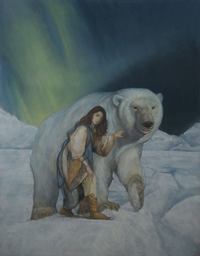
The beautiful and slightly haunting cover painting above, is by my friend and colleague, Stephen T. Johnson, for the book, East. The blurred edge of the fur on the bear’s head, letting the background blue slip over, gives the bear a glow. Better still…I own this painting. (hearts…)
Below are some of my all-time favorites of the Season. There are even more. (Isn’t there always?)
Merry Christmas, all you Muddy artists. I hope you have a great one, and All Best for a new year of new paintings!
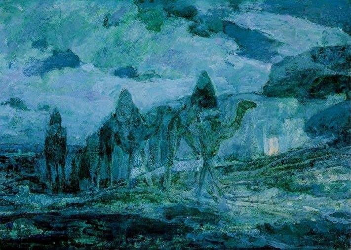
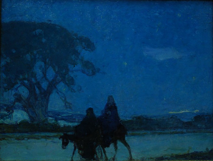
Henry Ossawa Tanner could simplify a scene to get an almost posterized effect. These two, set in Biblical times, capture the feeling of the night. The clouds in the upper right of the top one grabs attention and sets a solid value range, while the green stroke in the background of the bottom one adds depth to an overall flat sky. So simple.
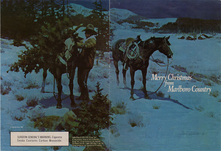
Please pardon the cigarette ad, but Reynold’s piece for Marlboro captures moonlight on snow so well it feels cold. The passage I look at so much is the way the far background trees, reduced to mere shapes, give form to those blank, white mountains.
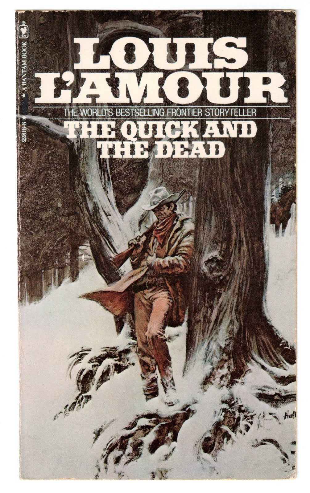
Keeping the western theme, and not so much Christmas, is this killer cover by H. Tom Hall for Louis L’Amour. Character, depth, and interest enhanced by snow. The sweet spot is his handling of the tree roots.
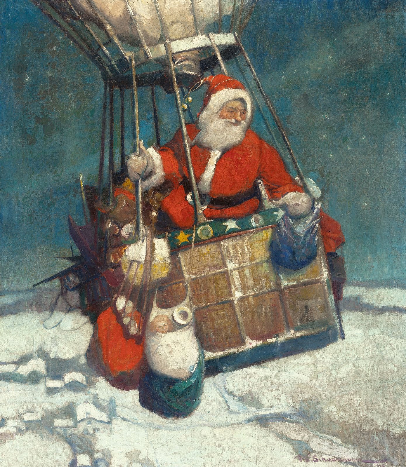
I haven’t seen many Schoonover Christmas paintings. Besides the great idea of Santa traveling by balloon, the grouping of the snow-covered village below is just enough to give the piece the aerial depth we need, and establish the direction of moonlight.
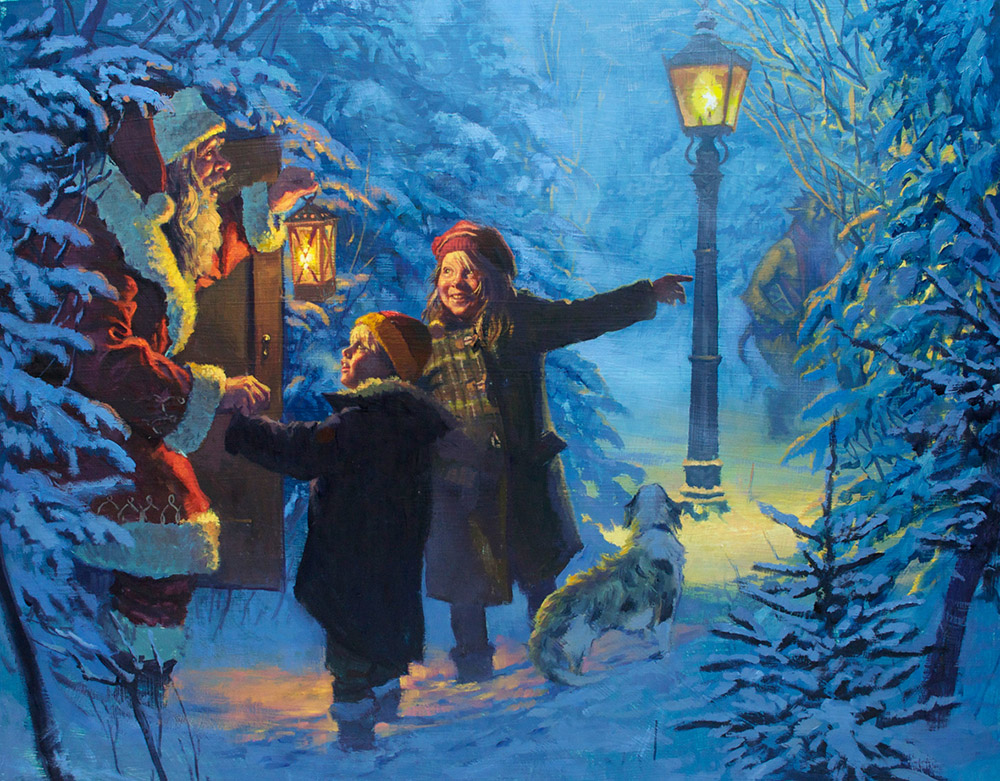
I’ve admired Karl Kopinski’s paintings for years, but this one that he recently shared with me, is a wonderful take on the Narnia series. Possibly the most magical moment in the book. The magic moment in this painting, though, is that little girl’s face, and the way the snow-covered pine branches of the middle ground recede into the background above her head. Perfection.
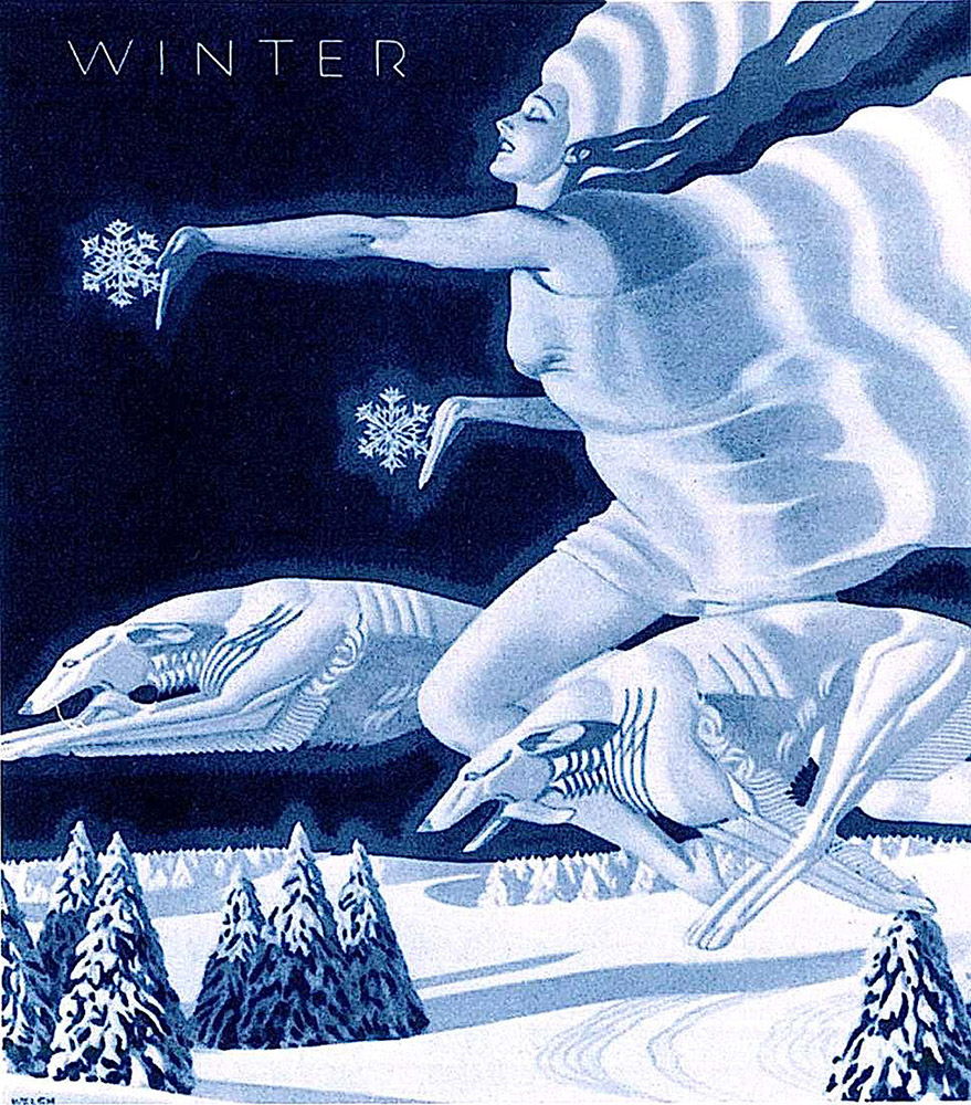
And I end with William P. Welsh’s painting for the cover of Women’s Home Journal for February 1931. Less Christmas, but ‘of the Season’ for me. Monochromatic as all get out, it’s the shapes and light that bring it. The passage I love is the way the shadow comes off her hip and tucks into the flowing drapery. Feels like satin.





Merry Christmas Greg. Thanks for all your posts and the effort you put into them. Your work, and that of all the Muddy Colors Contributors is always appreciated.
I've seen a lot of blow up Santa's in Balloons this year on the way home from the day job… Schoonover's influence transcending the canvas into reality maybe?
I love the moonlight in Winter… Marlboro always had a great ability to make you stop and look at their ads.
Happy New year!
Mike
Thanks, Mike!
Thank you for a fun read! Merry Christmas!