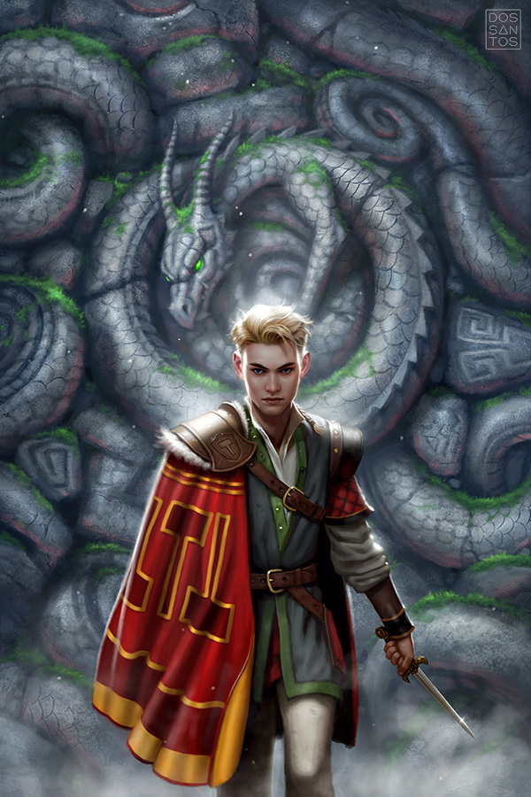
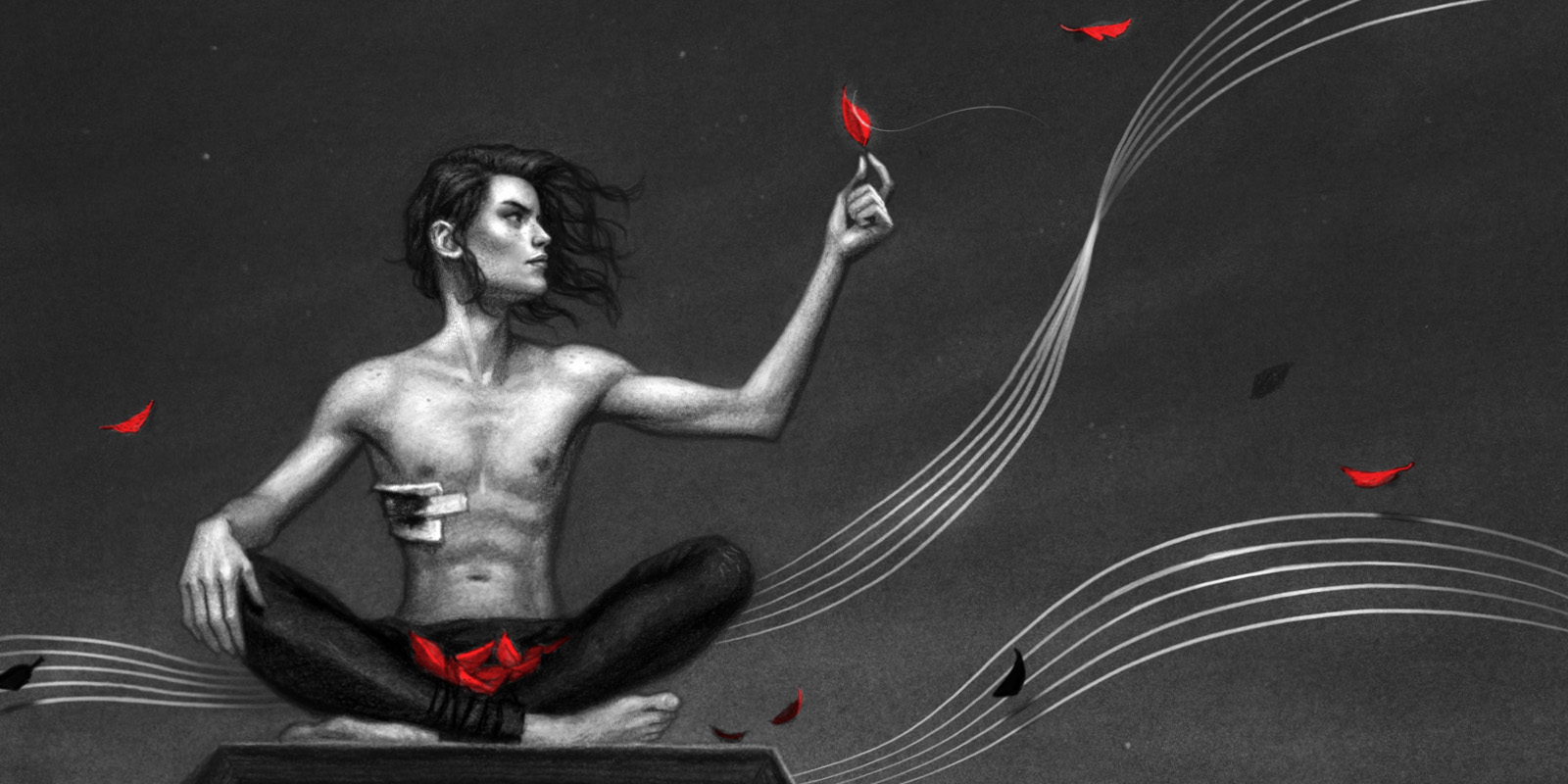
Here is a new cover I recently finished for the novel ‘The Dragon Hammer’, by Tony Daniel.
The story is fantastic, and takes place in an alternative America where Nordic culture and religion took hold instead of European. What we call Yellowstone Park, is actually a large dragon, sleeping just below the Earth’s surface, steaming and stinking of sulphur.
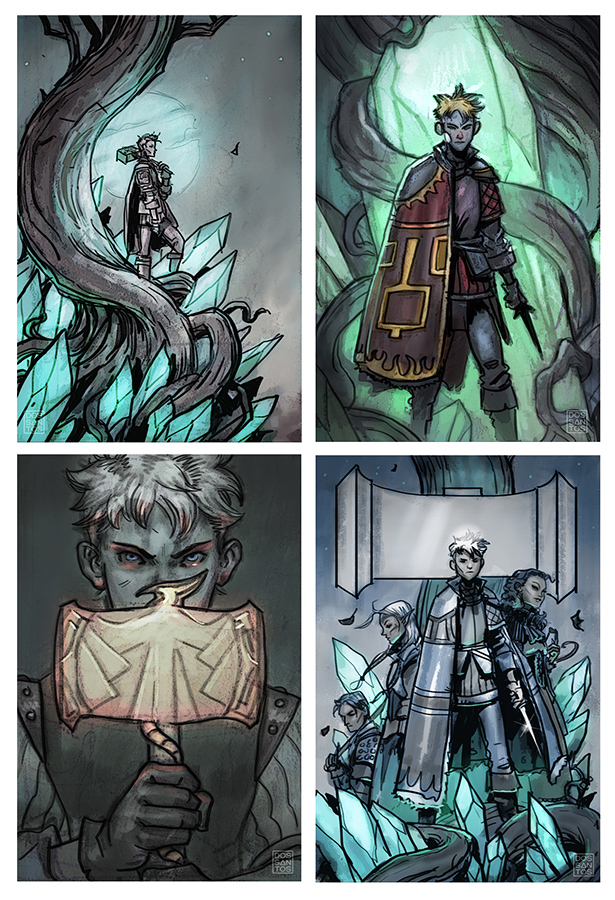
There was no shortage of wonderful visuals to pull from, from giant green crystals to a legendary hammer with world-shattering power. This made coming up with ideas fairly easy. The real challenge was finding an idea that worked well for the cover.
When you have a title like ‘The Dragon Hammer’, you kind of need to show a dragon and/or a hammer, otherwise the title just doesn’t make sense. The problem was, this is an ongoing series, and no dragon or hammer actually appear in the first novel. So I tried to find other ways to integrate those themes into the image. Such as using a hammer shape as a title cartouche, adding hammer patterns to the boy’s cloak, or adding dragons as a decorative element, like in the final image.
The other concern for me was that this story has a large cast of characters, each of them important. So we had to decide whether to show the whole ensemble, or just a single character. This may seem insignificant, but a group shot of teens, versus a solo shot of a young boy, definitely appeals to a different demographic and changes the perceived mood of the book. I usually try to offer an Art Director both options.
And below is how the image appears on the final cover.


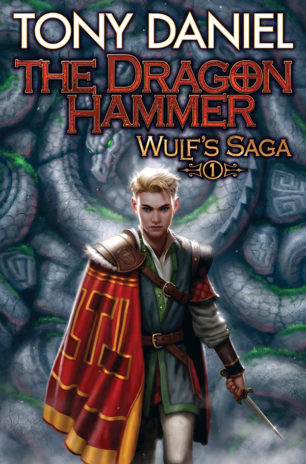
A lovely piece of art.this is another example though of the text being a bit too aggressive on the final cover.The marvelous dragon has been almost covered.Has Muddy colors had many articles on the impact the final text can have on a piece of artwork?.In the past I've had cover designs destroyed by some poorly balanced text layout.
Dan, sua arte é inspiradora!
That's a boy?
digital?
and yeah, that text feels slapped on. the red is too textured and dark and not enough contrast.
Yes, this one was a tight deadline so I did it digitally. I like the way it turned it though and really wish I painted it.
Yeah, that happens a lot. Quite often I'm not a fan of the type design, but that's often just another facet of marketing too. Different type styles attract different viewers. On the upside, I've seen just as many covers that were better with type as I've seen covers worse for it.
The artist has allowed more than enough room for the type , but it still seems to be crowding the figure. I think perhaps part of the problem is the order the artworks are posted in .If it had started with the final cover image and I'd viewed that first , it would't be such an issue.I agree Type and image coming together , can look really good and enhance the artwork.Great painting though , i wasn't sure if it was digital or old school
I like the composition. The red provides an eye-catching contrast to the dull greys.